Start with the bottle load, not the logo file
For liquor retailers, logo placement on an organic cotton tote should start with what the bag will actually carry. A tote used for a single wine bottle and receipt folder behaves differently from a tote expected to hold two spirits bottles, mixers, and a loyalty flyer. Once the bag is loaded, the front panel drops, stretches, and forms vertical tension lines. A logo that looks perfect on a flat sample can look low, wavy, or off-center in the store.
A practical RFQ should describe the use case before the artwork. State the expected bottle quantity, approximate loaded weight, and whether the bag is a giveaway, paid merchandise item, club member bag, or seasonal retail promotion. The factory can then suggest a print zone that avoids the highest stress areas and choose a fabric weight that gives the logo a stable surface.
- For one wine bottle plus small items, a medium tote around 360-380 mm wide can work if the gusset is adequate.
- For two bottles, consider a wider base or gusset so the front panel does not balloon and distort the logo.
- For premium retail sale bags, the logo position should be tested with the bag loaded and hanging from the handle.
- For checkout counter giveaways, a simpler logo position may be acceptable, but print durability still matters.
Choose the right organic cotton fabric before locking the print area
Logo quality depends heavily on fabric. Lightweight organic cotton around 140-180 GSM is common for low-cost promotional bags, but it is usually too thin for a liquor retail tote that needs a clean front logo and bottle-carrying confidence. For a stronger tote, buyers often move into 10-12 oz cotton canvas, roughly 300-380 GSM depending on construction. This gives the print a more stable base and reduces the chance that bottle corners will telegraph through the panel.
Heavier fabric is not always better. Very heavy canvas can have a coarse weave, which may reduce edge sharpness on small text or detailed crest artwork. It also increases carton weight and ocean freight. If the retailer needs a natural, sustainability-led look, unbleached organic cotton with visible flecks can be attractive, but the logo color must be tested because natural fabric is not a clean white base.
- 140-180 GSM: low-cost giveaways, light use, not ideal for heavy bottles.
- 220-280 GSM: mid-range promotional tote, better hand-feel but still needs load testing.
- 300-380 GSM: stronger retail tote range for liquor stores when paired with reinforced handles.
- Dyed organic cotton: better brand color background, but adds dye lot and colorfastness checks.
- Natural organic cotton: good sustainability appearance, but Pantone matching will be less exact than on white fabric.
Set a logo zone that avoids seams, hems, and stress lines
The safest main logo placement for a standard vertical tote is front center, below the top hem and above the lower fold area. For a common 380 x 420 mm tote, a main logo width around 180-240 mm usually gives good visibility without entering risky zones. The top of the artwork should normally sit at least 70-100 mm below the bag opening, depending on handle stitching and hem depth.
Side seams, gusset folds, and bottom folds are not reliable print surfaces for detailed logos. They move during sewing and folding, so a design that crosses these areas is more likely to show misalignment. If the retailer wants a large campaign graphic, build the artwork around the bag’s manufacturing limits instead of treating the tote like a flat poster.
- Keep important text at least 25-35 mm away from side seams on a flat tote.
- Avoid placing small QR codes or legal text near the bottom fold where wrinkles form.
- Do not let the logo overlap reinforced handle stitch boxes unless the design intentionally allows it.
- For gusseted totes, confirm whether the measurement is flat width or expanded width.
- For two-sided printing, define front and back orientation clearly so the logo is not reversed during sewing or packing.
Match the print method to artwork, order volume, and fabric color
For liquor retail programs, water-based screen printing is often the practical default for one to three solid colors. It gives a softer hand-feel than thick plastisol, suits natural cotton well, and keeps cost predictable when quantities are reasonable. Screen printing also holds well on organic cotton canvas when the ink is cured correctly and the fabric surface is not too rough.
Digital printing can help for small quantities or full-color artwork, but buyers need to evaluate color strength, wash resistance, and cost at scale. Heat transfer may work for complicated logos but can feel less natural on organic cotton and may crack or peel if the transfer quality is poor. Embroidery creates a premium look but can pucker lighter fabric and is not ideal for large, dense liquor retailer logos.
- Use screen print for solid store logos, event marks, and repeat programs with stable artwork.
- Use embroidery only for smaller marks, woven-style branding, or higher-margin merchandise.
- Use digital print when artwork has gradients or short-run personalization, but test durability first.
- Avoid oversized heat transfers on flexible tote panels unless the buyer accepts a heavier hand-feel.
- For dark dyed cotton, test opacity and color shift before committing to bulk.
Understand the real MOQ behind logo placement options
A tote MOQ is not only about the number of bags. It is also affected by fabric sourcing, dyeing, print setup, screens, labels, sewing line efficiency, and packing. A buyer may think 1,000 pieces is one order, but if it includes five store logos, two fabric colors, and three print colors, the factory sees many smaller production lots. That creates more setup waste and higher inspection complexity.
For liquor retailers with multiple branches or distributors, the cleanest cost structure is often one shared bag construction with controlled logo versions. Keep the bag size, handle length, fabric, and packing method identical, then separate only the artwork. This improves production efficiency and reduces the chance of mixed cartons. If each branch also wants a different fabric color and print position, expect longer lead time and higher unit cost.
- Clarify MOQ per artwork, not only total order quantity.
- Clarify MOQ per fabric color if dyed organic cotton is required.
- Clarify whether a woven side label has its own MOQ separate from the tote.
- Clarify whether screen charges are one-time or repeated for reorders.
- Clarify whether the supplier will combine small logo versions in one carton run or pack each version separately.
Use samples to approve placement, not just appearance
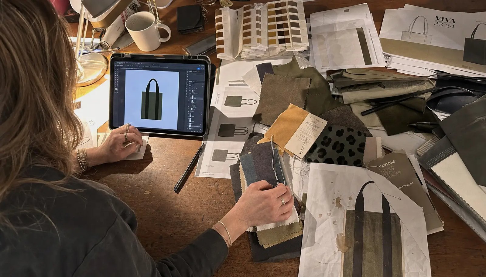
A good sample process should separate material, print, and construction decisions. A fabric swatch confirms hand-feel, weight, and color. A print strike-off confirms ink color, opacity, and curing on the actual fabric. A fit sample confirms size, gusset, handle length, and load behavior. The pre-production sample brings these together and becomes the reference for bulk inspection.
For logo placement, photos are useful but not enough. The buyer should receive measured photos or a placement drawing showing distance from the top opening, side seams, and bottom edge. The sample should then be loaded with the target bottle weight and photographed hanging naturally. This step often reveals whether the logo needs to move higher, shrink slightly, or avoid a wrinkle zone.
- Approve actual logo size in millimeters, not only a scaled PDF.
- Sign off fabric weight and color before print approval.
- Test the printed panel after the tote is folded as it will be packed.
- Check whether the logo remains visually centered when the tote is loaded.
- Keep one signed pre-production sample at the factory and one with the buyer or inspection team.
Build acceptance criteria into the purchase order
Many logo disputes happen because the PO says only "logo as artwork" or "print front center." That is not enough for production. Cutting, sewing, pressing, and folding all create normal variation. A better PO gives measurable tolerances so the factory QC team and third-party inspector can make the same decision at shipment.
For most front-center tote prints, a placement tolerance of plus or minus 5 mm is realistic if the bag construction is stable and the print is made after panel preparation. For very large prints, gusset prints, or prints across seams, tolerance may need to be wider. Color tolerance should be based on an approved physical strike-off, because natural organic cotton can make Pantone colors appear warmer or duller.
- Logo horizontal center tolerance: commonly within plus or minus 5 mm from center line.
- Logo vertical tolerance: commonly within plus or minus 5 mm from approved top distance.
- Finished bag size tolerance: define by dimension, for example plus or minus 10 mm depending on fabric and sewing.
- Print defects: reject heavy smudging, pinholes in key logo areas, poor registration, or visible ink offset.
- Stitching: reject broken handle reinforcement stitches, skipped stitches at stress points, or loose thread clusters around the print zone.
Prevent packing damage that ruins a good print
Logo placement can be correct at the factory table and still arrive poorly presented if packing is wrong. Heavy ink areas can offset onto adjacent fabric when bags are packed before full curing or compressed in humid conditions. Handles can press a crease through the logo if folded across the front panel. Natural cotton can also pick up carton dust or moisture if cartons are weak or stored badly.
For liquor retail distribution, packing should support both freight protection and store readiness. If store staff need to unpack quickly, overly tight bundles create labor and wrinkles. If the bags are intended for premium sale, inner polybags or paper bands may be worth the extra cost. For sustainability programs, buyers may avoid individual polybags but still use carton liners or kraft bands to keep units clean.
- Define whether the logo faces inward or outward when folded.
- Avoid folding handles directly across the printed logo if the ink area is large.
- Use carton quantities that do not crush the bottom layers.
- Consider carton liners for natural cotton to reduce moisture and dust exposure.
- Mark cartons by artwork version, bag color, quantity, PO number, and destination if multiple branches are involved.
Plan lead time around approvals and fabric availability
Lead time risk usually starts before bulk production. Organic cotton fabric may be available in greige, natural, or standard stock colors, but custom dyed fabric can add time and minimums. Print approval can also delay the schedule if the buyer changes logo size after seeing the sample. A realistic timeline separates artwork confirmation, material sourcing, sample making, sample review, bulk cutting, printing, sewing, inspection, and packing.
For repeat liquor retailer programs, the fastest path is to freeze the tote construction and maintain the same print position across reorders. Seasonal graphics can then change within an approved print zone. If every campaign resets the tote size, fabric color, handle detail, and logo location, each order becomes a new development project rather than a reorder.
- Artwork review should include vector file quality, color references, and print size.
- Material lead time depends on whether organic cotton fabric is in stock or woven/dyed to order.
- Sample lead time increases when print strike-offs are required before the sewn sample.
- Bulk printing should not start until the pre-production sample is signed off.
- Inspection booking should be scheduled before the ex-factory date, not after cartons are packed.
Compare quotes by landed cost, not only unit price
A lower unit price can be misleading if the quote uses lighter fabric, smaller print size, weak packing, or excludes setup charges. For organic cotton totes, fabric weight is one of the biggest cost drivers. Print cost changes with number of colors, print positions, ink type, and artwork coverage. Packing cost changes with folding method, inner packaging, carton strength, and labeling requirements.
Procurement teams should normalize quotes before comparing suppliers. Put each quote into the same specification: same fabric GSM, same bag size, same gusset, same handle construction, same logo size, same print method, same packing, and same incoterm. If one supplier quotes FOB and another quotes delivered duty paid, the unit prices are not comparable without freight, duty, and local receiving costs.
- Separate base bag cost from printing cost so artwork changes can be priced clearly.
- List screen, setup, sample, certificate, and inspection costs outside the unit price if they apply.
- Confirm carton dimensions and gross weight for freight calculation.
- Check whether the quote includes export carton markings, barcode labels, or retailer compliance labels.
- Compare the cost impact of 1-color versus 2-color printing before final artwork approval.
Specification comparison for buyers
| Spec decision | Recommended option | When it fits | Buyer risk to check |
|---|---|---|---|
| Front-center logo position | Keep the main logo 70-100 mm below the bag opening and centered between side seams | Best for liquor store giveaways, loyalty bags, and general retail programs where brand visibility matters | If the logo is too high, the handle stitching and top hem can distort the print or reduce visual balance when the tote is loaded |
| Logo size on standard tote | Use 180-240 mm width for a 380 x 420 mm tote; reduce for dense artwork | Fits most one-color liquor retailer marks, store names, and seasonal campaign graphics | Oversized logos can cross fold lines, seam allowances, or wrinkles caused by bottle weight |
| Fabric weight | 10-12 oz cotton canvas or approximately 300-380 GSM organic cotton | Suitable for 1-2 bottles plus light groceries when the tote is designed with proper handle reinforcement | Too-light fabric may show bottle corners and print-through; too-heavy fabric raises freight and can reduce print sharpness on coarse weave |
| Print method | Water-based screen print for 1-3 solid colors; pigment or discharge testing if using dark dyed cotton | Best for repeat liquor retail programs that need consistent logo color and cost control | Logo color can shift on natural cotton, and ink hand-feel or cracking must be checked after curing and rub testing |
| Side gusset logo | Use a small vertical logo or woven side label only if the gusset is at least 80-100 mm | Useful for premium house-brand programs where the front panel carries artwork or a promotional message | Gusset printing is harder to align in bulk production and may be hidden when the bag is flat-packed |
| Handle branding | Use woven label, small print on handle, or contrast stitch only after load testing | Works for higher-end retail merchandise or gift-with-purchase campaigns | Printing too close to handle fold lines can crack, and labels can irritate hands if the edge is not soft or properly folded |
| MOQ logic | Separate MOQ by fabric color, print color count, and bag size instead of treating the tote as one simple item | Important when different liquor store branches or distributors need shared bag construction but different logos | Combining too many small logo versions can increase setup waste, screen charges, sorting errors, and packing complexity |
| Packing format | Flat pack with logo facing inward or tissue protection for heavy ink coverage | Best for DC receiving, retail shelf readiness, and lower wrinkle risk during ocean shipment | If bags are compressed too tightly, dark ink can offset, handles can crease across the logo, and stores may reject poor presentation |
Buyer checklist before sampling
- Define the tote size, gusset, handle length, and target bottle load before approving logo position.
- State organic cotton fabric weight in GSM or oz, and clarify whether the weight is before or after washing.
- Provide vector artwork with Pantone references, minimum line thickness, and actual print size in millimeters.
- Mark the logo distance from top opening, side seam, bottom fold, and gusset edge on a measured placement drawing.
- Select print method by order quantity, fabric color, artwork complexity, and required hand-feel.
- Approve a physical pre-production sample, not only a digital layout or photo.
- Test print rub resistance, curing, color accuracy, registration, and logo distortion after loading bottles.
- Confirm MOQ by logo version, bag color, fabric dye lot, and packing style.
- Specify carton quantity, folding method, inner polybag policy, carton markings, and whether store-ready packs are required.
- Request a quote that separates bag cost, print setup, label cost, sampling, packing, inland freight, and export charges.
Factory quote questions to send
- What organic cotton fabric weight and construction are you quoting, and is it certified fabric available in current stock or made to order?
- What is the maximum safe print area for the quoted tote size after allowing for seam tolerance, shrinkage, and folding?
- Which print method is included in the unit price, and how many colors, screens, or print positions are covered?
- Can you provide a measured logo placement drawing with top, side, and bottom distances before sample production?
- What is the MOQ per artwork, per fabric color, and per bag size, and how does price change at 500, 1,000, 3,000, and 5,000 pieces?
- What curing, rub, wash, and load tests will be performed on the logo before shipment?
- How will the bags be folded and packed to prevent ink offset, handle creasing, and carton over-compression?
- What sample types are included: material swatch, print strike-off, fit sample, and pre-production sample?
- What lead time applies after sample approval, and which steps are most likely to delay production?
- What quote items are excluded, such as certificates, third-party inspection, retail barcode labels, or destination compliance packaging?
Quality-control points to confirm
- Logo placement tolerance should normally be controlled within plus or minus 5 mm for front-center print on standard totes.
- Print color should be checked against an approved Pantone or signed strike-off under consistent light, not only against a phone photo.
- Ink curing should pass dry rub and light wet rub testing without obvious color transfer.
- The tote should be loaded with the target bottle weight to confirm the logo does not wrinkle excessively or shift visually.
- Handle stitching must not overlap the print zone, and reinforced stitch boxes should be clean without broken threads.
- Finished bag size should be checked after pressing or natural settling, with a clear tolerance agreed in the purchase order.
- Cartons should not be overpacked to the point that the logo receives permanent fold marks or ink-to-fabric offset.
- Random inspection should include measurement of several logo positions across the carton, not only the top sample.