Why wellness brands need a different tote spec
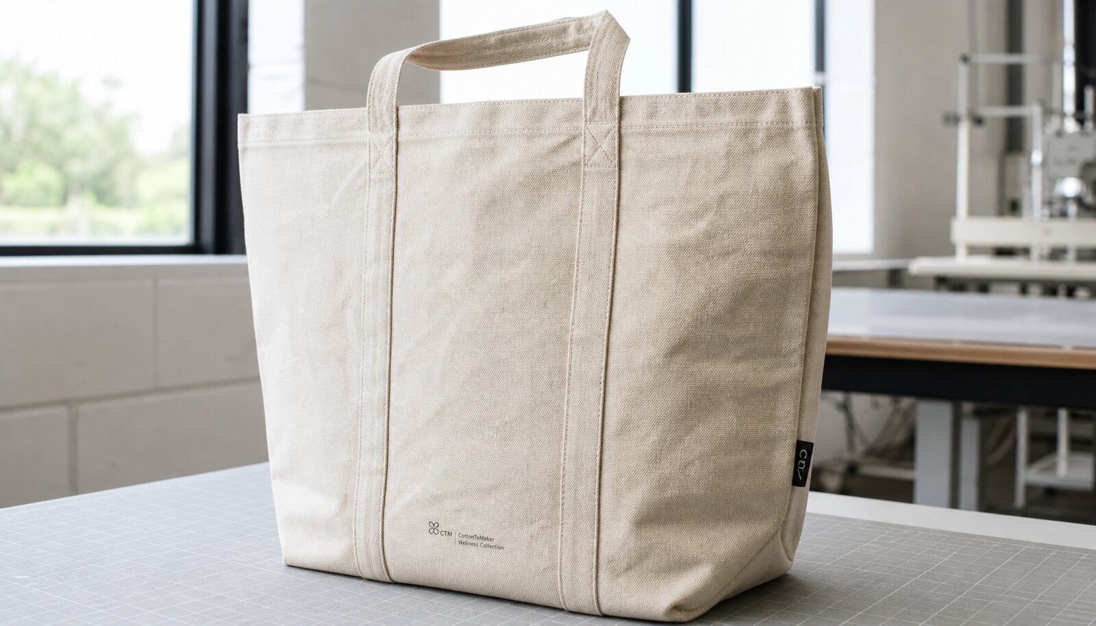
A large canvas grocery bag for a wellness brand is doing more than carrying product home. It is a retail signal, a reuse item, and often a small but visible extension of the brand’s packaging system. That changes the sourcing brief. A bag for a wellness label needs to look calm, durable, and intentional after folding, packing, and repeated use. If the print looks too heavy, too glossy, or too promotional, the product may still be functional but it will miss the brand role the buyer intended.
Procurement teams often start by asking for a logo print on a tote, then discover that the logo only works if the fabric, finish, packing style, and decoration route all support the same aesthetic. On canvas, the choice of print method affects hand feel, color sharpness, repeat-order consistency, and how obvious the mark looks after the bag is loaded with groceries. For wellness brands, that balance matters because the bag is usually expected to feel natural rather than flashy. The best sourcing decision is the one that matches the end-use and the shelf expectation, not the one that looks easiest in a quote sheet.
- Wellness tote briefs usually need a restrained, natural look rather than a loud promotional finish.
- The bag will be reused, so durability and ink stability matter more than a one-time presentation.
- Print, fabric weight, and packing should be treated as one purchase decision, not three separate ones.
Lock the bag spec before you compare decoration
Compare print methods only after the body spec is fixed. For large canvas grocery bags, buyers commonly work in the 10 oz to 12 oz range, roughly 340 to 410 GSM, because that range keeps the tote structured without making it too stiff for regular carry. Lower weights can be acceptable for short-life promotional use, but the bag will crease more and can look tired faster. Heavier canvas can improve perceived quality and load-bearing confidence, yet it may increase sewing cost and make some print finishes feel less natural in hand.
Finished dimensions and reinforcement details should be locked before pricing starts. Width, height, gusset depth, handle length, handle width, and handle drop all affect where the artwork can sit and whether it survives folding and loading. The supplier needs a real print window, measured from a seam, hem, or reinforcement datum, not a vague instruction to center the logo. That difference matters because a tote that looks balanced on a flat mockup can shift once the panel is sewn and the bag is packed. Buyers should also specify whether the canvas is natural ecru, bleached white, or dyed, because each base changes print contrast and often changes the cost structure too.
- A common large grocery range is roughly 14 to 17 inches wide, 14 to 17 inches high, with a 4 to 6 inch gusset.
- Keep artwork clear of top hems, side seams, and handle reinforcement zones.
- State the base canvas color in the RFQ because natural, bleached, and dyed fabric print differently and may price differently.
A better comparison frame than “good, better, best”
For procurement, the useful question is not which method sounds premium. It is which method fits the artwork, order volume, timeline, and brand tolerance for variation. Screen printing remains the most common route because it is stable on heavy canvas and scales predictably once the setup is approved. Water-based and discharge printing can create a softer, more textile-like result, which is attractive for wellness branding, but those methods depend more heavily on fabric chemistry, absorbency, and cure control. Transfer methods can help when the art changes often or the run is small, yet they usually add a visible film that may conflict with a natural brand aesthetic.
The production route matters just as much as the ink method. A direct cut-and-sew factory that prints in-house gives the buyer fewer handoffs, clearer responsibility, and better control over repeat orders. A trading company can still be useful for coordination, but the procurement team needs to know who actually prints, who inspects, and who owns the defect if the print drifts. Local decoration on imported blanks can work for launch testing or low-volume campaigns, but it introduces an extra freight leg and another point where color or placement can move off spec. The best route is the one that keeps the sellable unit stable over time.
The comparison should also reflect how the artwork behaves on canvas. Simple one-color marks, bold typography, and solid brand icons favor screen methods. Fine gradients, photographic art, or very small type can push the buyer toward digital transfer or embroidery, but those options bring their own tradeoffs. Wellness brands often want a quiet, tactile presentation, so the lowest-risk choice is not always the most visually dramatic one. It is the one that still looks clean after handling, folding, and shipping.
- Direct factory production usually gives the most stable repeat-order outcome.
- Local decoration on blanks can help with low MOQ, but it adds handling and freight complexity.
- Trading-company quotes are only comparable when the real production line is disclosed.
Print method comparison for large canvas grocery bags
The table below is most useful when read as a decision tool rather than a catalog. Pricing bands are relative because actual costs move with canvas weight, country of origin, color count, quantity, and packing. Even so, the relationships are consistent enough to help a buyer narrow the field quickly. If a supplier’s quoted method does not match the artwork complexity or the unit price is far outside the expected band, that is usually a sign that the production route, fabric, or packing assumption is different from what the buyer had in mind.
For simple wellness-brand grocery totes, one-color screen print on cut panels remains the most procurement-friendly starting point. It is usually the easiest way to balance cost, repeatability, and a natural-looking finish. Multi-color screen print is still strong when the art needs more than one flat color, but the buyer should expect more setup work and more sensitivity to registration. Water-based and discharge methods are worth considering when hand feel is a brand priority, while transfer and embroidery are better reserved for specific design needs rather than default use cases.
- Use the comparison table to screen out mismatched methods before asking for a quote.
- Treat pricing bands as relative indicators, not final landed cost.
- If the art is simple, a simple method is often the most reliable procurement choice.
How factory quotes should break down
A procurement-grade quote separates the product from the decoration. At minimum, buyers should see the body specification, fabric weight, finished dimensions, print method, color count, setup cost, unit decoration cost, packing method, carton details, incoterm, and any assumed waste or shrinkage. If all of those assumptions are buried in one unit price, it becomes impossible to compare suppliers on the same basis. A cheap quote can hide thinner canvas, outsourced decoration, loose packing, or an assumed defect allowance that the buyer never intended to accept.
The biggest price drivers are usually fabric weight, artwork complexity, and the point in the production process where the print happens. Printing on cut panels often improves alignment and reduces defect risk, especially on multi-color art. Printing on a fully sewn bag can be workable for simple marks, but the process is more sensitive to the gusset, seams, and handle placement. That is why a useful RFQ asks not only what the print method is, but also whether it is applied to panels or finished bags, and whether the factory owns that step or outsources it. Those details change both cost and risk.
For repeat programs, it is also worth asking which setup assets are retained. Screens, films, embroidery files, and color references should not disappear after the first order unless both sides agree on that. If they are retained, the reorder cost and timing should improve. If they are not, the buyer should expect some repeat setup expense and should put that into the landed-cost model from the start.
- Separate bag body, setup, per-unit decoration, packing, and cartonization in the quote.
- Ask whether the print is applied to cut panels or finished bags.
- Confirm whether setup assets are retained for reorders and for how long.
Sample approval should test the whole bag, not just the logo
A useful sample program proves the production route, not just the artwork. A flat strike-off can confirm the logo file, ink choice, and basic color direction, but it does not tell you how the print will look once the bag is sewn, folded, stuffed, and packed. On a canvas grocery tote, seams, gussets, and reinforcement points can change the way the mark reads. That is especially true when the artwork sits near a panel edge or when the bag is made from absorbent, textured canvas. A sample that looks good on a sheet can still fail in a warehouse or on a retail shelf.
The safest approval flow is two-stage. First, approve the artwork proof: size, placement, color count, and reference color. Second, approve a pre-production sample made from the same fabric, the same decoration route, and the same packing method planned for bulk. If the supplier only offers a loose panel or an unstuffed bag, the buyer is still guessing about the final presentation. Keep a dated photo record of the approved sample from the front, back, side, and inside so later disputes can be settled against a shared reference rather than memory.
For wellness brands, the sample should also be reviewed under the same lighting where the product will be received and sold as much as possible. Bright white inspection light is useful for finding pinholes, weak coverage, or shadowing. Natural retail lighting is useful for checking whether the logo still feels calm and balanced when the bag is viewed in context. Both matter, because a tote that passes one environment but fails the other is still a sourcing problem.
- Approve a stuffed pre-production sample, not only a flat swatch.
- Keep the approved sample tied to a versioned artwork file and date.
- Check the sample under bright inspection light before freezing bulk production.
QC details buyers can put in the PO
Quality control is strongest when the buyer writes down what counts as acceptable, what counts as rework, and what counts as reject. On print, the important questions are placement, registration, cure, and visual consistency. On sewing, the key risks are skipped stitches, loose thread tails, weak bar-tacks, and panel distortion. On packing, the issue is count accuracy and whether the finished bag still looks like the approved sample when it arrives. If those points are left vague, the factory will default to its internal standard, which may be fine for utility goods but not necessarily right for a branded wellness tote.
The QC language should be practical rather than ceremonial. It helps to reference the approved sample and the production method instead of pretending there is one universal tolerance for every tote. A buyer can still state numeric targets for placement, registration, stitch quality, and carton count, but those numbers should be used as operating limits for the specific program, not as abstract rules. That approach makes the memo more credible and easier to enforce on the line.
When the buyer wants AQL, the PO should state it clearly and name the defect classes. When the program is smaller or more direct, a plain-language defect matrix can work just as well. The key is to define which defects trigger reprint, which trigger repair, and which trigger shipment hold. That structure is more helpful than a long list of generic inspection reminders.
- Use the approved sample as the reference point for all QC decisions.
- Write the rework/reject rules before bulk starts.
- Make the defect language match the scale of the program; not every order needs the same inspection complexity.
Practical QC thresholds that are easier to defend
Buyers often want hard numbers because they make supplier conversations faster. That is reasonable, but the numbers should be framed as program limits, not universal standards. For example, a simple one-color logo may reasonably be held to a tighter placement window than a large soft-hand graphic. A multi-color design may need a different registration allowance than an embroidery badge. The right threshold depends on the artwork, the visual distance, the bag construction, and the level of brand sensitivity. If the bag is a premium retail item, the buyer should write stricter tolerances than if the tote is a utility giveaway.
A workable approach is to tie each QC threshold to the approved sample and the expected use condition. For instance, the logo should line up to the approved datum; seams should be straight and secure; the handle joins should match on both sides; and the printed area should not show obvious transfer under a simple rub test. What matters is that the factory knows how the buyer will judge the bag when it arrives. That is more credible than presenting a long list of absolute limits that look precise but are disconnected from the real program.
In other words, use numbers where they help, but do not overclaim certainty. Canvas is a sewn, absorbent, natural material. Small differences in weave, absorption, and finishing are normal. The buyer’s job is to define the margin where normal variation stops being commercially acceptable for the brand.
- Tie tolerances to the approved sample and artwork complexity.
- Keep the thresholds strict enough to protect brand presentation but flexible enough to reflect canvas variation.
- Avoid writing “universal” limits into the PO for soft, sewn products.
Packing rules affect both retail readiness and damage risk
Packing is often treated as an afterthought, but it changes what the buyer actually receives. A grocery tote packed loosely in bulk may be perfect for a warehouse program, while a wellness brand selling through retail or DTC may need each unit folded so the logo is visible and the handles lie flat. If the fold is too loose, the tote arrives wrinkled and awkward. If the fold is too tight, the canvas can crease in a way that changes the first impression. The packing decision should therefore be part of the buying spec, not a post-order instruction.
The packing note should say whether the bag is bulk packed, folded with a paper band, or polybagged. It should define fold size, inner pack, master carton quantity, and carton marks. If the bags will enter a distribution center, labels should also match the buyer’s receiving process: SKU, size, color, country of origin, carton ID, and barcode if required. That reduces receiving friction and makes it easier to track shortages or mixed cartons. In practice, a clear packing spec can prevent as many disputes as a clear print spec.
There is also a cost impact. Retail-ready packing adds labor and materials, while bulk packing may reduce the unit price but increase downstream handling. The buyer should compare those costs in the same landed-cost view instead of assuming the cheapest packing on paper is the cheapest packing in use.
- Define fold style, inner pack, carton count, and carton marks before production starts.
- Choose bulk pack only when the downstream warehouse can handle it cleanly.
- Do not separate packing cost from landed cost when comparing suppliers.
Lead time and reorder stability depend on the decoration route
Lead time is not just sewing capacity. It depends on where the decoration happens, how many colors are involved, how quickly the buyer approves artwork, and whether the factory can book fabric and finishing in one flow. A one-color screen print on stocked natural canvas is usually simpler to schedule than a multi-step transfer on dyed fabric. But that advantage disappears if the decoration is outsourced and the factory has to wait on another shop’s queue. Buyers should ask where the bottleneck is before relying on any ship date.
A better timeline breaks the order into stages: artwork approval, sample, material booking, decoration setup, sewing, inspection, and packing. That sequence gives the procurement team something to manage and something to chase. It also makes it easier to spot where delays are likely to appear. If the brand has a launch date, the supplier should show the critical path early, not after the PO has already been issued. Late color changes or print corrections can ripple across the order faster than most nontechnical buyers expect.
For repeat orders, ask whether the factory retains screens, films, embroidery programs, and color references. If those assets are kept, the reorder should usually be faster and more stable. If they are not, the buyer should plan for another setup cycle and another sample check. That expectation should be built into forecasting, especially for seasonal wellness launches or retailer restocks.
- Ask for a stage-by-stage schedule, not just a promised ship date.
- Freeze the artwork before screens, plates, or films are made.
- Confirm whether reorder files and screens are retained and for how long.
Specification comparison for buyers
| Print method | Typical pricing band | Best-fit artwork | Main failure modes | Avoid when |
|---|---|---|---|---|
| One-color screen print on cut panels | Lowest to low-mid | Simple logos, one solid color, bold type, limited line detail | Registration drift, undercure, uneven ink laydown on absorbent canvas | Artwork has fine gradients, many small type sizes, or multiple placements that must align perfectly |
| Multi-color spot screen print | Low-mid to mid | Flat logos with 2-4 spot colors, icons, short copy blocks | Color shadow, misregistration, ink build-up at overlaps, longer setup time | The design depends on photographic detail or very thin reversed-out lines |
| Water-based screen print | Low-mid to mid | Natural-looking logos, soft brand marks, simple wellness graphics | Uneven absorption, weak opacity on dark or heavily textured canvas, wash/cure inconsistency | The brief requires sharp opacity on dark substrate or a very bright white block print |
| Discharge screen print | Mid to high | Soft-hand graphics on darker dyed cotton canvas, restrained fashion or lifestyle marks | Color variability, fabric chemistry sensitivity, weak results on non-compatible canvas, aftercure inconsistency | The canvas is unknown, heavily blended, or the brand needs exact color repeatability |
| DTF or other digital transfer | Mid to high on small runs; can drop at scale but rarely beats screen print on simple logos | Full-color artwork, complex gradients, short test runs, seasonal graphics | Film edge visibility, peeling at fold lines, gloss mismatch, crack risk under repeated abrasion | The bag will be folded tightly, heavily loaded, or must feel fully natural in hand |
| Embroidery | High | Simple logos, monograms, premium marks, small badge-like graphics | Puckering, thread break, distortion on thin or very soft canvas, size limits for large artwork | The art is very large, highly detailed, or needs flat color blocks across a broad area |
| Applique or woven patch with simple print | High | Premium labels, heritage-style branding, limited-edition or elevated retail bags | Patch edge lift, extra sewing steps, placement drift, bulk at attachment points | The buyer needs the lowest unit cost or the logo must sit flush with the canvas |
| Specialty ink screen print such as puff or high-build | Mid to high | Tactile logo emphasis, fashion-led wellness packaging, statement marks | Cracking, height inconsistency, heat sensitivity, increased cure dependence | The tote will be packed tightly, rubbed frequently, or must stay very flat and flexible |
Buyer checklist before sampling
- Finished bag size, gusset, handle length, handle width, and handle drop are fixed before RFQ, with the acceptable tolerance stated in writing.
- Canvas weight is defined in both oz and GSM, plus the acceptable range and any shrinkage allowance after printing and curing.
- Artwork is supplied in vector format with the exact print area, Pantone reference or visual color target, and a locked version number.
- Print placement is dimensioned from a seam or hem datum, not from the bag edge alone, so the factory has a real reference point.
- The sample approval package includes a flat artwork proof, a stuffed pre-production sample, and a photo record from front, back, side, and inside.
- Packing is defined as bulk, folded with paper band, or polybagged, with fold size, inner pack, and master carton marks written into the quote request.
- MOQ logic is stated by print method, color count, and whether the fabric is stock canvas or custom dyed, so the supplier cannot hide a method change in the price.
- QC acceptance criteria cover print placement, registration, stitch quality, handle symmetry, and carton count, with pass/fail language or AQL written into the PO.
- Reorder expectations are documented, including whether screens, screens files, or embroidery programs are retained and how long a repeat order should take.
Factory quote questions to send
- Is printing done in-house, or is the decoration outsourced to another vendor after the bags are sewn?
- Is your quote based on cut panels, sewn blanks, or fully finished bags, and can you price all three if needed?
- What canvas weight, fabric construction, and shrinkage allowance are included in the quoted spec?
- How many screens, plates, films, or embroidery heads are included in the setup charge, and what is charged again on reorder?
- What is the MOQ by size, color, and print method, and does the MOQ change if the artwork changes later?
- What sample fees apply for a strike-off, a pre-production sample, and a corrected resample if the first one fails?
- What packing method is included by default, and what is excluded from the quoted unit price?
- What inspection standard do you use, and which defects are treated as rework, replacement, or normal tolerance?
- How do you handle reorder color matching if the second order is placed months later?
- What is the lead time for a repeat order if the screens or files are already approved and retained?
Quality-control points to confirm
- Use the approved pre-production sample as the primary reference, not a generic factory standard, when checking the first bulk output.
- Print placement should be measured from the same seam or hem datum used in the artwork proof; a practical buyer target is often within plus or minus 3 mm for simple one-color logos, but the tolerance should be set to the specific art, bag size, and production method rather than copied as a universal rule.
- Multi-color registration should be tight enough that the intended edges read cleanly at normal retail viewing distance; for many programs that means roughly within 1.5 mm on critical edges and about 2.5 mm on non-critical fills, unless the artwork is intentionally looser or more painterly.
- Under bright white inspection light, the printed area should not show distracting show-through, unintended banding, or patchy ink laydown when compared with the approved sample.
- Pinholes, skips, or voids in the logo area should be judged against the artwork size and viewing distance; small isolated imperfections may be tolerated on utility totes, but clustered defects in the brand mark should trigger rework or reject language in the PO.
- A dry rub test can be used as a practical screen for cure quality, but the exact pass count should be agreed with the supplier in advance and tied to the bag’s expected use case rather than written as a fixed universal standard.
- A wet rub or damp-cloth check should confirm that the print does not smear, transfer, or become tacky under normal handling; again, the test method should be written into the order so both sides evaluate it the same way.
- Main seams should be straight, securely back-tacked, and free of skipped stitches or loose ends long enough to catch on use; the acceptable stitch rate and thread-tail length should be based on the bag construction and agreed sample.
- Handle joins should carry the specified reinforcement points, and left/right symmetry should be checked from the same top datum so the handles do not hang unevenly on the shelf or on the shoulder.
- Bottom panel and gusset dimensions should be checked against the approved spec, but the buyer should allow for the normal movement of soft canvas after sewing and finishing rather than assuming every dimension will be exact to the millimeter.