Why jute print proofing fails more often than buyers expect
Jute gives coffee roasters the earthy, origin-linked look many retail teams want, but it is a difficult print surface. The weave is open, the yarn thickness varies, and the base shade moves from lot to lot. A clean digital proof can still produce broken edges, filled-in letters, and warmer-than-expected color once the ink hits the real bag. That is why print proofing on jute is not just design approval. It is a production decision about what level of texture, color shift, and edge softness is acceptable before the order goes into bulk.
The biggest mistake is treating jute like cotton canvas. Coffee brands often want small website copy, thin serif type, subtle line art, or a detailed badge borrowed from a coffee bag label. Those elements may survive on paper, but not on a coarse woven panel that gets sewn, folded, bundled, and shipped. A better workflow is to decide early which parts of the brand identity belong on the bag panel and which belong on a hangtag, inside label, or carton insert.
- Common failure mode: counters in small letters fill in after printing and curing.
- Common failure mode: off-white or cream inks shift warmer on natural jute.
- Common failure mode: a centered flat proof looks low once the gusset is opened.
- Common failure mode: fresh prints scuff during tight bundle packing.
Lock the bag construction before you approve any artwork
Print quality starts with the bag build. Fabric weight, lamination, gusset depth, seam finish, and handle attachment all affect how flat the front panel stays during printing and in use. If a supplier changes from 280 gsm to 320 gsm, or switches from unlaminated to laminated, the print result changes. The same is true if the side gusset widens or the top hem depth changes after the artwork was approved. For sourcing teams, that means the construction spec needs to be frozen before the print proof has any real value.
For most coffee roaster programs, a practical baseline is a 290-320 gsm natural jute body with light inner PP lamination, cotton webbing handles, and a finished size around 13 x 15 x 5 or 14 x 16 x 5 inches. That gives enough front-panel stability for one- or two-color branding and enough carrying strength for beans, mugs, cups, or gift sets. If the brand insists on an unlaminated rustic bag, the proof should allow for more visible weave, more panel distortion, and slightly looser print edges.
- Freeze finished size, not only flat cut size.
- State handle width and drop because they affect panel balance visually.
- Note whether inner lamination is required for shape retention and lint control.
- Use the comparison table in this guide to normalize quotes before price comparison.
Choose the print method around the artwork, not the brand book
For jute tote bags, the safest print choice is still screen printing. Manual or semi-automatic screen print handles bold logos and simple coffee graphics well, especially in one or two spot colors. It also tolerates the texture variation of jute better than many transfer-based methods. Digital direct print can work on some prepared surfaces, but it is less forgiving on uneven natural fiber. Heat transfer films may look sharp at first yet often feel too artificial for jute and can crack or lift where the bag folds hard.
Coffee roaster artwork usually works best when it is simplified for the substrate. A strong monogram, block wordmark, roast club stamp, or simplified origin illustration can print consistently. Fine maps, QR codes, micro text, and narrow line borders usually do not. A sensible production rule is minimum positive line width of 1.2-1.5 mm, reversed strokes around 2 mm, and text height above 4-5 mm on natural jute. Anything finer should be moved to a paper hangtag or woven side label.
- Best fit for jute: 1-2 color screen print with solid, readable shapes.
- Use dark inks on natural jute where possible; they hide substrate variation better.
- Treat gradients and halftones as a risk item unless the factory has proven samples.
- If white ink is needed, judge coverage on the actual bag and under retail lighting.
What a usable print proof must show before sampling begins
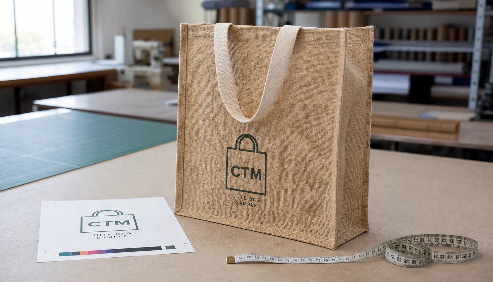
A proof that only shows the logo centered on a flat rectangle is not enough for jute bags. The approval sheet should show the finished bag dimensions, visible front panel area, gusset width, top hem depth, handle placement, and the exact print size in mm. It should also mark the distance from the top seam, left and right finished edges, and bottom fold. Without those references, buyers think they approved placement when they only approved artwork. That gap causes a large share of avoidable disputes at pre-production sample stage.
Color notes need the same discipline. On jute, a Pantone callout is useful, but it is not a guarantee. The approval should state whether the supplier is matching to Pantone as closely as practical on natural substrate, to the visual tone of the approved sample, or to a specific lab-dipped standard if one exists. Buyers should also define whether minor pinholes within the weave are normal or whether a denser white underbase is required, because those decisions change both cost and print appearance.
- Show print area size in mm and in relation to the finished seams.
- Mark no-print clearance near side seams and bottom fold.
- List ink colors, print sides, and whether underbase is used.
- Attach approved artwork file name and revision date to the proof.
Use the pre-production sample as a sign-off document, not a courtesy sample
The pre-production sample should answer whether the artwork survives the substrate, whether the print sits correctly after the bag is sewn, and whether the finished bag feels right for the selling channel. Measure the print from finished reference points, not from the raw fabric edge, because cutting and sewing shift those edges. On a gusseted tote, the visual center can differ from the flat panel center, so a sample photo with the bag lightly filled is often more useful than a flat lay photo alone.
Review the sample under daylight and under the warm indoor lighting common in cafes and gift stores. White or cream details may look crisp in a factory sample room and muddy in a coffee retail environment. Also load the bag with the heaviest realistic contents. A front logo that reads well on an empty sample can bow or wrinkle once two bean bags, a tumbler, or a mug set spread the gusset. Those distortions should be accepted or corrected before bulk production, not argued over after shipment.
- Good placement target: front print centered within +/-5 mm from approved references.
- Good visual target: text and logo readable from 1-1.5 meters on a filled bag.
- Good durability target: no obvious dry-rub transfer during normal handling.
- Good sewing target: handle pair length variation kept tight enough to avoid a visibly uneven top line.
Read MOQ and quote structure the way a merchandiser does
Jute tote prices move on a few levers: fabric weight, lamination, bag size, handle material, print colors, print area, and packing method. Coffee roasters often buy for seasonal programs, subscription add-ons, wholesale display kits, or holiday gift sets, so the order is not always one large steady SKU. That makes MOQ logic important. A supplier that looks cheaper on a headline unit price can become more expensive once extra screens, split artwork runs, stronger handle stitching, or export carton requirements are added back in.
For budgeting only, many buyers break the quote into four buckets rather than chasing one number. The blank bag body often carries roughly 65-75 percent of the ex-works cost, printing about 10-18 percent, upgraded handles and sewing around 8-12 percent, and packing around 3-6 percent before freight. Example setup charges may be in the range of one screen charge per color per artwork, and pre-production samples may be charged separately with credit on bulk order. Those details matter more than a small difference in base unit price.
- A one-color repeat order normally prices cleaner than a new two-color seasonal artwork.
- Mixed artwork under one PO often still needs separate print setups and separate wastage allowance.
- If your order is near MOQ, heavier gsm may add less cost than an extra print color.
- Request quote lines for sample fee, screen fee, master carton packing, and carton dimensions.
Set QC thresholds before bulk starts so print disputes stay objective
Jute printing will never look as sharp as coated paper or fine cotton, so the factory and buyer need written tolerances before production. The goal is not perfect microscopic edges. The goal is a commercial result that reads correctly on shelf, holds through normal handling, and matches the approved sample closely enough to protect the brand. Coffee roasters usually benefit from QC standards based on legibility, placement, and surface cleanliness rather than impossible laboratory-style color precision on a natural substrate.
Add those standards to the purchase order, inspection brief, and final approved proof. Then the print team has a clear setup target, inline sewing can flag bag distortion early, and the inspector has a practical pass-fail basis at AQL. Without documented tolerances, problems get judged emotionally: the factory says the texture is normal for jute, while the buyer says the print looks weak. That disagreement is preventable when the acceptance level is written before bulk fabric is cut.
- Front print placement tolerance: commonly held within +/-5 mm against approved references.
- Reject condition: important letters or logo counters closed or unreadable at normal shelf distance.
- Reject condition: heavy scuffing, offset, or peeling visible on unpacking from a normal carton.
- Reject condition: obvious seam pull or handle stitch weakness that distorts the printed front panel.
Packing is part of print protection on jute, not a separate logistics detail
A large share of print complaints appear after the goods leave production. Jute is abrasive by nature, and fresh screen prints can mark when rough surfaces rub face to face in tight bundles. Coffee roaster orders often move by sea and then sit in distributor warehouses before retail rollout. That means the packing method needs to protect the approved print through compression, humidity swings, and repeated handling. If packing is left vague, the supplier may use the cheapest bundle method even when it raises scuff risk.
The safer default is a moderate bundle size, printed faces inward or tissue interleaved where the artwork is large or white, and a master carton count that does not crush the handles or overly bow the bag body. If the program is retail-ready, carton markings should include item code, artwork revision, PO number, destination, and quantity. Buyers should also consider moisture exposure. Jute can hold odor and ambient dampness, so container loading conditions and inner protection matter, especially for premium gift programs.
- Common working pack: 25 pcs per inner bundle and 100 pcs per master carton.
- Use tissue interleave or face-in bundling for large solid prints or white ink areas.
- Avoid over-compression that flattens handles and increases print abrasion.
- Write carton size and gross weight into the quote so freight comparisons stay accurate.
Build the schedule around approvals, not around sewing time
Jute tote programs usually slip because artwork and proofing cycles drag, not because the factory cannot sew the bags. The first delay often comes when the buyer sends brand artwork that is too fine for jute, then loses several days revising it after the factory flags print risk. The second delay comes when the team approves a digital proof but still needs a physical sample to understand color and texture. For coffee roaster launches tied to harvest events, holiday sets, or subscription promotions, that delay can erase the margin for rework.
A practical timeline for a repeat construction with new artwork might be 2-4 days for artwork cleanup and proof revision, 5-7 days for sample printing and sewing, 3-5 days for courier transit, and 18-28 days for bulk production after PPS approval, plus handoff buffer before cargo cutoff. First-time constructions, dyed jute, or two-side print programs need more slack. The useful discipline is one decision maker, annotated proof comments in mm, and no verbal approvals that leave the factory guessing what changed.
- Approve artwork and placement in one document to cut revision loops.
- Do not book vessel space assuming the PPS will pass on the first submission.
- Freeze carton marks and packing details before bulk so shipment is not held for relabeling.
- Keep a buffer for one print remake if the first PPS misses color or legibility.
Compare landed cost by commercial risk, not by the lowest ex-works line
The cheapest jute tote rarely delivers the lowest total cost for a coffee brand. A bag that saves a few cents but arrives with weak print edges, mixed carton counts, or rubbing damage creates extra receiving labor, re-sorting, retail rejection, or markdown risk. In many programs, a slightly better fabric weight, cleaner one-color print strategy, and stricter packing instruction protect the launch better than a more complex low-cost design that never had a good chance on jute in the first place.
When comparing suppliers, normalize every line: bag size, gsm, lamination, handle material, print colors, sample cost, setup cost, pieces per carton, carton cube, lead time, payment terms, and defect handling. Then compare how each factory manages proofing risk. A supplier that is 3-5 percent higher ex works but holds placement better, shows the print on the actual production bag, and packs more carefully may be cheaper after freight, warehouse labor, and avoided reprint exposure are considered.
- Useful landed-cost fields: ex-works unit, sample fee, screen fee, carton cube, freight basis, and expected defect allowance.
- Normalize supplier quotes to the same packing method before you compare freight.
- Value the supplier who identifies unprintable artwork early instead of accepting it quietly.
- For seasonal coffee programs, schedule reliability often outweighs a small unit-price gap.
Specification comparison for buyers
| Spec decision | Recommended option | When it fits | Buyer risk to check |
|---|---|---|---|
| Body fabric weight | 290-320 gsm natural jute body as the working baseline | Retail coffee gift bags, event totes, and reusable merch carrying 2-5 kg | Below 270 gsm the panel wrinkles more and print edges break up; above 350 gsm freight and stiffness rise fast |
| Inner lamination | Light PP lamination on the inside, preferably matte if available | When you need better shape retention, lower lint shedding, and a flatter print face | Ink behavior changes on laminated bodies, so approve print on the actual laminated bag, not on an unlaminated swatch |
| Print method | 1-2 color screen print with enlarged line weight | Best for roaster logos, roast club marks, simple origin graphics, and block text | Halftones, gradients, and fine serif detail can fill in or disappear on jute texture |
| Artwork line size | Minimum 1.2-1.5 mm positive lines and 2 mm reversed strokes | Natural jute surfaces with visible slubs and uneven yarn texture | Hairline details that look fine on a PDF often break after curing, folding, and carton rub |
| Print panel clearance | Keep artwork at least 20-25 mm away from side seams and bottom fold | Most gusseted totes in the 13 x 15 x 5 to 14 x 16 x 5 inch range | A centered flat proof can still distort badly once the side gusset opens under load |
| Handle material | Cotton webbing handles sewn into the hem with reinforced box stitching | Coffee retail programs where hand feel and repeat use matter | Self-jute handles look cheaper, fray sooner, and can transfer loose fiber onto garments or shelf stock |
| Base color strategy | Natural jute with dark ink, using white only where essential | Rustic brand positioning and lower cost one-side prints | Natural fiber shade varies by lot, so cream, beige, and muted greens can shift warmer than paper proofs suggest |
| Packing method | 25 pcs per inner bundle and 100 pcs per export carton with printed faces inward or tissue interleaved | Sea shipments and mixed retail distribution where scuffing is a real risk | Over-compressed packing can offset fresh ink, flatten handles, and create avoidable abrasion on arrival |
Buyer checklist before sampling
- Freeze the bag construction before artwork approval: size, gusset, fabric weight, lamination, handle material, and handle drop.
- Approve print on the actual jute body or at least the exact production fabric, not on plain paper only.
- State minimum line width, minimum text size, and whether reversed text is allowed on the front panel.
- Mark seam and gusset no-print zones directly on the proof with dimensions in mm.
- Define whether color is judged to Pantone, to the approved sample, or to best effort on natural jute.
- Measure print placement from finished seams and hem, not from raw fabric edges.
- Load the pre-production sample with the actual product weight to review panel distortion under use.
- Add packing instructions to the PO, including bundle size, print-face direction, and carton quantity.
- Separate repeat order pricing from new artwork screen charges so quote comparisons stay clean.
- Write bulk tolerances into the PO for placement, skew, print legibility, handle strength, and odor condition.
Factory quote questions to send
- What jute gsm are you quoting, and is the body laminated or unlaminated?
- Is the print proof based on the actual production bag construction or only on artwork layout?
- What print method are you using for this artwork, and what line-width limit do you recommend on jute?
- How many screens or setups are charged for this design, and are they reusable for repeat orders?
- What is the MOQ for one artwork, and what happens to the unit price if the order is split across two or three designs?
- Does the quote include a pre-production sample, and is the sample charge credited back on bulk order confirmation?
- What placement tolerance and print skew tolerance can you hold in bulk production?
- How are bags packed after printing to prevent scuffing or ink transfer during sea transit?
- What is the lead time from artwork approval to PPS, bulk production, and cargo handoff?
- What carton size, gross weight, and pieces per carton are assumed in the quote for freight planning?
Quality-control points to confirm
- Front print placement tolerance held within +/-5 mm from approved centerlines.
- Print skew not more than 5 mm across the full artwork width when measured against the bag top edge.
- Major text and logo counters remain open and legible from 1-1.5 meters under retail lighting.
- No obvious ink transfer, heavy scuffing, or peeling after normal bundle unpacking and light dry rub.
- Handle attachment stitching is even, secure, and capable of carrying the agreed test load without seam opening.
- Body size and gusset size remain within agreed production tolerance after final sewing and pressing.
- No sharp jute odor, solvent smell, mildew note, or damp carton condition at final inspection.
- Cartons match the approved pack count, carton marks, and print revision reference.