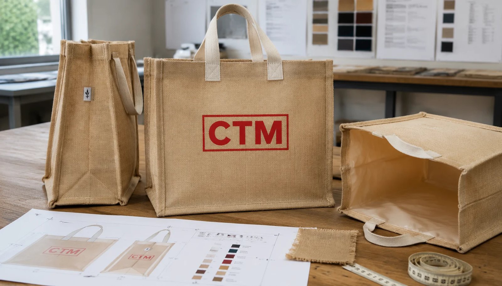
Why print proofing fails more often on jute than on cotton
Liquor retailers often approve jute totes using the same artwork logic they use for canvas or coated paper bags, then get disappointed when the bulk run looks rougher. Jute has a more open weave, more fiber variation, and more natural color shift from batch to batch. That changes how ink sits on the surface. A logo that looks crisp on a digital proof can lose edge sharpness once it is screen printed onto a textured panel, especially around thin serif fonts, small reverse lettering, and large solid blocks near seam lines.
The main buying problem is not whether the supplier can print a logo at all. It is whether the approved proof actually predicts the retail look of the delivered bags. For liquor retailers, that matters because these bags are often part of gifting, holiday promotions, bottle upsell, or reusable brand packaging. A bag can be structurally acceptable yet still look weak on shelf if the logo is off-center, the ink sinks unevenly into the fiber, or the gusset fold cuts through the artwork.
- Jute texture reduces edge definition compared with cotton canvas.
- Natural fiber tone shifts perceived Pantone shade, especially in light inks.
- Large logos near side seams distort more on gusseted constructions.
- Digital proofs show artwork intent, not actual print behavior on jute.
Start with the right bag spec before reviewing any artwork
Print proofing starts with the substrate, not the logo file. For most liquor retail tote programs, 270-320 GSM jute is the practical middle range. It holds shape well enough for bottle carry and gives a more stable print face than lighter, looser jute. If the program is meant for one wine bottle plus accessories, a narrower gusset may be fine. If stores will pack two heavy bottles, buyers should move from promotional dimensions into a more load-focused structure with stronger bottom support and wider web handles.
Lamination choice also changes print appearance. Inner PP lamination is common because it improves shape retention and adds some resistance to condensation or minor spills from cold bottles. It can also make the bag body flatter during printing. Unlaminated jute may look more natural, but it usually prints less evenly and can shed more fibers during production. If your brand positioning depends on a rustic look, that may be acceptable. If the bag must present as a clean giftable item, laminated jute is usually easier to control.
- Common body range for retail-ready jute totes: 270-320 GSM.
- For heavier bottle loads, wider bottom and stronger reinforcement matter more than only increasing print size.
- Inner lamination improves shape and helps the print panel sit flatter.
- Unlaminated jute gives a more natural handfeel but creates higher print variation risk.
Match the print method to the artwork, not the other way around
For jute tote bags used by liquor retailers, screen printing remains the most common and cost-effective method for bulk orders with simple branding. It works best for bold shapes, spot colors, and moderate coverage. If the artwork includes photographic gradients, very fine legal text, or sharp multicolor registration, the buyer should pause before approving the standard screen print quote. Some suppliers will still quote it cheaply, but the result may not survive comparison with a cleaner retail packaging program.
Heat transfer or digital transfer can help with more complex graphics, but they add cost and can look less natural on a textured jute surface. They also change handfeel and may crack or lift if the transfer film quality is poor or the bag is folded aggressively in packing. A common middle path is to keep the front logo in spot-color screen print and shift detailed care information, QR codes, or promotion tags to a sewn label or hangtag rather than forcing too much detail onto the jute body.
- Screen print suits bold logos and 1-3 spot colors.
- Small reverse text is risky on open-weave jute.
- Transfer methods may improve detail but can raise unit cost and handling risk.
- Labels and tags are often better for technical information than body print.
Build artwork around realistic jute printing limits
Many proofing issues begin with artwork that was designed for smooth packaging surfaces. On jute, line weight, type size, and negative space need more margin. If a supplier says the artwork is printable, that is not enough. Buyers need the minimum standards written into approval notes. As a practical rule, avoid very thin strokes, tightly spaced letters, and large solid flood areas extending close to side seams or fold lines. The natural slub in jute can break a fine line and create missing spots that look like poor printing even when production followed the approved method.
Front-panel coverage should usually stay within about 60-70% of the available width for a clean retail presentation. That gives room for seam tolerance, body shape variation, and visual centering. If the logo must appear on the gusset too, request a separate proof showing where the fold interrupts the art. On a bottle tote, a design that wraps across front and side can look premium in a concept sheet but messy in bulk if the gusset shifts even slightly from panel to panel.
- State minimum text size and minimum line thickness in the RFQ or proof notes.
- Avoid placing key logo elements within the seam or fold influence zone.
- Use separate artwork files for front, back, and gusset instead of one wrapped visual only.
- Request a print area template with safe margins marked by the factory.
What a physical pre-production sample must prove
A digital proof confirms content, layout, and general print placement. It does not prove the actual retail appearance of jute. For imported bulk orders, a printed pre-production sample is the more important approval stage. The sample should use the quoted fabric, lamination, handle type, and print method. If the factory sends a sample on a different jute quality or on a cleaner panel than they will use in production, the proof value is weak. Procurement teams should reject any sample that does not represent the real production route.
The sample should be reviewed as a merchandising item, not only as a technical print strike-off. Place one or two bottle weights inside and look at the logo when the bag is filled, because panel tension changes artwork appearance. Review under store lighting as well as daylight. Dark inks may look stable under both conditions, but lighter brand colors can shift more on natural jute. If the bag will be used in holiday gifting, also evaluate the face after repeated handling because jute fibers can fuzz and soften the apparent print edge.
- Sample should match production fabric GSM, lamination, and handle construction.
- Inspect the logo on an empty bag and on a bag loaded with bottle weight.
- Review color under at least two lighting conditions.
- Do not approve from photo only if the program is branding-sensitive.
MOQ logic and why proofing complexity changes the quote
MOQ for jute totes is not just about bag size. It is tied to material sourcing, color matching, screen setup, and packing efficiency. A simple 1-color front print on stock natural jute may fit a lower MOQ. Once the program adds custom dyed handles, inside lamination color preference, front and gusset printing, or multiple SKUs for different liquor brands, the workable MOQ usually rises. Buyers comparing quotes should separate true bag MOQ from print setup MOQ. Some factories can produce the bag body in lower quantities but will need a more economical quantity to spread screen and handling cost.
This matters during proofing because the sample that looks best may not match the most efficient production scenario. For example, a supplier may offer a very large logo with two print hits to improve opacity on jute, but that raises both setup time and print cost. Another may suggest reducing logo area slightly and adjusting ink choice to maintain readability in a single efficient pass. The second option may deliver a better landed value even if the sample looks slightly less bold at close range.
- Lower MOQ usually works best with stock natural jute and simple spot-color printing.
- Additional gusset print, custom handle color, and multiple SKUs often increase MOQ.
- Compare screen/setup charges separately from bag body cost.
- A more efficient print layout can reduce total cost without hurting retail impact.
Use quote data to compare suppliers on more than unit price
For this product category, quote comparison should include at least fabric GSM, lamination status, handle material, print method, number of colors, print sides, sample charges, packing ratio, carton size, and lead time by stage. A low bag price can hide a lighter jute body, weaker handles, or a simpler print method than the approved artwork really needs. Buyers should normalize the quotes before any cost discussion. If Supplier A is quoting 300 GSM laminated jute with cotton web handles and Supplier B is quoting 260 GSM unlaminated jute with rope handles, they are not offering the same bag.
It is also worth reviewing where the cost is likely to move after artwork approval. Common add-ons include extra color screens, oversized print area, custom side print, reinforced bottom board, individual polybagging, barcode stickers, and stricter AQL or third-party inspection support. A useful quote sheet should show what is included versus what remains conditional. That prevents the common problem where the sample is approved on one basis but the purchase order is booked on another.
- Normalize GSM, lamination, handle type, print sides, and print colors before comparing prices.
- Ask suppliers to separate optional costs from included costs.
- Carton pack quantity changes freight and damage risk as much as ex-factory price.
- Lead time should be split into sample, approval, production, and booking readiness.
Set measurable print and construction acceptance criteria
If print proofing is treated only as a visual preference issue, inspection becomes subjective and disputes follow. The better approach is to convert the approved sample into measurable tolerances. Print placement tolerance from center line, distance from top seam, acceptable edge roughness, and color approval basis should all be stated. On natural jute, exact Pantone matching is often unrealistic, but acceptable visual range against the approved sample can still be defined. Construction standards should also be linked to the proof, because a misaligned handle or uneven gusset can make a centered print look wrong even if the print itself is technically in place.
For liquor retailers, load-bearing performance also affects the print face. If stitching is weak or the panel is cut off-grain, the bag can twist when filled with bottles, pulling the logo off visual center. That is why QC should connect artwork approval to assembly quality. A bag that prints well on the table but deforms under real use will not support premium shelf presentation.
- Define print placement tolerance from bag center and top edge.
- Use the approved physical sample as the reference for shade and print sharpness.
- Classify major defects such as unreadable logo text, obvious smudging, and crooked print.
- Include seam symmetry and handle attachment in appearance inspection, not only load test.
Packing decisions that protect the approved print during transit
A good print proof can still arrive damaged if the packing plan is wrong. Jute is abrasive compared with smooth synthetic packaging, so printed faces can rub against neighboring bags during bundling and long transit. This is more noticeable with dark or high-opacity inks. Flat packing is standard, but the bundle count should suit the bag thickness and handle bulk. If too many pieces are compressed together, the print area can pick up creases, lamination stress, or rub marks before the cartons even leave the factory.
For liquor retail promotions with multiple store destinations, outer carton labeling also matters. Buyers should plan whether bags are shipping to a central DC, directly to stores, or to a co-packer adding bottle inserts. Piece count per inner bundle, barcode labels, carton dimensions, and moisture protection all affect warehouse handling and freight efficiency. The best packing spec is the one that preserves print appearance and fits the downstream distribution route, not simply the one with the fewest cartons.
- Confirm pieces per bundle and whether printed faces are protected from direct abrasion.
- Do not over-compress laminated jute bags in export cartons.
- Use dry, strong export cartons sized for stacking and freight compliance.
- Align carton labeling with DC, store, or co-packer receiving format.
Lead time risk points in seasonal liquor retail programs
Most proofing delays do not happen in the actual printing stage. They happen earlier, when artwork is revised because the original design does not suit jute, or later, when the first physical sample exposes a problem that was invisible on the digital proof. Seasonal liquor retail projects are especially exposed because purchase decisions and campaign calendars are often compressed. If the bag is tied to a holiday launch, every extra proofing round affects booking options and increases the risk of air shipment pressure or missed shelf dates.
A practical lead-time plan separates the timeline into artwork review, digital proof, pre-production sample, approval revision if needed, bulk production, final inspection, and vessel booking readiness. Buyers should not combine these into one loose delivery promise. If the design uses multiple print locations or retailer-specific SKUs, allow more time for file management and sample confirmation. Proofing is not just an art approval step; it is one of the main schedule control points for the whole sourcing program.
- Seasonal programs need earlier artwork lock than plain stock bag orders.
- Physical sample revision can add a meaningful delay if the first design is too detailed for jute.
- Split lead time into approval stages instead of relying on one total estimate.
- Multiple retailer SKUs increase coordination risk even if bag construction stays the same.
Specification comparison for buyers
| Spec decision | Recommended option | When it fits | Buyer risk to check |
|---|---|---|---|
| Base fabric weight | 270-320 GSM natural jute with even weave | Standard 1-2 bottle retail takeaway bags needing shape and print stability | Loose weave below this range can distort artwork edges and show uneven ink deposit |
| Lamination | Inner PP lamination | When the bag may carry cold or damp bottles and needs a cleaner print face | Lamination quality varies; poor bonding can bubble near print zones or crack on fold lines |
| Print method | Screen printing with solid spot colors | Simple retail logos, seasonal promotions, and bold graphics | Fine lines and small reverse text may fill in on textured jute if mesh count is not matched to artwork |
| Artwork coverage | Print within 60-70% of front panel width | Most liquor store branding where readability matters more than full-bleed effect | Large coverage near seams and gussets can skew registration and create visible off-center appearance |
| Handle type | Cotton web handles stitched with box-X reinforcement | Mid-volume programs where comfort and load strength affect repeat purchase | Some suppliers quote rope handles to save cost; handle style changes print panel usable area and carton pack count |
| Bag construction | Gusseted jute tote with wrapped edge top finish | Wine and spirits retail where upright bottle carry matters | Open top edge finishing can fray and contaminate print area with loose fibers during production |
| Proof approval stage | Digital artwork proof plus one physical pre-production sample | Imported bulk orders where printed jute texture must be seen before mass run | Digital proof alone does not reveal ink spread, fabric slub show-through, or seam proximity issues |
| Export packing | Flat packed in polybag bundles inside 5-ply export cartons | Container shipments where moisture control and print abrasion matter | Overpacked cartons can crush lamination memory and create panel creases directly across printed logos |
Buyer checklist before sampling
- Approve finished bag size with tolerance and state whether dimensions are taken on flat bag or filled bag shape.
- Specify jute fabric weight in GSM and whether the body is laminated, unlaminated, or mixed with cotton canvas panels.
- Mark maximum printable area on front, back, and gussets instead of assuming full panel coverage.
- State print method by artwork zone: screen print, heat transfer, digital transfer label, or woven label if required.
- Provide artwork in vector format and note all spot colors by Pantone reference, including acceptable tolerance for shade variation on natural jute.
- Call out minimum text height and line thickness so the factory can reject unprintable details before sampling.
- Approve handle material, width, color, stitch pattern, and attachment position because these affect panel centering and top opening.
- Require one physical pre-production sample with approved print, not only a digital mockup or paper proof.
- Define barcode, hangtag, and retail insert placement before mass production if the bags are for store shelving or promotional resale.
- Set acceptable quality limits for print registration, pinholes, smudging, odor, seam alignment, and carton moisture protection.
Factory quote questions to send
- What jute GSM are you quoting, and what is the acceptable tolerance per batch?
- Is the quoted body fabric laminated on the inside, outside, or not laminated at all?
- Which print method are you quoting for this artwork, and what line thickness or text size is your minimum on jute?
- How many spot colors are included in the quoted price, and what is the add-on cost for each extra color or extra print side?
- What is your standard print placement tolerance from center line and top seam on a gusseted jute tote?
- Will you provide a digital proof, blank sample, and printed pre-production sample, and which of these are chargeable?
- What is your MOQ by size, color, and artwork, and does MOQ increase if matching gusset print is required?
- What handle construction is included in the quote: cotton web, jute web, or rope, and what stitch reinforcement is standard?
- How many pieces per bundle and per export carton are planned, and what carton size and gross weight will be used?
- What lead time applies separately for lab dip or color approval, sample making, bulk production, and booking readiness?
Quality-control points to confirm
- Fabric GSM should be verified against approved spec, with visible weave and lamination quality matching pre-production sample.
- Front and back panel print position should remain within approved tolerance from center and top edge; seam drift should not make the logo appear obviously crooked at arm's length.
- Spot colors should be visually matched to approved proof under standard light, allowing for expected shade effect from natural jute fiber tone.
- No obvious ink smears, ghosting, double hit marks, mesh streaks, or blocked text on retail-facing panels.
- Reverse text and thin lines must remain legible after curing; pinholes are acceptable only within agreed minor threshold and not across key brand elements.
- Handles must match specified width and attachment points, with reinforcement stitches complete and no skipped stitches at load-bearing areas.
- Side gussets and bottom seams should be symmetrical enough for the bag to stand and present correctly when carrying bottles.
- Inner lamination, if specified, should not peel, bubble, or crack at fold zones after normal handling.
- Cartons should be dry, correctly labeled, and packed so printed faces do not heavily abrade during transport.
- AQL level, defect classification, and inspection sample size should be agreed before production begins, especially for promotional retail rollouts.