Why print proofing matters more on jute tote bags than on smoother fabrics
Jute tote bags are a strong fit for craft fairs because they support a handmade retail story, photograph well on a booth table, and feel more premium than many disposable event bags. Buyers often choose jute for the same reason shoppers do: it looks natural, sturdy, and more giftable than lightweight promotional packaging. That visual advantage, however, comes with a printing challenge. Jute is coarse, the weave is open, and the fiber tone is naturally variable. A logo that appears crisp in a PDF can break apart, shift in color, or lose detail once it lands on the actual fabric. For procurement teams, that is not a minor finish issue. It affects resale value, event presentation, and the buyer’s confidence in the supplier.
A print proof on jute should be treated as a production control step, not a courtesy sample. The approval process has to verify more than spelling and artwork layout. It should confirm how ink behaves on the real weave, whether the image remains legible at normal viewing distance, whether the artwork clears seams and folds, and whether the bag still looks presentable after sewing and packing. A craft fair tote is often handled by customers before purchase, then carried again during the event. If the bag arrives with weak print coverage, loose stitching, or a crease through the artwork, the defect is visible immediately.
This matters even more because craft fair programs are usually deadline driven. Buyers may be working toward a holiday market, seasonal launch, opening weekend, or a wholesale shipment window. If a proof problem is discovered late, the correction cycle can absorb the schedule. Re-screening, reprinting, re-sewing, or repacking may all be required. A disciplined proofing checklist protects both delivery time and product quality. That is why sourcing teams should build the checklist around actual factory controls rather than around a mockup alone. Digital artwork review is useful, but it is not a substitute for a physical printed sample on real jute.
For B2B procurement, the best approach is to define the product in measurable terms before sample work begins. That means specifying the bag dimensions, fabric weight, print method, print area, handle type, reinforcement, packing format, and acceptable variation. Once those variables are fixed, the sample can be judged against a clear standard. Without that structure, the buyer is left with subjective comments such as looks nice, print seems off, or bag feels light. Those remarks do not help a factory repeat the order well. Measured criteria do.
On jute, proofing also helps buyers control the gap between brand expectation and actual retail appearance. A craft fair customer sees the tote at arm’s length, often while standing in different light and moving quickly between booths. A design that survives only a close digital review is not enough. The sample must hold up in the real environment where the bag will be sold, carried, and judged alongside competing products.
The takeaway is simple: on jute, the print is never separate from the substrate. The weave, the color of the fiber, the stitching, and even the way the bag is folded all influence the final impression. That is why the proofing checklist should be more detailed than the average tote-bag approval form. It has to protect the visual result, the function, and the on-time release date at the same time.
- Treat the physical sample as the real approval gate, not the artwork file.
- Judge print quality on actual jute under normal lighting, not on a smooth mockup.
- Define the product spec before sampling so the factory is not guessing at the construction.
- Include packing condition in the approval, because craft fair buyers see the bag as delivered.
- Freeze the artwork before sampling; late design changes create avoidable cost and delay.
Start with the bag construction before reviewing the artwork
The first proofing decision is the bag structure, because structure defines the usable print area. Buyers often describe a tote loosely as small, medium, or large, but factories need exact dimensions: width x height x gusset, plus handle length if the bag is intended for resale. For example, a flat promotional tote might be 30 x 35 cm with no gusset, while a retail shopper style could be 40 x 35 x 15 cm with a deeper base. Those differences affect cutting yield, carton fit, and where the print can safely sit. If the dimensions are not fixed first, the artwork can end up too close to a seam or too low on the panel after sewing.
Fabric weight is one of the most important decisions because it changes the handfeel, body, print appearance, and freight cost. Light jute around 240-260 GSM may suit giveaway bags or simple event handouts, but it can feel soft, wrinkle easily, and make the print panel less stable. A more robust 280-320 GSM construction is usually better for craft fair merchandise, vendor carry bags, and shopper totes that need to hold jars, candles, books, or boxed goods. Laminated jute adds stiffness and helps the bag stand upright, while unlaminated jute keeps a softer, more natural feel. Buyers should choose the finish based on how the bag will be used, not only on how it looks in a catalog photo.
Handle construction should also be settled before the proof is approved. Cotton webbing handles are usually more comfortable for buyers carrying heavier merchandise and often look cleaner in a retail environment. Jute handles may suit a rustic brand position, but they can feel stiffer and may not be as comfortable in hand. Reinforcement at the handle anchor point matters more than appearance alone. If the bag will be filled with products at a fair, the handle stitch pattern, bar tack placement, and top seam strength need to be checked with the sample. A tote can look attractive flat and still fail once it is loaded.
The safest order of operations is simple: structure first, artwork second, sample third. When procurement teams reverse that sequence, they often end up redesigning the print to fit a bag that was never suited to the artwork in the first place. A measured spec sheet prevents that problem and gives the factory a clear build target from the beginning.
It also helps to ask whether the print panel remains fully usable after the bag is sewn. Some constructions lose a portion of the front panel to seam allowance, top turn-in, or handle anchoring. If the artwork is designed without accounting for those losses, the print may look centered on paper but shifted on the finished tote. This is one of the most common reasons buyers dislike the first sample even though the factory followed the file exactly.
- Define the exact size in mm or cm: width, height, and gusset depth.
- Confirm whether the tote must stand upright for display or only carry light giveaways.
- Choose laminated or unlaminated construction before artwork position is finalized.
- Select the handle material based on comfort, price point, and expected load.
- Ask the factory whether the print panel changes after sewing or remains flat and full-width.
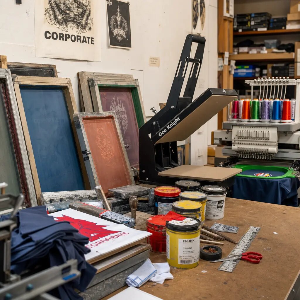
Choose a print method that matches the artwork, not the catalog photo
Screen printing is usually the most practical method for jute tote bags when the artwork is bold, simple, and intended for bulk production. It works well for one-color logos, event names, sponsor marks, and short slogans because the setup is straightforward and the result is visually strong. It is often the best option for buyers who need repeatability and good cost control over a medium or larger run. On a coarse jute surface, a solid screen print can look more intentional than a decorative method that tries to imitate a smoother fabric finish.
But screen print has limits, and those limits matter on jute. Thin lines, small text, halftones, and tightly registered multi-color images can become difficult because the weave breaks up the edge. Heat transfer can help when the artwork truly needs smaller detail, gradients, or more color variation. The tradeoff is that transfer prints can feel less integrated with the fabric, and some buyers feel they sit less naturally against the handmade aesthetic that makes jute attractive. Digital print may also be available from some suppliers, but buyers should not assume digital automatically means better. On jute, the base weave and fiber tone still affect the final look.
The most reliable sourcing approach is to simplify the artwork whenever possible. If a logo can be reduced to a strong one- or two-color graphic, that usually lowers cost, speeds up sampling, and improves consistency. If the artwork includes a QR code, small serif text, or a decorative border, assume a higher failure risk and require a real printed sample on the exact jute construction. The proof should show the actual production method, not only the visual intent. That distinction matters because some designs look excellent on a screen or on paper but become weak once ink lands across the weave.
For a craft fair bag, the design also needs to be readable at selling distance. A shopper usually views the tote while walking past a booth, not while examining a proof sheet. That means the artwork should be legible quickly, with enough contrast to stand out against the natural jute base. If the brand effect depends on subtle detail, the buyer should expect more testing and stricter sample review.
A practical rule is to use the simplest method that can still support the brand goal. In most procurement scenarios, that means one-color screen print for bold identity pieces and a more specialized method only when the artwork truly requires it. The wrong print method can create unnecessary revision cycles and reduce the usable shelf life of the order.
- Use screen print for bold logos, sponsor names, event titles, and simple icons.
- Use transfer print only when the artwork truly needs fine detail or multiple colors.
- Avoid ultra-thin lines, tiny text, and decorative borders that may break on the weave.
- Require a real printed sample for QR codes or any artwork that must scan reliably.
- Do not choose print method by price alone; choose by acceptable quality on the actual bag.
Set artwork rules the factory can actually control during production
The artwork file should give the factory enough information to build the screens, position the image, and keep the run consistent. That means the buyer needs to provide vector artwork when possible, the exact print size in millimeters, the number of colors, and Pantone references for each spot color. The more specific the instruction, the less chance there is for a gap between buyer intent and factory execution. On jute totes, placement matters just as much as color. If the image sits too close to the side seam, handle stitching, gusset fold, or bottom turn-in, it can warp after sewing or become visually crowded once the bag is handled and packed.
A practical sourcing rule is to keep artwork at least 20-25 mm away from seams and folds, with more clearance on gusseted styles or on bags that will be packed tightly. If the logo is large, the buyer should confirm whether the cleanest visual area can support the full image without touching the turn-in or side seam. One design may look balanced in a file but sit too low on the finished bag once the top hem and handle anchoring are taken into account. The factory should be told whether the measurement reference is from the top edge, centerline, side seam, or panel edge. Vague instructions such as centered or neatly placed are not enough for repeatable bulk production.
For multi-vendor or multi-SKU programs, each artwork version should be coded clearly. If a single shipment contains different craft-fair brands, event sponsors, or retail labels, the supplier needs a clean link between artwork file, print color, bag size, and carton mark. Otherwise, the risk of screen confusion or carton mislabeling rises quickly. Buyers should keep one controlled version of the artwork and one final approval record. If several revisions circulate by email or chat, the factory may produce from an older file. Good proof discipline prevents that type of expensive error.
The artwork brief should also state what must not change. If the logo cannot be stretched, recolored, or moved relative to a tagline, say so explicitly. If there is a minimum line thickness or minimum text size, note it. If a small regulatory or brand claim must remain legible, specify the target size and clear background area. These instructions reduce debate later and make the sample review much faster.
Finally, the buyer should ask for a layout proof that includes actual placement dimensions rather than a freehand mockup. The proof should show where the print sits on the bag panel, how much space remains to the seam, and whether the image is centered according to the agreed reference. That level of detail is what makes the proof useful for procurement.
- Provide vector artwork in AI, EPS, PDF, or SVG whenever possible.
- State print size in mm, not only by visual proportion.
- Define the measurement reference: top edge, centerline, seam line, or gusset fold.
- Include Pantone references, but approve the final shade on the physical jute sample.
- Lock artwork before sample approval; changes after proofing increase cost and delay.
Use the pre-production sample as the real approval gate
The pre-production sample is the point where the buyer confirms what will actually be delivered in bulk. For jute tote bags, the sample should use the same or equivalent fabric grade, the same handle material, the same print method, and the same sewing construction intended for mass production. A blank size sample or a simple counter sample can help check dimensions and structure, but it does not prove how the print will behave. Jute varies naturally from batch to batch, and its base color can shift enough to change the appearance of white, yellow, green, red, or other lighter inks. That is why a printed sample on the real fabric is the safest approval tool.
When reviewing the sample, the buyer should inspect more than the logo. The bag should be lifted, held, and, if possible, loaded with a realistic weight. Does it sit properly on a table? Does the print remain legible when viewed at normal distance? Are the handles comfortable and even? Does the print flatten or sink into the weave? Does the bag crease in the same area where it will be folded for carton packing? Craft fair buyers often sell directly to consumers, so the tote must look presentable out of the carton, not after steaming, reshaping, or extra preparation. That makes the packed sample as important as the open sample.
The review should be documented with photos and measurements. Capture the front panel, a close-up of the print edge, the handle stitch area, the side seam, and the folded condition if that is how the product will ship. Record the approved dimensions, any accepted variation, and the exact sample code or date. If the first sample does not meet the standard, revise the notes before asking for another one. Feedback like make it better or move the logo up does not help the factory. Feedback like move print 8 mm higher from the top seam, increase left/right balance by 5 mm, and use stronger handle stitching does. Precision speeds up the next sample and reduces repeat mistakes.
For first orders, the sample should be considered the buyer’s control standard for bulk inspection. Keep one signed sample with the buyer and one with the supplier if possible. That way both sides have the same physical reference during production and before shipment. If the supplier later argues about color, position, or finish, the signed sample becomes the baseline. In B2B sourcing, that document is often more useful than a long email thread.
If the shipment is time sensitive, buyers should also confirm the sample approval window. A factory may need a few days for screen prep, sewing, and drying after adjustments. Building that time into the schedule avoids pressure decisions and reduces the chance of approving a sample that is only partially corrected. A clean approval is faster than a rushed one.
- Confirm the sample uses the actual bulk fabric or the same approved fabric lot where possible.
- Measure finished dimensions and compare them against the spec sheet before approval.
- Inspect print sharpness on the weave, not just from a distance.
- Check the bag in folded, packed condition if that is how it will ship and be sold.
- Keep one signed sample with the buyer and one with the factory for QC comparison.
Compare MOQ and cost drivers before you ask for a final quote
MOQ for custom jute tote bags is driven by more than sewing capacity. Each artwork normally needs its own screen or transfer setup, and every bag size affects cutting yield and production planning. That means a factory may accept a lower MOQ for one simple logo on one bag size, but the minimum can rise when the buyer wants multiple designs, different handle types, or special packing. This matters for craft fair buyers because mixed design programs are common. Vendors, seasonal collections, and promotional partners may all want separate branding, but the supplier still has to manage each version as a production setup. Buyers should ask whether each artwork is treated as a separate run or whether the factory can combine versions efficiently.
The lowest unit price is not always the best value. A quote may look attractive while excluding sample cost, screen setup, inner packing, moisture protection, retail hangtags, or carton marking. Those omissions matter when the bags need to arrive on time and in saleable condition. Buyers should compare total landed program cost, not only the printed unit price. That total should include unit cost, setup fees, sample charges, packing upgrades, freight term, and any extra charge for color changes or revision rounds. If a supplier cannot explain those items clearly, the buyer may discover the hidden costs only after approval.
Cost control should come from removing unnecessary complexity, not from lowering the bag so much that it stops performing. Simplifying the design, reducing the color count, and using one standard bag size can lower cost without damaging the shopper experience. Cutting GSM too aggressively or removing reinforcement may save a small amount on paper, but it can create returns, poor booth presentation, or a tote that fails after normal use. For procurement, the better question is not what is cheapest at the factory gate, but what is cheapest to sell with confidence at the fair.
Buyers also need to consider whether they are ordering for immediate resale or for event distribution. Retail resale usually requires more consistent finish, cleaner packing, and tighter presentation than a simple giveaway program. That difference can affect both cost and MOQ. If the supplier understands the end use, the quote is easier to compare and the sample can be judged against the right standard.
One more point often missed: jute bags with multiple artwork versions can create hidden waste if the order is not planned carefully. A supplier may charge separately for each version, but the factory may also lose efficiency if the runs are too small to optimize screen preparation and packing. Grouping quantities intelligently can sometimes lower the overall program cost without changing the design itself.
- Main cost drivers: GSM, lamination, size, gusset, handle material, print method, and color count.
- Ask whether each artwork, size, or color combination is treated as a separate setup.
- Compare quotes on total landed cost, not just unit price.
- Request sample and setup fees as separate line items.
- Protect quality first on load-bearing areas such as handles and seams.
Build quote data that lets procurement compare suppliers fairly
A useful supplier quote should tell the buyer what assumptions are included in the price. If one supplier quotes a 260 GSM unlaminated tote and another quotes a 320 GSM laminated tote, the unit prices are not directly comparable. The same problem appears when one factory includes one-color screen print and another prices a multi-color transfer. Without a structured RFQ, the buyer may think one offer is cheaper when it is actually a different product. Procurement teams need a quote that can be checked line by line, not a single number with unclear assumptions behind it.
The RFQ should define the product in operational terms: bag size, gusset, fabric weight, lamination, handle type, reinforcement method, print size, number of colors, label requirement, packing format, and trade term. It also helps to define whether the bags are for direct resale, event distribution, or vendor use because that often changes the required packing detail and acceptable finish level. A supplier that answers in detail usually understands production reality. A quote that only gives a unit price may still come from a capable factory, but it gives the buyer less control over the final result.
The buyer should also request any assumptions that affect lead time. If the quote depends on stock fabric, existing screen availability, a standard carton size, or a single packaging format, that should be visible. If the order requires hangtags, inner labels, barcodes, or retail-ready folding, those items should be priced separately. A quote that hides those details can look simple but will be harder to manage after the purchase order is issued. Clear assumptions protect budget control and make it easier to compare bids accurately.
It is also worth asking the supplier to repeat the spec back in the quote. That simple step catches misunderstandings early. If the quote restates the wrong handle length, print size, or packaging count, the buyer can correct the error before production starts. This is one of the most efficient ways to reduce avoidable order disputes.
When buyers compare suppliers, they should compare more than price. They should compare response quality, clarity of assumptions, sample lead time, and the supplier’s ability to state tolerance limits. A strong quote usually reflects a stronger production process. That does not guarantee a perfect order, but it gives the buyer a better starting point.
- Ask the supplier to restate the product spec inside the quote, not only the unit price.
- Require separate lines for unit cost, setup/screen, sample, packing, and freight term.
- Confirm whether the quote uses stock fabric or newly sourced fabric.
- Include label, barcode, and retail packaging requirements if the bags are sold rather than only distributed.
- Make sure the supplier states excluded items so landed cost is not underestimated.
Control color, registration, and position with realistic tolerances
Jute is a natural substrate, so the buyer should set realistic tolerances before production starts. Expecting paper-like edges or perfect color uniformity is not practical on a coarse woven bag. The real goal is a print that is clean, legible, positioned correctly, and consistent enough for retail presentation. A common placement target for standard one-panel tote printing is within ±5 mm, but the buyer should adjust that tolerance based on artwork size, bag size, and seam structure. Larger, simpler artwork is easier to control. Smaller, more detailed artwork is more sensitive to the weave.
Color control is also different on jute than on coated paper or smooth fabric. Pantone references are useful for communication, but they do not remove the effect of the natural jute base color. White, yellow, green, and other light inks can shift depending on the fabric tone, ink opacity, and screen mesh. If the brand needs tighter visual consistency, the safest route is to approve a physical strike-off on the actual jute construction. That sample should become the acceptance standard, not the digital artwork alone.
Registration matters most when the design has multiple colors or layered elements. Even a slight shift can make the logo look poor on a coarse weave. Buyers should define what counts as a failure: missing letters, obvious tilt, heavy bleeding, broken borders, visible gaps, or a print positioned outside the approved window. Those criteria should be stated before bulk production starts. On a craft fair order, the tote itself is part of the customer-facing brand, so the supplier needs to know exactly what will be rejected.
For artwork with fine detail, buyers should ask for a close-up photo of the strike-off under neutral light. That image helps confirm whether the lines remain readable on the weave, but it should not replace the physical sample. A photo can hide texture, gloss, and ink spread. The sample remains the decision-making tool.
If the order includes a repeat print run, buyers should still compare the bulk output against the original signed sample. Jute can vary from lot to lot, and a second order may not look exactly like the first unless the factory is using the same fabric source and printing conditions. Repeat orders deserve the same scrutiny as first orders, especially when the bags are for retail sale.
- Set a measurable placement tolerance before approving bulk production.
- Do not place fine borders or tiny text too close to seams or folds.
- Approve white or light inks on the actual jute base color, not on white paper.
- For multi-color artwork, approve one real sample before giving bulk authorization.
- Write down reject criteria: smudging, missing text, heavy bleeding, and visible misregistration.
Inspect handles, stitching, and load performance as part of print proofing
Print quality should never be separated from bag durability. A tote can have a good logo and still be a bad purchase if the handles fail or the sewing is uneven. Craft fair buyers often underestimate the weight that end customers will place inside the bag. At an event, a shopper may carry candles, jars, ceramics, books, yarn, gift bundles, or several items bought from different booths. That means the handle anchoring, top seam reinforcement, and stitch consistency are part of the same approval process as the graphic.
Handle length and handle material should match the intended use. Short handles can work for hand carry, while longer shoulder-drop handles may be needed for customers carrying multiple purchases. Cotton webbing generally gives a smoother grip and often looks cleaner in a retail environment, while jute handles can support a more rustic look. The proof sample should be lifted and loaded during review, not only displayed flat. Buyers should check whether the handles sit evenly, whether the bag leans when loaded, and whether the stitch line remains neat after stress. A tote that looks balanced flat but twists under load is not acceptable for retail resale.
QC should include simple, documented functional checks. Inspect stitch density, reinforcement placement, thread trimming, and whether the handle attachment causes puckering. If the bag is laminated, inspect for bubbling, delamination, or sharp internal edges that could affect handling and folding. If the tote will be sold rather than used only for distribution, these checks matter as much as the print. For B2B buyers, the goal is not just that the bag arrives printed. The goal is that it arrives ready to be placed on a craft fair table with minimal sorting or rework.
One practical test is to load the sample with the weight the end customer is likely to carry and leave it standing or hanging for a short period. This will not simulate every condition, but it often reveals weak handle attachment, crooked seams, or excessive panel distortion. The buyer does not need a lab test to catch obvious field problems. A well-documented functional check can do a lot of the work.
If the bag has a reinforced base or gusset, buyers should also inspect how the bottom behaves when loaded. A base that looks acceptable empty can sag or shift once products are inserted. That matters at craft fairs, where presentation and carry comfort both influence perceived value.
- Check handle anchor strength with a realistic weight load during sample review.
- Confirm handle symmetry, stitch alignment, and top seam reinforcement.
- Look for skipped stitches, loose threads, or puckering around the handle box.
- If the bag is laminated, inspect for bubbling, delamination, or sharp internal edges.
- Match handle length to how shoppers will actually carry products at the fair.
Choose packing instructions that protect the approved print and presentation
Packing can preserve or damage the value of a good sample. If printed jute tote bags are packed before the ink is fully cured, transfer marks can appear on the back of another bag. If the carton is overfilled, the bags can develop permanent creases through the print panel or the laminated surface. If the shipping route is humid or rainy, weak outer cartons and poor inner protection can lead to odor, spotting, or edge damage. Packing therefore belongs in the proofing checklist, not only in the shipping section of the order.
For many wholesale craft fair orders, flat packing is safer than aggressive folding. Flat-packed bags reduce visible crease lines on the front panel and simplify receiving for distributors, warehouses, or retail teams. Bundling by 10, 20, or 25 pieces may also be efficient if the ink is fully cured and the bundle is protected. Individual polybags can be useful if the bags are sold as finished retail goods or if the buyer wants to separate multiple SKU versions. The right format depends on the channel and receiving process, not only factory convenience.
Carton marking should be specific and consistent. Each carton should show the bag size, artwork code, color, quantity, and destination if multiple designs are included in one shipment. That helps craft fair buyers sort inventory quickly before an event and reduces the chance of mixing designs during receiving. The clearer the carton label, the less time the team spends opening boxes and matching stock to booths, retailers, or sponsor kits. For a seasonal or event-driven order, that time savings is real operational value.
Buyers should also ask how the factory controls dryness, odor, and post-print handling before carton closure. If a bag is packed too soon, the print may offset or the product may carry a noticeable smell when first opened. Those issues can be avoided with better process control, and they are easier to prevent than to fix after shipment.
If the bags are going directly to a craft fair booth or store, the receiving team may not have time to re-press, air out, or re-fold each piece. That is why the packed condition should be part of sample approval. A bag that looks fine when hanging on a hook but arrives crushed in a carton is not ready for resale.
- Require full curing or drying time before packing begins.
- Avoid folding directly through large printed areas when possible.
- Use moisture-resistant outer cartons for humid routes or sea freight.
- Define inner bundle count and carton count based on handling weight, not just maximum fill.
- Label each carton with artwork code, size, color, and quantity for faster receiving.
Specification comparison for buyers
| Spec decision | Recommended option | When it fits | Buyer risk to check |
|---|---|---|---|
| Fabric weight | 260-320 GSM jute, selected by use case; unlaminated for soft handfeel, laminated for added body and moisture resistance | 260-280 GSM for lighter giveaway totes; 300-320 GSM for retail craft-fair merchandise, heavier maker goods, or bags that must stand upright | Low GSM can wrinkle, distort the print panel, and feel flimsy; overly stiff laminated stock can crease if packed too tightly |
| Print method | Screen print for bold logos and simple artwork; heat transfer only when fine detail or more colors are truly required | Screen print works best for one- to two-color logos, sponsor names, and event branding | Fine lines can break on open jute weave; proof must show print on real jute, not only a digital artwork file |
| Print color count | 1-2 spot colors wherever possible | Best for clean brand control and lower setup cost on repeat or seasonal orders | Each added color usually means another screen, another setup step, and a higher misregistration risk |
| Print size | Moderate print area that avoids seams and folds; confirm in mm before sampling | Most stable for bulk production and carton packing | Artwork too large or too close to a seam can curve, distort, or lose coverage during sewing and handling |
| Print placement tolerance | Target within ±5 mm for standard one-panel tote prints; tighter only if supplier can prove capability | Reasonable for bulk jute tote production when artwork is centered and simple | Tighter tolerances on coarse jute can create reject risk if the line is not equipped for it |
| Handle style | Cotton webbing for comfort and cleaner retail presentation; jute handles for a rustic look | Cotton webbing suits shopper totes that carry jars, candles, books, and boxed goods | Weak handle anchoring or poor stitch density can cause returns after normal buyer use |
| Interior finish | Laminated lining for structure and moisture resistance; unlaminated for softer natural feel | Laminated bags suit booth display and upright retail presentation | Lamination can crease or delaminate if folded aggressively or packed before cooling/setting |
| MOQ logic | Treat each bag size and each artwork version as a separate production setup unless the supplier confirms a combined run | Useful when sourcing multiple craft-fair vendors, retail brands, or event sponsors in one shipment | Small mixed-design runs can carry repeated screen, proof, and packing charges |
| Sample approval | Pre-production sample on actual jute, actual print method, actual handle, and actual packing format | Needed before first bulk order, seasonal launch, or hard event deadline | Digital approvals cannot show ink spread, weave interaction, seam distortion, or handle performance |
Buyer checklist before sampling
- Define the bag size as width x height x gusset, not only as small, medium, or large.
- State the target fabric weight in GSM and whether the jute is laminated or unlaminated.
- Confirm the intended use: giveaway, retail merchandise, vendor carry bag, or gift packaging.
- Provide artwork as vector files and identify the exact print size in millimeters.
- List Pantone references for each spot color, but require final shade approval on a physical jute sample.
- Set minimum print clearance from seams, handle stitching, top hem, and bottom fold before layout approval.
- Require one physical pre-production sample using the actual jute grade, ink system, handle material, and packing method.
- Review print sharpness on the real weave, especially thin text, fine outlines, QR codes, and small icons.
- Set an acceptable print position tolerance, commonly ±5 mm for standard one-panel jute tote production.
- Confirm handle pull-strength expectations based on the heaviest likely craft-fair load.
Factory quote questions to send
- What exact jute GSM and lamination type are included in this quote, and can you send a swatch from current stock?
- Is the print cost based on screen print, heat transfer, digital print, or another method?
- How many print colors are included, and what is the charge for each additional color or screen?
- Will the pre-production sample be made on the same fabric, handle, lining, and print method as bulk production?
- What is the MOQ per bag size, per artwork, and per print color combination?
- What print position tolerance and color tolerance do you normally control for jute tote bags?
- What handle reinforcement is included, and what load test can your QC team perform?
- How many pieces are packed per carton, and what is the estimated carton size and gross weight?
- What is the production lead time after sample approval, and what dates are at risk during peak season?
- Can the quote show EXW, FOB, or CIF terms separately from sample, screen, and packing charges?
Quality-control points to confirm
- Fabric weight within the agreed GSM tolerance, with no large slubs, stains, oil marks, or broken weave on the print panel.
- Finished dimensions within the agreed tolerance, especially width, height, gusset, and handle length.
- Print registration aligned within the approved tolerance, with no heavy bleeding, missing ink, obvious pinholes, or smudging.
- Artwork centered according to the approved measurement reference, with seam and bottom clearance maintained across bulk pieces.
- Print color reasonably close to the approved physical sample under consistent lighting, allowing for natural jute variation.
- Handles stitched symmetrically with secure reinforcement, no skipped stitches, loose threads, or weak attachment points.
- Laminated bags free from bubbling, severe creasing, delamination, or sharp internal edges.
- Finished bags properly aired or cured before packing so ink does not transfer onto adjacent bags.
- Cartons dry, correctly marked, and packed to avoid crushed corners or deep fold marks on printed panels.
- If multiple SKUs are in one shipment, carton labels and contents must match the approved artwork code, size, and quantity.