Why jute proofing matters more for boutique wineries than for generic tote buyers
A boutique winery tote has a different job than a trade-show giveaway. It may sit in a tasting room beside premium bottles, be folded into a gift set, or move from retail shelf to cellar door in the same day. That means the bag has to look deliberate, carry well, and survive handling without making the brand feel cheap. On jute, all of those requirements are connected because the material texture affects how the logo prints, how the bag stands, and how clean the finish looks at first glance.
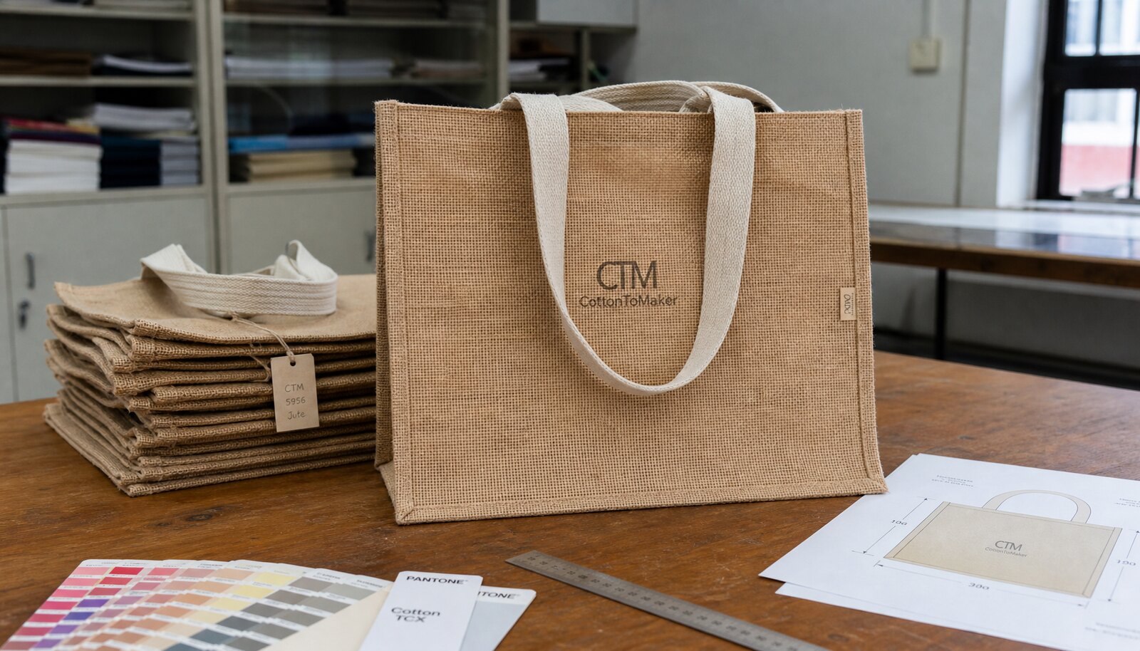
Proofing matters because natural-fiber bags hide problems until production. A logo that looks crisp in a PDF can fill in at the weave, shift off-center on the panel, or lose contrast if the ink is too thin. For winery buyers, the real question is not whether the artwork is technically approved; it is whether the bag can be sold, displayed, and re-ordered without a separate sorting or relabeling step.
- Treat the tote as retail packaging, not only as a carrier.
- Assume the weave will change the way fine lines and small text behave.
- Use a physical approval standard if the order is tied to shelf presentation or gift set work.
Define the carry use before you ask for a quote
The fastest way to get a useless quote is to ask for a price before defining what the bag must carry. A tasting-room shopper carrying a single bottle has a different requirement than a gift box, a two-bottle set, or a mixed merchandise purchase with glassware and accessories. The end use drives the fabric weight, gusset depth, handle reinforcement, and even the acceptable print area because larger logos can interfere with structural seams.
Write the use case in operational language. State whether the bag is meant for one 750 ml bottle, two bottles, a mixed retail purchase, or an event giveaway that only needs light carry performance. Once that is clear, it becomes much easier to choose whether 290-320 GSM is enough, whether you need lining, and whether the handles should be cotton webbing or reinforced jute. Those decisions are more important to the final result than a small price difference in the bag body alone.
- Set the intended load in kilograms or bottle count.
- Define whether the bag must stand upright on shelf or only carry a short trip home.
- Decide early if the bag is part of a premium gift set or a low-cost tasting-room add-on.
Build choices that change print quality on jute
Jute behaves differently from cotton canvas or nonwoven tote stock. The surface is more open, the fiber is more irregular, and the print can sit on top of the texture rather than sink into it evenly. That is why the body weight and weave matter before the print method does. A 290-320 GSM bag is often a practical retail starting point for boutique winery programs because it gives enough structure for shelf display without making the tote bulky or expensive to ship.
When the bag has to handle heavier retail contents, it is usually better to increase reinforcement than to rely on a looser weave and hope the print survives. Lining improves presentation and reduces fiber transfer, but it also changes internal dimensions and sewing steps. Laminated or lined interiors can make the bag feel more finished, which helps in a tasting room, but they also affect lead time and make the supplier quote less comparable unless you normalize the specs carefully.
- 290-320 GSM is often the usable middle ground for retail winery totes.
- 350+ GSM or reinforced construction is better when the bag must hold more weight or feel premium in hand.
- Lining or lamination improves structure but changes cost, sewing time, and the internal fit of bottles or inserts.
Choose the print method based on the artwork, not the supplier's default
On jute, a simple one-color logo is usually the cleanest and safest route. Screen printing is often the best choice for bold winery branding because it handles strong shapes well and keeps the setup economics manageable on repeat orders. If the logo is large, simple, and high-contrast, screen print is usually the most defensible option because it matches what the material can actually support.
Where teams get into trouble is insisting on preserving fine digital detail that the substrate cannot reproduce cleanly. Thin serif text, narrow border lines, small legal copy, and gradients are common failure points on textured jute. If the art needs to be simplified, that is not a compromise in quality; it is the practical step that protects readability. For more detailed artwork, transfer methods can help, but they raise the importance of proofing because they can look crisp in a mockup and still degrade once they are pressed onto an open weave.
- Use screen print for bold brand marks and repeat programs.
- Avoid tiny type and hairline strokes unless the supplier confirms they can hold them on jute.
- Ask for a physical sample on actual fabric before you approve the print method.
What a useful proof should prove
A proof should answer five questions: does the art fit, does it print cleanly, does the color hold, does the placement work, and does the bag still look like a retail product after printing? A digital mockup can only answer the first question. A paper proof improves layout review, but it still cannot show weave fill, edge break-up, or whether the ink sits too lightly on the surface. The only proof that matters for bulk approval is a physical pre-production sample made from the actual fabric lot and the actual print process.
Review that sample under daylight-equivalent lighting and at normal retail viewing distance. Check whether the logo remains legible when the bag is held at arm's length, whether it is centered in the safe area, and whether the print competes with seams or handles. For boutique wineries, this is important because the bag often sits next to premium bottled product. If the tote looks rushed, it can undermine the rest of the packaging even when the product inside is excellent.
- Approve a physical sample, not a layout file.
- Measure print width and position in centimeters on the actual bag.
- Archive the approved sample with the artwork version and date so bulk can be compared later.
Set measurable acceptance criteria before production starts
The biggest weakness in many RFQs is that the quality language is descriptive rather than measurable. Phrases like good print, neat stitching, and acceptable color are too vague to resolve a dispute. If the order matters to a retail launch or seasonal winery program, write tolerances into the PO or approval sheet before the factory starts. That gives both sides a reference point when bulk is inspected.
For print registration, a buyer can reasonably ask for the main visual edges to stay within about 3 mm of the approved placement on a single-color logo, with tighter control on the overlap points if the design has multiple layers. For color, the most defensible approach is a physical master sample under the same lighting you will use at approval. If the supplier uses instrumentation, a Delta E target of around 3 is a workable commercial standard for a natural substrate, but the final decision should still be tied to the approved master, not a screen image. For stitching, the acceptance rule should be simple: no skipped stitches, no open seams, no broken bartacks, and no loose thread tails that can snag retail packaging.
Load testing should also be defined in buyer language. If the tote is meant for one or two bottles, confirm that it can be lifted repeatedly without handle creep or seam opening. If the bag will carry a mixed retail load, specify the load target in kilograms and the number of lift cycles you expect the sample to survive. The point is not to imitate a laboratory standard for its own sake; it is to make sure the bag survives the actual behavior of winery shoppers and tasting-room staff.
- Use centimeter-based print placement limits instead of visual-only approval.
- Set a color target against a physical master sample and keep that master with the file.
- Define a load and lift-cycle requirement that matches how the bag will actually be used.
How to compare supplier quotes without missing real cost
A jute tote quote can look low until you compare what is actually included. One supplier may quote only the body price and then add screens, sampling, labels, inner packing, and carton marks later. Another may appear more expensive but already include the higher GSM fabric, stronger handles, and a cleaner packing format that saves receiving time and reduces damage. For procurement, the real number is landed cost per saleable bag, not the cheapest ex-factory line item.
This is especially important for boutique wineries because the order size may be modest but the branding requirement is high. A small batch for a harvest event or holiday promotion can become expensive if it needs rework after proof approval. When you compare offers, normalize them by fabric weight, print method, handle spec, lining, carton dimensions, and sample policy. Otherwise the quote that looks cheapest will often be the one with the most expensive surprises.
- Separate one-time setup charges from repeat production cost.
- Normalize quotes by GSM, print method, handle spec, and packing format.
- Ask for carton dimensions early because freight can change the true cost materially.
Sourcing routes: direct factory, trader, or domestic finisher
The right sourcing route depends on how stable your program is. A direct factory relationship usually gives the best cost control when the artwork is final, the order is repeatable, and the buyer can manage sample timing. The tradeoff is that the factory will expect cleaner artwork, clearer specs, and a firmer approval process. If you can provide that, the factory route is usually the best option for recurring winery programs because the unit economics improve once the line is stable.
A trader or distributor is useful when you need one point of contact for mixed SKUs, lower-volume orders, or a program that is still changing. The margin is usually higher than going direct, but the coordination burden can drop. A domestic finisher or decorator can be the right route when speed matters more than price, especially for small seasonal runs or last-minute retail replenishment. The pricing step-up is often justified if the order avoids missed launch dates, but only if the supplier can still print on the actual jute rather than on a substitute substrate.
- Direct factory: best for repeat orders, tighter pricing, and stronger spec control.
- Trader or distributor: useful when you need consolidation, mixed sizes, or faster communication.
- Domestic finisher: better for speed and lower logistics friction, usually at a higher unit cost.
Packing, labels, and warehouse handling should be part of the product spec
Packing is not an afterthought on printed jute bags. The wrong fold can leave a permanent crease across the logo, and packing while the ink is still not fully cured can transfer print onto other bags or inserts. If the bags are going directly into a tasting room or retail warehouse, ask for a packing format that protects the print without creating unnecessary volume. Inner polybags can help protect the surface, but they also add material cost and can make carton counts less efficient.
Labeling should also be decided early. If the bags need hangtags, barcodes, care labels, or retail stickers, include the exact position in the quote. Ask the supplier to share carton weight, carton size, and inner count so you can plan palletization and receiving. For winery buyers, the practical issue is not only shipping cost but how quickly the bags can move from the dock into a store display or gift-set assembly line.
- Avoid tight folds that leave a hard crease across the print zone.
- Specify whether polybags, tissue, or silica gel are required.
- Use carton dimensions and gross weight to estimate freight before approval.
A buyer's decision sequence for repeat seasonal orders
For recurring winery programs, the easiest way to reduce mistakes is to use the same decision order every time. Start with the use case, then finalize the bag build, then simplify or lock the artwork, then sample, then quote, then inspect. That sequence avoids the common trap of chasing the lowest price on a file that still needs redesign. It also makes reorders faster because the supplier can reference a prior approved build rather than re-litigating basic specs.
Once the first lot is approved, keep a controlled archive. Save the signed sample, the artwork file, the quote, the carton spec, and the inspection notes together. If the next season needs a minor change, such as a different vintage callout or event date, you can update only that element while holding the structure and print standard steady. That is how buyers keep a boutique winery tote program stable across seasons without turning every reorder into a new sourcing project.
- Lock the bag build before you finalize the artwork.
- Keep one reference sample and one quote file for every approved version.
- Treat reorder consistency as a procurement objective, not just a design preference.
Specification comparison for buyers
| Decision area | Option comparison | Pricing impact | Buyer route or risk |
|---|---|---|---|
| Print method | 1-color screen print versus 2-color screen print versus transfer print | 1-color screen print is usually the lowest setup cost; every added color increases setup and proofing time; transfer print often costs more per bag but can preserve finer detail | Choose screen print for bold winery logos; use transfer only when the artwork needs thinner lines or more detail than the weave can hold |
| Body construction | 290-320 GSM unlined jute versus 350+ GSM reinforced or lined build | Heavier or lined builds usually add material and sewing cost, often lifting unit price by a noticeable step | Low GSM can feel limp on shelf and may distort the print; heavier builds improve presentation but can raise freight and sewing complexity |
| Handle construction | Simple jute handle versus cotton webbing or reinforced handle with bartacks | Reinforced handles usually increase cost, but the change is often small compared with the cost of returns or failures | For wine bottles or mixed retail loads, handle strength matters more than a small unit-price saving |
| Artwork complexity | Bold single logo versus fine-line logo with small text | Simpler art keeps setup cost lower and reduces proof rounds; fine art can require redesign, larger print size, or higher rejection risk | If the logo has thin serif text, ask the supplier to confirm minimum line thickness before approving the file |
| Sourcing route | Direct factory versus trader/distributor versus domestic decorator | Direct factory is usually best on unit cost at stable MOQ; trader adds coordination margin; domestic routes are often highest unit cost but fastest on small runs | Use factory when you can manage sample rounds; use trader when you need consolidation; use domestic when speed and lower communication friction matter more than cost |
| Sample route | Digital mockup versus paper proof versus physical pre-production sample | Digital proof is free but incomplete; paper proof helps layout; physical sample is the only proof that shows weave fill, ink behavior, and stitching | Never approve a winery retail order on a mockup alone if the print lands on raw jute |
| Packing format | Bulk pack in carton versus polybag plus carton versus retail-ready pack | Retail-ready pack adds cost and carton volume; bulk pack is cheaper but may need rework at receipt | Packing can move freight cost and crease risk more than the bag price itself |
| Lead time | Standard build versus custom lining or multi-color print | Custom features usually extend the schedule because they add sample and production steps | If the launch is tied to harvest season, holiday gifting, or tasting-room events, protect time for proof correction |
Buyer checklist before sampling
- Define the use case first: tasting-room retail, bottle carry, gift-set packaging, or promotional giveaway.
- Set the finished size, gusset depth, handle drop, and intended load in kilograms or bottle count.
- Choose the body construction before artwork: raw jute, lined jute, laminated jute, or reinforced base.
- Keep the artwork simple enough for jute: confirm logo width, clear space, and minimum line thickness before quoting.
- Request a physical pre-production sample made from the actual fabric, ink, and handle build, not just a digital render.
- Approve color against a physical target under daylight-equivalent light, and keep that target with the order file.
- Write print tolerance into the RFQ: placement shift, registration limit, and acceptable color drift.
- State stitch and handle requirements: bartack reinforcement, seam finish, and any load expectation.
- Confirm inner packing, carton count, carton dimensions, and whether polybags or silica gel are required.
- Ask for a landed-cost quote that includes screens, sampling, packing materials, carton marks, and freight dimensions.
Factory quote questions to send
- What is the exact GSM, weave style, and construction: raw, lined, laminated, or reinforced?
- Which print method is included in the price, and how many colors are covered before setup charges increase?
- What is the minimum line thickness and minimum text size you recommend for this jute surface?
- Can you make a pre-production sample from the same fabric lot, handle material, and print method that will be used in bulk?
- What tolerance do you accept for print placement, color variation, and registration on textured jute?
- What handle spec are you quoting: material, width, drop length, and bartack or seam reinforcement?
- How many lift cycles or how much static load has this handle construction been designed to support?
- What are the MOQ rules per artwork, per color, and per size?
- What is included in the quote versus charged separately: screens, setup, sampling, labels, hangtags, polybags, and silica gel?
- What is the carton pack count, carton size, gross weight, and estimated CBM for each packing option?
Quality-control points to confirm
- Print position should match the approved sample within about 3 mm on the key visual edges, and not drift into seams, handles, or folds.
- For single-color work, set a practical color match target against a physical master under daylight-equivalent light; if the supplier uses instruments, a Delta E target around 3 or better is a workable buyer standard.
- For multi-color graphics, set a tighter registration rule on the key overlap points, typically no more than 1.5-2.0 mm on the visible edges.
- Fine text should remain readable at arm's length; if letters blur into the weave or fill in, the print should be rejected or simplified.
- Handle stitching should show no skipped stitches, no broken bartacks, and no loose thread tails longer than about 5 mm.
- A loaded sample should hold the planned retail use, such as the stated bottle count or equivalent weight, without seam opening, handle creep, or base distortion.
- Inspect for pinholes, patchy ink coverage, fiber lift around the print edge, and any transfer of print onto adjacent bags or inserts.
- Check odor after airing the goods for 24 hours; strong solvent, mildew, or storage odor is a release risk for winery retail.
- Verify carton count, inner pack integrity, and barcode placement against the packing list before shipment release.
- Reject any bulk lot with a visible sample-to-bulk shift in shade, print density, or stitch quality unless the deviation was pre-approved in writing.