Why Proofing Jute Is Different
Jute tote bags are popular with trade show exhibitors because they feel more substantial than thin non-woven bags and give an event kit a natural, tactile look. They also bring a proofing challenge that many buyers underestimate. Jute is coarse, uneven, and absorbent. It is not a smooth white print panel. The weave, fiber color, slubs, lamination, seams, and handle reinforcement all influence the final logo.
A PDF proof can make a logo look clean because the screen removes the hard part: the fabric. On production jute, ink can sink into fibers, pale colors can disappear, thin strokes can break, and small reversed text can fill in. Even placement can surprise people. A centered logo on a mockup may print too close to a handle stitch line or too low after the bag is sewn and opened.
For trade show exhibitors, those small failures are public. The bag is carried across the show floor, photographed near the booth, handed to prospects, and sometimes promised as part of a sponsor package. Procurement should therefore treat proofing as a controlled buying process, not a quick artwork approval. The goal is to define the product, test the decoration on real material, and release bulk production only after the buyer and supplier are looking at the same approved reference.
- Treat jute as a textured substrate with natural variation, not as a flat print surface.
- Separate digital layout approval from physical print approval.
- Use a physical strike-off or pre-production sample when color, small text, or sponsor branding matters.
- Record the approved version, measurements, sample date, and signoff comments before production starts.
Start With The Event Reality
The best proofing checklist starts before the artwork file is opened. First, define what the bag has to do at the event. A lightweight aisle giveaway has different requirements from a registration kit packed with brochures, samples, a notebook, and a water bottle. A sponsor tote may need a crisp front panel and controlled logo placement. A booth sales bag may need to stand upright and look presentable on a counter.
Ask the internal stakeholder how the tote will be used, who will receive it, and what will be inside it. If attendees will carry the bag for several hours, handle comfort matters. If the bag will hold product samples, reinforcement and gusset construction become more important. If the bag will be photographed or displayed, print placement and packing become part of the visual standard, not secondary details.
The event date should also shape the specification. Trade show orders leave little room for correction once sampling, freight, and venue receiving are on the calendar. If timing is tight, simplify the design early. A bold one-color screen print may be safer than a complex multicolor design that needs several rounds of strike-off approval. That is not lowering the standard; it is matching the proofing route to the deadline.
- Define whether the tote is a giveaway, registration kit, sponsor pack, VIP bag, or retail-style booth bag.
- Estimate the actual contents and target load before choosing fabric weight and handle construction.
- Identify who signs off: buyer, brand team, distributor, event manager, sponsor, or end client.
- Work backward from the required arrival date at the warehouse, decorator, or venue dock.
Freeze The Bag Specification First
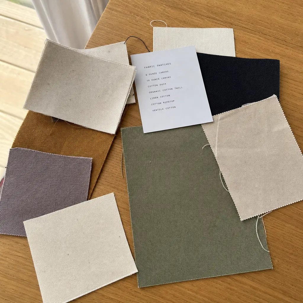
Print proofing is much more reliable when the bag itself is defined before the logo is positioned. Many exhibitor jute tote programs fall around 370 to 425 GSM, roughly 13 oz to 15 oz. That range often gives a practical balance of cost, structure, and natural appearance. Lighter jute can reduce price, but it may wrinkle more, collapse when filled, and show larger gaps in the weave. Heavier fabric usually improves body and presentation, while increasing carton volume and cost.
Lamination must be stated in the quote. An inner laminate can make the tote firmer, reduce fiber shedding, and create a flatter panel for printing. It can also affect stiffness, odor, folding behavior, and the way the bag feels in hand. A quote that says only jute tote is incomplete. The buyer should know whether the fabric is laminated or unlaminated before comparing prices.
Construction also controls the printable area. A flat tote gives a simple front panel and usually works well for light collateral. A box-bottom or gusseted tote carries more and can stand better, but the folds and seams reduce the safe print zone. Handle material, handle drop, handle width, bartacks, and reinforcement patches can also interfere with the artwork if they are not shown on the layout.
- Specify finished size, gusset depth, jute GSM, lamination, handle material, handle width, and handle drop.
- For simple exhibitor totes, a size around 35 x 40 cm may work when contents are light.
- For catalogs or sample kits, a gusseted size around 38 x 35 x 15 cm may be more practical.
- Keep the logo clear of gusset folds, handle stitching, reinforcement patches, and bottom fold pressure.
Match Print Method To Artwork Risk
Screen printing is usually the first method to consider for jute tote bags. It works well for bold one-color or two-color logos, event names, sponsor marks, and simple promotional artwork. It is familiar, cost-efficient, and often easier to control across a bulk order. The catch is that the artwork must be suitable for the weave. Hairlines, tiny serif text, soft shadows, and detailed textures rarely improve once they touch jute.
Heat transfer or digital transfer can be useful when the artwork needs more colors, gradients, small elements, or sharper edges than a direct screen print can hold. The tradeoff is appearance. On jute, a transfer may look more glossy, more solid, or more like a patch on top of the fabric. The edge can be visible, and the hand feel may be less natural. That may be acceptable, but it should be a deliberate approval based on a real sample.
Embroidery, woven labels, and sewn patches can also be options, but they should not be treated as automatic upgrades. Embroidery can distort small letters on coarse fabric and add cost quickly. A woven label can look polished, but it changes the branding from a large printed panel to an attached trim detail. The buyer’s job is to ask which method best protects the design intent, then require the factory to state the limits before production artwork is finalized.
- Use screen print for bold spot-color logos and cost-controlled trade show quantities.
- Consider transfer for gradients, many colors, or detail that screen print cannot hold cleanly.
- Approve transfer gloss, edge visibility, adhesion, and hand feel on actual jute.
- Ask for minimum line width, minimum text height, and registration tolerance before sample approval.
Rebuild Artwork For Jute
The artwork that prints best on jute is often not the same file used on a website, brochure, or coated paper bag. Procurement should request vector artwork in AI, EPS, or editable PDF format, with fonts outlined and all colors named. Remove shadows, delicate texture fills, hairlines, very small type, and anything that relies on a bright white background. Clean production art is not less branded; it is more likely to survive the fabric.
Color needs extra care because natural jute is tan, uneven, and slightly variable from lot to lot. Pantone references are useful for communication, but they do not guarantee the same visual result on jute that they do on coated stock. Pale colors, muted neutrals, and low-contrast tones can disappear. Dark colors usually read better, though large solid areas may show weave breaks or slubs. If color matters, the approved reference should be a physical strike-off, not the monitor view.
QR codes require a separate decision. They can work on some jute totes, but the code must be large enough and printed cleanly enough to scan. The weave can distort module edges, and low contrast can make scanning unreliable. If a QR code is required for the show, test it on the physical proof with multiple phones and lighting conditions. A short URL printed nearby is a practical backup.
- Supply vector art with outlined fonts and a final print-size callout.
- Increase stroke weight and type size compared with paper print collateral.
- Avoid reversed text, distressed effects, fine outlines, and tiny legal copy unless already proven on the same material.
- Treat pale ink on natural jute as a proofing risk, not a guaranteed brand match.
- Name every artwork version so a draft file cannot be mistaken for the approved file.
Make Placement Measurable
A centered logo instruction is too loose for a trade show tote order. The supplier needs exact placement from fixed points, and the buyer needs to know the real printable area. The safe area changes with seam allowance, gusset folds, handle reinforcement, panel distortion, and whether the logo is printed before or after sewing. The apparent front panel may be larger than the area that can be printed cleanly.
Printing cut panels before sewing can give the printer a flatter surface, which may improve print consistency. After sewing, however, the final bag can shift slightly. Printing finished bags after assembly lets the operator align to the completed tote, but seams, thickness, handles, and gussets can interfere with the screen or press. Neither route is automatically better. What matters is that the supplier identifies the process and confirms the placement tolerance that comes with it.
A useful proof shows logo width, logo height, distance from the top edge, distance from the side seam or centerline, and clearance from the bottom fold. If the brand wants the logo visually centered between handles, that should be written down. If both sides are printed, the tolerance should be confirmed for each side. A plus or minus 5 mm tolerance is a reasonable starting point for many jute tote projects, but it should be confirmed by the factory, not assumed by the buyer.
- Request a marked layout over the actual bag pattern before setup begins.
- Measure placement from the top edge, side seam or centerline, and bottom fold.
- State whether the logo is centered on the flat panel, between the handles, or across the visible front face.
- Confirm separate tolerances for front print, back print, and any side-gusset artwork.
- Approve placement on a physical sample when the bag has deep gussets or visible reinforcement.
Use Approval Gates
A disciplined proofing process keeps people from treating a digital image as if it were a finished product. The first gate is specification approval: bag dimensions, jute weight, lamination, handle type, print method, color count, and packing. The second gate is digital artwork approval: spelling, logo size, color callouts, layout, and file version. The third gate is physical print approval: a strike-off or pre-production sample on the selected jute. The fourth gate is bulk release.
A strike-off is especially useful when the main question is print behavior. It shows color, coverage, edge quality, ink absorption, and fiber show-through. A pre-production sample goes further because it shows the complete bag: stitching, handle balance, gusset shape, logo position, and overall presentation. For an exhibitor tote that will be visible to prospects or sponsors, the full sample is usually worth the extra lead time.
Approval comments should be written like production instructions. Instead of saying the logo looks low, state that it should move up 10 mm from the bottom fold or sit 90 mm below the top edge. Instead of saying the color is dull, compare it to the approved strike-off and describe the needed correction. If the buyer accepts normal jute texture through the ink, write that down. Clear comments prevent sample debates from returning during final inspection.
- Gate 1: approve bag specification and quote version.
- Gate 2: approve digital artwork for size, spelling, color callouts, and placement.
- Gate 3: approve physical strike-off for print coverage, edge quality, and color behavior.
- Gate 4: approve pre-production sample for full construction, handle balance, and presentation.
- Gate 5: release bulk only after the approved version and comments are recorded.
Compare Quotes Without Guesswork
Two jute tote quotes can look close while describing different products. One supplier may quote 320 GSM unlaminated jute with narrow handles and no sample. Another may quote 425 GSM laminated jute with cotton webbing handles, a strike-off, a pre-production sample, and protective packing. Unit price alone hides those differences. For procurement, the comparison has to normalize the specification before the price means anything.
A strong comparison sheet includes finished bag size, gusset depth, fabric weight, lamination, handle material, handle drop, handle width, reinforcement, print method, print size, number of colors, number of printed sides, setup charges, sample cost, sample lead time, bulk lead time, packing style, carton quantity, carton dimensions, gross weight, payment terms, and incoterm. If setup charges are separated from unit price, the buyer can see how costs change at different quantities.
MOQ should also be questioned rather than simply accepted. Jute tote MOQ may depend on fabric roll usage, cutting yield, handle sourcing, screen setup, ink mixing, packing, and labor scheduling. A very small run may be possible, but the unit cost often rises because setup is spread across fewer pieces. For annual shows, distributor programs, or recurring campaigns, ask for realistic price breaks so inventory and budget can be weighed together.
Finally, ask what is excluded. Sample freight, revision samples, taxes, customs clearance, destination charges, and delivery to a venue or show decorator are common sources of confusion. A clean quote does not need to be long, but it does need to tell the buyer what product, proofing path, packing, and delivery assumption the price actually covers.
- Compare the same GSM, lamination, handle construction, print method, print size, color count, and packing style.
- Show setup charges, sample charges, and sample freight separately when possible.
- Request pricing at realistic quantities such as 500, 1,000, 2,500, and 5,000 pieces.
- Check incoterm and destination responsibilities before comparing landed cost.
- Request carton dimensions and gross weight early so freight planning is not left until the end.
Define QC Before Production
Jute is a natural material, so inspection should separate normal variation from avoidable defects. Slubs, slight fiber variation, and visible weave texture are expected when they match the approved sample. Wrong logo position, heavy smudging, missing strokes, poor registration, weak stitching, handle failure, damp packing, or a print color that no longer matches the approved proof are different issues. Those should be treated as defects.
Print inspection should cover placement, color, clarity, registration, and adhesion. Placement is checked against written measurements. Color is compared to the approved strike-off or sample under the agreed lighting condition. Clarity means the logo reads at normal viewing distance and fine elements do not fill in or break apart beyond the approved reference. Adhesion depends on the method: screen print should not flake or dust under normal handling, and transfer edges should not lift.
Construction inspection matters just as much. Check stitching consistency, bartacks, handle reinforcement, panel symmetry, gusset shape, and any load expectation stated in the order. Odor and moisture also deserve attention. Jute can hold humidity, and damp cartons can create staining, odor, or mildew risk. If the bags are going to a show venue or distributor warehouse, dry and clean packing is part of the specification.
- Set a written logo position tolerance before bulk production, often around plus or minus 5 mm if the supplier confirms it.
- Use the approved physical proof as the reference for color, coverage, and acceptable fiber show-through.
- Reject flaking, tackiness, powdery residue, ink transfer, heavy smudging, or lifting transfer edges.
- Check handle reinforcement against the expected loaded bag, not only an empty tote.
- Inspect cartons for moisture, crushed corners, strap damage, dirt, and fold pressure across the print face.
Control Packing And Receiving
Some jute tote problems appear after the print is finished. A factory may fold bags tightly to reduce carton size, and the fold can land directly across the logo. If ink is not fully cured, stacked bags can transfer print to each other. If bags are packed while damp, the carton can develop odor or moisture damage. Those issues are especially painful for trade show buyers because there may be no time to replace or air out product before booth setup.
Flat packing usually protects the printed panel best, but it increases carton volume. Controlled fold packing can work when the fold line stays away from the artwork and the print is fully cured. Individual polybags can keep totes clean and help with kit packing, though they add cost, labor, and plastic use. They can also trap moisture if the product is not fully dry. The right choice depends on transit route, storage time, venue receiving, and how polished the bag must look when opened.
Carton marks should be planned for the people who will handle the shipment before the exhibitor sees it. Boxes may pass through a freight forwarder, show decorator, warehouse, and venue dock. Marks should include item code, purchase order, quantity, carton number, gross weight, destination, and event reference when needed. Also check whether carton weight is practical for manual handling. Saving a little space is not helpful if cartons arrive crushed or difficult to move during setup.
- Keep fold lines away from the logo whenever presentation matters.
- Confirm bags are dry and print is cured before packing, especially for humid routes or sea freight.
- Use carton liners, moisture protection, or individual bags based on route, warehouse time, and receiving conditions.
- Approve carton quantity, carton size, gross weight, and mark format before shipment.
- Ask for packing photos before final balance payment when timing is tight or venue delivery is complex.
Specification comparison for buyers
| Spec decision | Recommended option | When it fits | Buyer risk to check |
|---|---|---|---|
| Jute fabric weight | 370 to 425 GSM, roughly 13 oz to 15 oz, with lamination stated clearly when a firmer body or flatter print face is needed | Most trade show totes, registration kits, sponsor bags, and booth giveaways that need a natural look with enough structure to present well | Light fabric can wrinkle, collapse, or show wider weave gaps; confirm the exact GSM, ounce weight, and whether the quote is laminated or unlaminated |
| Bag construction | Flat tote for light handouts; box-bottom or gusseted tote for catalogs, product samples, notebooks, or retail-style booth use | When the bag must stand upright, hold more volume, or look substantial when photographed or displayed | A lower-cost flat tote may look limp once filled; gussets improve capacity but reduce the safe print zone and can shift logo placement |
| Handle material | Cotton webbing handles for comfort and cleaner presentation; jute handles only when the buyer wants a more rustic finish and accepts rougher hand feel | Bags carried around a show floor, sponsor giveaways, VIP kits, and any tote expected to hold heavier inserts | Handle width, color, drop length, and reinforcement stitching must be specified; dyed handles can vary by lot and may show dirt more quickly |
| Print method | Screen print for one to three solid spot colors; transfer only when the design truly needs gradients, many colors, or fine detail | Most exhibitor logos, show names, sponsor marks, and simple event graphics | Transfers may look glossy or sit on top of the fabric; screen print can lose thin strokes unless artwork is adjusted for the jute weave |
| Artwork detail | Use vector art, outlined fonts, bold strokes, simplified shapes, and high-contrast colors | When the logo must be legible at normal viewing distance and still read in booth photos | Website artwork often contains hairlines, shadows, or tiny copy that will not hold on jute; ask for minimum line width and minimum text height |
| Logo placement | Define print size and position in millimeters from the top edge, side seam or centerline, and bottom fold; use plus or minus 5 mm only if the factory confirms it | Programs with sponsor lockups, handle alignment requirements, two-sided printing, or strict brand placement rules | A note saying centered is too vague; seam allowance, handle reinforcement, gussets, and sewing variation can all change the visible result |
| Sample approval | Approve a physical strike-off or pre-production sample on the selected production jute before bulk release | Any trade show order where color, small text, sponsor branding, or event presentation matters | Digital proofs do not show ink absorption, fiber show-through, edge quality, odor, handle balance, or the real stiffness of the bag |
| MOQ logic | Compare MOQ by material roll usage, cutting yield, handle sourcing, print setup, carton plan, and labor scheduling, not by bag count alone | Buyers comparing 500, 1,000, 2,500, and 5,000 piece options across multiple suppliers | Very low MOQ may hide setup charges, weak process control, substitute material, or a packing method that is unsuitable for venue delivery |
| Packing and carton plan | Flat pack or controlled fold with the logo protected; confirm carton quantity, carton dimensions, gross weight, and moisture protection | Shipments handled by freight forwarders, show decorators, warehouses, or venue receiving teams | Fold lines, strap marks, damp cartons, and uncured ink transfer can damage the printed panel before the booth team opens the boxes |
Buyer checklist before sampling
- Define the tote use case before proofing artwork: aisle giveaway, registration kit, sponsor pack, VIP gift, retail-style booth bag, or post-event follow-up item.
- List the real contents the bag must hold, including catalogs, samples, bottles, notebooks, apparel, or boxed inserts, and estimate the target load in kilograms or pounds.
- Request finished bag size, gusset depth, handle drop, handle width, handle material, reinforcement method, lamination, and jute GSM in the RFQ so quotes can be compared correctly.
- Send vector artwork in AI, EPS, or editable PDF format with fonts outlined, colors named, and the intended print size stated in centimeters or inches.
- State whether small text, reversed text, QR codes, gradients, halftones, distress effects, or fine outlines are allowed, and ask the supplier to confirm production limits.
- Mark the logo position with measurements from fixed points on the bag, not only a visual centered note.
- Ask whether the factory prints cut panels before sewing or prints finished bags after assembly, and request the placement tolerance for that process.
- Require a marked digital layout before screens, films, plates, or transfers are made.
- Request a physical strike-off on the selected jute when the logo has small copy, multiple colors, exact brand color, or sponsor-facing value.
- Review the strike-off under office light and daylight because natural jute changes the appearance of pale colors, muted colors, and warm neutrals.
Factory quote questions to send
- What exact jute GSM or ounce weight is included in this quote, and is the bag laminated or unlaminated?
- What are the finished bag dimensions, gusset depth, handle drop, handle material, handle width, and reinforcement method for this quote version?
- Which print method are you using, how many spot colors are included, and what is the maximum print size included in the unit price?
- What screen, plate, film, artwork, transfer, or setup charges apply, and are they included in the unit price or listed separately?
- What is the confirmed printable area on this exact bag pattern after allowing for seams, gussets, handle reinforcement, and sewing variation?
- Will you provide a physical strike-off on production jute before the pre-production sample or bulk run?
- What minimum line width and minimum text height can you reliably hold on this fabric with this print method?
- Is the logo printed on cut panels before sewing, or on finished bags after assembly?
- What print placement tolerance do you work to for this tote, and which measurement points do you use?
- How do you control color for printing on natural jute, and what level of fiber show-through should we expect?
Quality-control points to confirm
- Fabric weight should match the approved GSM or ounce specification within the agreed tolerance, with no thin panels, tears, holes, oil marks, stains, or visible contamination on the print face.
- If lamination is specified, it should be even and bonded without bubbling, cracking, excessive shine variation, sharp odor, or peeling that would make the tote unsuitable for booth use.
- The print should match the approved strike-off or pre-production sample in overall tone, coverage, edge quality, and density under the agreed lighting condition.
- Logo position should remain within the written tolerance from the top edge, side seam or centerline, and bottom fold, rather than being judged by eye alone.
- Small text, reversed text, QR codes, and fine lines should remain legible at normal viewing distance and should not fill in, break, smear, or scan poorly compared with the approved sample.
- Print registration should be consistent across all colors; visible misalignment between layers should be rejected if it changes brand legibility or makes the artwork look unprofessional.
- Ink adhesion or transfer-film bonding should survive normal rubbing, stacking, and gentle flexing without flaking, lifting, tackiness, blocking, or powdery residue.
- Stitching should be even and secure, with no skipped stitches, loose threads, weak bartacks, open seams, or tearing at reinforcement points.
- Handle length, color, width, spacing, and placement should match the approved sample and should not interfere with the print area or make the bag uncomfortable to carry.
- Bag shape should match the approved sample after opening, especially on gusseted totes that need to stand upright or hold a kit cleanly.