Why museum totes need a different spec from ordinary promo bags
Museums buy tote bags for a different reason than a tradeshow distributor or a generic promotional campaign. The bag has to carry books, catalogues, postcards, and retail purchases, but it also has to present well beside art books, home goods, and branded souvenirs. That means the tote is both a utility item and a retail object. If the canvas is too thin, the bag looks temporary. If the decoration method is chosen only for price, the artwork may fail to reproduce cleanly on a rough surface.
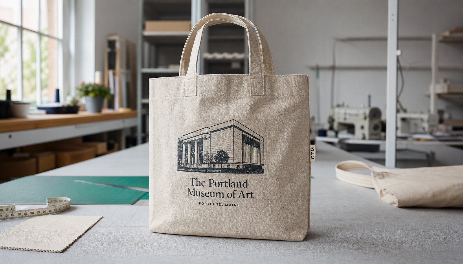
For most museum programs, the starting point should be a heavy canvas tote bag rather than a lightweight giveaway style. In procurement terms, that usually means 12 oz to 14 oz cotton canvas, or roughly 407 to 475 GSM, with enough structure to hold shape after folding and unpacking. A more substantial body also gives the decoration method a better surface to work on. On very light canvas, logos can look wavy, transfer edges can telegraph, and embroidery can pull the panel out of shape. Buyers sourcing heavy canvas tote bags for museums should therefore treat fabric weight, decoration method, and retail presentation as one spec, not three separate choices.
- Use heavier canvas when the bag is expected to carry books, catalogues, or multiple retail items.
- Prioritize shelf appearance if the tote will sit on a gift shop wall, table, or display rack.
- Avoid thin canvas when the artwork includes large solids, tight linework, or a premium retail price point.
Start with fabric and construction, then select the decoration method
The print method should not be chosen before the fabric and construction are settled. A 12 oz bag with a smooth enough weave can take a clean screen print or transfer. A rougher 14 oz canvas can still work well, but it will reduce how fine the details can be. Handle construction matters too. A bag with self-fabric handles and reinforced stress points behaves differently from one with webbing handles or contrast trim, and that affects both cost and decoration placement.
For museum buyers, the practical question is usually whether the tote should emphasize clarity, image detail, or premium feel. Screen print is strongest for clarity and repeatability. Transfer gives more freedom for detailed art and short-run exhibit graphics. Embroidery adds perceived value but works best as a controlled accent, not as a full artwork replacement. Woven labels or patches sit at the premium, subtle end of the spectrum and are often better when the museum wants brand presence without filling the entire front panel with ink or thread.
- Choose fabric weight first, then pick decoration that matches the weave and surface.
- Confirm handle construction before setting print position, because handle anchors can block artwork.
- Use premium decoration for small brand moments rather than forcing it across a large print field.
Print method comparison: screen print vs transfer vs embroidery vs woven label
For the keyword intent behind this guide, the decoration decision is the real procurement issue. Buyers often ask which method is “best,” but the better question is which method is best for the artwork type, resale channel, and expected wear. Screen print remains the default for museum logos, exhibition titles, and simple one-color or two-color artwork because it is economical at scale and usually delivers the most stable color appearance on heavy canvas. It performs especially well when the image has bold outlines, strong typography, or a limited palette. The tradeoff is that screen print becomes less economical as color count and setup complexity rise, and very fine detail can close up on rough canvas if the ink deposit is too heavy.
Transfer printing is more flexible for artwork with gradients, photographic content, or line detail that would be expensive to separate into multiple screens. It is often the best path for exhibition graphics or seasonal merch where the art changes frequently. The tradeoffs are practical: the supplier must prove the transfer is compatible with the specific canvas texture, and the buyer should inspect edge lift, hand feel, and abrasion resistance. A transfer that looks excellent on a sample board may wear differently once the tote is folded, handled, and carried. For that reason, the sample should be tested on the actual finished bag, not only on a swatch.
Embroidery delivers a premium feel that some museums prefer for member gifts, limited editions, or small logo placements. It gives strong brand presence and can feel more collectible than a flat print. However, embroidery introduces stitch count, backing material, and fabric distortion as real sourcing variables. On a heavy canvas tote, a dense embroidered design can pucker the panel or make the bag feel stiff in the wrong area. It is usually best for a logo, monogram, or compact badge rather than for a full-size artwork reproduction.
Woven labels or patches are useful when the museum wants the branding to look refined and durable without relying on a large printed image. A sewn woven label can be paired with a plain or lightly printed tote, which works well for understated premium retail lines. The main limitation is detail. Woven labels handle small text better than embroidery in many cases, but they still cannot reproduce complex artwork or a large exhibit image. They are strongest when the design language is simple and the bag’s value comes from fabric quality and construction rather than a large graphic field.
- If the artwork is simple and the order is repeatable, screen print is usually the lowest-risk option.
- If the artwork is image-heavy or changes often, transfer is often more practical than trying to force screen print.
- If the goal is a premium perception rather than large artwork coverage, embroidery or a woven label can be the better commercial choice.
- Always ask the factory which method they would use on your actual file, then verify the answer with a sample.
What artworks work best for each print method
Museum artwork is often more demanding than ordinary logo design. It may include fine line illustration, typography pulled from exhibition graphics, small copyright text, or gradients lifted from poster art. Those elements behave differently depending on the decoration method. Screen print rewards bold shapes, strong type, and a limited number of colors. If the art includes tiny text or delicate lines, the buyer should ask the supplier to show a production-ready separation, not just a clean digital proof. The goal is to see how the image will hold once it hits the texture of the canvas.
Transfer is more forgiving for detail, but that does not mean every full-color file will work. Some image effects look good in a PDF and poor on a woven substrate because the canvas texture interrupts smooth tonal transitions. When the bag is heavy canvas, the buyer should ask for a test transfer at actual size, on actual fabric, using the same heat and pressure settings the factory will use in bulk. That is particularly important for photographic art, gradients, or poster-style artwork where tonal accuracy matters more than flat color blocks.
Embroidery and woven labels work best when the design is intentionally simplified. A museum badge, gallery name, or short line of copy can look elegant in thread or woven yarn. A detailed exhibit image does not translate well. Procurement teams should think in terms of visual hierarchy: if the bag must carry the exhibition image, use print; if it must carry the institution’s identity with a premium feel, use a smaller embroidered or woven accent alongside a plain or lightly printed panel.
- Use screen print for bold logos, titles, and simple iconography.
- Use transfer for gradients, full color, or artwork that would need too many screens.
- Use embroidery or woven labels for small premium marks, not for detailed poster art.
- Ask for a production-size sample of the actual artwork, not a resized proof.
How MOQ, lead time, and routing change by decoration method
MOQ is usually tied to setup effort and production routing, not just a factory preference. Screen print has screen-making and color setup costs, but once the line is running, it is efficient for repeat orders. That often makes it the most favorable route for museum shops that reorder the same tote across seasons or exhibitions. Transfer can be attractive for lower quantities because it avoids screen counts, but the material cost per piece and the labor involved in careful application can push the unit price up. Embroidery typically has the heaviest setup burden per design and becomes less competitive as stitch count rises. Woven labels can be flexible, but the label itself still needs sourcing, and a custom label run may create a secondary MOQ if the museum wants a specific size, yarn blend, or edge finish.
A practical procurement band for custom heavy canvas tote bags is often 1,000 to 3,000 pieces, but the real number depends on artwork and packaging, not just the tote body. A simple natural canvas bag with one-color screen print can often support a lower threshold than a dyed body, a large transfer image, or a dense embroidery layout. Buyers should be cautious when a supplier gives one MOQ for every method, because that usually means the quote is generalized and not method-specific. Ask for a per-method MOQ and a per-method lead time.
Lead times also vary in a way that is easy to underestimate. Screen print can be faster if the artwork is approved and the fabric is in stock. Transfer may add time for testing and correction because the supplier must validate adhesion on the actual weave. Embroidery adds machine setup and sampling time. Woven labels can be fast if the label is stocked, but custom woven labels may require their own production cycle. For museum orders tied to exhibitions, holidays, or opening dates, the buyer should schedule for the longest critical path, not the average one.
Routing matters too. A factory that cuts, prints, sews, and packs in one location is usually easier to manage than a chain of separate vendors. If decoration is outsourced, the buyer should ask who owns the final quality call and who pays for rework if the logo is off-center or the color is wrong. Split routing can work, but only if the responsibility map is written into the quote and sample approval process.
- Ask for MOQ and lead time by decoration method, not one general answer.
- Treat a very low MOQ as a signal to inspect the routing, fabric stock, and packing assumptions.
- For launch dates, plan around artwork approval and sample revisions, not only sewing time.
RFQ details that make supplier quotes comparable
A useful RFQ should allow suppliers to quote the same bag in the same way. The core fields are straightforward: finished size, gusset depth, handle length, handle drop, canvas weight, body color, decoration method, artwork size, print location, and packing method. What often gets missed is the tolerance around those fields. If one supplier assumes a 38 x 42 cm bag and another assumes 40 x 42 cm, the unit price comparison becomes misleading. The same issue applies to handle type, hem finish, and print coverage. A quote that does not specify these details may still be valid as a rough budget, but it is not reliable for procurement comparison.
For museum buyers, the RFQ should also include retail context. Is the tote a wholesale item for the gift shop? A member perk? A seasonal exhibit exclusive? A resale SKU needs better visual consistency and more conservative QC than a one-off giveaway. If the tote will be sold in a museum shop, the quote should include whether the supplier can meet carton labeling, barcode placement, and shelf-ready fold requirements. If the tote is a gift-with-purchase item, the buyer may accept a simpler fold and lower-cost packing in exchange for better unit economics.
It also helps to ask suppliers to quote alternates. For example, ask for the same bag with screen print, transfer, embroidery, and woven label on identical body specs. Then compare the difference in unit price, MOQ, sample time, and expected wear. That comparison shows where the real cost lies. Often the bag body itself is not the big driver; decoration complexity and packing format are. A clear quote format also prevents suppliers from quietly changing the base bag material to offset the cost of a premium decoration method.
- Use one RFQ sheet with identical dimensions and packing assumptions for every supplier.
- Ask for alternates by decoration method so landed cost can be compared fairly.
- Require the supplier to state whether the quote assumes stock fabric or custom dyed fabric.
Sample approval workflow that protects museum quality standards
The best sample approval workflow has more than one checkpoint. Start with artwork placement and decoration method, then review the physical pre-production sample under real handling conditions. For screen print, check opacity, edge definition, and whether the print sits straight relative to the seam and hem. For transfer, check the look after cooling, then flex the panel and inspect edge lift. For embroidery, confirm that the back side is clean enough for the intended use and that the front panel does not ripple. For woven labels, look for straight sewing, clean corners, and stable attachment after manipulation.
The museum buyer should also inspect the construction of the sample as a finished retail product. Open and close the tote, load it with a few books or catalogues, and check handle comfort, seam strain, and bag recovery after weight is removed. Heavy canvas bags can pass a visual approval but still fail on ergonomics if the handles are too short or the gusset is too shallow. If the tote is meant to hold art books or hardback merchandise, the buyer should test the load path at the handles and bottom seam. The goal is not lab testing for its own sake; it is to catch the problems that affect customer satisfaction and retail returns.
If the order has a fixed launch date, do not approve from digital artwork alone. Artwork approval confirms the graphic. It does not confirm the finished bag shape, the location of the print relative to the side seam, the stiffness added by embroidery or transfer film, or the visual presentation after folding. A physical pre-production sample should be mandatory whenever the bag is retail-facing, time-sensitive, or decorated with anything more complex than a small one-color logo.
- Test the sample as a real bag: load, carry, fold, and display it.
- Check both the front view and the reverse side if decoration or backing could show through.
- Approve the production sample only after confirming the exact fabric, trim, print method, and packing.
Quality control standards buyers can put into the PO
Quality control becomes easier when acceptance criteria are written in operational terms. For heavy canvas tote bags, the buyer should set fabric-weight tolerance, finished size tolerance, seam quality, decoration placement, and packing accuracy. A vague note such as “good quality” is not enough. A better standard is a defined acceptable range for width, height, gusset depth, handle length, and handle symmetry after sewing and pressing. That way the warehouse or inspector can measure the bag and decide quickly whether the carton is acceptable.
For stitching, define a few load-bearing checkpoints rather than trying to inspect everything equally. Handle anchors, side seams, bottom seams, and bartacks should have the strongest criteria because those areas carry the load. If the bag will be filled with books, catalogues, or merchandise, the stitch density at these points matters more than a decorative seam elsewhere. Buyers should also ask for a defect threshold that identifies what counts as rejectable. For example, loose threads may be acceptable within a narrow limit, but skipped stitches, open seams, or visible stains should be rejectable. The factory should know this before production, not after shipment.
Decoration QC should be method-specific. For screen print, check registration, ink opacity, surface evenness, and rub resistance. For transfer, check edge lift, cracking under fold, and any gloss change that makes the print look mismatched to the canvas. For embroidery, check stitch pull, puckering, and backing visibility. For woven labels, check alignment, weave clarity, and whether the label edges are clean and secure. If a museum wants a premium retail impression, the inspection should also include folded presentation: the tote must arrive with a predictable fold direction, a clean front face, and carton labels that match the SKU being received.
- Set numeric tolerances for size, handle length, and print location before bulk production.
- Define method-specific defect criteria for print, transfer, embroidery, and woven labels.
- Require a carton count check and SKU verification before shipment release.
- Use a simple AQL or agreed defect threshold if the supplier and buyer already work with that system.
Landed cost comparison: how procurement teams should evaluate the real total
A museum tote quote is only useful if it can be translated into landed cost. That means comparing ex-factory price, packing density, decoration cost, and freight impact together. Heavy canvas is naturally dense, but decoration and packing can still change the final cost materially. A bag with embroidery may look attractive on the quote sheet, but it can increase labor time and result in a slightly bulkier pack. A transfer print may avoid screen setup costs, but if the supplier needs extra testing or protective packing, those savings may disappear. Buyers should not assume the cheapest unit price gives the lowest landed cost.
The most reliable comparison method is to normalize the quote. Use the same bag dimensions, same canvas weight, same handle specification, and same packing format across all suppliers. Then compare the incremental cost of each decoration method. If one supplier uses a stock canvas color and another uses a custom-dyed shade, isolate that difference before comparing print methods. If the museum wants to sell through a gift shop channel, include retail presentation cost as part of the comparison: insert card, polybag, hangtag, or custom folding time all affect the true cost of a sellable unit.
Freight also deserves attention. Bulk cartons with flat-packed totes can ship efficiently, but bulky embroidery backing, heavy inserts, or overpacking can raise carton volume. That matters especially for export orders or replenishment orders moving through distribution centers. Procurement teams should ask for packed weight and carton dimensions early in the quote stage, then calculate the landed cost per sellable unit rather than per factory unit. This is where a quote with full detail becomes valuable: it allows apples-to-apples comparison and makes it easier to defend the purchase decision internally.
- Compare ex-factory price, decoration cost, packing cost, and freight together.
- Normalize the bag body before comparing print methods.
- Ask for packed weight and carton dimensions before final supplier selection.
Practical sourcing workflow for museum buyers
A workable sourcing workflow helps the buyer move from artwork to purchase order without rehashing the same decisions. First, define the bag platform: size, gusset, handle construction, and canvas weight. Second, define the artwork class: simple logo, detailed illustration, full-color exhibit image, or premium brand accent. Third, request side-by-side quotes for the feasible methods only. Fourth, approve a physical sample on the exact material and decoration route. Fifth, lock the packing format, carton marks, and inspection rules before mass production starts. This sequence reduces the number of times the supplier can reinterpret the spec.
For museums with multiple shops or a rolling exhibition calendar, the workflow should include a master spec sheet. That sheet should record the approved bag construction, the approved decoration method for each artwork type, the QC thresholds, and the exact packing standard. Once the first order is approved, reorders become much easier because the buyer can simply reference the same approved spec and request the same route unless the new artwork requires a different method. This is more efficient than re-litigating the tote spec every season.
A final practical point: keep supplier communication tied to the intended use case. A member gift may tolerate a premium method with smaller quantity and more presentation packaging. A wholesale museum-shop SKU may need more predictable packing, lower unit cost, and simpler decoration. If the supplier understands which channel the tote serves, their recommendation is usually more useful and the quote becomes easier to evaluate. The best sourcing result is not the fanciest tote; it is the tote that matches the channel, artwork, and order volume without avoidable production risk.
- Build a master spec sheet so repeat orders do not start from zero.
- Match the decoration method to the sales channel, not only the artwork file.
- Keep one approved sample and one approved quote basis for future reorders.
Specification comparison for buyers
| Decision area | Screen print | Transfer print | Embroidery | Woven label / patch |
|---|---|---|---|---|
| Best artwork type | Flat logos, typography, 1 to 3 solid colors, bold exhibit marks | Full-color art, gradients, line drawings, variable artwork, short-run campaigns | Small logos, monograms, premium marks, minimal iconography | Brand mark, collection name, museum line, subtle premium branding |
| Durability on heavy canvas | Very good when ink is cured correctly; best for repeat orders and retail tote use | Good to moderate depending on film quality, adhesive, and canvas texture | Very good for the thread itself, but thread can snag and stiff stitch areas can distort | Very good for the label itself; depends on sew-in quality and edge finishing |
| Color limits | Most efficient at 1 to 3 colors; more colors add screens and setup cost | Strong for full color and tonal detail; color matching depends on print technology | Thread color count is limited and less precise than print; gradients are not realistic | Color is fixed by woven yarns; logo detail must stay simple |
| Typical cost drivers | Screen count, print size, ink colors, coverage, curing time | Artwork complexity, film type, print area, and any underbase or extra passes | Stitch count, thread colors, design size, stabilizer, and machine time | Label size, yarn colors, sew application, and whether it is inserted or topstitched |
| Recommended museum use | Gift shop logo totes, exhibition series with repeat print, wholesale merch | Seasonal exhibitions, image-heavy campaigns, short runs, mixed-color artwork | Premium memberships, gift items, commemorative pieces, small logo accents | Subtle branding, collection bags, premium basics, co-branding |
| Risk to verify in samples | Ink cracking, poor curing, misregistration, rough hand feel, uneven opacity | Edge lift, peeling, color shift, gloss differences, abrasion on textured canvas | Puckering, stitch pull, design distortion, heavy backing visible on inside | Label curling, crooked placement, weak seam bite, scratchy backing |
| Best starting fabric weight | 12 oz to 14 oz, roughly 407 to 475 GSM | 12 oz to 14 oz, preferably smoother weave within that range | 13 oz to 16 oz if the design is small and the bag must support needle density | 12 oz to 14 oz with enough body for clean label placement |
| Lead-time sensitivity | Lowest among the four when artwork is final and screens are ready | Moderate; depends on film prep, curing, and image testing | Higher because setup and stitch testing take more time | Usually moderate, but label sourcing can add delays |
| MOQ behavior | Often the most favorable at scale for repeat art | Can support smaller runs, but unit cost may rise | Best for premium short runs, yet setup can make small runs expensive | Flexible for brand accents, but needs consistent label sourcing |
Buyer checklist before sampling
- Define the finished bag size, gusset, handle length, handle drop, and target load use before asking for quotes.
- Specify fabric weight in oz and GSM, canvas weave type, color tolerance, and whether the cloth is pre-shrunk.
- Send vector artwork, artwork scale, Pantone references, and the exact print area with seam clearance.
- Ask each supplier to quote screen print, transfer, embroidery, and woven label on the same bag spec so pricing is comparable.
- Request a physical pre-production sample using final fabric, final thread or print material, final packing, and final trim placement.
- Confirm packed quantity per carton, carton dimensions, gross weight, and any retail folding or insert-card requirements.
- Set acceptance criteria for print placement, stitch quality, measurement tolerances, and defect thresholds before production starts.
- Ask who owns curing, color matching, and rework if decoration is outsourced or split across vendors.
Factory quote questions to send
- What is the finished fabric weight in oz and GSM, and is the canvas pre-shrunk before cutting?
- Please quote the same bag spec with screen print, transfer print, embroidery, and woven label options side by side.
- For each method, what are the cost drivers by color count, design area, stitch count, or label size?
- Is decoration done in-house, and if not, who is responsible for color matching, curing, and any rework?
- What is the MOQ by print method, and how does it change if we reduce colors, reduce print area, or switch to a stock canvas color?
- Can you provide a pre-production sample using final fabric, final handle construction, final decoration method, and final packing style?
- What are the carton size, packed quantity per carton, and estimated gross weight for freight planning?
- What inspection points do you allow before shipment, and what defects are rejected for museum retail or wholesale delivery?
Quality-control points to confirm
- Define fabric weight tolerance before production, such as ±5 percent on oz or GSM, so bulk canvas does not drift thinner than the approved sample.
- Measure finished bag dimensions after sewing and pressing, not from cut panels, and set tolerances for width, height, and gusset depth.
- Check handle length, handle drop, and left-right symmetry on a finished bag; uneven handles are visible in retail display.
- Specify stitch counts or stitch density for load-bearing seams and bartacks, especially at handle anchors and gusset joins.
- For screen print, check registration, ink opacity, edge sharpness, and rub resistance on the actual canvas texture.
- For transfer, check edge lift, cracking, gloss mismatch, and adhesion after heat and rub testing on the real fabric.
- For embroidery, inspect stitch pull, puckering, backing visibility, and whether the design distorts the bag panel.
- For woven labels, verify edge finishing, label alignment, seam bite, and whether the label curls after handling.
- Set defect thresholds in advance, such as maximum allowable stains, skipped stitches, loose threads, print misalignment, or label skew per carton or per hundred units.
- Confirm carton labels, SKU marks, and quantity counts before sealing so museum receiving or distributor intake does not slow down.