Why an imprint placement memo matters on drawstring pouches
A drawstring pouch imprint placement memo is the fastest way to stop quote drift before it starts. On small bags, a few millimeters can decide whether the logo looks centered, sits too close to the cord channel, or disappears into a seam. If you send only a logo file and a rough mockup, each factory will make its own guess about where the art should sit, how large it should be, and whether the print is measured from the cut panel or the finished bag. That is how you end up comparing quotes that are not actually quoting the same product.
For procurement teams, the memo is not a design document. It is a production control document. It should tell the factory what to print, where to print it, how big it must be, what the fabric weight is, and which finish is acceptable on bulk goods. When those points are written clearly, the supplier can price the same work across all quote rounds, the sample can be checked against one standard, and the receiving team can reject bags that miss the approved placement instead of debating intent after shipment.
- Use the memo to lock one comparison standard across all suppliers.
- Treat the placement memo as part of the RFQ, not a follow-up note.
- Measure from seams, not from the visual center of a loose sample.
- State whether the print must sit on the front panel, back panel, or side seam.
Start with the pouch build before you define the logo
The wrong placement decision usually starts with the wrong pouch definition. A pouch that is made from 120 GSM cotton muslin behaves very differently from a 220 to 280 GSM canvas pouch. Light fabric can show ink strike-through and distort when filled; heavier fabric gives a cleaner print edge but can resist fine detail if the weave is coarse. If the bag is lined, washed, dyed, or pre-shrunk, the final print area changes again. Your memo should name the exact fabric weight, structure, and closure style before anyone argues about logo position.
Do not let the supplier define the placement around their preferred sewing pattern. A good buyer memo states the finished size, the reference seam, the open edge, the drawcord channel depth, and any fold or gusset that changes the visible front panel. If the pouch has a bottom seam that sits high after filling, the lower print area may disappear in use. If the pouch is very narrow, a centered logo may crowd the cord ends. The goal is not just a pretty sample; it is a pouch that still reads correctly when packed, shipped, and handed to a customer.
- Name the fabric weight in GSM or ounces and do not rely on a generic cotton description.
- State finished size, not only cut size, because sewing eats placement space.
- Call out lining, dyeing, or prewash effects if the final logo area can shift.
- Confirm whether the supplier is measuring on the cut panel or on the finished pouch.
Choose the placement that survives production and use
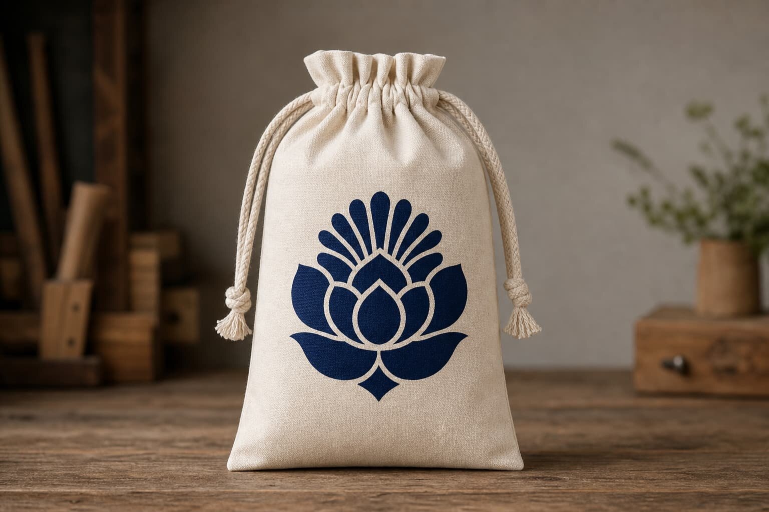
Most drawstring pouch disputes are not about artwork quality; they are about placement choice. Center-front printing is the safest commercial option when the buyer wants a visible brand mark and a straightforward quote. Lower-front placement can look cleaner on retail pouches, but it must be checked against how the bag sits when filled. Back-panel printing is useful when the front carries a separate message, SKU code, or compliance note, but buyers often forget to include it in the approval set. Side-gusset marks and woven labels work well on premium or slim pouches, yet they raise the risk of crooked stitching and uneven visibility.
A strong memo names the preferred placement and the backup placement, then tells the factory which one is acceptable if the first option becomes impossible. That matters when the art is wide, the pouch seam lands too close to the logo, or the drawcord channel removes the top part of the printable area. Do not rely on the sample room to make creative decisions for you. The supplier should be quoting against one clear placement rule, not interpreting a mood board.
- Center-front is usually easiest to quote and easiest to inspect.
- Lower-front looks refined but is more sensitive to fill shape and fold lines.
- Back-panel printing must be written into the quote or it will be missed.
- Side-gusset and label placements need a seam-based reference, not an eyeballed center.
How print method and fabric weight change the result
Print method is part of placement, not a separate decoration decision. A simple one-color screen print is usually the best value on cotton pouches between 120 and 280 GSM because it gives strong coverage, repeatable setup, and a clear unit-cost break at scale. Heat transfer or digital transfer can help when the art has small text or multiple colors, but those methods can become vulnerable on rough weave, repeated folding, or very small placement zones. Embroidery and sewn patches create a premium look, but they need more space and can distort the pouch if the fabric is too light.
If the pouch is very light, ask how the ink or patch will behave after sewing and folding. On soft muslin, a heavy print can show through on the reverse side. On coarse canvas, thin lines can close up unless the art is simplified. On dark fabric, a buyer should ask whether the factory is quoting a white underbase, a discharge-like print approach, or a layered transfer. The imprint placement memo should not just say print the logo; it should tell the factory what visual result you want, what fabric it is printed on, and what loss of detail is acceptable.
- Use screen print for clean, repeatable art on common cotton pouch weights.
- Use transfer methods when you need more colors or a smaller logo area.
- Use embroidery or woven labels when the brand wants a premium tactile finish.
- Ask whether dark fabric requires an underbase, extra pass, or different setup.
Build the quote around the placement variables that move cost
A useful quote is not just a unit price. It should show how placement changes the cost structure. The factory needs to know whether the logo is on one side or two, whether it is one color or multiple colors, whether the art sits on a plain cotton pouch or a dyed pouch, and whether the job requires a sewn label instead of direct print. Each of those choices can add setup time, change the printing method, or create a new inspection step. If the quote only gives one line for a finished pouch, you cannot tell whether two factories are pricing the same work.
MOQ logic is also tied to placement. One color on one front panel usually keeps the order simpler than a front-and-back decoration package, and a sewn label can create its own minimum because it adds cutting, stitching, and fold control. When you send an RFQ, ask the supplier to split the quote into body price, print setup, additional color cost, label cost, sampling charge, and packing cost. That makes it much easier to compare quotes and to explain to your sales team why one option is cheaper on paper but more expensive once the decoration is fully loaded.
- Request separate pricing for body, print setup, each extra color, and each extra location.
- Ask for MOQ by decoration type, not only by pouch style.
- Confirm whether samples are credited back or billed separately.
- Require the same qty breaks from every factory so quotes can be compared line by line.
What a sample should prove before you approve bulk
A placement memo is only as good as the sample check behind it. The first thing to approve is the artwork proof or digital layout, but that is not enough for production. You also need a strike-off, a sewn sample, or a finished pre-production sample made from the actual fabric, actual drawcord, and actual packing method. A flat proof can make a logo look centered while the finished pouch shifts the art upward by the time the cord channel and top seam are added. Buyers who approve only the artwork file usually discover the problem after the bulk order is already running.
Use the sample to check both the decoration and the bag structure. Measure the print size, the distance from the top edge, and the distance from the side seam. Open and close the pouch to see whether the drawcord or folding line interferes with the logo. If the pouch is lined or top-stitched, inspect whether the stitching distorts the art. For buyer protection, the memo should say which sample controls the bulk run, which measurements matter, and what happens if the factory changes print position during sewing.
- Approve a finished sample, not only a flat art proof, whenever sewing affects placement.
- Check the logo against the actual cord channel and top seam.
- Confirm color, opacity, and edge sharpness on the final fabric GSM.
- Keep one signed reference sample for the factory and one for the buyer file.
Set acceptance criteria that a factory can actually hold
Good buyers do not just say the placement must look nice. They define what acceptable looks like. A practical memo states the reference point for measurement, the allowed shift in millimeters, the acceptable color range, and what defects are not allowed. For many commodity pouches, buyers set a small but realistic tolerance on front-panel placement, then allow slightly more on woven labels or hand-sewn patches because those operations naturally move a little more than direct print. If you do not define the tolerance, the factory will judge the run by its own internal comfort level, which is often looser than the brand wants.
The acceptance rules should also address finish quality. The logo should not run into the seam allowance, should not show cracking at the fold, and should not blur where the fabric weave opens up. If a print touches a stitch line, the buyer should already know whether that is a reject or a rework. The memo should also state whether a small rotation is acceptable, whether a slight shade change is tolerable, and whether the outer carton can contain mixed placement versions. Clarity here saves time on both sides because the warehouse team can inspect against a written standard instead of arguing from memory.
- Define placement tolerance in millimeters and tie it to a seam or top edge.
- State whether minor rotation, shade shift, or label offset is acceptable.
- Ban any print that crosses into the seam allowance or cord tunnel.
- Write the rejection rule for crack, blur, truncation, and label fray.
Packing and lead time change when the placement gets more complex
Placement can affect packing more than many buyers expect. If the imprint must always read upright, the factory may need to pack the pouch in one specific direction, which changes labor and carton density. If the print area is delicate, an over-tight polybag can rub the ink before shipment. If you add a woven label or patch, the pouch may need an extra inspection before bundling because stitch tails and folded edges can snag. These are small costs, but they should be visible in the quote because they affect both unit price and lead time.
Simple one-color center-front printing usually moves through production faster than a multi-location decoration package because the supplier only has one print setup and one approval path to manage. As soon as you add a back print, a side label, or embroidery, you create another operation, another inspection point, and often another sampling round. That does not mean the complex version is wrong; it means the buyer should not accept the same lead time without asking which step has been removed or compressed. A clear memo lets the factory tell you where the real bottleneck is before the order is placed.
- Ask whether orientation-sensitive packing is required for logo visibility.
- Confirm whether the decoration needs a protective polybag or insert sheet.
- Separate simple print lead time from label or embroidery lead time.
- Ask if any extra sample round is needed before the bulk schedule starts.
Common mistakes and the cleanest way to issue the RFQ
The most expensive mistake is sending a decorative mockup instead of a production memo. A mockup shows intention; a memo shows control. Other common errors are omitting the reverse side, not naming the fabric GSM, using only pixels instead of millimeters, and forgetting to say whether the print is on the finished bag or the panel before sewing. Buyers also get into trouble when they ask for a premium label but do not specify the label size, fold style, or stitch color. Every omission gives the factory room to make an assumption, and assumptions are where rework starts.
The cleanest workflow is simple. First, define the pouch build and the artwork placement in one memo. Second, ask the supplier to quote the same placement against the same fabric and same packing format. Third, approve the artwork proof, then a finished sample, then the bulk run. Fourth, keep the signed memo with the sample in the order file so receiving can check against it later. If a supplier proposes a cheaper placement or a different label, treat it as a new option and ask for a separate quote line. That keeps the RFQ honest and stops one supplier from quietly changing the spec to win on price.
- Do not rely on a plain mockup when the seam and cord channel affect visibility.
- Issue one memo per pouch style so suppliers quote the same structure.
- Keep the approved sample and memo together in the order record.
- Treat any alternate placement as a separate commercial option, not a hidden substitution.
Specification comparison for buyers
| Spec decision | Recommended option | When it fits | Buyer risk to check |
|---|---|---|---|
| Center-front logo | Simple one-color screen print | Promo pouches, brand giveaways, and repeat programs with stable artwork | Logo can crowd the cord channel or shift if the supplier measures from the wrong seam |
| Lower-front logo | Screen print or transfer below the main opening seam | Retail pouches where the top area must stay clean or where the logo needs more white space | Artwork can look too low once the pouch is filled or folded for packing |
| Back-panel logo | Second imprint location or compliance mark | When the front is reserved for artwork, SKU coding, or a premium minimalist look | The back is easy to forget in approvals, so the quote may not include it |
| Side-gusset mark | Small woven label or narrow vertical print | Slim pouches, premium sets, and logos that do not fit a wide front panel | Stitch lines and seam pull can warp the mark or hide part of the art |
| Sewn-on label | Woven label or cotton patch sewn at side seam | When the buyer wants a premium finish, lower print cost, or a durable brand identifier | Label size, shade, and stitch quality must be locked or suppliers will substitute materials |
Buyer checklist before sampling
- Confirm pouch size, fabric type, GSM, closure style, and whether the bag is lined or unlined.
- Mark the exact print side, reference seam, and finished placement dimensions in millimeters.
- State the print method, number of colors, Pantone targets, and whether a white underbase is required.
- Ask for unit pricing by qty break plus separate setup, artwork, sample, and label charges.
- Define the acceptable placement tolerance, color tolerance, and any no-go zones near seams or cords.
- Request a flat artwork proof, a strike-off or lab dip if relevant, and a finished pouch pre-production sample.
- Specify packing format, carton quantity, polybag need, insert card need, and carton marking language.
- Require the supplier to confirm how any change in placement, fabric weight, or print color affects MOQ and lead time.
Factory quote questions to send
- Which exact print method are you quoting for this placement, and why is it the best fit for the fabric GSM?
- What are the setup charges, artwork charges, label charges, and sample charges separate from the unit price?
- What is the MOQ for one color on one placement, and how does it change if we add a second location or second color?
- Can you quote the same pouch with the logo centered on the front panel, lower front, and back panel as separate options?
- What placement reference do you want us to use from seam to art edge, and what tolerance can you hold in production?
- Will the print be applied before or after sewing, and does that change the visible size or edge quality?
- Can you supply a finished sample with the actual pouch fabric, actual drawcord, and actual packing style before bulk approval?
- How will packing orientation, folding method, or polybag size affect the logo position and carton count?
Quality-control points to confirm
- Measure artwork position from the same seam or edge on every sample and bulk piece, not from the visual center by eye.
- Check that no part of the logo falls into seam allowance, cord channel, or stitch line after the pouch is sewn and filled.
- Verify color, opacity, and edge sharpness on the actual fabric weight, especially on 120 to 280 GSM cotton or canvas.
- Inspect the first production run for skew, scale drift, label fray, blocked letters, and print cracking at folds.
- Confirm that the finished pouch still looks correct after flat packing and after being opened once from the carton.
- Record the accepted placement tolerance in the approval memo so the factory and the receiving team use the same standard.