Why the proof memo matters more than the logo file
A drawstring pouch order usually starts with a logo, but the real risk sits in the proofing step. Buyers often send a clean vector file and assume the factory will handle the rest. That is where problems begin. On a pouch, the printable area is limited, the cord channel changes the layout, the fabric may distort under tension, and a logo that looks strong on screen can become too small, too close to a seam, or too light on the actual textile. A good artwork proofing memo turns the logo into a production instruction, not just a design file.
For procurement teams, the memo is also a quote control tool. It tells the factory what they are pricing, what they are not pricing, and which proof stage is binding. If the memo is vague, every change becomes a new assumption: different print method, different color count, different placement, different pack-out, and different lead time. That is how a low quote turns into an expensive revision later. Treat the proof memo as part of the contract pack, not an internal note.
- Use the memo to define the final print method, not just the artwork file.
- State whether the proof is for layout only, color only, or full production approval.
- Tie the memo to the PO or RFQ version so the supplier cannot quote against an older file.
Start with the pouch structure, not just the artwork
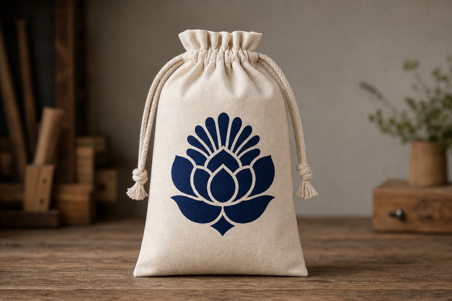
Before you review colors or line weights, lock the pouch structure. A 10 x 15 cm pouch made from 80 gsm cotton behaves very differently from an 8 oz canvas pouch or a polyester pouch with a tighter weave. Lighter cotton can show ink strike-through, while heavier canvas can handle stronger coverage but may need a larger logo to stay readable. If the pouch has a bottom gusset, a flat seam, or a drawcord channel with thick stitching, the placement zone can shrink quickly. Your proof memo should show the actual printable area, not the theoretical panel size.
This is also where fabric weight/GSM affects the approval path. For simple one-color logos, 80-100 gsm cotton is usually fine if the print is light and the artwork is bold. At 120-140 gsm, buyers can usually push better opacity and slightly finer detail. On heavier canvas, such as 8 oz or above, embroidery and woven labels become more practical for premium packs because they hold detail better over repeated handling. If the artwork was designed for a flat paper bag or a rigid box, it may need simplification before it can be printed cleanly on soft fabric.
- Measure the real print zone after seams, channels, and turn-ins are included.
- Ask the factory to mark the logo position on a flat layout drawing.
- Check whether the pouch is cotton, canvas, polyester, or a blended fabric before approving small type.
Choose the decoration method before you lock the proof
The best proof memo does not treat all decoration methods as equal. Screen print is usually the most cost-controlled choice for one- or two-color logos on simple cotton pouches, especially when volume is steady. Heat transfer works better for detailed art, gradients, or short runs, but the buyer has to check hand feel and edge durability. Embroidery adds texture and a premium look, but it changes the size logic because tiny text can lose legibility. Woven labels are useful when the brand needs a cleaner retail presentation and the pouch body should stay simple.
Your proof needs to match the method you intend to buy, not the method the designer prefers. A beautiful full-color logo may look strong on a mockup, but if the order is for a low-cost promotional pouch, the supplier may need to simplify it into a one-color print or a label plus icon. The memo should say which elements are mandatory and which can be simplified. That gives the factory room to quote realistically without substituting the wrong decoration style later.
- Use screen print for cost control and repeat orders with simple art.
- Use heat transfer when the design has gradients, thin lines, or multiple colors.
- Use embroidery or a woven label when the pouch is part of a premium retail set.
What a usable proof memo must contain
A proof memo should read like a production instruction sheet. It needs the artwork version, the pouch size, the fabric spec, the decoration method, the print size, the color reference, and the approved placement. It should also say whether the logo can move to avoid seams, whether one side or both sides are printed, and whether the supplier may adjust line weight to fit the substrate. If the supplier is forced to guess any of these items, the approval loses value. The memo should remove guesswork before the first sample is made.
The most useful memos also include quote data. That means the buyer states whether the price should include sampling, strike-off, printing, woven labels, inner packing, carton marks, and any special folding or bundling. If the pouch has individual polybags, hangtags, or barcodes, note them in the same memo so the factory does not price a plain pouch and later charge separately for packaging. A good memo makes supplier comparison easier because every quote is based on the same assumptions.
- Include artwork file name, version, and date so the proof can be traced later.
- State logo size in millimeters, not only as a visual reference.
- Write the accepted color reference: Pantone number, visual match, or both.
How to review digital proofs, strike-offs, and production samples
Digital proofs are useful, but they are not the final answer for fabric goods. They are good for checking layout, size, and overall placement, especially when the logo sits near a seam or cord channel. What they cannot show is how the print interacts with the weave, the stretch, the ink penetration, or the real texture of the pouch body. That is why first-order buyers should ask for a strike-off or a pre-production sample when the artwork is important to brand presentation. On soft goods, a clean screen view can still fail on the actual textile.
When you review a strike-off, inspect it under consistent light and compare it against the approved memo rather than against memory. Check whether the logo is centered the way the proof showed, whether small text is still readable, and whether the print feels too heavy for the fabric. If the pouch is a gift or retail item, fold the sample the same way it will be packed in bulk. Many defects only appear after folding, cinching, or stacking. The sample should prove the final behavior, not just the flat print.
- Use the digital proof for placement and layout, not as proof of final fabric performance.
- Use the strike-off to check ink, color, registration, and fabric interaction.
- Use the pre-production sample to confirm print, folding, packing, and carton count together.
Set acceptance criteria that stop repeat disputes
A strong proof memo includes acceptance criteria, not only approval notes. Buyers should define how close the print must be to the approved layout, how much color shift is acceptable, and what kinds of defects trigger rework. For example, a small centered logo may need a tighter placement tolerance than a large front panel design. A one-color screen print on a natural cotton pouch may allow slight tonal variation, but it should still keep clean edges and readable text. If the art uses fine lines or tiny type, say so up front because the factory may need to enlarge the logo to keep it legible.
For practical control, use clear boundaries. Many buyers work with placement tolerance in millimeters, a defined master reference for color, and a simple defect rule for obvious misprints. You do not need a complex lab spec for every order, but you do need enough detail to end arguments later. The goal is to make the sample easy to judge and the bulk easy to reject if the factory deviates. If the supplier knows the acceptance rule before production starts, the order is far less likely to drift.
- State placement tolerance in mm for top edge, center line, and side seam distance.
- State whether slight color variation is acceptable on natural cotton or dyed fabric.
- Define what is not acceptable: blurred text, broken outlines, or logo distortion.
How artwork changes the quote, MOQ, and lead time
Artwork is not just a decoration issue; it changes the commercial structure of the order. A one-color screen print on a simple cotton pouch usually has a different MOQ logic than a four-color heat transfer or an embroidered pouch. More colors mean more setup, more cleaning, and more production checks. A woven label adds its own setup cost and usually affects minimum quantity because the factory has to justify the extra trim run. If you compare quotes without matching the artwork method, you are not comparing the same product.
Lead time also changes with proof complexity. A plain layout proof may be fast, but a strike-off, a second color correction, or a revised placement request will add days before bulk production can start. Buyers should ask whether the quoted lead time begins after artwork approval, strike-off approval, or deposit receipt. That one detail can change the whole schedule. If the supplier is vague, the order may look fast on paper but still arrive late because the proof loop was never included in the timeline.
- Ask for a split quote that shows fabric, print, label, packing, and carton costs separately.
- Confirm whether MOQ is tied to one artwork version or one colorway only.
- Make sure the lead time starts from the correct approval milestone.
Comparison table: pick the right decoration path for the pouch
A useful comparison table keeps the buyer focused on the real trade-offs. The point is not to choose the fanciest decoration; it is to choose the one that fits the fabric, the brand standard, the order size, and the packing method. In many pouch programs, the artwork itself is simple. The risk comes from choosing a decoration method that looks fine in the proof but fails under production pressure, carton compression, or retail handling.
Use the table below as a decision aid when you request quotes. If the factory pushes one method over another, ask them to explain the trade-off in terms of setup, durability, and repeatability. A good supplier can tell you why a one-color screen print may be better than heat transfer on a cotton pouch, or why a woven label may protect a small logo that would otherwise disappear on coarse canvas.
- Match the decoration method to fabric texture and order volume.
- Ask the factory to show the exact print size and placement on the proof.
- Do not approve a method just because it looks good in a digital mockup.
Packing, labeling, and carton data must match the proof
Artwork approval does not end with the logo. For drawstring pouches, packing details can affect how the artwork looks when the buyer receives the goods. If the pouches are folded before bagging, the print may crease differently. If the cartons are overfilled, the print can flatten or rub against the next layer. If the product includes a woven side label or care label, the packer needs to keep that label visible and consistent. The proof memo should include the final fold direction, the inner pack count, and any bagging requirement so the factory does not create a packaging version that changes the presentation.
Carton marks matter too, especially for importers and distributors who need clean receiving. The memo should state the product name, quantity per carton, carton dimensions if known, and whether the master carton needs barcode, SKU, or customer reference marks. When the supplier quotes the pouch but leaves carton data undefined, buyers often get a shipping pack that is hard to count or relabel. That creates receiving delays even when the product itself is correct. The artwork memo should therefore connect decoration approval with pack-out approval.
- Confirm how each pouch is folded before it goes into the polybag or carton.
- Specify label location, barcode needs, and carton marks early.
- Check that the outer pack does not rub or deform the printed area.
Common mistakes that create rework on pouch orders
The most common mistake is approving artwork without confirming the substrate. A logo that looks sharp on a white cotton pouch may disappear on a natural or heathered fabric. Another frequent issue is ignoring seam lines and cord channels. If the logo crosses a seam, the supplier may shift it during production and the buyer will think the print is wrong. In many cases, the factory was trying to avoid a technical problem that the proof memo never addressed. Clear placement notes prevent this kind of blame loop.
Another source of rework is overcomplicated art. Tiny text, thin outlines, and multi-color gradients may be fine for a digital file but not for a low-cost pouch. If the buyer insists on keeping every detail, the factory may raise the MOQ or switch to a different decoration process. That is not always a problem, but it should be visible early. Buyers save time when they simplify the artwork for the fabric instead of asking the factory to force an unsuitable design into production.
- Do not approve artwork before checking seam lines, cord channels, and print space.
- Avoid tiny fonts and thin strokes on low-GSM or textured fabric.
- Ask the factory to flag any artwork element that may need simplification.
Specification comparison for buyers
| Spec decision | Recommended option | When it fits | Buyer risk to check |
|---|---|---|---|
| One-color logo on basic cotton | Single-screen print | Best for promotional pouches, repeat orders, and tight cost control on 80-120 gsm cotton | Check ink strike-through, edge sharpness, and whether the logo sits too close to the seam or drawcord channel |
| Detailed or multi-color artwork | CMYK heat transfer or digital transfer | Best when the artwork has gradients, small text, or more than two colors on a short-run order | Check hand feel, peel resistance, and whether the transfer survives folding and carton compression |
| Retail-ready brand presentation | Woven side label plus simple print | Best when the pouch is part of a gift set, subscription kit, or premium retail pack | Check label size, thread color, and whether the label placement interferes with the cord path or seam allowance |
| Premium texture on heavier fabric | Embroidery | Best on 8 oz canvas or heavier cotton when you want a durable, tactile brand mark | Check puckering, stitch density, and whether small text turns unreadable at production size |
Buyer checklist before sampling
- Confirm the pouch size, fabric, and GSM before you approve artwork placement.
- Send the supplier a vector master file plus a preview PDF with all text outlined.
- State the exact decoration method, print size, print side, and position tolerance.
- Lock the Pantone reference, or write down that a close visual match is acceptable.
- Ask for a digital layout, then a strike-off or pre-production sample for first orders.
- Confirm whether the quote includes one proof round or multiple revisions.
- Check how the logo behaves near seams, grommets, cord channels, and bottom folds.
- Confirm pack-out: polybag, quantity per carton, carton marks, and master carton dimensions.
Factory quote questions to send
- What fabric, weave, and GSM are included in this quote, and is the GSM tolerance stated?
- Which print method is priced here: screen print, heat transfer, embroidery, or woven label?
- How many colors, print locations, and sides are included in the quoted decoration cost?
- What file format do you need for the proof, and who signs off the final artwork version?
- Does the MOQ change if we add a second print color, a label, or individual packing?
- What is the sample cost, and is that cost credited back on the bulk order or not?
- How many proof revisions are included before the order is released to production?
- What overrun or underrun tolerance do you apply for the final bulk quantity?
- What are the lead times for layout proof, strike-off, and bulk production after approval?
- Can you confirm carton packing, inner pack count, and shipping marks in the quote?
Quality-control points to confirm
- Artwork version on the proof matches the final approved file name and date.
- Logo placement stays within the agreed tolerance from top edge, seam, and center line.
- Print color matches the approved reference under the agreed viewing light.
- Text remains legible at production size, especially on small pouch formats.
- No ink bleed, cracking, wash-off, or transfer edge lift on the sample.
- Stitching and drawcord channel remain smooth after printing or embroidery.
- Woven labels, side tags, or care labels are aligned and securely attached.
- Carton count, polybag quantity, and shipping marks match the packing sheet.