Why proofing matters more on jute than on cotton or canvas
Jute looks simple at a glance, but it is one of the less forgiving surfaces for logo work. The weave is coarse, the surface is irregular, and the natural color of the fiber can shift how ink appears under store lighting. For coffee roasters, that matters because the tote is often used in a retail setting: at the register, in the café, at a tasting table, at a market stall, or inside a gift bundle. A logo that looks crisp on screen can feel too small, too pale, or too crowded once it is printed on textured fiber.
That is why proofing is more than an art sign-off. It is a manufacturing control step. Procurement is not only checking whether the logo looks attractive. It is checking whether the bag still reads well from a normal viewing distance, whether the print survives handling, and whether the bag feels consistent enough to sell beside coffee and brewing accessories. If the tote is part of a retail program, the bag itself becomes a brand asset, not just a carrier.
A digital mockup is useful for layout, but it does not show the behavior of the material. It will not reveal weave absorption, stitch distortion, edge fraying, or how the print sits after the panel is sewn and folded. A buyer who approves only from the mockup is not really approving the manufacturing result. That is why the sample has to be real, and why the sample should match the intended construction as closely as possible.
Coffee roasters also tend to use brand styles that are especially sensitive to jute texture. Earth tones, black marks, small type, and restrained layouts can work beautifully, but thin details can vanish into the weave if the artwork is not adjusted for the substrate. The point is not to make the design louder for the sake of it. The point is to make sure the intended brand impression survives the material.
The strongest proofing process creates one locked reference: a bag the supplier can build against and the buyer can inspect against. Once that reference is agreed, the bulk order becomes easier to control. The supplier knows what is acceptable. The buyer knows what is rejectable. And any later discussion about quality can be tied back to one physical standard instead of a vague art file.
Bulky tote programs often fail at the boundaries between teams. Marketing assumes the factory will interpret the logo correctly. Procurement assumes the sample already reflects the bulk order. The supplier assumes the buyer understands what the material can and cannot do. Proofing closes those gaps before they become costly rework.
For coffee roasters, the bag may travel in many hands before the customer sees it. It may move through a warehouse, a café shelf, a subscription box, or an event kit. A bag that only looks good in one lighting condition is not enough. The proof has to show the real product in a real process, and it should answer the same question every buyer cares about: will the bulk order still look like this when it ships?
- Jute texture can hide detail that looks fine on a flat digital proof.
- Retail-facing coffee totes need more than decorative approval; they need production control.
- One signed reference sample reduces dispute during bulk inspection.
- The bag should be reviewed under normal light, not only through photos.
- Material behavior matters as much as logo design.
- A strong proofing process protects both the buyer and the supplier.
Start with the bag spec before you talk about artwork
The most efficient proofing process starts with the bag specification, not with the logo file. If the supplier does not know the finished size, gusset depth, handle style, lining or coating, and target use, the proof can look acceptable while the actual bag misses the business need. For a coffee roaster, the tote often has to do one of three jobs: hold retail coffee packs, support gift bundles, or act as a branded merchandise item. Each of those uses can justify a different structure.
You do not need to lock every detail before asking for a quote, but you do need enough information for the supplier to price a real construction. The final width, height, and gusset should be clear. So should the handle drop and whether the bag needs to stand upright empty. That last point is especially important in retail. A tote that collapses flat may be perfectly usable, but it will present differently on a shelf or counter than a bag with more structure.
Do not treat fabric weight as a magic number. Jute weights vary by supplier, weave style, coating, and overall construction. A useful approach is to ask the supplier what construction best suits the load and presentation you need, then compare that recommendation with your internal budget and finish requirements. If the bag must carry a heavier retail bundle, stay upright, and still feel premium, the supplier may recommend a heavier or more structured version. If the tote is a lighter promo item, a simpler build may be enough.
The same logic applies to finish. An unlined rustic tote may fit a farm-to-café brand well, while a coated or lined tote may be better for moisture control, cleaner shelf presentation, or more frequent consumer use. That decision influences print behavior, fold lines, and sometimes odor or hand feel. If the brief does not mention it, the factory may make assumptions that create a mismatch later.
Handle construction deserves the same clarity. Handles can be self-fabric, cotton webbing, or another supplier-dependent option. They can be reinforced with different stitch patterns, patches, or bar-tacks. Because the handle is visible and functional, it affects both the sample appearance and the long-term durability of the tote. If your use case involves heavier coffee packs or gift sets, ask specifically how the handle is reinforced and how the supplier verifies that reinforcement during inspection.
The best RFQ reads like a build sheet, not a creative brief. It should tell the factory what the bag is for, what it must carry, how it should sit, and what construction choices are non-negotiable. That reduces the chance that the quote is based on a guess. It also gives the proofing stage a real benchmark instead of a vague concept.
If your team is comparing suppliers, make sure every quote is based on the same bag definition. A supplier quoting an uncoated tote should not be compared directly with another quoting a coated tote unless you intend that difference. Procurement gets better when it compares like for like, and proofing only works when the like-for-like definition is clear.
In short: define the bag first, then the artwork, then the sample. That sequence prevents the common mistake of designing around a beautiful logo that the material can only reproduce imperfectly.
- Confirm finished width, height, gusset depth, and handle drop.
- State whether the tote must stand upright when empty.
- Tell the supplier what the bag will carry: coffee, gifts, or mixed retail packs.
- Clarify whether the finish should be rustic, retail-polished, or premium gift-ready.
- Include any lining, coating, or reinforcement that changes print behavior.
- Ask the supplier to recommend the build if the use case is not obvious.
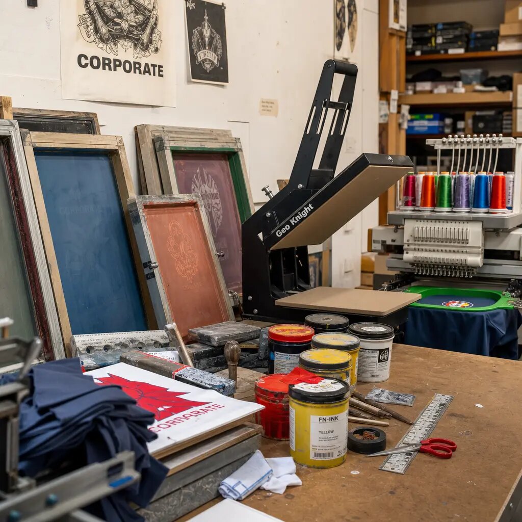
Choose the print method by artwork, not by habit
For many coffee roasters, screen printing is the most practical starting point. It often suits bold logos, simple brand marks, and one- or two-color artwork on coarse jute. It can also be easier to repeat in future orders because the process is straightforward to control once the artwork is finalized. If the design is simple and the program may repeat, screen print is usually worth exploring first.
That said, no print method is automatically best for every tote. If the logo has very fine detail, multiple colors, or typography that must stay crisp at a small size, another decoration method may reproduce it better. Heat transfer, for example, may handle detail more faithfully in some cases, but buyers should look carefully at how it sits on jute. Some transfer finishes can look glossy, sit on top of the fabric, or show edge lift after folding. That may be fine for a certain brand style, but it is not the same visual result as a more matte direct print.
A premium label, patch, or sewn-on brand element can also be a good choice if the tote is meant to sell as merchandise rather than function as a giveaway. But that choice changes the bag’s sewing complexity and cost. Buyers should not assume that a higher-end look automatically delivers better durability or better value. The key question is whether the method matches the intended retail result and the acceptable unit cost.
Ask the supplier what method they use most often on this type of jute. Then ask what the method cannot do well. The second question is usually more valuable than the first. A serious supplier will tell you the minimum line thickness, smallest readable text, or color-count limit that works reliably on the selected material. If they cannot give those boundaries, the quote is not yet grounded in production reality.
It also helps to see the same logo in more than one process when the order is strategic. A simple two-color mark may be clearer as a direct print than as a transfer, but a fine-detail campaign logo might need another approach. The buyer should compare not just price, but also how the bag will feel in hand, how the artwork will wear, and how the finish supports the brand story. A coffee roaster selling a tactile, earthy product may want a finish that feels aligned with the brand rather than mechanically perfect.
The cheapest decoration method is not always the lowest-risk one. If the process creates a higher reject rate, slower packing, or more visual inconsistency between lots, the landed cost can rise quickly. The proof should make that tradeoff visible before the bulk order is placed.
If the artwork contains both a primary logo and secondary information like a website or tagline, ask whether everything really needs to go on the bag. In many cases, simplifying the print improves legibility and reduces the risk of poor reproduction on textured fabric. Extra information can often move to a hangtag or insert card instead.
Good print-method selection is less about preference and more about fit: fit to fabric, fit to artwork, fit to order size, and fit to the brand’s tolerance for visual variation.
- Screen print is often the safest default for bold, simple logos.
- Heat transfer can help with detail, but check gloss and edge adhesion.
- A woven or sewn label can look premium but adds cost and sewing complexity.
- Ask for the method’s minimum line thickness and smallest readable text.
- Compare finish, wear, and repeatability, not only unit price.
- Simplify artwork if the fabric cannot support the full design cleanly.
Use a proofing standard that mirrors production, not a nicer-looking sample
A digital proof is only a layout tool. It tells you where the logo will sit, not how the bag will actually print. On jute, the final result depends on the fabric lot, ink load, curing, pressure, sewing sequence, and even how the bag is folded before packing. That is why the most useful approval is a physical pre-production sample made with the same construction and print process intended for bulk.
The sample should be judged under normal light and at normal viewing distance. For coffee retail, that usually means the tote should read clearly from around a meter away, then still look clean on close inspection. The buyer should check whether the logo is centered as intended, whether the edges are sharp enough for the brand standard, and whether any natural fiber variation looks acceptable rather than random. The point is not to eliminate all variation; it is to define what level of variation is normal and acceptable.
A good approval standard is short and explicit. Approve only when the sample matches the agreed dimensions, the print sits in the approved location, the artwork remains legible, and the bag structure behaves as expected. If the tote is coated, laminated, or lined, the sample should include that same finish. If the handle material or reinforcement changes the bag feel, the sample should reflect that too. Too many programs approve the wrong version because the sample was a partial representation of the final bag.
Flex the sample before sign-off. A bag is not a flat poster; it will be handled, stacked, and folded. Light flexing can reveal whether the ink cracks, whether the coating whitens at the fold, or whether the print becomes blurred when the panel moves. A quick hand test is not a laboratory method, but it is enough to catch obvious issues before they become a bulk problem. If the print fails a simple bend check in the sample room, it is not ready for repeated handling in retail or shipping.
Keep one identified approval sample. It can be signed, tagged, photographed, or sealed, but it must be easy to trace back to the approved version. Attach the main dimensions, artwork size, print location, and any allowed natural variation in the jute. That note becomes the production reference and helps prevent later arguments about what was actually approved.
Do not rely on a sample that is “close enough” unless the difference is intentional and documented. If the sample uses a different fabric, different handle, or different print method from the bulk order, the approval loses value. Procurement teams protect themselves by making sure the sample is not just visually close; it is constructionally relevant.
When the order is strategic, a sewn pre-production sample is usually more valuable than a print-only strike-off. A strike-off can show how the print behaves, but it will not show handle balance, seam alignment, or final silhouette. For a retail tote, the full bag is what the customer experiences, so the full bag is the safer approval object.
The approval rule should be simple: if the bag in the sample room is not representative of the bag you plan to receive, do not sign off yet.
- Approve a physical sample before bulk production starts.
- Check the bag under normal light and from normal retail viewing distance.
- Use the same fabric, finish, handle, and print method planned for bulk.
- Keep one signed or tagged reference sample for inspection.
- Flex the sample lightly to see whether the print or finish reacts badly.
- Prefer a sewn pre-production sample when the full bag experience matters.
What to include in the artwork file so the quote is real
A quote built from only a logo file and bag size is usually too loose to manage well. Procurement needs to tell the supplier the exact print area, the number of colors, the intended placement, and any text constraints. On jute, small details are where most surprises happen. Thin lines can break up, tiny words can disappear into the weave, and light colors can look weaker than expected. The supplier cannot price that risk accurately unless the artwork is described in practical production terms.
Send vector artwork in a format the factory can use without redrawing the logo from scratch. More important than file extension, though, is whether the artwork is production-ready. If the logo contains a tagline, website, phone number, QR code, or legal copy, ask whether all of it really needs to be on the tote. In many coffee roaster programs, the clearest result comes from printing only the core mark and moving supporting information to a hangtag or insert card.
That choice often improves readability and lowers reject risk. A tote is not a brochure. If the brand message depends on too much copy, the final bag can become busy and hard to read. A cleaner design usually performs better on textured fiber and still looks premium. Buyers should treat simplification as a sourcing decision, not just a design preference.
If color matters commercially, specify the color reference and ask how the supplier will control it. But be cautious about expecting perfect color matching on natural fiber. The base tone of jute can influence the final appearance, and exact consistency may depend on fabric batch and print process. Better procurement language says what range is acceptable and what will be rejected rather than implying laboratory-level uniformity on a natural material.
You should also define whether artwork placement is measured from the flat panel or from the sewn bag. Those are not always the same. Some factories print before sewing; others print after assembly. If the reference point is unclear, the bag can look misplaced even when the factory believes it is correct. A precise quote should tell you not only the print size, but the measurement basis.
When buying for a coffee roaster, consider how the tote will be used after purchase. If it is likely to be sold in-store or at events, the brand mark needs to hold up at a glance. If the tote is bundled with other items, the logo may need to be smaller or positioned differently so it does not fight with the other packaging. The artwork file should reflect that use, not just the logo owner’s preference.
Ask the supplier to tell you the smallest line thickness and text height they are comfortable recommending for the selected bag. That one question can save a lot of reproofing. If the answer is vague, the design probably needs to be simplified before sampling. If the answer is clear, you can quote more accurately and avoid late-stage artwork changes.
A useful artwork brief is not long. It just needs to be specific enough that a factory planner could produce the bag without guessing.
- Send vector artwork and outline the fonts.
- Specify the exact print width and height in millimeters.
- Name the print side or sides and the placement reference point.
- Remove nonessential small text when legibility is at risk.
- Ask for the supplier’s minimum line thickness and text height.
- Use accepted color tolerance language instead of assuming exact natural-fiber matching.
Use supplier comparison to expose cost and lead-time tradeoffs
When coffee roasters compare suppliers for jute totes, the first instinct is often to compare unit price. That is useful, but it is not enough. A lower quote may hide a weaker decoration process, a looser packing spec, or a slower approval cycle. A more useful comparison asks what changes the price, what changes the lead time, and what changes the risk of getting something different from the approved sample.
The most common sourcing routes are factory-direct, trading company, and local decorator or distributor. Factory-direct often gives the buyer the most visibility into construction and print control, especially for repeat orders. Trading companies can be helpful when you need coordination across several items or factories, but responsibility can become less clear unless the sample and approval flow are tightly documented. Local decorators may be faster for urgent domestic programs, though they may have less flexibility on jute construction or long-run pricing.
Ask each supplier to quote the same spec in the same format. If one supplier includes a coated interior and another does not, or if one has a stronger handle reinforcement and another quotes a lighter build, the comparison is not apples to apples. The same applies to sample cost, setup charges, and packing assumptions. Procurement teams get better decisions when the price is broken into pieces, not hidden in one blended number.
The ideal quote shows where the money goes: material, print setup, sewing, finishing, packing, and freight assumptions if relevant. A quote that is slightly higher on unit price may still be the smarter choice if it includes a better sample process or stronger QC. For a coffee roaster, the cost of a bad retail bag is not just replacement units; it can be brand damage, launch delay, and extra handling in the warehouse.
A simple way to compare is to ask for price at three quantities and then ask what changes between those levels. A sharp drop may show setup cost spreading over more units. A small drop may show the supplier is already near its efficiency limit. If you plan to repeat the design seasonally, that information matters more than the headline quote.
Responsibility also matters. If a trading company places the order with a factory, clarify who signs off on the sample, who approves the bulk proof, and who resolves a mismatch claim. The cheapest route can become expensive if no one owns the error. Procurement should always know who is accountable for the same spec moving from quote to sample to shipment.
In practice, the best supplier is the one that gives you a believable quote, a real sample, and a clear explanation of what could still go wrong. If the answers are vague, the low price is probably not a real advantage.
The table below is meant to help buyers think about tradeoffs, not to force a one-size-fits-all recommendation.
- Compare the same bag spec across suppliers before judging price.
- Ask for setup, material, sewing, finishing, and packing as separate cost items.
- Review price at multiple quantities, not only one order size.
- Clarify who owns sample approval and bulk mismatch claims.
- A lower quote is only useful if the quality-control path is equally clear.
Comparison table: sourcing routes and decision tradeoffs
Use this comparison to judge the real procurement tradeoff, not just the headline price. The right route depends on how much control your team needs, how complex the artwork is, and how fast the bags must land. For coffee roasters, the bag may be sold as merchandise, included in a gift set, or used to support a launch event. Each use case changes how much risk you can tolerate.
Do not let one supplier’s quote be the benchmark unless it is built on the same spec, same print method, and same packing assumptions. A clean comparison is worth more than a cheap one. The best route is the one that fits your budget and still gives you a believable path from approval sample to bulk shipment.
If you are unsure which route to choose, start by asking who can most reliably reproduce the approved sample at the required quantity. Then layer in price and lead time. That order of evaluation usually produces a better decision than starting with the cheapest quote and trying to fix the risk later.
When the order is small, urgent, or highly customized, some buyers prefer the route that reduces coordination. When the order is repeatable and quality-sensitive, others prefer the route that gives the strongest process control. There is no single answer, but there is a bad answer: choosing a route that cannot support the proof standard you need.
The following table is intentionally decision-oriented. It helps buyers see where savings may come from and where the hidden costs might appear later.
- Use the same spec and same proof expectations for every supplier you compare.
- Think about who owns the problem if bulk bags miss the approved sample.
- Match the sourcing route to your internal capacity for technical follow-up.
Sample approval: the checks that prevent avoidable bulk rejection
The sample is where procurement earns its value. A good review session does not need to be dramatic or long, but it does need to be specific. Start with five questions: does the print sit in the right place, is the artwork readable, does the bag hold its shape, are the handles reinforced correctly, and does the finish match the agreed look? If those five pass, the order is usually on a safer path.
Do not inspect only the front face. Turn the bag over, open it, check the seams, and look at the handle attachment points under light tension. A tote may look good from one angle but still have weak top-edge stitching or uneven panel alignment. Those defects matter because tote bags are handled by customers, cashiers, warehouse teams, and shipping staff. A bag that fails under simple handling will not survive a retail program well.
You should also inspect the sample both empty and lightly loaded if the bag has to present well on a shelf. Some totes look fine flat but collapse awkwardly once they are opened. Others stand nicely but warp when weight is added. Coffee roasters often care about presentation because the tote may sit beside premium packaging or be photographed for e-commerce. If the bag is part of the retail story, the empty shape matters almost as much as the printed logo.
Record the sample details in writing. Keep the approved dimensions, print location, print size, ink color reference, handle spec, and any acceptable natural variation in the jute. If the supplier wants to substitute fabric lot, coating batch, or handle material, ask them to flag it before bulk production. A written approval note is not paperwork for its own sake; it is the easiest way to stop the bulk run from drifting.
It is also smart to define what counts as a rejectable defect. That list may include crooked print, off-center artwork, broken stitching, loose threads, stains, bad odor, coating damage, or handle imbalance. Be careful not to make the list so long that no natural-fiber bag can pass. The best rejection criteria focus on defects that affect function, retail appearance, or brand trust.
If the bag includes multiple print positions, review each one separately. A front logo may be perfect while a side mark is slightly rotated or too close to a seam. Each print position needs its own check, because the supplier may treat them as separate operations. The same is true for labels, hangtags, or pockets.
The sample approval meeting should end with one answer: yes, this is the version we want bulk production to follow. If the answer is anything softer, the order is not yet ready. It is better to delay sign-off by a day than to receive a shipment that looks “close enough” but creates receiving and resale problems later.
For recurring programs, keep the sample and the approval note together with the PO history. That makes reorders easier to compare and gives your team a reliable reference when a later shipment arrives with a new fabric lot or slightly different finish.
- Inspect print position, readability, structure, handles, and finish as separate checks.
- Review the tote empty and lightly loaded if shelf behavior matters.
- Keep the exact approval note and sample reference together for reorders.
- Define rejectable defects in advance, but do not overcomplicate the list.
- Check each print position separately if the bag has front, back, or side artwork.
MOQ, setup, and cost drivers you should separate in the quote
MOQ on jute tote bags is rarely just one number. It is usually the result of fabric booking, print setup, sewing efficiency, and packing efficiency. A supplier may offer a low bag MOQ while charging separately for each color, side, handle style, or label addition. That can make a small program look easy until the buyer adds the real spec and the total cost rises quickly.
Ask the supplier to break the quote into fixed and variable elements. Fixed costs often include sample development, screens, and setup. Variable costs usually include fabric, sewing time, finishing, packing, and carton labeling. When those pieces are visible, you can compare suppliers more honestly and understand what happens if you change handle length, add a pocket, or switch to a coated interior. It is much easier to make a good decision when you know what actually drives the price.
It can also help to ask for pricing at multiple quantities, such as a lower test quantity, a mid-level run, and a more efficient bulk level. That gives you a sense of whether the order is being priced at the setup stage or at the production stage. If the unit price improves sharply at a higher quantity, you may be able to consolidate seasonal designs or standardize one size across more programs. If it barely changes, the supplier may already be near the practical limit of that construction.
Be alert to hidden complexity. A woven label may be a small visual change, but it can add a separate sewing operation. A coated interior may sound simple, but it can affect curing, folding, and odor control. Reinforced handles may be expected, but if the reinforcement method is not standard for that factory, it can raise cost and rework risk. Buyers should treat every added feature as both a brand decision and a process decision.
For coffee roasters, this matters because merch programs often start small and then expand. A tote introduced for one seasonal launch may later need to work for multiple campaigns or be repeated across stores. If the quote is built only for one-off pricing, the program can become expensive the moment it scales. A good supplier will explain where the quote is efficient and where it is not.
If your team is working with tight margins, simplify before you negotiate. Reducing color count, trimming copy, or standardizing size often saves more than pushing harder on labor cost. Proofing is part of that decision because the sample shows whether the simpler version still looks intentional. Procurement should use the sample to find the best balance, not just to defend a design that is too expensive to repeat.
The goal is not the lowest possible number. It is the most reliable quote for the bag you actually intend to sell or distribute.
- Ask for fixed costs and variable costs separately.
- Compare pricing at multiple quantities to see where efficiency starts.
- Treat labels, lining, coating, and handles as cost drivers, not small extras.
- Simplifying artwork can reduce both price and reject risk.
- A good quote should help you understand scale, not hide it.
Packing, cartonization, and warehouse receiving belong in the RFQ
Jute bags are bulkier than flat printed items, and they can pick up dust or moisture if packing is not defined early. That means packing is part of product quality, not just shipping. If the bags are printed with dark ink, stacked too tightly, or packed before the ink is fully cured, you can get transfer marks or scuffing. If the bags are supposed to look retail-ready on arrival, they should not come out of the carton wrinkled, dusty, or compressed beyond recovery.
The RFQ should state whether each tote needs an inner sleeve, tissue wrap, or no inner packing. It should also state carton pack count, carton dimensions, gross weight, net weight, and whether the cartons need to survive pallet stacking. Those details help freight planning and warehouse receiving. A bag that seems inexpensive on paper can become costly if the packing creates a poor cube or if cartons collapse in transit.
If your receiving team uses scan-based intake, carton marks matter. Include the SKU, PO, quantity, and any warehouse-specific codes in the packing instructions. It sounds minor, but a missing or inconsistent carton mark can slow receiving and create avoidable labor. The factory may think packing is the end of the job; procurement should think of it as part of fulfillment quality.
Ask whether the bags should be packed flat or lightly shaped. Flat packing uses less space, but shaped packing may protect the presentation if the tote will go directly onto a store shelf or into a retail display. There is no universal answer. The right choice depends on how the tote will be received and sold. If the first customer sees a bag with crushed corners or a distorted logo, the packing spec has already failed.
Also confirm whether each carton should contain exact counts. Exact counts are better for inventory control and rework prevention. If approximate counts are unavoidable, make sure the supplier states the tolerance in writing. Silent changes in carton count are a common source of dock disputes. Clear packing language keeps the order easier to receive, easier to count, and easier to resell.
For export orders, moisture protection may matter more than buyers expect. Jute can tolerate everyday handling, but a damp shipment or poor carton protection can affect odor and appearance. If the route is long, humid, or handled multiple times, ask the supplier what protection they recommend and why. The answer may influence carton strength, inner packing, or pallet wrapping.
In short, packing needs the same discipline as print. If the print proof says what should appear on the bag, the packing instruction should say how the bag should arrive.
- Define inner packing only if it adds real value to appearance or protection.
- State carton pack count, carton dimensions, and gross weight before approval.
- Include SKU, PO, and warehouse marks in the RFQ if you use scan-based receiving.
- Ask whether flat packing or shaped packing better suits the retail plan.
- Request moisture protection guidance if the route is humid or long.
- Avoid approximate packing rules unless the supplier states the tolerance clearly.
Specification comparison for buyers
| Spec decision | Recommended option | When it fits | Buyer risk to check |
|---|---|---|---|
| Fabric weight and body | A mid-to-heavier jute construction chosen with the supplier based on load, structure, and finish rather than a fixed rule | Best for retail-facing coffee totes that need shelf presence, upright presentation, and repeat handling | Too-light fabric can sag, distort print placement, and make the bag feel less premium |
| Print method | 1–2 color screen print for simple branding; another method only if artwork detail or finish demands it | Works well for bold marks, repeat orders, and straightforward brand systems | Thin text, fine lines, and gradients can fail on coarse weave or show edge loss |
| Artwork complexity | Simple logo, thick strokes, limited copy, no gradients unless the supplier confirms print control | Best for first production, seasonal retail, and programs that need reliable repeatability | Detailed artwork may need simplification to avoid unreadable text or blotchy coverage |
| Handle construction | Reinforced handles with clear stitch details and stated reinforcement method | Suitable for bags carrying coffee packs, gift sets, and everyday merch | Weak handle reinforcement can become the first failure point in use or transit |
| Interior finish | Unlined or coated/laminated depending on moisture, presentation, and cleaning needs | Unlined suits rustic merchandising; coated or lined suits more protective retail use | Finish changes print adhesion, fold behavior, odor risk, and visual feel |
| Supplier route | Factory-direct for repeat volume; trading company for multi-item coordination; local decorator for urgent domestic runs | Choose by control needs, lead time, and how much technical follow-up your team can manage | A lower quote can hide responsibility gaps if the bulk bag misses the approved sample |
| MOQ strategy | Negotiate MOQ by size, print count, and handle style rather than accepting one blanket number | Useful for testing a new roaster design or seasonal campaign | A low MOQ may still carry setup fees that make total cost unattractive |
| Packing method | Bulk packed in cartons with defined protection, carton marks, and pallet rules if needed | Best for warehouse receiving and wholesale distribution | Poor packing can cause moisture pickup, smudging, creasing, or carton damage |
| Proofing route | Physical pre-production sample plus photo proof of placement and finish | Needed for new artwork, two-sided print, premium retail launches, or any first order | Digital mockups alone can miss weave absorption, stitch distortion, and placement drift |
Buyer checklist before sampling
- Confirm finished bag size, gusset depth, handle length, and intended load before sending artwork.
- Ask the supplier to recommend an appropriate jute construction based on use case, rather than forcing a guessed gsm target.
- Provide vector artwork, specify the exact print area in millimeters, and flag any fine text that may need simplification.
- State whether the logo appears on one side, both sides, or with a label/hangtag instead of extra print.
- Request a pre-production sample made with the same material, sewing method, and print process planned for bulk.
- Define acceptable natural variation in weave, slubs, tone, and ink appearance so the factory knows what is normal.
- Capture rejectable defects in writing: crooked print, open stitching, loose threads, stains, odor, misaligned handles, and coating damage.
- Confirm whether the bag must stand upright when empty, since that changes structure and shelf presentation.
- Ask for carton pack count, carton marks, and any inner packing requirement before production starts.
- Request a written lead-time split for sampling, material booking, printing, curing, sewing, inspection, and packing.
Factory quote questions to send
- What jute construction, weight, and weave are you quoting for this bag, and why is it suitable for the use case?
- Which print method will you use for this artwork, and what are the setup charges per color, screen, or process step?
- What is the MOQ by size, print count, and handle type, and does it change if we add a lining, label, or coated interior?
- Can you make a pre-production sample with the same fabric, ink, stitch, and curing method as bulk production?
- What placement tolerance do you normally hold for print location, and how do you measure it on a sewn jute tote?
- What is your acceptable color variation for natural jute, and what happens if the base fabric tone shifts between lots?
- How many bags per carton, what carton dimensions, and what gross weight do you recommend for export or palletized freight?
- What is the production lead time after sample approval, and which steps depend on materials versus labor capacity?
- Which defects are inspected before packing, and do you use an AQL level or an internal pass/fail standard?
- If we change handle length, add a label, or switch to a coated interior, what cost and schedule impact should we expect?
Quality-control points to confirm
- Print placement should match the approved sample within the agreed tolerance, with special attention to center alignment and symmetry relative to seams or gussets.
- Ink coverage should be even, with no obvious pinholes, ghosting, smearing, or broken edges when viewed under normal retail lighting.
- Any small text should remain readable at normal viewing distance without obvious fill-in, distortion, or loss of character shape.
- Handle stitch lines should be straight and reinforced, with no skipped stitches, loose threads, or visible seam damage near the top edge.
- Finished dimensions should remain within agreed tolerances so the bag fits shelf displays and cartons predictably.
- Natural fiber odor should be normal for jute, with no strong chemical smell from ink, coating, adhesive, or packaging.
- If the bag is laminated or coated, the surface should not peel, whiten, or crack at folds, corners, or stress points during a basic bend and rub check.
- Cartons should close properly, carry the agreed SKU and PO marks, and survive stacking without collapse or label loss.
- If the order uses multiple print positions, each side should be checked for registration, orientation, and consistent ink density before packing.
- The pre-production sample measurements should be recorded against the same tech pack version that will govern bulk production.