Why print proofing matters more on zipper portfolios than on simple tote bags
A canvas zipper portfolio is a more demanding print item than a flat tote because the front panel has structure, seam tension, zipper curvature, and often internal components that change how the brand mark reads after sewing. A logo that looks perfectly centered on a flat art file can appear high, low, compressed, or slightly skewed once the zipper is attached and the seams pull the panel into its finished shape. For coffee roasters, that matters because this item is rarely treated as a throwaway giveaway. It is commonly used for distributor kits, wholesale account presentations, training materials, account-opening packets, event folders, and branded sales collateral. That means the portfolio is often handled by café owners, distributors, internal sales teams, or retail buyers who notice inconsistencies quickly.
The most common buying mistake is approving artwork in isolation. Strong proofing for this product means reviewing the artwork on the actual finished panel size, with seam allowance, zipper path, fabric texture, closure direction, and any internal structure considered together. If the procurement team signs off only on a PDF mockup, the factory may technically print correctly and still deliver a portfolio that looks off-center when closed. The fix is not complicated, but it needs to be written into the RFQ, the sample request, and the inspection standard before the order moves forward.
This is also where coffee-roaster branding can be more sensitive than generic office stationery. Roaster brands tend to care about texture, tone, and the story their merch tells at first touch. A canvas portfolio that feels underbuilt, prints too faintly, or shows zipper bulge can send the wrong message about product quality even if the item is functional. Print proofing is therefore not only an artwork task. It is a brand presentation check, a sewing validation step, and a packaging risk review rolled into one.
If you are building this item for trade shows or wholesale outreach, you should also think about how the portfolio will be seen in the real world. It may sit on a counter, get carried under one arm, or be opened repeatedly in front of a buyer. That means small flaws become visible. A 4 mm shift in logo position may not matter on a sample board, but on a compact portfolio it can make the whole piece look rushed. The goal is not perfection for its own sake; the goal is to avoid visible distractions that reduce the perceived value of the branded item.
For procurement teams, the practical implication is simple: make the proof a contract document, not a design courtesy. Ask the supplier to annotate the approved proof with finished dimensions, fabric color reference, print area, zipper direction, and the exact tolerance you will accept. If the factory is asked to guess any of those points, you are paying for ambiguity later in the form of sample revisions, delayed approvals, or production disputes. A good proof is measurable, not decorative.
- Use finished product dimensions, not cut panel dimensions, as the print reference.
- Review the logo on the exact fabric color because natural canvas and dark dyed canvas both change how the print reads.
- Treat zipper wave, seam pull, and internal pocket stitch-through as part of print proofing, not only as sewing issues.
- Ask for closed-view and open-view photos so you can verify how the logo reads in both states.
- If the portfolio has a directional closure, confirm whether the logo must remain level when the zipper pull sits at the top or side.
- Approve the proof under daylight or neutral white light to avoid color misread from warm indoor lighting.
Choose the base specification before you debate the artwork
For coffee-roaster programs, the safest working specification is usually 12 oz to 14 oz canvas, roughly 340 to 400 GSM, with a nylon coil zipper #5 and a simple zip-around or three-side opening. That fabric range gives enough body for the portfolio to feel substantial, but it still accepts screen printing well. If you move too light, the front panel can wrinkle during printing and buckle near the zipper tape. If you move too heavy, the unit behaves more like a rigid case and may require stronger needle settings, slower sewing, more labor variation at the corners, and more risk of visible seam bulk where the print sits.
Think about actual use before adding structure. A coffee roaster may want to carry cupping forms, origin sheets, product catalogs, contracts, sample request forms, or a slim tablet. Yet many internal features sound better in concept than they work in production. A pen loop, card slot, notebook sleeve, foam padding, full lining, or gusseted organizer section can all change the tension on the front face. That can affect logo appearance even if the print itself is accurate. Unless the portfolio is meant to feel like a premium retail accessory, keep the internal build simple and use the front panel as the hero area.
For buyer teams comparing supplier options, it helps to decide the specification hierarchy in advance. First lock the finished size and use case. Then lock the fabric weight and base color. After that, choose whether the piece needs any inner organization. Only then finalize logo method, zipper finish, and packaging. If you reverse that sequence and start with artwork first, you will often discover later that the chosen internal layout makes the print area smaller or less flat than expected. That is where rework starts.
One practical procurement approach is to request one “lean” version and one “premium” version in the quote stage. The lean version can be stock natural canvas with one-color print and minimal interior construction. The premium version can include dyed canvas, a better puller finish, a woven label, and a neater packing presentation. This gives your team a cleaner basis for trade-off decisions without forcing the supplier to guess which features matter most.
When you compare those two options, ask the supplier to identify what changes the unit price most. On this category, the biggest jumps usually come from fabric customization, print color count, and added sewing operations rather than from small trim details. That is why a quote that looks only slightly more expensive can actually be the better sourcing choice if it preserves repeatability, color stability, and faster reorders.
- Common finished sizes: A4 compatible around 260 x 340 mm, or custom sales folder sizes based on your inserts.
- Useful canvas range: 340-400 GSM for most zipper portfolios; 280-320 GSM only if cost pressure is high and structure demand is low.
- Good baseline trim: dyed-to-match zipper tape, metal puller, 1-color screen print, single lining or no lining depending use case.
- Keep any pocket or sleeve away from the main print zone unless you have approved a sample that proves the front stays flat.
- If the portfolio is for tablets or heavier inserts, ask for reinforced zipper ends and a stronger seam allowance.
- Request the factory to state whether the finished dimension is measured at the widest point, tallest point, or both.
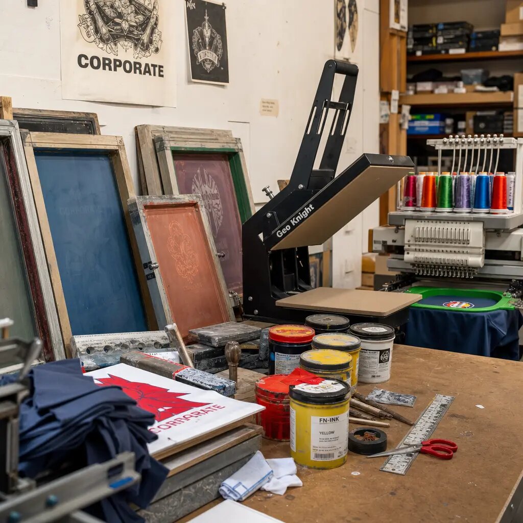
Print method selection: what actually works on canvas portfolios
For most coffee roaster logos, screen printing remains the most reliable bulk method. It handles solid marks, simple icons, and bold typography well, and it usually holds up better than transfer methods in areas that flex during opening and closing. Screen print also gives clearer quote comparison because color count, print area, and setup logic are straightforward. If your design is a one-color or two-color brand mark on natural or dyed canvas, screen print should be the default route unless there is a specific visual reason not to use it.
Heat transfer and digital print have their place, but buyers should use them for the right reasons. Heat transfer can help with short runs or finer multicolor details, yet it creates a film layer that may feel less premium on textured canvas and can crack on repeated fold points. Digital print can reproduce complex art, but on coarse canvas it often loses edge sharpness and can vary between production lots more than buyers expect. On a zipper portfolio, the main front panel is small enough that a clean, centered screen print usually looks stronger than a busy graphic that fights the fabric texture.
The biggest mistake is choosing a print method that matches the artwork file instead of the final use. A roaster brand that needs a simple, premium presentation item does not usually benefit from trying to print a tiny photo, a detailed landscape, or a multi-shade background. Those images may look impressive on screen, but once they are printed on cotton canvas they can lose contrast and look less intentional. If your creative team wants complex art, ask the supplier for a material-specific proof and insist on a test sample on the exact fabric type.
For dark canvas, ask a clear question about underbase. White or light ink on black or dark olive canvas may require an underbase or a thicker print deposit to stay legible. That can change handfeel and add cost. For natural canvas, confirm whether the raw shade varies enough that the logo may look warmer or cooler from lot to lot. If the brand needs consistency across reorder cycles, the base fabric and print recipe should be locked together, not treated separately.
It is also worth asking how the print is cured and whether the curing temperature can affect zipper tape or adjacent seams. On small canvas goods, excessive heat can distort fabric handfeel or leave a gloss change around the print zone. A supplier who can explain their curing sequence in plain terms is usually easier to manage during approval than one who only says the print is “good quality.”
- Screen print suits solid roaster logos, simple line art, and repeat bulk orders.
- Use white underbase on dark canvas only when needed; it adds cost and may stiffen the print area.
- Avoid placing fine serif text over heavy slub areas or near seam folds.
- If transfer print is quoted, request rub test and fold-area appearance after sample handling.
- Ask for a test of the smallest text size in your logo so you know what will remain readable after printing.
- Request a photo of the print under both close inspection and normal viewing distance because canvas texture can change the visual result.
Build a print proof that the factory cannot misread
A usable print proof for custom canvas zipper portfolios should show much more than a centered logo on a front view. It should include finished closed size, exact print width and height, left-right and top-bottom distances from finished edges, zipper direction, seam allowance note, and whether measurements are taken from the visible face or from the stitched edge. On this product, that difference matters. If the factory centers the print on the cut panel but the zipper seam consumes more material on one side, the finished logo drifts visually even though the operator followed the file.
Coffee brands often care about balanced presentation because the portfolio may sit on a buyer desk next to branded coffee packs, tasting cards, sample jars, or menus. To avoid argument later, the proof should state tolerance. For example, front logo placement tolerance can be plus or minus 3 mm, but if your art is small and centered on a compact panel, you may want tighter control on the top margin. Also state what is acceptable on textured fabric. A perfectly razor-sharp edge on coarse canvas is unrealistic; a clean edge without visible breaks at normal viewing distance is a practical standard.
A good proof packet should include a front-view mockup, a back-view or interior view if relevant, a sewn-panel layout if the zipper path changes the print area, and a list of material assumptions. Those assumptions should cover fabric color, print method, zipper type, puller finish, thread color, and whether a lining or pocket exists. Without that context, factories may interpret the same file in different ways and give you multiple samples that are all technically valid but visually inconsistent.
If you want fewer revisions, put the proof instructions in simple factory language. Instead of saying “center logo aesthetically,” say “center logo on the finished front panel with 25 mm clearance from the zipper seam and 20 mm clearance from the nearest outer edge, measured on the closed and flattened product.” That wording reduces debate. It also gives your inspection team something measurable to compare against when the bulk lot arrives.
For repetitive programs, keep the approved proof revision code on every document. The artwork file, sample approval sheet, purchase order, and final carton mark should all reference the same style code and date. That one habit prevents the most common sourcing error: a supplier building the right item against the wrong version of the artwork.
- Include pantone numbers plus note whether match is visual or instrument-controlled.
- State print area in millimeters and distance from finished top, bottom, left, and right edges.
- Add a note if the front panel should appear visually centered when the portfolio is zipped closed.
- Mark no-print zones near zipper tape, corner curves, or internal stitch-through lines.
- Specify whether the print should read on a flat open portfolio, a closed portfolio, or both.
- Require the supplier to annotate the proof with the final zipper pull location if it changes the visual balance.
Sample approval should separate artwork approval from construction approval
Many importers lose time because they approve a logo strike-off and a sewing sample independently, then assume the combination will be fine. On zipper portfolios, that is risky. You need at least one pre-production sample made in the actual canvas, actual zipper, actual print method, and actual internal build. A blank sewing sample can confirm dimensions and compartments, but it will not reveal how the front panel behaves after print curing or whether the print is visually centered once the zipper is installed.
For coffee roaster buyers with seasonal launches or trade show deadlines, the sample path should be compressed but not skipped. A practical flow is digital layout approval, then one physical pre-production sample with print, then final sign-off against a short acceptance sheet. If you approve by photos only, ask for front view zipped closed, front view laid flat, side seam close-up, zipper open/closed video, and a ruler in frame. That is still weaker than a physical sample, but it is better than a single glamour shot.
The sample should also be checked for practical handling. Open and close the zipper several times. Insert the documents or inserts you actually plan to use. Place the portfolio on a table and see whether the front panel remains visually flat or if the pocket stitch lines, lining seam, or zipper bulk show through. If the portfolio is intended for premium sales use, inspect how it looks when held in hand as well, because the fabric drape and zipper position can change the perceived quality.
A good sample approval record includes a signed or stamped sample reference, date, approved artwork version, approved construction notes, and a statement that bulk production must match the retained sample. Keep that golden sample in a labeled bag or box. If a dispute appears later, the approved sample becomes the most important reference in the file.
If you expect a repeat order, ask the supplier to keep the same screen, color recipe, and trim codes on file. That reduces the chance that a reorder starts from a new interpretation of the old sample. For procurement, this is a small administrative step that can save a great deal of time when the second run is placed months later.
- Sample checks should include finished size, logo position, print feel, zipper smoothness, and front panel flatness.
- On natural canvas, compare sample under daylight because warm indoor light can hide shade and print tone shifts.
- If repeat ordering, retain a sealed golden sample with date, PO reference, and approved construction notes.
- Ask for a sample with actual inserts inside if the portfolio is meant to hold documents or notebooks.
- If the logo includes thin lines, inspect the sample after a short handling period to make sure edges do not chip or lift.
- Do not approve by photos alone if the item is heading to retail or a customer-facing wholesale program.
MOQ logic and quote comparison: where the real cost moves are
Custom canvas zipper portfolios can look similar across quotes while hiding meaningful differences in fabric, print setup, and labor. MOQ usually follows the level of customization. If the supplier uses stock natural canvas and a one-color screen print, 200 to 300 pieces may be possible, though the unit price will be relatively high. Once you request custom dyed fabric, special zipper color, lining, woven label, or multiple internal components, the practical MOQ usually moves toward 500 to 1000 pieces per design because material booking and cutting efficiency start to matter.
For comparison, separate the quote into cost drivers instead of chasing one unit price. The main variables are canvas GSM, dye route, print color count, internal structure, zipper quality, label trim, packing, and inspection standard. A low quote sometimes comes from lighter fabric, smaller seam allowances, fewer print passes, or looser packing assumptions rather than from genuine efficiency. Procurement teams should compare like for like by forcing each supplier to state what is included.
Coffee roaster buyers should also think in terms of reorder continuity. If the first batch supports a product launch or sales program that may repeat later, a lower MOQ on stock fabric can be attractive, but only if the color and trim are available again. If brand consistency matters more than short-term price, a custom-dyed program may be worth the higher MOQ because it protects the look across reorder cycles. The right answer depends on whether the portfolio is a one-time campaign item or a recurring branded tool.
Ask the supplier to split the quote between one-time setup items and recurring unit cost. Screen setup, print plates, sample courier, custom zipper sourcing, and woven label tooling should be visible in the pricing. That makes it easier to understand which costs disappear on repeat orders and which remain embedded in every unit. This is especially useful when procurement teams need to justify supplier selection to finance or brand managers.
It also helps to ask whether the quote assumes one size only, one print location only, and one packaging method only. Some factories quote a low base unit and then add charges for every variation. Others absorb minor changes into labor. You need clarity before comparing suppliers, otherwise the cheapest quote is often the hardest one to execute without change orders.
- Typical cost drivers: heavier canvas, dark dyed fabric, white underbase print, lining, pockets, woven labels, and retail packing.
- MOQ usually rises when fabric is custom dyed or when multiple internal sewing operations are added.
- A quote with unspecified GSM or unspecified zipper grade is not yet comparable.
- Ask for separate pricing for stock color and custom color so you can weigh speed against brand consistency.
- Check whether the quote assumes mixed sizes or one size only, because size variation can change cutting efficiency.
- If the factory offers a much lower MOQ than others, confirm whether they are using existing stock trim or simplifying the construction.
Print-proofing checklist for coffee roasters: what to confirm before bulk
If you are sourcing for a coffee roaster brand, your proofing checklist should match the way the portfolio will actually be used. Start with the basics: finished size, closed and flat measurement, document capacity, and opening direction. Then move to the front-view brand questions: logo size, logo location, color values, and whether the mark must stay visually centered when the zipper pull sits at the top or side. Finally, cover the production questions: canvas weight, zipper grade, thread color, lining, packing format, and inspection target. Putting these together reduces the chance that one department approves the art while another later rejects the sewn piece.
A simple checklist is useful because it prevents the team from assuming the factory knows the brand intent. For example, a roaster may want a refined, understated look with a small logo and no extra branding clutter, while the factory might default to a larger print for visual impact. The difference is not minor. On a compact portfolio, logo size changes the whole balance of the product. The same is true for zipper color. A black zipper on natural canvas can create a more modern look, while a tone-on-tone zipper may feel softer and more premium. Those choices should be explicitly approved rather than left to the supplier.
It also helps to decide whether the logo should be visible on the portfolio when it is half-open. Some buyers care only about the closed look, but others use the product during meetings and want the brand to remain clear when the zipper is opened. If that matters, your proof should show both states. This is particularly important if the portfolio will be used as a sales kit or distributor folder rather than only as a storage sleeve.
The safest internal process is a three-step sign-off: brand team approves art size and style; procurement approves material, zipper, and packing details; quality or operations approves the sample against the actual use case. That way, the final order reflects what each team cares about rather than blending all decisions into one ambiguous approval email.
Below is a practical pre-bulk checklist for coffee roaster buyers. Treat it as the final gate before deposit or production release, not as a casual reminder list. If any of the items are still open, the risk of a late-stage change order is high.
- Define whether the portfolio must hold A4, letter, or custom inserts, and test with the actual contents.
- Confirm whether the logo size is measured by width, height, or both, so the factory does not resize it unexpectedly.
- Specify whether the zipper pull should sit on the top edge, side edge, or bottom edge in the closed view.
- State whether the outer face should remain smooth enough for a centered logo with no visible seam shadow.
- Ask the supplier to show the print proof against the actual fabric color, not only on a white mockup background.
- Record who signs off on artwork, who signs off on sewing, and who signs off on QC before bulk release.
QC thresholds that prevent the most common production disputes
The most common dispute on this product is not catastrophic failure; it is visual disappointment. Buyers expected a clean premium presentation item and received units with slight logo drift, front panel puckering, zipper misalignment, or print inconsistency that is hard to reject without pre-defined thresholds. Your quality plan should therefore combine functional checks with appearance limits. The factory needs to know what will trigger rework before production starts, not at final inspection.
For print-heavy portfolios, practical QC criteria include color consistency to approved standard, placement tolerance, no visible smearing, acceptable edge definition on canvas texture, and no severe puckering around the print or zipper line. Functional criteria include smooth zipper action, secure reverse stitches at zipper ends, no skipped stitches, and correct internal part alignment. If the order is for distributor channels or retail presentation, add carton-level checks so printed fronts are not abraded during transit.
A useful QC sheet should define both critical and non-critical defects. A missing zipper pull or a broken zipper is a major functional defect. A minor thread tail may be acceptable if it is within your trim standard. A 5 mm shift in logo position may be acceptable on a large portfolio but not on a compact one. By defining these differences up front, you reduce argument at inspection and give the factory a clear target.
It is also smart to inspect the first production units early rather than waiting for the full batch. A first-article check can reveal whether the print placement on the cut panel is translating properly to the sewn product. If not, the factory can correct the marker, print screen position, or sewing guide before the mistake spreads across the order.
For B2B buyers, the inspection document should be short enough for the factory to use on the line. That means numeric tolerances, simple pass/fail criteria, and photo references from the approved sample. If the QC sheet is too vague, line operators will interpret it differently from the inspection team and the result will be avoidable friction.
- Placement tolerance example: plus or minus 3 mm from approved finished position.
- Appearance rule example: no obvious print breaks visible at 50 cm under normal daylight viewing.
- Functional rule example: zipper must complete five open-close cycles smoothly with no snagging.
- Packing rule example: no print offset after packed sample carton has remained closed for 24 hours.
- Add a first-article approval step if the order is large or if the product has a complex zipper route.
- Reject any unit with oily marks, mildew smell, or visible abrasion on the print face.
Packing decisions that affect both appearance and landed cost
Packing for canvas zipper portfolios is often treated as a final administrative detail, but it directly affects delivered quality and freight cost. If units are packed too tightly, zipper pullers can rub the printed face of the next unit and leave marks. If prints are not fully cured or there is high humidity in transit, stacked fronts can offset. On the other hand, overpacking with heavy inserts, retail boxes, or low carton counts can inflate cube and push up sea or air cost more than buyers expect.
For most B2B coffee roaster programs, a flat pack with optional tissue or interleave between printed faces is enough. Individual polybags are useful when clean presentation matters, but they should be justified rather than added automatically. A common master carton plan is 20 to 40 pieces per carton depending on size, lining, and fabric bulk, with carton weight held at a level your warehouse can handle. Procurement should request carton dimensions during quotation, not after PO placement, because that data feeds landed-cost comparison.
Packing should also reflect how the goods will be received. If the portfolio will go directly to a distributor’s marketing team, a cleaner presentation pack may be worthwhile. If the item is strictly a back-office tool for document storage, the buyer may prefer a more efficient flat pack that lowers freight. Ask the supplier to quote both options if the final use is still under discussion. That makes the trade-off explicit and avoids a hidden assumption about presentation level.
When cartons are exported to humid climates or long transit routes, ask the supplier how they protect against print offset, odor, and moisture. That does not mean automatically adding expensive materials. It means making sure the packing plan fits the route. Sometimes a simple change in interleaving, carton strength, or dry storage before loading is enough to protect appearance without adding unnecessary cost.
Also confirm the carton label content before production starts. At minimum, most buyers should require style code, color code, PO number, carton number, quantity, and destination mark. If your warehouse uses barcode scanning, include the barcode format and placement on the carton face so receiving does not slow down.
- Specify whether polybags need suffocation warning, vent hole, recycling mark, or barcode label.
- If shipping to humid markets, consider silica gel only if your compliance team permits it and it is truly needed.
- Request drop-safe carton strength if portfolios include stiff inserts or premium metal pullers.
- Ask for outer carton dimensions and gross weight per packed quantity to compare freight cube across suppliers.
- Confirm whether carton marks must show PO number, style code, carton number, and quantity per carton.
- If retail presentation matters, ask the supplier to pack one unit per sleeve and then master carton, not just loose flat pack.
Lead time planning: where coffee roaster projects usually slip
Lead time risk on this item usually comes from artwork revision loops, custom dye matching, zipper color sourcing, and waiting too long to approve the printed pre-production sample. Buyers often think the portfolio is a simple sewn canvas item, then lose a week correcting print placement after the first sample arrives. If the order is tied to a launch, wholesale program, or trade event, work backward from the ex-factory date and lock the approval calendar early.
A realistic planning model is to separate development time from bulk production time. Development may include quote clarification, artwork preparation, sample making, and courier movement, plus extra time if custom dye or multiple trims are involved. Bulk production usually runs more smoothly once all decisions are frozen. The most avoidable delay is changing the logo size or pocket construction after the sample is already in review. That single change can force a new screen, new sewing adjustment, or a revised packing plan.
Coffee roaster buyers should also plan around reorder timing. If the portfolios support a seasonal launch, the first run may be small and fast. If the item becomes part of a recurring wholesale kit, the second order should be planned early enough to avoid stock-out while the factory resets materials. For repeat orders, keep the approved sample, the file version, and the material record together so the next quote does not restart from scratch.
Ask the supplier to give you a development calendar in plain language. It should show when artwork must be frozen, when sample approval is due, when fabric is booked, when bulk starts, when first inspection occurs, and when packing is complete. That calendar becomes much easier to manage than a generic “lead time 30 days” answer that does not explain where the time is actually spent.
If your timeline is aggressive, ask the supplier to identify the critical path items. On this product, those are usually fabric availability, print screen preparation, and sample approval turnaround. Knowing the bottleneck lets procurement protect the schedule with earlier decisions instead of hoping the factory can accelerate everything at the end.
- Typical sample timing example: 5-10 days for a pre-production sample after art and material details are confirmed.
- Typical bulk timing example: 25-40 days after sample approval, depending on fabric route and order volume.
- Schedule risk increases with custom dye, multiple SKUs, mixed print methods, or retail labeling requirements.
- Build in extra time if you need a sample shipped internationally for physical approval.
- Do not promise event deadlines until the sample has been signed off and material bookings are confirmed.
- If the factory needs to source a special zipper puller or custom zipper tape color, ask how that affects the start date.
Specification comparison for buyers
| Spec decision | Recommended option | When it fits | Buyer risk to check |
|---|---|---|---|
| Canvas weight | 12 oz to 14 oz canvas, about 340-400 GSM | Best for a structured portfolio that carries cupping sheets, notebooks, sales documents, and slim tablets without feeling flimsy | Below 300 GSM can wrinkle around the print and expose zipper wave; above 450 GSM may raise sewing cost and reduce print smoothness |
| Base fabric color | Dyed black or dark olive for premium look; natural canvas for lower dye cost and eco-style branding | Dark dyed fabric suits bold white logos and hides warehouse dust; natural canvas suits earthy coffee branding and simpler graphics | Natural canvas shade can vary lot to lot; dark dyed canvas may need underbase printing and can show crocking if dye fixation is weak |
| Print method | Screen print for solid logos; heat transfer only for small multi-color graphics; digital print only for full-panel art trials | Screen print is the most stable route for repeat bulk orders of roaster logos and event portfolios | Heat transfer can crack on fold zones; digital print may shift color and lose crispness on textured canvas |
| Artwork placement | Keep main logo at least 25 mm from zipper seam and 20 mm from edge fold | Protects visual centering and avoids distortion from seam bulk on zip-around portfolios | Factories may center to cut panel, not finished product; proof must show placement against finished size and seam allowance |
| Zipper specification | Nylon coil zipper #5 with dyed-to-match tape and metal puller | Good balance of cost, smooth running, and consistent bulk supply for portfolios | Cheap zipper tape can shrink after finishing; confirm pull test, slider brand or equivalent grade, and color tolerance |
| Inner construction | Single lining with document pocket or pen loop only if actually needed | Works when portfolios are used as sales kits, coffee training folders, or distributor presentation packs | Extra compartments raise MOQ and assembly time; internal parts can telegraph through front panel and affect print face |
| MOQ route | 500-1000 pcs per design for custom dyed fabric and screen print; 200-300 pcs possible using stock canvas colors | Best for roasters ordering for wholesale reps, launch kits, or retail merchandise in planned batches | Very low MOQ often means limited color choice, mixed material lots, or higher unit cost that distorts quote comparison |
| Packing style | Individual polybag only if required, then 20-40 pcs per export carton with flat pack and tissue between prints | Suitable for B2B shipments where clean presentation matters but master carton efficiency still matters | Overpacking increases cube and landed cost; no interleaving may cause print offset or zipper rubbing in humid transit |
Buyer checklist before sampling
- Define finished portfolio size in millimeters and state whether dimensions are taken when closed and laid flat.
- Specify canvas weight in GSM or oz, plus whether fabric is natural, dyed, washed, or laminated.
- State print method preference and acceptable alternatives for your artwork type.
- Include pantone references for all print colors and note if visual match is required on natural canvas.
- Provide artwork placement from finished edges, not only from cut panel centerlines.
- Identify zipper type, zipper color, puller finish, and whether opening is three-side or top-side only.
- Clarify whether the front panel must stay smooth with no internal pocket stitch lines showing through.
- Approve pre-production sample against both print proof and sewn construction sample, not artwork alone.
- State carton quantity target, export carton size limit, and whether retail barcode labels are needed.
- Set acceptable AQL or functional QC points for print registration, zipper performance, seam margin, and shade consistency.
Factory quote questions to send
- What canvas weight are you quoting, and what is the actual GSM tolerance by lot?
- Is the quoted fabric stock color or custom dyed? If stock, how stable is replenishment for repeat orders?
- Which print method is included in the price, and how many print colors and print positions does that include?
- Will you provide a digital print layout plus a physical pre-production sample showing true fabric, true zipper, and actual logo size?
- What is the standard placement tolerance for the front logo relative to finished edges and zipper seam?
- What zipper grade are you using, and do you test opening and closing on 100 percent of units or by sampling?
- How does adding a lining, pocket, pen loop, or woven label change MOQ, unit cost, and production days?
- What packing is included in the quote: individual polybag, tissue, silica gel, inner carton, or carton marks?
- What are the carton dimensions and gross weight at the quoted pack quantity per carton?
- What are the lead times for sample, artwork proof, bulk fabric booking, production, and final inspection readiness?
Quality-control points to confirm
- Logo placement within agreed tolerance, commonly plus or minus 3 mm from approved position on finished product
- Print color match against approved pantone or signed physical standard under daylight conditions
- No obvious ink pinholes, smudging, ghosting, or edge saw-toothing visible at normal review distance
- Canvas GSM and handfeel consistent with approved sample, with no excessive slub concentration on print area
- Zipper runs smoothly through full opening cycle with no skipped teeth, tape twisting, or puller detachment
- Front panel lies reasonably flat with no severe puckering caused by zipper insertion or print curing distortion
- Stitch density, seam margin, and corner reinforcement consistent across lot, especially at zipper ends
- Internal pockets or pen loops aligned and securely stitched with no needle damage or loose threads
- Carton count, carton marks, and barcode labels match packing plan and PO requirements
- No print offset, abrasion marks, mildew odor, or moisture damage after packed-carton spot check