Why print-method choice matters more than most tote buyers expect
For boutique programs, the decoration method is not a styling detail. It changes setup cost, speed, minimum order quantity, reprint risk, and the final shelf impression. Two quotes can look close in price and still represent very different products if one uses a low-cost screen print on stocked 12 oz canvas while the other relies on a transfer process, heavier fabric, and retail-ready folding. Buyers who compare only the unit price usually discover the gap after sampling, not before.
The commercial question is straightforward: what print method gives the right balance of appearance, durability, lead time, and margin for this specific boutique channel? A resale tote placed on a boutique shelf needs clean edge quality, believable color, and a finished look that supports retail pricing. A gift-with-purchase tote may prioritize speed and low tooling cost. A seasonal capsule may require fast art changes. The best method is the one that matches the use case instead of forcing the art to fit the factory’s easiest line.
This is why procurement teams should separate three decisions. First, define the bag body and canvas weight. Second, decide the decoration method. Third, define packing and QC. If those are blended together, the supplier can underquote one variable and recover the margin later through packing changes, weaker materials, or a decoration method that is cheaper for them but not right for your channel.
- Do not compare tote quotes until the fabric, size, and decoration method are frozen.
- Retail presentation matters as much as carrying function for boutique resale.
- The cheapest decoration method on paper is not always the lowest-risk option in production.
Start with the body spec: canvas weight, bag construction, and display behavior
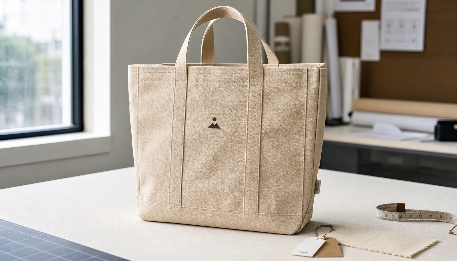
A good print-method comparison starts with the tote body because the bag structure determines how the decoration will behave. For most boutique programs, 10 oz to 16 oz canvas is the practical range. Around 12 oz is a common commercial middle ground: it is heavy enough to feel credible, light enough to keep costs manageable, and versatile enough for screen print, transfer, and some embroidery applications. When the brand wants a more substantial retail feel, 14 oz or 16 oz canvas makes the tote stand up better in display and reduces the limp look that can make a printed bag feel promotional rather than premium.
The construction details matter just as much as the fabric weight. Define the exact finished width, height, gusset depth, handle length, handle drop, seam allowance, and whether the handles are self-fabric or webbing. If you intend to print near the upper body or across a large front panel, leave enough room so the artwork does not land on a seam or fold line. Printing across a seam increases the chance of distortion and makes it harder to judge print placement consistently in bulk.
Buyers should also decide whether the tote needs to stand open on a shelf. A thicker canvas and a more structured bottom seam improve display, while a lightweight bag may collapse and hide the print. For boutiques, that presentation issue is not cosmetic fluff; it affects how the tote reads to shoppers from two or three meters away and how likely it is to be picked up.
- 12 oz canvas is a common baseline for boutique tote sourcing.
- 14 oz to 16 oz canvas usually supports a more premium shelf impression.
- Keep logos clear of seams, folds, and handle stitch points whenever possible.
Print-method comparison matrix: screen print, transfer, DTG, embroidery, and woven labels
For custom canvas tote bags for boutiques, the decoration method should be chosen by artwork and order profile, not by habit. Screen print remains the best-value choice for many simple logo programs because it scales well and gives good opacity on canvas. It is especially strong when the design uses one to four spot colors, consistent Pantone targets, and repeat orders over multiple seasons. The key procurement advantage is predictability: once the screen count and ink formula are locked, replenishment is easier to repeat.
Heat transfer is the short-run flexibility option. It is useful when the design changes frequently, when the artwork has gradients or small details, or when the launch quantity is too low to justify multiple screens. The tradeoff is finish quality. On textured canvas, some transfers feel more plastic than the fabric around them, and edges can lift if the film or application conditions are not controlled tightly. Buyers should insist on a physical sample tested under the intended handling conditions, not just a digital proof.
DTG is best treated as a specialty method for selected applications, not a universal tote solution. It can reproduce complex art on lighter or smoother canvas, but coarse weave, color variation, and pre-treatment inconsistency can all affect result quality. If the boutique wants a graphic-heavy seasonal bag, DTG can work on the right substrate. If the bag is meant to look like a premium retail staple, the buyer should weigh whether the print surface is consistent enough to justify the method.
Embroidery and woven labels are often the better premium-brand answer when the front face does not need full-image decoration. Embroidery adds texture and perceived value, but it can distort on thick canvas or near high-stress areas. Woven labels are excellent for subtle branding, side placement, or hybrid constructions where the front panel stays clean and the brand cue moves to the seam or trim. In boutique sourcing, these methods are often used not because they are the cheapest, but because they make the product look intentional on shelf.
- Screen print: strongest all-around option for simple logos and repeat replenishment.
- Heat transfer: best when art changes often or the run is too small for screen economics.
- DTG: useful for complex full-color art on suitable canvas, but test the weave first.
- Embroidery: premium tactile branding, but watch for puckering and stitch distortion.
- Woven labels: subtle, durable brand identification with high retail credibility.
Deep comparison table: what changes in cost, durability, and presentation
The table below compares the methods buyers actually have to choose from. Use it when reviewing quotes so the supplier has to defend the method in practical terms. The goal is not to find the “best” method in the abstract. The goal is to identify the method that fits the art, the quantity, the fabric, and the boutique channel.
A good supplier should be able to explain why one method is better for your logo than another. If the answer is only “we can do all of them,” the quote is still incomplete. Ask for the same bag spec, same print area, and same packing format across all methods before you judge price.
| Method | Typical MOQ fit | Typical artwork fit | Strengths | Main watchouts | Best buyer question | |---|---:|---|---|---|---| | Screen print | Medium to high | Spot colors, logos, bold text | Low unit cost at scale, strong opacity, good repeatability | Setup cost, color registration, cure quality | What is the screen count and how will you verify color match? | | Heat transfer | Low to medium | Full color, gradients, seasonal art | Fast changeovers, lower tooling, good for short runs | Hand feel, edge lift, lower abrasion tolerance | What rub or flex test do you use after application? | | DTG | Low to medium | Detailed art on lighter canvas | No screens, strong detail reproduction, useful for tests | Texture issues, color consistency, pre-treatment variability | Which canvas weight and surface finish gave you the approved result? | | Embroidery | Low to medium | Simplified logos, icons, initials | Premium look, tactile finish, durable branding | Puckering, stitch distortion, thread limits | What backing and stitch density will you use on 12 oz or heavier canvas? | | Woven label | Any, often low to medium | Small branding, side or seam placement | Clean premium branding, durable, repeatable | Size limits, fold/edge finish, placement consistency | How will you control label placement and edge quality across the lot? |
- Treat the table as a quote filter, not a design preference chart.
- Ask the supplier to quote the exact same bag body under each method if you are comparing options.
- Method choice should be driven by art complexity, order size, and desired shelf presentation.
When screen print is the right answer for boutique tote programs
Screen print is the most commercial option when the design is simple and the order will repeat. A clean one-color logo or a two-color brand mark on natural canvas usually prints sharply, cures reliably, and keeps the per-unit cost attractive once setup is spread across volume. If the boutique chain plans to reorder the same style through the season, screen print is often the best match because the process can be documented and repeated with less variation than many short-run alternatives.
For procurement, the real screen-print advantage is control. You can specify ink opacity, Pantone references, placement from fixed edges, and the number of screens involved. The factory can then price screens, test the strike-off, and produce a controlled batch. This is especially useful on natural canvas, where the weave and flecking can make a weak print look washed out. A properly built opaque screen print hides much of that background texture and delivers a cleaner retail image.
Screen print is not the best answer for everything. If the artwork contains photographic detail, fine gradients, or many color transitions, the setup can become cumbersome and costly. Buyers should also watch for print crossing folds, because repeated folding in the same location can create wear lines over time. For a boutique tote that needs to look premium and last through customer use, keep the print where the bag stays relatively flat.
- Best for simple logos, repeat replenishment, and brand colors that need stability.
- Ask for an approved strike-off with confirmed ink opacity before bulk release.
- Avoid placing the main print across seams or hard fold lines.
When transfer or DTG makes sense, and how to avoid disappointment
Transfer and DTG are often selected because the artwork is too detailed for easy screen printing or because the order size is too small to justify screens. That can be a smart procurement decision, but only if the buyer understands the tradeoffs. On canvas, both methods depend heavily on surface texture. A rough weave can soften fine detail, make edges appear less crisp, or create a less luxurious touch than the buyer expected from the rendering.
Heat transfer works best when the print area is not too large and the artwork can tolerate a more film-like feel. The buyer should ask whether the transfer uses a matte or gloss finish, whether the edges are cut cleanly, and whether the factory has tested flexing at the bag fold line. A transfer that looks good on a flat sample can still crack or lift after folding, packing, and customer handling.
DTG is more selective. It can produce strong results on lighter, smoother canvas, but the supplier should prove that the pre-treatment, curing, and wash or rub performance are stable. If the canvas is too rough or too dark, the art can lose clarity or brightness. Buyers should not judge DTG from a digital file alone; they need a physical strike-off on the same fabric lot or as close to it as possible.
If the brand expects the tote to feel like a premium retail product rather than a printed promo item, the buyer should also consider whether the front panel needs less print and more brand finishing. In some cases, a minimal transfer or DTG graphic paired with a woven label, side seam label, or premium hangtag gives a better commercial result than trying to force a full-image print onto a coarse bag.
- Ask how the print behaves after folding, not only how it looks flat.
- Transfer and DTG need real fabric samples, not just art proofs.
- If the tote must feel premium, consider reducing front coverage and adding a woven label or side brand mark.
Embroidery and woven labels: premium cues with different production risks
Embroidery can be an excellent choice for boutique programs that want a tactile, higher-end finish. It is durable, visually distinct, and often perceived as more premium than ink on canvas. The downside is that embroidery adds thickness and can distort on heavy fabric if the design is too dense or too close to a seam. Buyers should keep the design simple, define the stitch density, and check whether a backing stabilizer is needed to prevent puckering. A nice mockup is not enough; the sample must be examined after trimming and folding so the raised stitching does not affect the bag’s shape.
Woven labels are less about decoration than about brand identity and quality cues. They are effective on the side seam, near the handle, or as an interior brand detail when the front panel should stay clean. A woven label can elevate the tote without adding much risk to the bag face, but it still needs careful control. Ask for label dimensions, edge finish, fold style if applicable, and whether the label is sewn in at a stress-free location. Poorly cut or frayed labels can make the bag look cheaper, not better.
For many boutiques, the best answer is a hybrid build: a restrained front print paired with a woven label or a small embroidery detail. That approach can help the product look branded without overloading the canvas with decoration. It also gives the buyer more control over how the tote reads at distance versus in-hand, which matters when the bag is displayed on a shelf, on a counter, or in an ecommerce product photo.
- Embroidery needs stitch-density control and anti-pucker planning.
- Woven labels are strongest when used as a brand cue, not a large decorative panel.
- Hybrid decoration can improve perceived value without increasing print complexity too much.
Cost drivers buyers should isolate before comparing quotes
To get apples-to-apples pricing, buyers need to isolate the variables that actually move cost. The biggest ones are fabric weight, bag dimensions, number of print colors, decoration coverage, packing format, and whether the order is a one-off or a repeatable replenishment style. A quote for a 12 oz natural tote with one front print and bulk packing is not comparable to a quote for a 16 oz tote with full-color decoration and retail folding, even if both use the same bag size.
Setup charges can be the hidden difference. Screen print often looks more expensive at small quantities because each color requires a screen and setup time. Heat transfer may look cheap until the per-unit application cost is counted. Embroidery may require digitizing, stitch programming, and test runs. Woven labels may add a separate trim order and sewing labor. Buyers should ask suppliers to separate material cost, decoration cost, packing cost, and any one-time setup fees so the pricing structure is visible.
Another often-overlooked cost driver is yield loss. If the artwork is large, crosses a fold, or demands high registration accuracy, the factory may allow more waste for setup and QC rejects. That waste is usually built into the quote in some form. A supplier who cannot explain yield assumptions may still deliver the bags, but the buyer will not know whether a low quote is the result of a more efficient process or simply a thinner allowance for mistakes.
- Normalize fabric weight, bag size, decoration area, and packing before comparing prices.
- Separate setup fees from recurring unit cost.
- Ask each supplier how much waste or reject allowance is built into the quote.
How to write an RFQ that gets a usable print comparison instead of a vague price list
A strong RFQ should force the supplier to quote the same tote in the same way. Include the finished bag dimensions, canvas weight, color, handle construction, print area, logo file format, Pantone references, decoration method, packing style, and target delivery window. If you want a genuine print-method comparison, ask the factory to quote at least two acceptable methods on the same spec so you can compare setup cost, unit cost, and lead time with no hidden changes to the bag body.
The quote request should also define the commercial intention. Is this a core reorder item, a seasonal launch, a gift-with-purchase item, or a premium retail SKU? Each use case changes the method choice. A supplier can then recommend screen print for a core logo style, transfer for a seasonal graphic, or woven label plus minimal print for a premium line. When the use case is explicit, the quote is more likely to reflect the right process rather than the factory’s default process.
Avoid generic wording like “good quality” or “premium print.” Those phrases are too broad to help procurement. Replace them with measurable terms: placement 80 mm below the top edge, logo width 120 mm, bulk packed 100 pcs per carton, surface to pass a defined rub test, and sampling required before bulk. The better your RFQ language, the easier it is to challenge a quote that looks cheap only because it quietly omits important work.
- Quote the same tote spec across all methods you want compared.
- State the use case: core reorder, seasonal launch, gift item, or premium retail SKU.
- Replace vague quality language with dimensions, tolerances, and test expectations.
Sample approval rules that prevent rework and argument later
Sampling should have three stages: blank sample, decorated sample, and packed reference sample. The blank sample confirms the physical tote: fabric hand, dimensions, seam quality, handle length, and overall symmetry. The decorated sample confirms color accuracy, placement, coverage, and whether the decoration sits cleanly on the chosen canvas. The packed sample confirms the commercial reality: fold, carton fit, label placement, and whether decoration is damaged by the packing process.
The buyer should approve sample dimensions in writing. For example, if the logo is centered and placed 85 mm below the top edge on the approved sample, that measurement becomes the production reference, with a stated tolerance. If the art must stay fully above a side seam or clear of a handle stitch line, say so in the approval notes. If the supplier needs room to adjust by a few millimeters, define that range now instead of debating it after the first bulk cartons arrive.
It is also smart to retain a physical signed reference sample. Photos are useful, but they do not show print feel, ink sheen, edge sharpness, or fabric texture. A signed reference sample helps quality teams judge whether the lot matches the approved standard. That reference should travel with the order file, inspection instructions, and purchase order so production, third-party inspection, and receiving all work from the same target.
- Approve blank, decorated, and packed samples before bulk release.
- Write placement and dimension tolerances into the approval note.
- Keep one physical reference sample tied to the order file.
Specification comparison for buyers
| Decoration method | Best order profile | Strengths for boutiques | Buyer risks to verify |
|---|---|---|---|
| Screen print | 1,000+ units; 1-4 spot colors; repeatable core styles | Lowest unit cost at scale; strong opacity on canvas; stable Pantone control; good for replenishment | Check screen setup charges, color registration tolerance, cure quality, and whether art crosses seams or folds |
| Heat transfer | Very short runs; full-color art; fast seasonal drops; frequent design changes | Low upfront tooling; good for detailed graphics; easy design changes between drops | Check feel/hand, edge lifting, wash/rub durability, and whether the film looks glossy on textured canvas |
| DTG | Light-colored, smoother canvas; small-to-mid runs; complex gradients or photo art | Best for full-color complexity; no screen setup; useful for test programs | Check print sharpness on woven texture, pre-treatment consistency, and abrasion resistance after cure |
| Embroidery | Premium retail bags; logos that can be simplified; gift-with-purchase or higher-ticket resale | Tactile, durable branding; strong perceived value; no ink cracking | Check stitch density, puckering on thick canvas, thread color limits, and distortion near seams |
| Woven label | Brand-led boutique programs; minimal front decoration; premium presentation | Excellent for subtle branding; durable; good on repeat styles and private label | Check label size, fold quality, edge fray, and placement consistency across lots |
| Hybrid print + label | Retail collections that need a decorative face and a premium brand cue | Balances cost and shelf appeal; useful when front artwork should stay simple | Check whether two vendors or two processes create quality gaps, delays, or extra handling cost |
Buyer checklist before sampling
- Freeze the finished tote spec before comparing decoration quotes: bag dimensions, fabric weight, handle length/drop, closure, and packing format.
- Specify the decoration method by name and include a fallback option only if both methods are acceptable to the brand.
- Send vector artwork, Pantone targets, print size, and exact placement measured from the top edge and side seam.
- Ask for a blank sample, a decorated strike-off or pre-production sample, and one packed reference sample.
- Require the supplier to state setup charges, screen counts, color separations, and whether the quote includes one approval revision.
- Define a rub-test expectation, a placement tolerance, and a defect list before bulk production starts.
- Ask for carton pack-out counts, barcode placement, and whether the bag will be folded with tissue, insert card, or in bulk.
- Record who signs off on art, sample, and pre-shipment inspection so the production reference is clear.
Factory quote questions to send
- What exact canvas weight are you quoting, and is it finished fabric weight or raw/greige weight?
- Which decoration method is priced, and if alternatives are offered, what changes in setup, lead time, and unit cost?
- How many screens, color separations, or machine passes are included, and what are the extra charges if artwork changes?
- What placement tolerance do you hold for the logo in millimeters from the top edge and side seam?
- What is your standard cure or fixation process for the print, and how do you verify it before packing?
- Can you provide a blank sample, a decorated strike-off, and a pre-production sample with measurements marked?
- What are the handle reinforcement details, stitch type, and stress-point construction at the anchor points?
- What packing format is quoted, and how does it affect carton size, freight, and shelf presentation?
- What is the MOQ per design, per colorway, and per print method, and can mixed designs share the same fabric base?
- What is the lead time after sample approval, and which materials or processes are the usual delay points?
Quality-control points to confirm
- Use cut-and-weigh verification for fabric weight on incoming or pre-production samples; do not rely on hand feel alone.
- Check overall bag dimensions, handle drop, and symmetry; allow only the agreed dimensional tolerance between sample and bulk.
- Inspect print placement against a measured template; reject obvious skew, drift, off-center logos, or inconsistent top margins.
- For solid ink areas, verify opacity against the canvas weave and confirm no heavy show-through where the artwork requires solid fills.
- Perform a dry rub test on the strike-off and a light abrasion test on the decorated sample; note any visible color transfer or edge wear.
- Inspect cure/fixation by flexing the printed area and checking for cracking, powdering, tackiness, or edge lift after folding.
- Examine seam quality, bottom seam reinforcement, and handle joins for skipped stitches, loose threads, or weak bar-tacks.
- Check for packing damage: crease marks across the print, bent corners, dirty polybags, wrong inserts, or inconsistent fold orientation.
- Verify carton labels, SKU marks, and counts against the purchase order; record any overages, shortages, or mixed cartons.
- Reference an inspection standard such as AQL 2.5 for major defects and AQL 4.0 for minor defects if your program uses third-party inspection, then define what counts as a major versus minor tote defect.