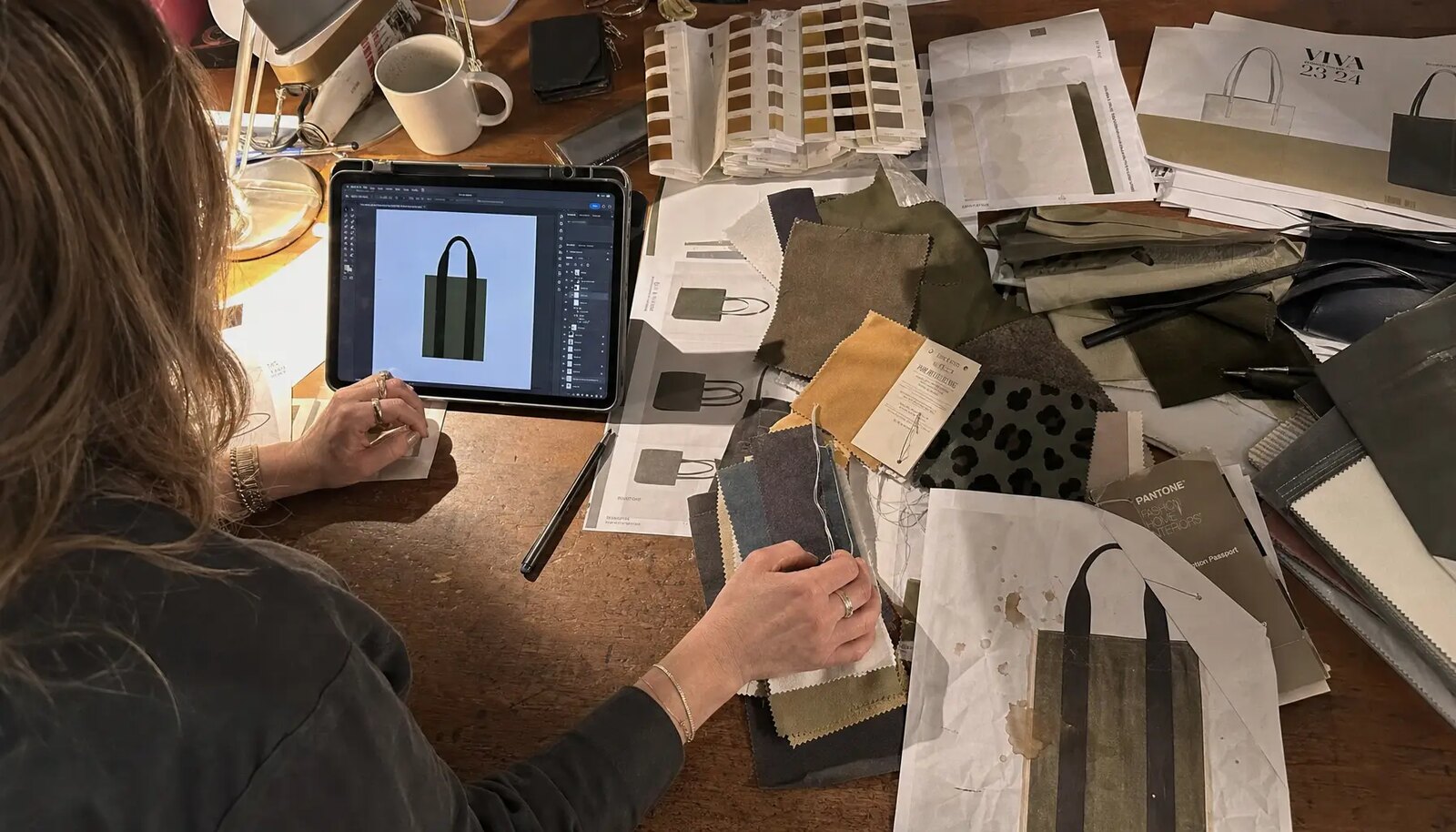
Why print proofing fails on canvas grocery totes
Eco apparel brands often lose time on tote approvals because the first proof is treated like paper insert artwork or a simple promo bag mockup. Canvas is not a flat coated sheet. It is textured, absorbent, and sewn from multiple panels. A logo that looks sharp in a PDF can print softer, darker, wider, or slightly uneven once ink hits 10 oz or 12 oz cotton canvas. Grocery totes also have a structural job to do, so seams, gussets, and handle stitch zones affect where artwork can sit cleanly and how the finished bag looks when it is full.
The real risk is not only color matching. It is proving the interaction between fabric weight, weave texture, print method, panel dimensions, seam placement, and packing. If any of those are missing from the RFQ, one factory may quote a heavier body with solid screen print while another prices a lighter body and a different print method that looks acceptable in a photo but behaves differently in bulk. A strong proofing process must lock the visual result before mass production, not after cartons are already committed.
For procurement buyers, the first mistake is assuming that a proof is only for artwork approval. On canvas, the proof also validates whether the production route can repeat the same logo sharpness, opacity, and placement at scale. The second mistake is approving a sample without measuring it. If the print sits 12 mm higher than expected or the handles are 15 mm shorter than the agreed spec, the tote can still look acceptable in a photograph while failing retail presentation standards.
A third common failure point is treating every supplier as if they are quoting the same bag. Canvas grocery totes can be made with different GSMs, yarn counts, stitch strengths, handle constructions, and print methods. If those changes are not visible in the RFQ, the sample may arrive looking close enough while the bulk run drifts in strength, color, or hand feel. The most efficient proofing discipline is to make every assumption visible before sampling begins.
For eco apparel brands, this matters even more because the tote often carries brand equity, not just utility. A grocery tote may sit beside apparel, hang tags, or retail packaging that already follow a defined color standard. If the tote logo is off by even a small amount, the mismatch is easy to notice. The proofing checklist should therefore control both the bag and the print path from the start.
- Canvas absorbs ink differently than coated paper or polyester surfaces.
- Natural cotton shade variation can change perceived print color density.
- Large tote panels may look centered flat but shift visually once the gusset is filled.
- Handle stitch boxes can interfere with top-positioned artwork if margins are too tight.
Start with the bag spec before you review the print
Print proofing is only reliable when the physical bag specification is already stable. For most reusable grocery totes, a good starting point is 10 oz to 12 oz canvas, roughly 280-340 GSM, because that range balances structure, printability, and cost. Lighter 6 oz to 8 oz options can work for giveaways or short campaigns, but the print surface is more pliable, the bag body can look limp on shelf, and show-through from the reverse panel becomes more likely. If your brand expects repeated grocery use, the heavier range usually reduces complaint risk better than chasing the lowest unit price.
Dimensions need to be fixed early because artwork placement changes with panel size and gusset depth. A typical grocery tote might be around 35-40 cm wide, 35-38 cm high, with a 10-15 cm bottom gusset, but those are examples only. The important point is to define whether print placement is measured on the cut panel or the sewn finished bag. A 15 mm difference is minor in a poster design but noticeable on a front logo when bags are stacked at retail or carried on body.
Handle construction also affects the print area. If the handles start too low or the stitch reinforcement extends too far down, the top portion of the printable front panel shrinks. Buyers should ask the factory to mark the printable rectangle on the pattern or on a pre-production template before sample sewing begins. That simple step avoids a common scenario where a logo approved on the mockup is later moved down to clear stitch zones and ends up visually too low on the finished tote.
If the bag includes pockets, binding, lining, or a board insert, those features should be written into the spec because they alter how the bag hangs and how the print reads. Even a small inside pocket can pull the front panel slightly or alter seam tension. On canvas grocery totes, the product is simple enough that every added feature matters. The RFQ should describe the bag as a complete manufactured item, not just a logo on a rectangular body.
The best practice is to freeze the bag spec before the first sample is quoted. Once size, fabric, handle, and construction are fixed, the print proof becomes meaningful. Without that order, you can end up debating artwork revisions that were really caused by a changed bag body, not a changed design.
- Typical buyer starting point: 100% cotton canvas, 280-340 GSM for reusable grocery use.
- State finished size flat and expanded if the bag has side or bottom gussets.
- Define handle length and width because top panel shape can change when the bag hangs.
- Note whether the bag includes inner hem, binding, pocket, or bottom insert that affects printable area.
- Ask the supplier to mark the safe print zone on a pattern sheet before sampling.
Choose the print method based on artwork and order size
For most eco apparel brand grocery totes, screen printing is still the most stable choice for solid-color branding. It handles logos, short phrases, and simple graphics well, gives good opacity on cotton canvas, and usually scales best at medium to high volumes. Heat transfer can hold finer detail and more colors, but hand feel, edge durability, and unit cost can differ materially. Direct digital printing can be useful for lower MOQs or artwork with gradients, but on canvas it may produce softer edges and stronger interaction with weave texture.
The quote should not simply say printed logo included. It should state the method, number of colors, approximate print area, and whether a white underbase is needed on dyed fabric. A low quote sometimes hides a method change that looks acceptable in a digital mockup but changes the product in person. For example, a dark green logo on natural canvas may look richer in screen print than in digital print, while a fine-line illustration may lose detail in a coarse weave unless the artwork is simplified for the substrate.
Buyers should also define what is acceptable if the artwork needs to be edited for production. A factory may suggest thickening thin lines, removing tiny knockout areas, or reducing a gradient. Those changes may be necessary and reasonable, but they should be approved before printing starts. Otherwise the sample and the approved file no longer match, which creates a dispute if the result is technically printable but visually different from the retail concept.
As a procurement rule, match the print method to the use case. If the tote is a seasonal brand giveaway, a slightly softer digital result may be acceptable. If it is part of a paid retail program or a branded wholesale pack-out, screen print or a controlled transfer method may be more suitable because repeatability matters more than speed. The right method is the one that protects consistency across the full run, not the one that wins the first quote on paper.
Do not forget curing or fixation. On canvas, a print can look finished while still needing enough dwell time to avoid blocking, smearing, or gloss inconsistencies. Ask the factory how they cure the print and how they confirm that the ink is dry enough for folding and packing. This is especially important for large solid areas, which can trap moisture or tackiness longer than a small logo.
- Screen print: best for solid colors, strong opacity, and repeatable bulk output.
- Heat transfer: useful for multi-color detail, but evaluate hand feel and crack resistance.
- Digital print: useful for small runs or complex artwork, but edge softness on canvas should be expected.
- Large flood coverage increases drying time, rub risk, and unit cost.
- If the artwork contains tiny type, ask the factory for a minimum line and font size recommendation.
How fabric color and GSM change the approved artwork
Buyers often approve artwork on a white screen and then object when the same Pantone appears warmer or duller on natural canvas. That is normal. Natural cotton fabric is not a pure white base, and heavier canvas can absorb and spread ink differently than lighter sheeting. Even optical white fabric can vary by mill and finishing method. If your apparel brand has a strict seasonal palette, the print must be approved on the actual fabric color and weight, not on substitute cloth.
GSM affects print edge quality and color saturation. On a tighter, heavier weave, simple logos usually print with more stable edges and better opacity. On a lighter open-weave canvas, tiny gaps and pinholes are more common, especially in large solid areas. Neither result is automatically defective if expectations were aligned, but the acceptance criteria must be written. Buyers should decide before sampling whether they want a cleaner, heavier retail hand or a lighter, softer, lower-cost body with more visible canvas texture coming through the ink.
When a supplier says natural canvas, ask what that means in practice. Natural can range from a warm beige to a slightly speckled off-white depending on fiber source, yarn processing, and finishing. That variation changes how a printed logo reads. On a brand with strict color controls, the safest path is to approve one retained fabric swatch and reference it in the PO. If a later bulk lot drifts from that swatch, the buyer can reject or negotiate before the full run is packed.
It is also worth clarifying whether the fabric is pre-shrunk or whether the factory expects post-sew shrinkage to be within a set range. Shrinkage can change not only size but also print appearance because the weave tightens after washing or finishing. For eco apparel brands, that matters if the tote is sold as a lifestyle item alongside garments and packaging that already follow tighter brand color controls. The print proof should therefore include both appearance and substrate assumptions.
Another source of confusion is the body-to-handle fabric match. Some suppliers use the same canvas weight for the handles, while others switch to webbing or a denser strip for extra strength. Either option can be fine, but the RFQ should say exactly what is used, because handle material and thickness affect both comfort and production cost. When the sample arrives, the buyer should verify that the handle material matches the approved spec, not only that the logo looks right.
- Natural canvas gives an earthy look but shifts bright colors warmer or duller.
- Optical white increases color brightness but may cost more than natural.
- Heavier canvas generally supports more stable print coverage.
- Approvals should reference both Pantone and actual strike-off appearance on fabric.
- Ask whether fabric is pre-shrunk, enzyme-washed, or unfinished because that changes print behavior.
What a proper proofing sequence looks like
A reliable proofing sequence for custom canvas grocery totes usually has three stages: digital layout approval, physical print strike-off, and pre-production sample. The digital layout confirms art size, panel position, and seam clearance. The strike-off shows how the ink behaves on the actual fabric. The pre-production sample then confirms the complete bag, including sewing, print placement, handle construction, and packing assumptions. Skipping one step can be acceptable on a repeat order with no spec change, but it is risky for a first run or a seasonal retail launch.
The strike-off stage is where many errors can still be corrected cheaply. If the print reads too dark, too transparent, too close to the seam, or too rough at the edge, the factory can adjust screen mesh, ink deposit, curing, or artwork line weight before sewing bulk units. Once the buyer moves directly from PDF to full sample, the team tends to focus on the complete bag and may miss subtle print issues until after mass production starts. Good proofing isolates variables in the right order.
Digital layout approval should not be treated as a trivial admin step. It should confirm the actual printable width and height, the distance to the top seam, the centered position relative to the bag body, and any relationship between the artwork and gusset fold line. Buyers should also ask the factory to note whether the artwork will be printed on one panel or both. A logo that appears centered on the front may look off-balance if the back panel is left blank while the front panel is wide and tall.
The pre-production sample is the last chance to compare the approved print with the sewn and packed product. At this point, the buyer should inspect the bag in hand, hang it, place an item inside if relevant, and check how the print reads in a realistic use condition. This matters because a flat tote on a table can hide misalignment that becomes obvious once the bag is filled. The proofing checklist for eco apparel brands should therefore include flat measurements and in-use visual checks, not one or the other.
For repeat orders, retain a sealed golden sample and attach it to the commercial spec. If a later bulk lot is questioned, both sides can compare against the same reference. That simple discipline reduces disputes over what was approved, especially when multiple print colors, seasonal artwork, or multiple sourcing regions are involved. If a supplier cannot keep a controlled reference, ask how they will reproduce the same result six months later when staff, screens, or fabric rolls have changed.
- Stage 1: PDF or AI layout with exact print dimensions and seam margins.
- Stage 2: Strike-off on production fabric using final print method.
- Stage 3: Pre-production sample using approved fabric, print, sewing, and labels.
- For repeat orders, approve against retained golden sample and updated lot references.
- Record who approved each stage and on what date to avoid later ambiguity.
Sample approval criteria that reduce bulk disputes
Approval should not be a vague email saying the sample looks good. It should define what was approved and what tolerance is acceptable in production. For grocery totes, print placement should be measured from a stable reference point such as the top edge and side seam. Color approval should note whether an exact Pantone match is required or whether a commercial tolerance is acceptable because canvas absorbency makes perfect matching unrealistic. Construction approval should include handle length, handle stitch box size, seam allowance appearance, and whether the bag stands reasonably square when filled.
This becomes especially important when more than one supplier is quoting. One factory may show a better print but weaker handle sewing; another may send a stronger sewn sample but a softer logo edge. Your approval notes let suppliers revise quotes and samples on the same target. Without this, you are comparing different bags under the same product name. A disciplined approval sheet also helps QC inspect against facts rather than visual memory.
A practical approval record for a tote sample should capture the following: bag measurements, fabric color reference, print method, print size, placement tolerance, number of colors, stitch quality, handle drop, and packing format. It should also note any known compromises, such as slightly visible weave texture or a matte rather than glossy print finish. That matters because a supplier is much less likely to argue later if the expected trade-off was documented in writing.
Buyers should also define pass or fail criteria for small defects. For example, a tiny amount of pinholing may be normal on a coarse natural canvas, but a large unprinted patch in a solid logo should fail. A one- or two-millimeter placement drift may be acceptable, but a logo pushed into the seam curve should not be. The more specific the acceptance standard, the easier it is for the factory to replicate the sample at scale without guessing what the buyer prefers.
If the project is retail-facing, the sample should be evaluated both visually and physically. Hold it at arm’s length, place it on shelf, fill it with a standard grocery load, and inspect how the print reads when the bag has weight. A tote that looks perfect flat but awkward when filled will create merchandising issues even if it passes a simple photo review. Include a photo log of the approved sample from the same angle each time so later comparisons are not based on different lighting or camera distance.
- Record approved print size in millimeters and placement tolerance, for example plus or minus 5 mm.
- Define acceptable ink look: matte, semi-matte, hand feel, and texture show-through.
- State whether pinholes under a certain size are acceptable on textured canvas.
- Approve handle drop and total length with a measured tolerance.
- Keep one sealed golden sample for bulk inspection reference.
- Document any approved deviations so the factory knows what is intentional.
Cost drivers hidden inside a simple tote quote
Canvas grocery totes look simple, which is why quotes often appear close even when the real specs are not. The biggest cost drivers are usually fabric GSM, fabric color, bag dimensions, gusset size, handle construction, print method, number of print colors, print area, and packing method. A large tote in 12 oz canvas with shoulder-length reinforced handles and a two-color oversized screen print is not in the same cost bracket as a small 8 oz promo tote with a one-color chest print, even if both are called custom canvas bags.
MOQ logic also matters. Fabric mills and print setups create thresholds. A supplier may quote an attractive unit price assuming one fabric color and one print artwork across the full order. If the buyer later splits the run into several slogans, store drops, or colorways, setup charges and waste rise. For that reason, RFQs should separate fixed costs from variable costs. Ask what changes if you add one more print color, enlarge the artwork, split into more SKUs, or require individual insert cards. Those answers reveal whether the quote is truly comparable.
The quote should also identify whether sample charges are deductible from bulk, whether strike-offs are free or chargeable, and whether any testing or third-party inspection fees are included. Sometimes the lowest quote simply shifts the cost into sample rounds, rework, or packaging upcharges. Procurement teams need the full cost picture, not only the unit price. For a tote program tied to a seasonal apparel launch, a low starting quote can become expensive if it creates one extra approval cycle.
Another hidden cost is print area size. A large centered logo may be easy to quote until the factory calculates the screen size, ink usage, drying time, and reject risk. Oversized prints, especially on textured canvas, may require more careful curing and slower throughput. If the artwork is intended to feel premium, build that into the budget up front. That way the buyer can compare like with like instead of negotiating against an unrealistically small impression area.
Finally, ask whether the supplier is quoting from stock blank bodies or fully cut-and-sew production. Some traders can offer low prices by using existing blanks and adding print, while others are quoting from raw fabric and sewing new panels. Those are different supply chains. The buyer must know which one is being used because it affects lead time, shade consistency, and the chance of spec drift. It also affects whether the golden sample is a true production reference or only a decorated stock item.
- Higher GSM increases material cost and carton weight but often lowers complaint risk.
- Dyed canvas usually costs more than natural canvas and can need colorfastness control.
- Each additional print color usually adds setup, labor, and reject risk.
- SKU splits can raise effective MOQ and reduce production efficiency.
- Polybag-free packing may save material cost but needs print protection planning.
- Ask whether sample, strike-off, and testing charges are credited against bulk if the order proceeds.
Packing, carton planning, and print protection
Packing is part of print proofing because ink surfaces can rub during transit. A tote that looked clean at final inspection can arrive with scuffing if stacked too tightly while the print is still curing or if rough seams contact the printed panel repeatedly inside the carton. For eco apparel brands that want reduced plastic, polybag-free packing is possible, but it should be designed rather than assumed. Flat folding direction, inner bundle count, carton compression, and interleaving all affect the delivered appearance.
Carton planning also affects landed cost. Heavier 12 oz canvas with large gussets takes more cube and weight than many buyers expect. If your distributor or retail DC has carton gross-weight limits, note them in the PO before packing starts. A good packing spec covers units per inner, units per carton, carton dimensions target, gross-weight maximum, and whether cartons should be tested for export stack strength. If your bag is sold folded with a belly band or hangtag, make sure the approved fold does not crease directly across the printed feature area.
Packaging should also be checked against retailer handling. If the tote ships to stores for merchandising, the outer carton opening style matters because staff may pull bags individually and risk rubbing the print on carton edges. If the bags are going into a fulfillment center, the carton label format, carton count, and SKU mapping matter because mis-picks can happen when several art variants are packed in similar boxes. Proofing should therefore include a packing drawing or at least a written packing standard.
If the product is air shipped for launch, the packing density and carton strength should be rechecked. A carton that is fine for ocean freight may suffer under air handling if cube optimization leads to overcompression. Conversely, a very loose carton may create movement and scuffing. The buyer should ask the factory to confirm how the bags are protected against surface rub and how long after printing the bags are packed. That extra question often reveals whether the supplier controls curing time or simply packs as soon as the line clears.
For sustainability-conscious brands, polybag-free does not mean no protection. It means choosing the least wasteful method that still keeps the product clean and saleable. In many cases, a controlled flat bundle in a sturdy carton is enough. But if the print is heavy or the carton route is rough, one internal protective layer may still be justified. Buyers should evaluate the trade-off between sustainability claims and the practical cost of damaged stock.
- Define whether bags are packed loose, bundled, individually bagged, or interleaved.
- Set maximum carton gross weight if warehouse handling is manual.
- Protect fresh prints from blocking or rub transfer during transit.
- Specify fold line so the printed logo is not cracked or hidden at retail.
- Include carton marks, PO number, SKU, quantity, and country-of-origin details.
- Confirm the minimum curing or resting time before carton sealing.
Lead time risks that usually hit after artwork approval
The calendar risk on custom canvas grocery totes is rarely only sewing capacity. Delays more often come from late artwork cleanup, Pantone decisions, replacement strike-offs, or changing bag dimensions after the print area was already approved. Each revision can restart one downstream step. If your brand launch date is fixed, build the timeline backwards from vessel cutoff or warehouse receipt date and assign firm approval deadlines for artwork, strike-off, pre-production sample, and carton marks.
Buyers should separate nominal lead time from risk lead time. A factory may state 30 days bulk production, but that figure may not include fabric booking, dyeing if applicable, print screen preparation, or congestion before holidays. The safest RFQ asks for a time breakdown by stage. That makes it easier to compare two suppliers who offer similar total days but different risk profiles. A mill-backed fabric source with slower setup may still be safer than a trader with a fast promise but weak process control.
The same principle applies to samples. Ask how many days are needed for layout review, strike-off, and pre-production sample, and whether each step requires separate approval. Many projects slip because the buyer assumes the sample timeline starts only after art is final. In practice, the factory may not order fabric, prepare screens, or schedule sewing until all items are approved, which adds days between stages. The procurement team should map these dependencies explicitly before confirming the launch schedule.
Seasonality matters too. Tote programs tied to retail promotions, back-to-school periods, holiday gifting, or Earth Day campaigns often collide with higher factory and freight demand. Even if the tote is simple, an overloaded supplier may prioritize repeat orders from larger accounts. Asking about the busiest production windows is not pessimism; it is risk control. A supplier that tells you where the bottlenecks are can usually manage them better than one that claims every month is identical.
For first orders, leave room for correction. If the proof is close but not perfect, you may want one more revision before bulk. That extra cycle is cheaper than accepting a run that misses the brand look or requires sort-and-rework later. A smart lead time plan includes a buffer specifically for proof refinement, not just for transit. It should also include time for final QC photos, carton label sign-off, and any importer documentation review before shipment release.
- Request timeline by stage: fabric booking, strike-off, sample, bulk, packing.
- Freeze artwork before bag dimensions are released to cutting.
- Watch peak periods before major holidays and back-to-school retail programs.
- Leave time for corrective sample revision on first orders.
- Do not schedule shipment based only on sewing days.
- Confirm whether screens or plates must be remade if artwork changes after approval.
Factory evidence that matters more than a polished sample photo
A nice sample image is useful, but procurement teams should weigh process evidence more heavily. For print-critical grocery totes, the supplier should be able to show how they control incoming fabric shade, artwork separation, screen setup, print placement references, curing or fixation, and final inspection standards. If printing is subcontracted, that is not automatically a problem, but the quote should disclose it because lead time and consistency depend on the workflow. Buyers need to know where the work happens and who owns the approval chain.
Useful evidence includes strike-off records, prior inspection criteria, fabric test reports where available, and photos of in-line production controls. Buyers do not need every document on a small project, but they do need enough to judge whether the supplier can repeat the approved sample at scale. The right question is not can you make this bag. It is can you make 5,000 or 20,000 pieces with the same print look, seam quality, and packing outcome that the approved sample established.
It is also worth asking how the factory stores approved references. A mature supplier will keep a golden sample, approved artwork file version, and sometimes a signed spec sheet with measurement tolerances. That is useful if the project is reordered months later or if a second location handles production. Without retained references, the bulk run depends too much on memory, which is not reliable when staff changes or seasonal pressure increases.
If the factory provides test or inspection evidence, read it as a process signal rather than a marketing badge. A supplier that can explain how they inspect print density, color variance, and seam strength is usually easier to work with than one that only offers attractive sample photography. For procurement buyers, transparent process evidence reduces the chance of discovering hidden assumptions after the bags are already packed.
One practical request is to ask for photos or a short video of the print strike-off next to the actual canvas roll or cut panel. That shows whether the physical fabric used for approval is the same as production. Another useful request is a photo of the packed carton with count and label visible. Those small pieces of evidence help verify that the approved sample and the quoted production process align. If a supplier cannot provide those basics, the buyer should assume the factory control system is weak until proven otherwise.
- Ask whether printing is in-house or subcontracted and how approvals flow between sites.
- Request photos of print strike-offs and pre-production control records.
- Review how the factory identifies approved artwork and golden sample versions.
- Confirm final inspection standard for print defects, sewing defects, and carton quality.
- Ask for a clear contact person who owns sample follow-up and bulk execution.
Specification comparison for buyers
| Spec decision | Recommended option | When it fits | Buyer risk to check |
|---|---|---|---|
| Fabric weight | 10 oz to 12 oz canvas, about 280-340 GSM | Best for reusable grocery totes that need structure, cleaner print support, and lower show-through than light cotton | Factories may quote a lighter body fabric while keeping the same dimensions; the tote will feel softer and may print less evenly |
| Fabric color | Natural, optical white, or dyed body fabric matched to a named standard | Use white for brighter artwork and cleaner color reading; use natural for a lower-dye look and less processing | Natural canvas shade can vary by lot and mill; approve a retained swatch because white-proofed artwork can shift on production fabric |
| Print method | Screen print for flat solid logos; heat transfer for detailed multi-color art; digital print only when MOQ is small or artwork is highly variable | Choose by artwork complexity, run size, and durability target, not by supplier convenience | A cheaper quote may quietly swap print methods, changing hand feel, opacity, edge sharpness, and wash/rub performance |
| Artwork coverage | Front-panel print with a safe margin, usually 20-30 mm from seams, fold lines, and handle stitch zones | Helps keep placement repeatable after sewing and when the bag is filled | Large edge-to-edge art can shift during sewing and folding; proofs often look centered flat but look off when the bag is in use |
| Color approval standard | Pantone reference plus physical strike-off on the actual production fabric | Needed when the tote must match seasonal graphics, packaging, or a brand color system | PDF proof alone cannot predict print on textured canvas; the same Pantone can read darker or warmer on heavier absorbent fabric |
| MOQ and SKU plan | Consolidate artwork and colorways where possible; keep print setups limited | Useful for brands testing multiple slogans or regional messages across one body style | Small split runs increase setup cost, raise unit price, and create higher odds of shade or placement variation between lots |
| Handle construction | Self-fabric or webbing handles with reinforced cross-stitch or box-X stitching; typical shoulder-carry handle drop 250-300 mm on a medium grocery tote | Good for grocery use where repeated lift and load are expected | If handle length, stitch pattern, and reinforcement are not specified, the supplier may use a weaker construction than the approved sample |
| Packing method | Flat-pack in inner bundles when retailer rules allow; carton count, gross-weight limit, and fold direction written into the PO | Balances sustainability goals with warehouse handling and print protection | Loose packing can scuff fresh prints; overpacked cartons can deform bags and trigger DC receiving issues |
| Proof approval route | Digital layout plus strike-off plus pre-production sample for first orders or spec changes | Best for private label and retail launch orders where reprint risk is costly | Skipping strike-off often leads to disputes over color density, texture show-through, and placement |
Buyer checklist before sampling
- Define finished bag size, gusset depth, and handle length; state clearly whether dimensions are measured flat, sewn, or expanded.
- Specify fabric composition and weight in one line, such as 100% cotton canvas at 10 oz / about 340 GSM, and note whether the fabric is pre-shrunk, washed, or unfinished.
- State fabric color standard: natural, optical white, or dyed color with a reference code or retained swatch.
- Attach vector artwork and separate each print color; note the Pantone reference for each ink and identify any gradients, halftones, or knockouts.
- State the print method preference or acceptable alternatives by SKU: screen print, heat transfer, or digital print.
- Mark print location with exact width, height, and margin from top seam, side seam, bottom fold, and handle stitch zone.
- Require a print strike-off on actual production fabric before bulk approval when color accuracy, line clarity, or placement matter.
- Define acceptable tolerances for placement shift, color variation, pinholes, edge sharpness, and print density.
- Specify handle construction, stitch pattern, reinforcement, and minimum load expectation for grocery use.
- List packing method, inner pack quantity, carton dimensions target, maximum gross weight, and any no-polybag or recycled packaging requirement.
Factory quote questions to send
- What exact fabric weight in GSM will be used for body panels, gusset, and handles, and is that the same fabric used for the approved sample?
- Is the quote based on natural canvas, optical white canvas, or dyed canvas, and what lot-to-lot shade tolerance do you accept?
- Which print method is included in the price, and what changes in cost, lead time, or appearance if we move to another method?
- How many print colors are included, and what is the added cost for each extra color or oversized print area?
- What is the maximum printable area on the finished bag, and how much margin do you require from seams, folds, and handle stitches?
- Can you provide a strike-off on the actual production fabric before pre-production sample approval, and is that cost included or refundable against bulk?
- What placement tolerance do you hold in millimeters from the approved layout, and how do you measure it on the finished bag?
- What print defects do you consider acceptable on this canvas weight, such as minor pinholes, slight weave show-through, or soft edges?
- What is the MOQ per artwork and per colorway, and can multiple SKUs combine to meet one fabric or print setup MOQ?
- What packing assumptions are included in the quote: inner bundle count, polybag use, carton size, carton gross weight, and carton test standard?
Quality-control points to confirm
- Fabric GSM should stay within the agreed tolerance and match the hand feel and drape of the approved sample.
- Base fabric color must match the approved standard because natural shade shifts affect the final print appearance and brand consistency.
- Print placement should be measured from seams and top edge, not only judged visually on a flat table.
- Ink coverage should be even, with no major pinholes, ghosting, smudging, wet ink transfer, or visible registration drift.
- Print color should be evaluated on actual canvas texture under daylight-equivalent lighting, not from a screen proof alone.
- Handle attachment stitches must be even, locked, and reinforced with no skipped stitches, loose ends, or pulled seam allowance.
- Side seams and gusset seams should remain straight enough that the front print does not twist visually when the bag is filled.
- Cartons should protect print surfaces from rub marks, moisture, and excessive compression during export transit.
- Flat folded bags should not crease through the printed area in a way that causes cracking, set marks, or visible band lines.
- If the order is retail-facing, inspect one filled tote at use-load so the print, handle drop, and silhouette can be judged in realistic condition.