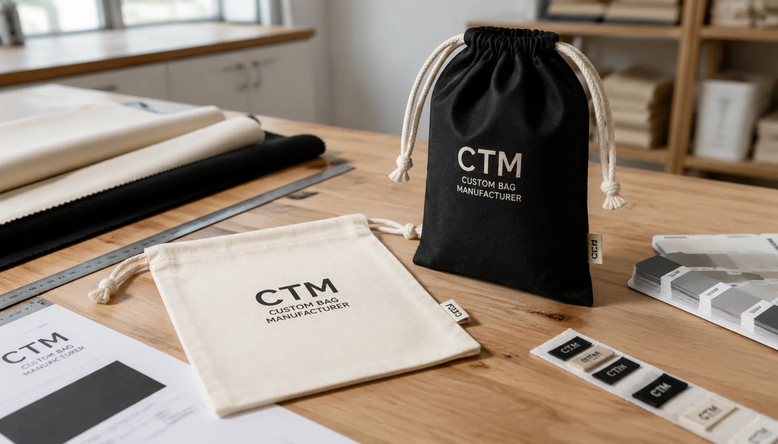
Why print proofing is the main failure point on liquor gift pouches
For liquor retail programs, the pouch is usually not a low-attention accessory. It sits next to a bottle that already carries a controlled brand image, regulated label details, and premium price positioning. When the pouch print lands too low, reads muddy on natural cotton, or wraps into a side seam, the buyer gets a packaging item that weakens the shelf set instead of supporting it. Most disputes on cotton drawstring pouches are not about whether the bag can hold the bottle. They are about logo appearance, color expectation, and whether the approved proof reflected real production behavior on textile.
Print proofing becomes more critical when retailers run seasonal gifting, private-label spirits, or distributor-specific artwork versions. In those cases, the same pouch body may carry several logos or campaign messages, and each art version creates a new chance for setup error. A disciplined proofing process saves more money than pushing for the cheapest unit price. One incorrect print run can erase the savings from a lower quote, especially when airfreight, repacking, or store markdowns follow.
- Main risk areas: artwork scale, color shift on natural fabric, seam interference, and poor opacity on dark cloth
- Most common hidden error: approving a digital proof without seeing ink behavior on actual GSM and fabric color
- For branded liquor gifting, print consistency often matters more than shaving a few cents off unit cost
Start with the bottle format before discussing artwork
Many RFQs begin with logo files and finish with repeated size corrections. That sequence is backwards. The first job is to define what the pouch must hold in real retail handling. A 750 ml Bordeaux bottle, a tall Riesling bottle, a squat spirits bottle, and a gift set with neck tag all create different dimensional needs. If the pouch body is too narrow, the front print stretches around the bottle and visually shrinks. If it is too wide, the pouch face collapses and the artwork looks off-center when displayed.
For most single-bottle liquor programs, buyers should specify bottle height, diameter, shoulder shape, and whether tissue, leaflet, or hangtag will go inside. A useful factory sample routine is to provide one actual bottle or a dimension sheet with body diameter and total height. That lets the supplier decide whether a flat pouch, side gusset, or boxed bottom construction gives the most stable front panel for printing.
- Typical 750 ml pouch dimensions may range by bottle shape; do not copy a generic wine bag size blindly
- Boxed bottoms improve standing shape and front print presentation, but add sewing time and material usage
- Include closure position requirement if the pouch must cover the full bottle neck or leave the neck exposed
Choose fabric weight for print behavior, not only for handle feel
Cotton sheeting and cotton canvas can both work for drawstring pouches, but they behave very differently during printing. Lighter sheeting around 140 to 180 GSM can suit promotional gift wraps where the buyer wants a softer drape and lower material cost. The tradeoff is lower opacity, more weave movement, and a less stable print surface. Fine text and dense solid areas may not look as clean, particularly on natural unbleached cloth with visible slubs.
For premium liquor retail packaging, 270 to 340 GSM canvas is often the safer choice because it gives a flatter print bed and stronger shape retention around the bottle. This heavier base also reduces show-through from bottle silhouette and helps the front panel look more deliberate in store photography or gift stacking. It costs more in fabric and freight, but it lowers the chance that your logo looks cheap. If buyers are comparing supplier quotes, they should normalize by GSM first. A low quote on 150 GSM is not comparable to a higher quote on 300 GSM canvas.
- 140 to 180 GSM: lower cost, softer body, more movement in print surface
- 200 to 240 GSM: middle ground for simple one-color logos and short gifting runs
- 270 to 340 GSM: best for premium presentation, stronger opacity, and cleaner large-area printing
- Ask whether GSM is nominal greige weight or finished fabric weight after dyeing and washing
Pick the print method around logo structure and order volume
Screen printing remains the standard choice for cotton drawstring pouches because it balances setup cost, durability, and unit economics. For one-color and two-color liquor retailer logos, screen print usually gives the cleanest result at bulk quantities. It also handles medium to large front-panel graphics well. The main caution is artwork detail. Very fine lines, small reverse text, and tight registration between colors become harder on woven fabric than on coated paperboard or labels.
Heat transfer and digital options can work for low-volume trials, multi-shade artwork, or photo-based campaigns, but buyers should be realistic about handfeel and longevity. Transfers may sit on top of the cloth and can look less integrated on natural cotton. Embroidery may suit a simple crest or monogram on premium gift pouches, though it adds unit cost and can distort lighter fabric. For most retail-volume liquor pouches, screen print on approved fabric with a physical strike-off is still the practical benchmark.
- Screen print: best for solid logos, repeat volume, and consistent unit cost
- Heat transfer: useful for small runs or complex color art, but evaluate handfeel and edge quality
- Embroidery: premium look for simple marks, but not ideal for detailed small text
- On black or dark fabric, include white underbase if logo opacity matters
How to proof artwork so the bulk run matches shelf expectations
A good proofing sequence has stages. First, the buyer approves vector artwork with dimensions, color references, and print position. Second, the factory provides either a blank size sample or a marked layout on the actual pouch pattern. Third, the supplier produces a physical strike-off on approved fabric, showing real ink coverage and placement. Only after those steps should the pre-production sample be signed off. Skipping from digital file to mass production creates the exact mismatch that causes post-arrival disputes.
The strike-off is where many practical issues become visible. Natural cotton is not a bright-white paper surface, so logo colors may appear warmer or duller. Fine serif text may fill in. A print placed too close to the drawstring channel may wrinkle when the top closes. Buyers should state acceptance criteria in measurable terms: position tolerance in millimeters, minimum readable text size, maximum pinholes in solid area, and acceptable shade variation against the approved strike-off. This is stronger than saying 'match approved artwork.'
- Use Pantone references, but approve on fabric because cotton base tone shifts the final appearance
- Specify placement from top seam and side seam, not only centered visually
- Set minimum line thickness and reverse text size in the artwork file notes
- Keep artwork clear of folds, side seams, and boxed bottom corners
Common print mistakes on cotton liquor pouches and how to prevent them
One frequent problem is over-scaling the logo. On a flat pouch, a large logo may look impressive in artwork review, but once a bottle is inserted, the center panel curves and side areas pull inward. That can make a circle logo appear oval or push text into wrinkles. Another common issue is choosing natural cotton for sustainability positioning without accounting for shade variance. One lot may read creamy beige, another a lighter oat tone, and printed colors will not look identical across both lots.
Dark-dyed pouches create a different set of risks. White or metallic inks often need more than one pass or an underbase for solid coverage. Suppliers who quote aggressively may omit that detail, resulting in a washed-out logo. Misregistration between underbase and top color can also create a visible halo. Buyers should compare quotes based on actual print construction, not just color count. A one-color white logo on black fabric is not equivalent to one-color black logo on natural fabric in production effort.
- Prevent seam interference by keeping print margin away from side seam and bottom fold
- Do not judge color only from screen view; review strike-off under neutral lighting
- For dark fabric, confirm underbase, pass count, and curing method in the quotation
- Request first-off photos with ruler reference if on-site approval is not possible
MOQ logic, setup cost, and why artwork versions change the real unit price
Procurement teams often compare only the base unit cost, but print proofing economics sit inside the MOQ structure. Factories usually build MOQ around the combination of size, fabric color, and artwork. If you split one pouch program into four liquor brand logos, the sewing cost may stay similar, but print setup, screen cost, handling, and packing complexity rise. That means the effective unit price per logo version can jump even when total order quantity looks healthy.
This matters for distributor groups and multi-banner retail chains. If the bottle size and pouch body stay the same, buyers can reduce cost by standardizing one body color and one pouch size, then varying only the print where truly necessary. Another option is to align campaign timing so artwork versions print in one production window instead of several small runs. When asking for quotes, request a matrix by quantity break and by artwork split. That reveals whether your initial concept is commercially efficient or whether the logo variation strategy is driving avoidable cost.
- Screens and strike-offs are often charged per artwork colorway, not per purchase order total
- Small quantity logo splits increase handling errors during packing and labeling
- Consolidating body specs while limiting art variants usually improves both cost and lead time
- Ask for quote scenarios: one logo, two logos, and four logos at the same total quantity
Sample approval, QC thresholds, and what should go into the PO notes
A pre-production sample is useful only if the approval standard is specific. Procurement teams should lock in the approved sample code, artwork revision, fabric swatch, and packing method directly in the purchase order or technical sheet. Without that linkage, the factory may treat the approved sample as indicative rather than binding. For printed pouches, measurable QC thresholds are more effective than aesthetic language. 'Print centered' is weak. 'Print centerline within plus or minus 5 mm of approved position' is usable on the line and at final inspection.
Quality control should also reflect real use. Since these pouches are meant for bottles, seam stress at the lower corners matters. A beautiful print on a weak bottom seam is still a failed packaging item. If the buyer uses third-party inspection, provide defect definitions in advance. Major defects might include wrong size beyond tolerance, wrong fabric color, unreadable logo text, severe smudging, or open seam. Minor defects might include isolated slubs in natural fabric or slight drawstring length variation.
- Attach approved artwork file name and revision date to the PO
- Set size tolerances in millimeters for width, height, gusset, and channel depth
- Define major versus minor print defects before production starts
- Load-test seam areas with intended bottle weight where boxed bottom is used
Packing details that affect warehouse handling and landed cost
Packing sounds routine until the goods hit a distributor warehouse. For liquor retail buyers, mixed-SKU cartons often create receiving delays, mis-picks, and store allocation errors. A pouch program with multiple logos or colors should be packed by SKU in clearly marked export cartons, with carton labels showing item code, print version, quantity, gross weight, and PO reference. Flat packing saves cube, but buyers should specify whether pouches need individual polybags, inner bundles, or paper banding based on the retail presentation plan and market packaging rules.
Carton efficiency also affects freight cost more than many buyers expect. Heavy 300 GSM canvas in small cartons can drive up the number of cartons and reduce container utilization. On the other hand, oversized cartons create compression and handling issues. A useful quote review step is to ask each supplier for carton dimensions, units per carton, and estimated CBM for the order. Without this, the lower ex-works price may be offset by a worse freight profile. Landed-cost comparison starts with packaging density, not only product cost.
- Pack by single SKU when stores or distributors will allocate by logo or campaign
- Request carton marks with SKU, quantity, PO number, and country of origin where required
- Ask for units per carton and CBM to compare real freight impact across suppliers
- State whether individual polybags are prohibited, required, or optional for your market
Lead time planning for seasonal launches and promotional deadlines
Cotton drawstring pouches for liquor retail often support seasonal windows such as year-end gifting, festival bundles, or launch campaigns. In these projects, the risk is not only production time but delayed approval time. Every unresolved item in artwork, fabric shade, or size can stall the schedule before the factory even starts bulk work. Buyers should separate lead time into approval stages: artwork proof, strike-off, pre-production sample, bulk sewing and printing, final inspection, and outbound booking.
If the pouch is made from stock fabric in a standard size, lead time can be materially shorter than for a custom-dyed, custom-cut program. But that speed advantage disappears if the print proofing loop is vague. A practical planning rule is to freeze artwork before fabric booking where color-sensitive printing is involved, and before cutting where size is custom. Build extra days for re-strike-off if the first print sample on natural cotton does not match expectation. Seasonal liquor programs usually fail because approval calendars were too optimistic, not because factories cannot sew pouches quickly.
- Custom dyeing adds time for lab dips and shade approval
- Custom size adds cutting and sample confirmation risk even when fabric is in stock
- Strike-off corrections can move the ship date if artwork line weight or opacity changes late
- Book inspection and freight space early for peak gifting seasons
Specification comparison for buyers
| Spec decision | Recommended option | When it fits | Buyer risk to check |
|---|---|---|---|
| Fabric weight | 8 oz to 10 oz cotton canvas, about 270 to 340 GSM | Best for premium bottle presentation, stronger opacity, cleaner print surface | Lighter cloth below about 180 GSM can shadow bottle shape and distort solid prints |
| Fabric color base | Pre-bleached natural or dyed black with lab dip approval | Use natural for rustic gifting or black for premium liquor and holiday programs | Natural cotton shade varies by lot; black fabric can shift logo color if white underbase is skipped |
| Pouch construction | Single bottle pouch with boxed bottom or side gusset | Fits 750 ml bottle retail gifting and keeps artwork front-facing on shelf | Flat pouches without gusset can twist after filling and misalign centered artwork |
| Print method | Screen print for solid logos; heat transfer only for small trial runs; embroidery only for simple premium marks | Screen print gives the best unit economics and color consistency on bulk orders | Digital artwork may look sharp on screen but lose edge definition on woven texture if line weight is too fine |
| Artwork coverage | Front print within 55 to 65 percent of pouch face width | Allows good logo visibility while avoiding seam and drawstring interference | Oversized artwork near side seams can crack, skew, or disappear into folds after filling |
| Proof approval route | Digital artwork approval plus physical strike-off on actual fabric before bulk | Important for branded liquor gift packaging where color and placement affect shelf presentation | PDF approval alone does not reveal ink absorption, off-white base tone, or registration spread |
| MOQ planning | Bulk MOQ by size-color-print combination, often one MOQ per artwork and fabric color | Useful when buyers need the same pouch size across multiple store banners or liquor brands | Too many logo versions split quantity and push up unit price, sample cost, and print setup charges |
| Packing method | Flat packed by size and color in inner poly or paper band, export carton marked by SKU | Best for distributor warehouses and retail allocation by branch | Mixed cartons without SKU segregation slow receiving and create store allocation errors |
| Lead time control | Approve pre-production sample before fabric cutting for custom size and before printing for stock size | Reduces rework risk on seasonal launches and promotional gifting windows | Late proof changes after cutting or after screen making usually add cost and move ship date |
Buyer checklist before sampling
- State bottle size target clearly: 375 ml, 500 ml, 700 ml, 750 ml, or mixed SKU range.
- Specify finished pouch dimensions in millimeters, including width, height, gusset, and drawstring channel depth.
- Name fabric type and weight, such as cotton sheeting 140 to 180 GSM or cotton canvas 270 to 340 GSM.
- Define whether fabric must be natural, bleached, dyed, organic, recycled blend, or conventional cotton.
- List print colors by Pantone reference and state whether white underbase is required on dark fabric.
- Mark the maximum printable area and exact logo placement from top seam and side seam.
- Set minimum line thickness and minimum reverse text size for artwork acceptance.
- Request a physical print strike-off on actual fabric, not only a digital proof.
- Confirm drawstring material, color, knot finish, and whether cords are cotton, polyester, or herringbone tape.
- Approve seam type, stitch count, tolerance, and whether boxed bottom or side gusset is required.
Factory quote questions to send
- What is the quoted fabric specification in GSM and weave, and what tolerance do you allow in finished weight?
- Is the quote based on stock size or custom cutting, and does the price include boxed bottom or gusset construction?
- Which print method is included in the quote, and how many colors, print positions, and screens are costed?
- Does dark fabric pricing include a white underbase, flash curing, or extra passes for opacity?
- What MOQ applies per size, per fabric color, and per artwork version?
- What sample stages are available: digital proof, blank size sample, print strike-off, pre-production sample, and shipment sample?
- What are the standard print placement tolerances in millimeters from seam and top hem?
- How is logo color approved on natural cotton where the fabric base is not bright white?
- What carton dimensions, gross weight, and units per carton are assumed in the quote?
- Are export cartons packed by single SKU only, and what is the surcharge for mixed assortment packing?
Quality-control points to confirm
- Measure finished width, height, gusset, and drawstring channel against approved tolerance before printing and after packing.
- Verify fabric GSM and handfeel against approved swatch; lighter substitute cloth changes print opacity and bottle coverage.
- Check print placement from top seam and side seam on first bulk pieces and at inline intervals.
- Confirm Pantone match under standard lighting and compare against approved strike-off on actual fabric base color.
- Test print adhesion and rub resistance after curing, especially on dark-dyed cloth with white underbase.
- Inspect minimum text legibility, line sharpness, and filled solid areas for pinholes or bleeding into weave gaps.
- Review seam security at side seams and bottom corners with loaded bottle simulation where applicable.
- Check drawstring threading, knot security, and channel opening so pouch closes smoothly without twisting.
- Inspect for oil marks, needle damage, slubs, and woven contamination visible on light-color pouches.
- Verify packing count, SKU separation, carton marking, and barcode or purchase order labeling before container loading.