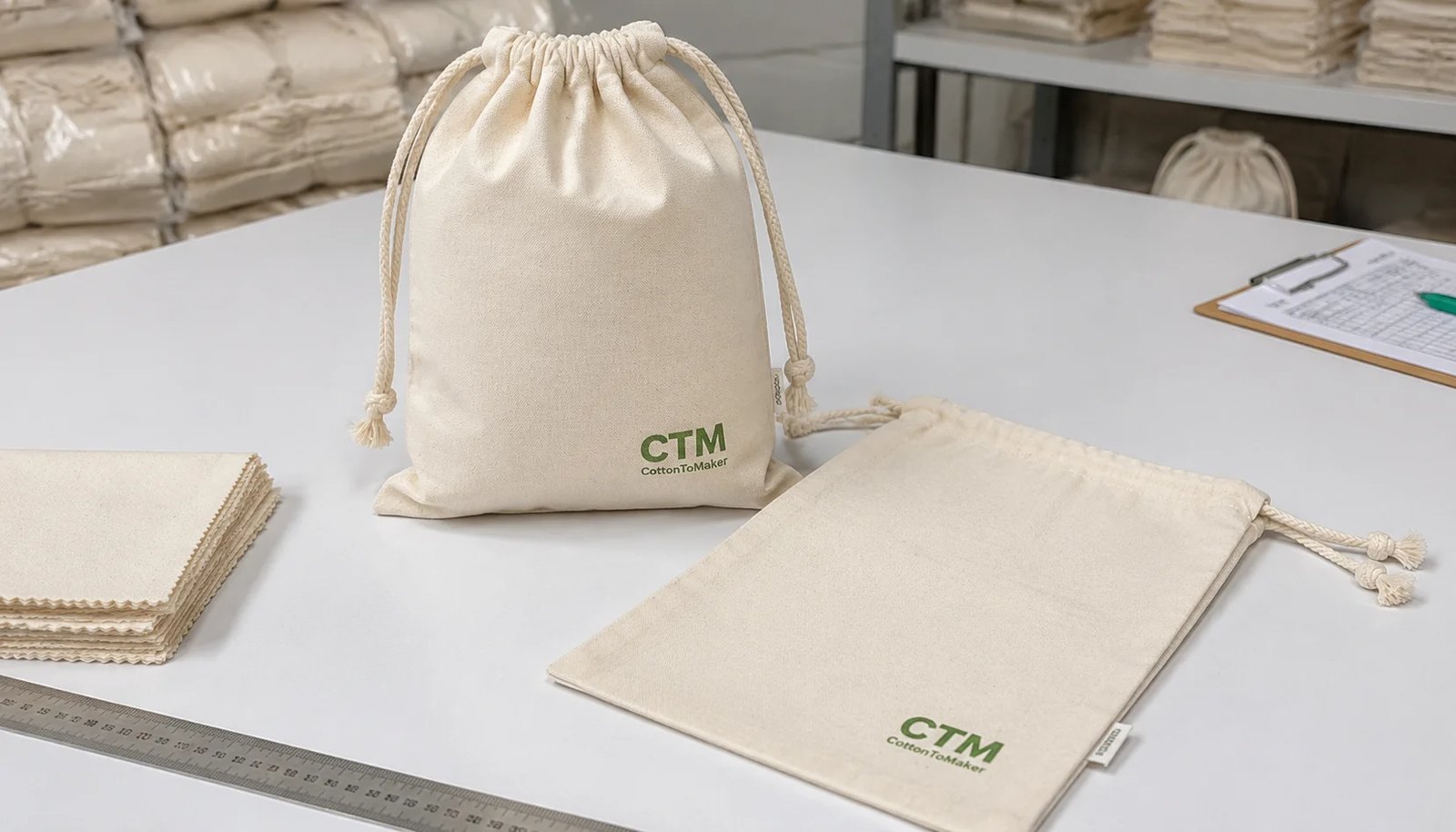
Why logo placement becomes a procurement issue for natural grocers
For natural grocers, a cotton drawstring pouch is rarely just a small packaging accessory. It may be part of a refill program, a produce initiative, a wellness gift set, a private label bundle, or a reusable retail item that has to match an eco-conscious brand image. In all of those cases, logo placement affects more than appearance. It influences print yield, reject rate, packing behavior, consistency across stores, and whether the pouch still looks presentable after being filled, cinched, handled, and merchandised.
That is why cotton drawstring pouches logo placement should be written as a production specification, not left as a visual preference. On a factory floor, the logo has to coexist with the drawstring channel, seam allowances, fabric shrinkage, and the limits of the selected print method. A logo that looks centered on artwork can shift visually after the pouch is sewn. A mark placed too high can disappear into the gathered channel once the cord is pulled. A mark that sits too close to the side seam can distort or lose ink coverage where the pouch flexes.
Natural grocers also face a specific branding challenge: they usually want the pouch to feel simple, reusable, and understated rather than overly promotional. That means the logo often needs to be modest in scale, carefully positioned, and printed with a soft hand-feel on natural cotton. Procurement teams therefore need an RFQ that aligns design intent with factory reality. The strongest RFQs define pouch use, finished dimensions, safe print area, artwork size, logo tolerances, approved sample process, and inspection checkpoints before price comparison begins.
- Visual risk: a logo placed too near the top channel can wrinkle or hide when the pouch is closed.
- Commercial risk: suppliers may quote different fabric weights and print methods, making price comparisons misleading.
- Receiving risk: inconsistent logo height across cartons can trigger avoidable inspection disputes.
- Brand risk: a print that feels too heavy or synthetic can conflict with natural grocer positioning.
Start with the use case: bulk refill, produce, gift, or retail pouch
The best logo position depends first on how the pouch will be used. A small herb pouch sold near the tea aisle is viewed differently from a medium wellness kit pouch hanging on a hook, and both behave differently from a produce or refill bag that is filled, pulled tight, and stacked in a basket. Buyers should therefore start by classifying the pouch before discussing print placement. The same artwork can require different sizing and placement rules depending on whether the pouch is mainly seen flat, hanging, standing, or collapsed in a display tray.
For natural grocers, common use cases usually fall into four practical groups. First are small pouches for tea, herbs, bath products, sample packs, or supplements. These need compact branding that does not overwhelm the available front panel. Second are medium pouches for wellness kits, soap sets, dry goods bundles, or seasonal gift packs. These often allow a more visible front logo but still need balanced white space. Third are larger utility or refill pouches used for produce, grains, or store-branded reusables, where the logo must stay legible even when the pouch expands. Fourth are premium retail pouches where subtle branding is the goal, and a side label or lower-front print may be better than a dominant center mark.
Defining use upfront also helps calibrate print durability and quality expectations. A pouch used as primary retail packaging may need cleaner print registration and more presentable folding. A reusable produce pouch may need stronger seams, more forgiving logo size, and a softer print that withstands repeated handling. A gift pouch for a short campaign may accept a simpler structure and smaller logo. Without this use-case definition, the logo conversation becomes abstract, and factories may quote a technically workable option that does not fit the merchandising reality.
- Tea, herb, soap, or supplement pouch: usually best with a compact front logo around 35-60 mm wide.
- Wellness kit or mixed dry goods pouch: often supports a 60-100 mm logo with stronger shelf visibility.
- Produce or refill pouch: logo should remain legible when the bag expands and the top gathers under tension.
- Premium retail pouch: consider subtle branding such as a small lower-front print or side seam label.
- Store operations pouch: prioritize consistency, low cost, and easy repeat ordering over decorative print complexity.
How to define the safe print area on a finished cotton drawstring pouch
The most common sourcing mistake is approving artwork size without defining the safe print area on the finished pouch. A drawstring pouch is not a flat card. The top edge is folded into a channel, the sides are closed with seam allowances, and the bottom may include a seam turn, boxed corners, or shape variation. Every one of those construction features reduces the stable printable zone. If the logo is positioned from a cut fabric panel instead of from the finished sewn pouch, the final result can land too high, too low, or slightly off-center.
A better method is to specify all logo measurements from fixed finished references. In practical terms, buyers should define the distance from the bottom edge of the drawstring channel to the top of the logo, the distance from the left and right finished seams to the logo edges, and the distance from the bottom seam to the logo base if lower placement is used. These reference points are easier for suppliers, inspectors, and buyers to measure consistently on real goods. They also reduce ambiguity during dispute resolution.
For most natural cotton drawstring pouches used by grocers, a front-centered logo usually performs best when the top of the logo sits about 20-35 mm below the drawstring channel. Smaller pouches may work with 15-20 mm if the cord channel is narrow and the artwork is compact. The sides of the logo should usually stay at least 15-20 mm away from the finished side seams. Larger pouches and heavier cotton may need more clear space because the fabric bulks and folds more aggressively when filled or cinched.
It is also important to define whether the logo is being printed on one side only or on both front and back. Double-sided printing can look balanced in concept but may increase tolerance challenges, especially if the pouch opening and seam structure make one side behave differently during printing. If both sides are required, buyers should confirm whether alignment between front and back matters, or whether each side only needs to meet its own placement references.
- Reference the finished pouch, not the cut panel.
- Mark logo width and height in millimeters on the production drawing.
- State safe clear space from top channel, both side seams, and bottom seam.
- Use a practical placement tolerance, commonly ±3 mm for small pouches and ±5 mm for larger sizes.
- Avoid artwork that intentionally crosses seam folds unless an irregular rustic effect is approved.
- If two-sided printing is needed, clarify whether front-to-back registration matters or only single-side placement accuracy matters.
Common logo placement options and when each works best
Most natural grocer buyers choose from three practical branding layouts: front center, lower front, or side label. Each has different visual and operational tradeoffs. Front center is the standard because it gives immediate visibility on a flat or hanging pouch and is easy for warehouse teams to verify during spot checks. It is often the safest choice for store-branded refill pouches, wellness kits, and promotional sets, provided the logo sits low enough to stay clear of the gathered top area.
Lower front placement creates a quieter, more premium look. This works well when buyers want the pouch to feel reusable and understated rather than obviously promotional. It can also help when the upper front area is reserved visually for the product shape or for a separate paper tag. The risk is that lower placement disappears when pouches are placed in baskets, bins, or countertop displays where the bottom third is hidden. Buyers should test this layout using the actual intended merchandising format rather than relying only on a flat approval photo.
A side label is often the best choice when branding needs to be subtle, when one pouch body will support many SKU versions, or when repeated seasonal changes make front reprinting inefficient. A woven or printed cotton label sewn into the side seam keeps the pouch face clean and can look more premium for natural grocer private label programs. However, side labels increase component management and can raise MOQ because labels must be produced separately and inserted during sewing.
Some buyers also consider combining a small front print with a side label. This can work if the front mark is very restrained and the side label carries technical or sub-brand detail. The key is to avoid over-branding, which can make a cotton pouch feel more like a promotional giveaway than a reusable retail product.
- Front center: best overall visibility and easiest factory control.
- Lower front: cleaner visual style, but can disappear in baskets or trays.
- Side label: subtle branding and good for multi-SKU programs, but adds label management.
- Front print plus side label: useful only when both serve distinct functions and branding remains restrained.
Fabric weight, natural cotton appearance, and how they affect print results
Fabric choice is one of the biggest hidden variables in cotton drawstring pouch buying. Two suppliers may quote the same pouch size with the same logo position, but if one is using lighter cotton and the other is using a denser fabric, the print result and the pouch behavior in store can be quite different. Fabric weight influences print sharpness, wrinkle tendency, opacity, seam bulk, and how stable the front panel remains during printing.
For most natural grocer applications, 5 oz to 7 oz cotton is the practical range. At 5 oz, the pouch remains relatively light and cost-efficient, which is useful for promotional packs, simple dry goods pouches, or lighter-duty refill use. At 6 oz to 7 oz, the pouch usually feels more substantial and gives a flatter, more stable print surface, which helps logos look cleaner and more intentional. An 8 oz fabric can support a heavier reusable positioning, but it increases cost, seam thickness, and freight weight, and it can make the top channel and corners bulkier.
Buyers should also understand the visual character of natural cotton. Unbleached cotton commonly shows seed specks, slubs, and slight base-tone variation from lot to lot. That can be acceptable and even desirable for an organic or low-processed brand image, but only if it is agreed before production. Natural specks can slightly affect how fine-line logos appear. Light ink colors may look duller on darker natural bases, while very crisp print expectations may be harder to achieve on rustic-textured fabric than on smooth bleached material.
Because of this, fabric approval and print approval should happen together whenever possible. A logo that looks perfect on a bleached development sample may appear softer or less opaque on the final natural cotton body. Procurement teams should therefore request the pre-production sample in the actual specified fabric weight and color, not on a substitute cloth.
- 4 oz cotton: budget-friendly but less stable for sharp print edges and more transparent.
- 5 oz cotton: common entry point for lightweight grocery and promotional pouches.
- 6-7 oz cotton: balanced choice for reusable feel, better panel stability, and stronger shelf presentation.
- 8 oz cotton: premium heavier reuse option, but with higher material and freight cost.
- Natural cotton: define whether seed specks, slubs, and shade variation are acceptable within approved limits.
Choosing the right print method for natural grocer branding
Print method selection should follow the artwork and end use, not habit. For most cotton drawstring pouches with simple store logos, screen printing is still the strongest starting point. It is reliable for one to three solid colors, scalable for medium and large runs, and generally the most cost-efficient repeat option. It also gives buyers predictable setup logic: screen cost per color, stable repeatability once approved, and relatively straightforward bulk inspection.
Within screen printing, the ink system matters. A softer hand-feel is often preferred for natural grocer branding because the pouch should still feel like fabric rather than coated signage. Water-based textile inks or comparable soft-hand systems may be a good fit if opacity on natural cotton is acceptable. Heavier ink systems may produce stronger color coverage but can create a thicker surface feel, especially on larger logos. Buyers should ask the supplier what ink type is being quoted and whether the logo area will remain flexible after folding.
Heat transfer has a place, particularly for short runs, multicolor artwork, gradients, or many small logo variations that would make multiple screen setups inefficient. However, transfers require more caution on cotton pouches intended for repeated reuse. The edge of the transfer can become visible, the hand-feel may seem less natural, and repeated folding can reveal cracking or edge wear if the material and process are not appropriate. Transfers should therefore be sampled and folded repeatedly before approval.
Embroidery is possible but often a poor fit for lightweight cotton pouches because it can pucker the front panel and adds cost. A woven side label or printed cotton label is often a better alternative when subtle branding is desired. For natural grocers that want minimalist identity and repeated seasonal flexibility, a side label can outperform a large front graphic both aesthetically and operationally.
- Screen print: best default for simple logos, repeat orders, and cost control.
- Soft-hand ink systems: preferable when a natural textile feel matters.
- Heavier opacity inks: useful for stronger color but should be checked for stiffness.
- Heat transfer: acceptable for complex or short-run art, but test fold durability and transfer edge appearance.
- Embroidery: usually too bulky for small cotton pouches unless a deliberate craft look is wanted.
- Woven side label: strong option for understated reusable branding.
Cost, MOQ, and quote comparison factors buyers should separate clearly
Logo placement decisions can influence cost more than buyers expect. A single one-color front print is usually straightforward. Cost rises when there are multiple print positions, large logos that slow handling, tighter-than-normal placement tolerances, double-sided printing, many artwork versions, or special retail packing added after printing. Procurement teams should therefore request quote breakdowns that separate pouch cost from print setup, print run charges, label costs, sample fees, and packing labor.
MOQ should also be understood as a combination of material efficiency and process setup. Standard natural cotton in a common weight usually allows lower minimums than custom dyed fabrics or custom-dyed cords. A standard front screen print can be easier to run at lower quantities than a complex transfer program with many logo versions. If a natural grocer chain needs one base pouch across multiple regions or private label sub-brands, the most efficient strategy is often to keep size, fabric, and construction common while separating artwork and packing by batch.
Another frequent cost issue is hidden sorting work. Buyers may request mixed logos or store destinations under one order but fail to define carton separation and labels. The supplier then either quotes conservatively with added labor, or underquotes and creates allocation errors later. For chain grocers, it is usually worth specifying SKU logic at RFQ stage: what constitutes one SKU, whether each logo version gets its own carton, and whether store-specific labels are applied at factory or later in the buyer's warehouse.
The same principle applies to tolerances. Asking for unusually tight logo placement, such as insisting on near-zero deviation, will either raise inspection and handling cost or create tension during acceptance. A practical tolerance tied to sample approval usually protects both sides better than an idealized requirement that cut-and-sewn cotton goods cannot consistently meet.
- Separate base pouch price from logo setup and print run price.
- Confirm MOQ per size, fabric color, artwork version, and packing version.
- Keep fabric and construction common when running multiple regional or store logos.
- Clarify carton separation for each logo version to prevent receiving errors.
- Treat unusually tight placement tolerance as a cost driver, not a free expectation.
How to approve samples so the bulk order matches the intent
A strong sample process is the best protection against logo placement disputes. Digital mockups are useful for confirming general scale and visual direction, but they do not prove how the print will behave on a sewn cotton pouch. The pre-production sample should use the actual specified fabric weight, fabric color, cord type, seam construction, print method, and logo size. If any of those elements change after sample approval, the buyer should treat the sample as no longer fully representative.
When reviewing the sample, procurement teams should inspect it in three ways: flat, filled, and cinched. Flat review confirms measurements and centering. Filled review shows how the logo reads when the pouch carries realistic contents or filler volume. Cinched review shows whether the top gathering visually pulls the mark upward or causes wrinkling across the print. For natural grocer programs, the pouch should also be tested in its intended merchandising condition, such as in a basket, on a peg, or inside a gift set carton.
The approval record should include actual measurements, not only comments like approved or looks good. Buyers should photograph the sample laid flat with a ruler and note the exact distance from the drawstring channel to the top of the logo, from both side seams to the logo edges, and from the bottom seam if relevant. The buyer should retain one approved reference sample, and the factory should retain a matching sample or signed photo reference for line setup and final inspection.
If the order includes several pouch sizes, each size should be sampled or at least have its own placement drawing. Scaling one logo proportionally across all pouch sizes without checking the finished safe area often creates poor results, especially on very small pouches where a standard logo width crowds the seams.
- Approve the real fabric, real print method, and real cord construction.
- Review the sample flat, lightly filled, and fully cinched.
- Record actual placement dimensions with a ruler on approval photos.
- Retain a sealed buyer sample and a matching factory reference.
- Sample each pouch size if logo scale or safe area changes materially by size.
QC standards that matter for natural grocer pouch orders
For cotton drawstring pouches, quality control needs to cover both appearance and function. Natural grocers usually care about visual consistency because the pouch is customer-facing, but they also care about whether the item feels authentic, reusable, and clean. That means inspection should not focus on logo placement alone. It should include fabric appearance, odor, seam quality, cord performance, and packing condition.
Logo placement should always be measured from fixed references and checked against the agreed tolerance. A typical range is ±3 mm for smaller pouches and ±5 mm for larger ones, though exact numbers depend on size and construction. The logo should also be checked for centering by comparing left and right margins, rather than relying only on visual impression. A pouch can look slightly off even when the top distance is correct if the side positioning drifts.
Print quality matters as much as location. Inspectors should look for uneven opacity, smearing, missing ink in critical letters or icon areas, over-thick deposits, and visible transfer edge if a transfer process is used. On natural cotton, some rustic texture in the print may be acceptable if approved in the sample, but that should not excuse poor adhesion or major coverage failure. The print should remain stable under normal rubbing and flexing suitable to the chosen print system.
Fabric inspection is particularly important on natural unbleached cotton. Small seed specks and minor slubs may be normal, but oil marks, mildew smell, holes, severe shade mixing, and strong chemical odor are not. Seam QC should include skipped stitches, open seams, loose thread tails, uneven seam allowance, and weak stress points around the channel exits. Cord draw should be tested repeatedly to confirm that opening and closure are smooth and do not distort the front panel excessively.
- Measure placement from the bottom of the top channel and both side seams.
- Check centering numerically, not only by visual impression.
- Inspect print for opacity, smearing, edge definition, and surface feel.
- Confirm print durability with suitable rub, flex, or tape checks for the selected process.
- Inspect fabric for odor, stains, holes, heavy contamination, and unacceptable shade variation.
- Test seam strength and cord movement under repeated opening and closing.
Packing, carton marking, and lead time planning for grocery distribution
Packing is often treated as an afterthought, but for cotton drawstring pouches it can affect both product condition and warehouse efficiency. If the pouch is heading to a distribution center for later allocation, bulk flat packing is usually the most efficient approach. Inner quantities of 50 or 100 pieces are common, depending on pouch size and fabric weight. If the pouch is a retail item, the buyer may instead need a hangtag, belly band, barcode sticker, or kraft sleeve. These additions must be specified early because they change labor content, carton dimensions, and sometimes MOQ.
Logo placement and print method should influence how the pouch is folded for packing. A heavy fold directly across a thick print can create permanent creasing or early cracking. Transfer prints are especially sensitive if packed too soon after curing. Buyers should therefore define whether the pouch should be laid flat, lightly folded, or bundled in a way that avoids hard pressure on the logo area. Cartons should be sized to prevent over-compression, especially on thicker fabrics or larger logos.
For natural grocer distribution, carton marking accuracy is as important as the pouch itself. Cartons should clearly identify SKU, pouch size, fabric color, logo version, quantity, purchase order number, and destination where relevant. If one order contains multiple regional logos or store programs, each variant should be physically separated and labeled at carton level, not just on an inner paper note. This is a simple step that prevents expensive receiving and allocation errors.
Lead time should be mapped by stage rather than accepted as one total number. Buyers should ask how much time is needed for artwork confirmation, sample production, sample transit, approval, material preparation, printing, curing, sewing, final inspection, packing, and handover. Delays often occur not in sewing, but in late artwork changes, unclear Pantone references, added barcode demands, or last-minute store allocation instructions. A realistic schedule therefore needs approval discipline from the buyer as well as production capacity from the supplier.
- Specify whether pouches are packed flat, lightly folded, or individually retail packed.
- Avoid hard folds across thick logo areas unless tested in the approved sample.
- Confirm inner quantity, carton quantity, and carton dimensions before PO approval.
- Mark cartons with SKU, size, logo version, quantity, PO number, and destination as needed.
- Separate regional or store-specific versions physically by carton.
- Build lead time around approval, material prep, printing, curing, sewing, QC, and packing stages.
Specification comparison for buyers
| Spec decision | Recommended option | When it fits | Buyer risk to check |
|---|---|---|---|
| Front center logo placement | Place logo 20-35 mm below drawstring channel and keep at least 15-20 mm from side seams | Best for bulk-bin refill programs, wellness kits, gift-with-purchase sets, and shelf-visible retail pouches | Logo can distort into the gathered top area or appear off-center after sewing if placement is referenced from cut panels instead of finished size |
| Lower front logo placement | Use a smaller logo in the lower third, centered above the bottom seam with clear bottom seam allowance | Good for premium natural grocer programs where a cleaner front face is preferred and the pouch may sit upright on shelf | Logo may disappear in baskets, bins, or shallow trays if placed too low or if the pouch collapses when empty |
| Side label instead of front print | Use a woven or cotton side label inserted into the side seam | Useful for minimalist reusable branding, seasonal assortment changes, and programs needing one base pouch across many SKUs | MOQ may increase because labels require separate development and there is added sewing handling at the seam |
| Fabric weight | 5 oz to 7 oz cotton for most natural grocer uses; 8 oz only for heavier reuse positioning | 5 oz suits lightweight dry goods and promo use; 6-7 oz improves print stability and perceived value | Low GSM fabric can wrinkle, show ink bleed, and make logo edges appear uneven after packing |
| Print method | Screen print for solid one to three color logos; heat transfer only for complex color or short runs | Screen print is usually the practical default for natural cotton grocery pouches with simple branding | Heat transfer may feel less natural, show transfer edge, or crack if folded sharply or washed repeatedly |
| Cord and channel design | Cotton cord with reinforced top channel and bartack or backstitching at stress points | Fits eco-positioned grocery branding and improves repeated open-close use | Thin or rough cord can pucker the top area and visually pull the logo upward during closure |
| MOQ logic | Combine same pouch size and fabric, but separate artwork and packing clearly by SKU or region | Works for regional store groups, private label programs, and mixed logo versions under one material platform | Mixed artwork without controlled carton labeling creates allocation errors and receiving confusion |
| Packing format | Flat pack 50-100 pcs per inner polybag or kraft bundle; cartons sorted by size and artwork | Best for warehouse receipt, store allocation, and kit assembly efficiency | Over-compression can crease print areas or cause ink blocking if curing is incomplete |
Buyer checklist before sampling
- Define the pouch use case before discussing artwork: bulk refill, produce, tea or herb pouch, wellness kit, gift pouch, retail merchandise, or store operations bag.
- Specify finished pouch dimensions in width x height after sewing and pressing, not fabric cut-panel size.
- State cotton composition, fabric weight in oz or GSM, fabric color, acceptable natural specks, shrinkage expectation, and whether washed or unwashed finish is required.
- Request a flat dieline or production drawing that marks the printable safe area after the top channel fold, side seams, and bottom seam are completed.
- Provide logo width and height in millimeters, vector artwork, Pantone references, and whether slight rustic texture is acceptable on natural cotton.
- Define logo position from fixed finished references: distance from bottom of drawstring channel, left seam, right seam, and bottom seam.
- Select print method based on artwork complexity, order quantity, wash expectation, hand-feel target, and eco-positioning.
- Ask for a pre-production sample using final fabric, cord, stitching, print method, and packing plan, not a substitute fabric or digital mockup only.
- Set measurable acceptance tolerances for size, logo location, print color, seam quality, and carton quantity before PO issue.
- Define packing details: fold direction, inner pack quantity, polybag or paper bundling, barcode label, carton markings, and store-allocation needs.
Factory quote questions to send
- What finished pouch size tolerance can you hold after sewing and pressing for this specific size?
- What cotton fabric weight are you quoting in oz or GSM, and is that based on greige, washed, dyed, or finished fabric?
- What is the actual printable safe area on the finished pouch after top channel fold, side seams, and bottom seam are completed?
- Will you print on cut panels before sewing or on finished pouches after sewing, and how does that affect centering tolerance?
- Which print method do you recommend for our artwork and expected use, and why is it better than the alternatives?
- How many screens, plates, transfer setups, or label setups are included in the logo cost?
- Can you provide a placement drawing showing exact logo distance from the drawstring channel, side seams, and bottom seam?
- What is the MOQ per pouch size, per fabric color, per logo artwork, and per packing version?
- Will the bulk order use the same fabric lot type, cord diameter, ink system, and stitching construction as the approved sample?
- What QC tolerances do you apply to logo position, print color variance, seam defects, cord function, and carton quantity?
Quality-control points to confirm
- Finished pouch width and height measured flat after sewing and pressing, using agreed tolerance by size.
- Logo placement measured from fixed finished references: bottom edge of top channel, left seam, right seam, and bottom seam.
- Logo centering checked by comparing left and right clearances rather than visual judgment alone.
- Print color checked against approved sample or Pantone target under consistent lighting, with note that natural cotton base shade may slightly affect final appearance.
- Print surface checked for smearing, patchiness, weak opacity, over-thick ink buildup, pinholes in critical logo areas, and visible transfer film if not approved.
- Print adhesion and durability checked by controlled rubbing and suitable tape pull or flex test for the chosen ink system.
- Cord draw tested for smooth opening and closure without severe puckering, tearing, or distortion across the printed panel.
- Top channel, side seam, and bottom seam inspected for skipped stitches, open seams, loose threads, uneven seam allowance, and weak bartacks.
- Fabric checked for holes, oil marks, mildew odor, heavy slubs, excessive black specks, strong chemical smell, and unacceptable shade variation within the same lot.
- Packing verified for correct fold direction, inner quantity, SKU separation, barcode placement, carton marks, and absence of over-compression damage.