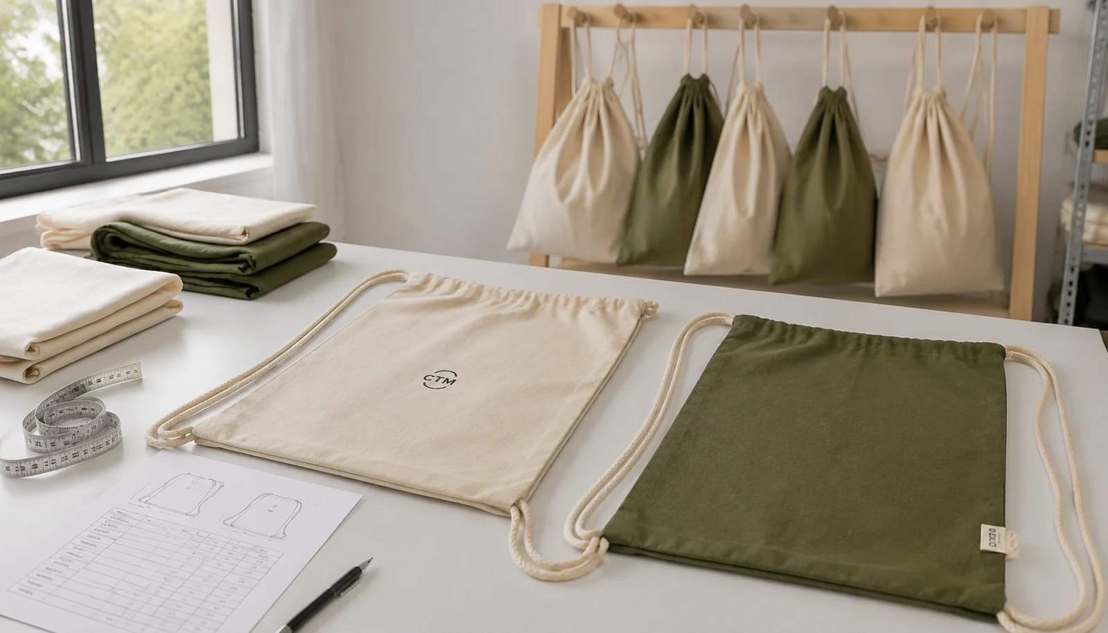
Why logo placement is a sourcing specification, not a decoration note
For natural grocers, cotton drawstring backpacks often need to look useful, modest, and reusable rather than like a disposable promotion. That makes logo placement important. A small centered mark on natural canvas can look clean and premium, but the same mark can look careless if it sits too close to the gathered top channel, drifts toward one seam, or folds through the bottom of the artwork.
The production challenge is that the logo is applied to a flexible sewn product, not a rigid rectangle. The top closes by drawcord, the side seams can pull inward, and the lower panel rounds when the bag carries light contents. Placement that looks perfect in a flat digital mockup may look high, low, or tilted after sewing, packing, and normal use.
Different suppliers may also use different reference points. One may print on cut panels and measure from the cut edge. Another may print after sewing and center the art inside the available press area. A third may say “center front” without documenting whether that means the visual center, artwork centerline, or finished panel center. These differences affect bulk consistency and make quote comparison difficult.
A strong buying document converts the brand idea into measurable production instructions: finished size, top channel depth, safe print zone, artwork dimensions, logo offset, tolerance, sampling method, and packing rules. Once those points are written, price, lead time, and quality become much easier to compare.
- Use finished sewn references, such as top hem and side seams, for logo placement.
- Do not rely on an unscaled mockup as the only approval document.
- Review the sample flat, lightly cinched, and lightly filled.
- Keep one written placement standard for the supplier, inspector, and reorder team.
- Treat logo position, construction, fabric, and packing as one specification system.
Lock the bag construction before finalizing artwork position
Construction defines the printable front panel. A simple cotton drawstring backpack with a folded top channel and bottom corner cord exits gives one usable logo area. Add metal eyelets, reinforcement patches, contrast top bands, boxed corners, or a side label, and the print-safe area changes. The artwork file may stay the same, but the real placement window does not.
For many grocery programs, an adult finished size around 34 x 42 cm to 38 x 45 cm is a practical buyer-spec example. It is large enough for community events, light shopping, wellness kits, or employee programs without becoming bulky in cartons. However, buyers should confirm whether the supplier is quoting finished size after sewing or cut size before assembly. Seam allowance and top channel folding can reduce the visible front panel and move the apparent logo center.
Top channel depth is especially important. A deeper channel may improve closure, but it creates a larger gather zone where printing is less stable and less visible. Cord exits also matter. Bottom corner exits can pull the lower panel outward; eyelets or reinforcement patches can improve durability but remove clean print space near corners.
The best sequence is construction first, artwork second. If the factory changes channel depth, seam allowance, drawcord route, or reinforcement shape after artwork approval, the logo may no longer sit in the intended visual zone even if the print itself is accurate.
- Request a construction sketch with finished width, finished height, channel depth, seam allowance, and cord exit type.
- Confirm whether measurements are finished dimensions or cut dimensions.
- Map eyelets, bartacks, reinforcement patches, and side labels on the same layout as the logo.
- Recheck logo position if the factory changes bag size or construction.
- Approve the final construction before approving final artwork placement.
Choose fabric for panel stability, print behavior, and brand appearance
Fabric choice affects both logo quality and how the bag presents in use. Lightweight cotton can reduce unit cost, but it usually creates a softer front panel that wrinkles and twists more under drawcord tension. The logo may still measure centered, yet appear uneven once the bag is hanging or lightly loaded.
For many natural grocer orders, 8 oz to 10 oz cotton canvas, roughly 270 to 340 GSM, is a useful quote range. It normally gives better panel stability and cleaner print definition than very light cotton while still folding and shipping efficiently. This should be framed as a buyer-spec target, not a universal rule: the supplier should state its actual fabric options and tolerance, such as a percentage or GSM range it can verify.
Very light cotton, for example around 140 to 220 GSM, may be appropriate for short-term promotional giveaways where cost is the main driver. It is less forgiving for centered logos and can show more wrinkling during printing. Heavier fabric above roughly 350 GSM can feel more premium and structured, but it increases fold bulk, freight impact, and cinch stiffness.
Natural cotton also has visible character. Seed specks, slubs, and shade variation may fit an organic or natural grocery look, but they affect print smoothness and color perception. If the buyer expects a very clean logo field, that expectation must be written. Recycled cotton content, dyed bodies, and washed finishes can also change shade consistency and hand feel, so composition and finish should be declared before sampling.
- Ask for composition, target GSM or ounce weight, color, finish, and tolerance.
- Define whether natural specks, slubs, and shade variation are acceptable.
- Use heavier cotton only when the added structure supports the program goal.
- Check dark dyed bodies for ink opacity requirements before approving artwork.
- Do not approve fabric by hand feel alone; verify it in a physical printed sample.
Map the safe logo zone on the finished bag
The full front panel is not the same as the safe print area. The top channel gathers, side seams create edge distortion, bottom folds can crease, and cord exits or reinforcement patches can interfere with placement. A safe logo zone keeps artwork away from these unstable areas.
On many adult cotton drawstring backpacks, a logo width of about 180 to 240 mm is a practical starting point. The final size should be confirmed against the actual finished panel, not the nominal bag size. A conservative layout keeps artwork at least about 25 mm from side seams, above the bottom fold area, and clearly below the gathered channel zone. These are useful specification examples, not fixed standards for every factory or style.
A wide horizontal logo often performs better than a tall stacked design because it stays in the stable middle band of the bag. If the mark includes an icon, store name, slogan, and legal line, the buyer may need to simplify or separate elements. Very small reverse text and thin outlines are risky on textured cotton, especially if the logo is placed where the bag will fold.
Sample review should include three states: laid flat, lightly cinched, and lightly filled. If the logo only looks correct in the flat state, the placement is probably too aggressive. A slightly smaller mark in a cleaner zone is often better for a natural grocer than a large print that fights the bag’s movement.
- Show the safe print zone on a dimensioned drawing.
- Specify artwork width, height, top offset, and centering method.
- Keep artwork out of seams, channel gathers, bartacks, eyelets, and bottom folds.
- Review logo appearance flat, cinched, and lightly loaded.
- Avoid placing small text on likely fold lines.
Select the print method based on artwork and cotton surface
Water-based screen print is often the best default for simple natural-grocer branding on light or natural cotton canvas. It can provide a softer hand feel and a less plastic appearance than heavier ink systems, especially for one to three solid colors. It also works well when the buyer wants a calm, understated logo rather than a high-gloss promotional graphic.
The method still needs to match the artwork. Textured cotton is not as smooth as paper, coated nonwoven, or polyester. Fine lines can break, small reverse text can fill in, and slubs can interrupt crisp edges. Ask the supplier for minimum line width and minimum readable text size based on the selected fabric, not a generic design rule.
Plastisol or higher-opacity screen printing may be useful on darker dyed bodies, but the hand feel can be heavier. Heat transfer or DTF can suit short runs or complex multicolor artwork, but buyers should inspect film edge visibility, flexibility, and crease behavior after folding. Embroidery may work for a small premium mark on heavier fabric, but dense stitching can pucker soft cotton and is not usually ideal for large center-front graphics.
The quote should state the print method, ink or transfer type, print size, number of colors, curing or application process, and any artwork limits. A print strike-off or PPS should confirm the final look before bulk production.
- Use water-based screen print for simple solid marks on light natural cotton when appropriate.
- Check opacity and hand feel on dark dyed bodies.
- Use transfer methods cautiously when bags will be folded tightly.
- Avoid dense embroidery on large soft-cotton front panels.
- Require a print sample for fine lines, small type, or unusual colors.
Build a compact RFQ that removes hidden assumptions
A useful RFQ for cotton drawstring backpacks should be short enough for suppliers to answer accurately but specific enough to prevent interpretation gaps. The goal is not to repeat procurement language in every line; it is to define the few variables that control cost, quality, and logo presentation.
Include finished size, fabric composition, target GSM, body color, drawcord type, construction notes, print method, artwork size, placement reference, and packing requirement. State whether the logo is measured from the top finished hem to the top of artwork, to the centerline, or to another defined point. If multiple factories are quoting, give each the same spec and ask them to identify any deviations.
Separate fixed requirements from supplier recommendations. For example, the buyer may fix the finished size and front logo location but allow the factory to recommend 270 GSM versus 300 GSM cotton canvas. Or the buyer may fix the fabric target but ask whether water-based or plastisol print is more suitable for a dark green body. This creates controlled alternatives instead of unclear bids.
The RFQ should also ask for evidence: a scaled layout, fabric confirmation, sample lead time, PPS cost, bulk lead time, MOQ by variable, carton details, and packing method. If a supplier cannot document the basic dimensions at quote stage, placement control during bulk production is less predictable.
- Use finished bag dimensions, not only a style name.
- List artwork width, height, color count, and print location.
- Define the placement reference point in millimeters.
- Ask suppliers to mark any deviation from the requested spec.
- Request carton quantity, carton size, and packing method in the quote.
Control MOQ and SKU complexity before the first bulk order
MOQ is affected by fabric color, print color count, logo position, packaging, and sometimes drawcord color. A buyer may view two logo placements as one item, while the factory sees two setups with separate alignment risk. This matters for pricing, sampling, inspection, and reorder consistency.
For a first order, a cleaner strategy is one body color, one main front logo, and one artwork version per SKU. If regional or store-level differentiation is needed, consider a hangtag, carton mark, insert card, or small woven side label instead of changing the center print. That keeps the main production process stable and reduces the chance of mixed cartons.
Ask for line-item pricing rather than only one unit cost. Useful details include fabric option, bag weight estimate, print setup charge, sample charge, packing cost, carton quantity, carton dimensions, and any barcode or polybag upcharge. A lower unit price may reflect lighter fabric, smaller print size, less controlled packing, or a different assumption about artwork.
Clarify overrun and underrun terms before issuing the PO. If the program requires exact store allocations, the supplier needs to know that early. Shipment variance, mixed artwork versions, and carton labeling errors can create receiving problems even when the bags themselves are acceptable.
- Limit first-run complexity where possible.
- Treat each body color, print position, or artwork version as a potential separate setup.
- Use side labels or hangtags for variation instead of changing the main logo.
- Confirm overrun and underrun allowance in writing.
- Compare reorder pricing only against the same approved spec.
Use sampling to prove placement before bulk production
A digital mockup is useful for internal approval, but it cannot prove how cotton, seams, drawcords, and folds behave. A physical pre-production sample is the most important checkpoint for logo placement. It should use the intended fabric, construction, drawcord, print method, artwork size, and packing fold whenever possible.
A practical approval path has three steps. First, approve a dimensioned layout showing finished bag size, safe print zone, artwork size, and offsets. Second, receive a physical PPS made to the quoted construction. Third, measure the PPS and record the approved dimensions and placement on the sample approval form. This prevents bulk inspection from relying on memory or a rough mockup.
During review, measure bag width, bag height, top channel depth, artwork width, artwork height, top offset, and left-right centering. Then lightly cinch the bag and add light contents. If the logo appears skewed, identify whether the cause is print placement, panel skew, uneven cord length, or seam asymmetry. Each problem requires a different correction.
Keep one approved sample with the buyer and one sealed reference sample with the factory when possible. Photograph the bag flat, cinched, and lightly filled. Note acceptable natural cotton characteristics, print hand feel, and any allowed shade variation so inspection has a clear standard.
- Approve a scaled layout before PPS production.
- Measure the PPS from finished top hem and finished side seams.
- Check the same sample flat, cinched, and lightly loaded.
- Record approved natural-cotton appearance allowances.
- Keep duplicate reference samples for buyer and factory.
Set QC standards for print, sewing, dimensions, and packing together
Logo placement quality depends on more than the print station. A logo can be placed correctly but still look wrong if the top channel is uneven, the front panel is skewed, or the cords pull one side tighter than the other. QC should therefore combine dimensional checks, print checks, sewing checks, drawcord function, and packing checks in one inspection standard.
Inspectors should measure finished width and height first, then logo placement from the finished top hem and side seams. A tolerance such as ±5 mm may be suitable for many standard screen-printed drawstring backpacks, but it should be agreed with the supplier and matched to the process. Tighter tolerances should only be used when the factory can demonstrate it can hold them in production.
Print inspection should cover coverage, edge quality, registration, pinholes, strike-through, ghosting, ink buildup, rub resistance, and curing. For natural cotton, normal seed specks or slubs may be acceptable, but the approved sample should define what is normal and what is a defect. Sewing inspection should cover seam strength, channel depth consistency, bartacks, cord exits, label insertion, and loose threads.
Packing can damage a good print if it happens too early or too tightly. Pull samples from different carton levels and look for blocking, offset, gloss shift, or hard folds through the artwork. Confirm carton count, barcode labels, carton marks, artwork version, and any retailer routing requirements before shipment release.
- Use one QC sheet covering dimensions, print, sewing, cords, labels, and packing.
- Measure logo placement only from approved finished references.
- Check top channel depth and side seam straightness.
- Perform agreed dry rub and light damp rub checks.
- Inspect packed samples for blocking, offset, and fold marks.
Final buyer notes for natural grocer programs
The strongest cotton drawstring backpack programs usually avoid overcomplication. Natural grocer branding often looks better with a clean logo, stable fabric, and careful placement than with oversized artwork or too many SKU variations. Buyers should prioritize repeatable construction, a realistic safe print zone, and a sample approval process that can be repeated on reorders.
When reviewing quotes, do not compare unit price until the technical assumptions match. A quote based on lighter fabric, cut-size dimensions, a smaller logo, or loose packing is not equivalent to a quote based on finished dimensions and controlled placement. Ask each supplier to confirm the same finished size, fabric target, print method, logo offset, tolerance, carton pack, and sample process.
The final PO should attach the approved spec sheet, artwork file, scaled layout, PPS approval notes, packing requirements, and inspection criteria. This gives the factory, buyer, third-party inspector, and receiving team the same reference. It also makes replenishment orders easier because the approved geometry and quality expectations are already documented.
For procurement teams, the key is to make logo placement measurable without making the specification unnecessarily complex. Define the finished bag, map the safe zone, approve the physical sample, and inspect against fixed references. That approach gives natural grocers a cleaner branded backpack and reduces avoidable disputes during bulk delivery.
- Keep the logo clean and safely placed rather than maximized.
- Compare suppliers only after matching technical assumptions.
- Attach the approved layout and PPS notes to the PO.
- Use the same measurement method for sampling, final inspection, and reorders.
- Document any approved deviations before bulk production starts.
Specification comparison for buyers
| Spec decision | Recommended option | When it fits | Buyer risk to check |
|---|---|---|---|
| Base fabric weight | Quote 8 oz to 10 oz cotton canvas, roughly 270 to 340 GSM, with supplier-stated tolerance | Balanced choice for reusable grocery promotions, wellness events, and cleaner front-panel printing | If the supplier substitutes lighter cotton, the panel may twist under cord tension and make a centered logo look low, skewed, or wrinkled |
| Finished size reference | Adult body around 34 x 42 cm to 38 x 45 cm, measured after sewing and before cinching | Useful for grocery giveaways, loyalty programs, farmers market events, and light retail use | If the quote is based on cut size, seam take-up and channel folding can shift the approved logo location |
| Logo reference point | Measure from finished top hem and finished side seams, not from mockup center alone | Best for comparing supplier quotes and conducting incoming inspection | Different factories may center artwork on cut panels, finished bags, or press platens unless the reference method is written |
| Front logo position | Top of artwork commonly placed about 90 to 130 mm below finished top hem, adjusted to channel depth and artwork height | Keeps the mark visible when the bag hangs, lies flat, or is lightly cinched | Too high can disappear into gathers; too low can distort over contents or bottom folding |
| Safe print area | Keep art clear of side seams, bottom fold, bartacks, eyelet patches, cord exits, and the gathered top channel | Reduces print distortion and makes inspection criteria easier | Artwork pushed into stress points can crack, skew, or appear off-center even if the print was registered correctly |
| Print method | Water-based screen print for simple 1 to 3 color logos on natural or light cotton | Matches the understated look many natural grocers prefer and keeps a softer hand feel | Fine reverse text, dark body colors, or photo-like detail may need another method and a tested strike-off |
| Logo size | Use a buyer-spec example of about 180 to 240 mm wide on many adult front panels, then confirm against the actual finished safe zone | Visible enough for store and event use without crowding the panel | Large solid fills increase ink laydown, drying time, strike-through risk, and crease visibility after folding |
| Brand label option | Small woven label inserted into a side seam or attached near the lower side edge outside key stress points | Good for subtle branding, compliance text, regional identification, or private-label programs | Label insertion must preserve seam allowance and should be checked for flipping, fraying, and crooked attachment |
| SKU and MOQ control | Start with one body color, one print location, and one artwork version per first-run SKU | Simplifies sampling, costing, production setup, and inspection | Color splits, alternate placements, and mixed logos may create separate setups, higher waste allowance, and more receiving errors |
Buyer checklist before sampling
- Define logo placement from finished seams or finished top hem references; provide top offset, artwork width, artwork height, and centering method in millimeters.
- Confirm bag dimensions as finished size after sewing and before cinching; state acceptable dimensional tolerance by agreement, such as ±5 mm or ±10 mm depending on supplier capability.
- Specify fabric composition, target GSM or ounce weight, color, finish, and whether recycled cotton content is required or only optional.
- State whether natural cotton shade variation, seed specks, slubs, and minor texture irregularities are acceptable appearance characteristics.
- Match print method to artwork: water-based screen print for simple solid logos, higher-opacity screen print for dark bodies, transfer for complex short runs, embroidery only for small marks on suitable fabric.
- Approve a physical pre-production sample made with the intended fabric, construction, drawcord, print method, print size, and logo position before releasing bulk production.
- Create a safe print zone that excludes top channel gathers, seam allowance, bartacks, eyelet reinforcement, cord exits, side labels, and bottom fold areas.
- Clarify whether the factory prints on cut panels before sewing or on finished bags after sewing, because the placement risk and inspection method differ.
- Provide Pantone or approved color references for printed ink and dyed fabric, and define whether a lab dip, strike-off, or PPS controls final approval.
- Define print defects before production: pinholes, edge feathering, misregistration, strike-through, offset, ghosting, under-cure, fold marks, and placement deviation limits.
Factory quote questions to send
- What are the finished front panel width and height after sewing, and what flat logo area do you recommend for this exact construction?
- Are you quoting finished size or cut size, and what width and height tolerance can you hold in bulk?
- Which cotton canvas options can you quote by GSM, ounce weight, composition, color, and fabric-weight tolerance?
- Will the logo be printed on cut panels before sewing or on finished bags after sewing, and how does that affect usable print area?
- What placement tolerance can you hold in millimeters, measured from the finished top hem and finished side seams?
- For our artwork and body color, which print method do you recommend, and what minimum line width or text height should we avoid going below?
- For screen print, what curing process, rub-check method, and internal pass standard do you use before packing?
- Can you provide a scaled layout plus one physical PPS showing the logo relative to seams, top channel, cord exits, and bottom fold?
- What is the MOQ by fabric color, print color count, print position, and artwork version, and what overrun or underrun percentage applies?
- What are the seam allowance, top channel depth, drawcord specification, and cord exit construction on the quoted style?
Quality-control points to confirm
- Measure logo placement from fixed finished references, typically the top finished hem and both side seams. A buyer may specify around ±5 mm for standard screen-printed bags, but only if the supplier confirms that capability.
- Confirm finished body width and height after sewing and before cinching. Use the tolerance agreed in the PO or spec sheet rather than assuming a universal standard.
- Check actual fabric weight against the approved target or supplier tolerance because lower GSM can change drape, print stability, and perceived logo position.
- Verify top channel depth, seam symmetry, and side seam straightness. Uneven folding or seam take-up can make a properly printed logo appear crooked.
- Inspect print edges for feathering, voids, pinholes, ghosting, ink buildup, sawtooth edge, and obvious strike-through where the approved sample does not allow it.
- For multicolor artwork, compare registration to the approved sample and reject visible color shift beyond the agreed inspection limit.
- Confirm no part of the logo enters the gathered top channel, bartack area, eyelet patch, seam allowance, cord exit, side-label seam, or bottom fold unless approved.
- Test drawcord operation on both sides. Cords should pull smoothly and evenly without twisting the front panel or collapsing one side more than the other.
- Inspect front and back panel alignment, bag hang, and corner symmetry because panel skew can create an off-center appearance even when print placement measures correctly.
- Perform dry rub and light damp rub checks according to the buyer-factory agreement; reject obvious color transfer, tackiness, blocking, or under-cured ink.