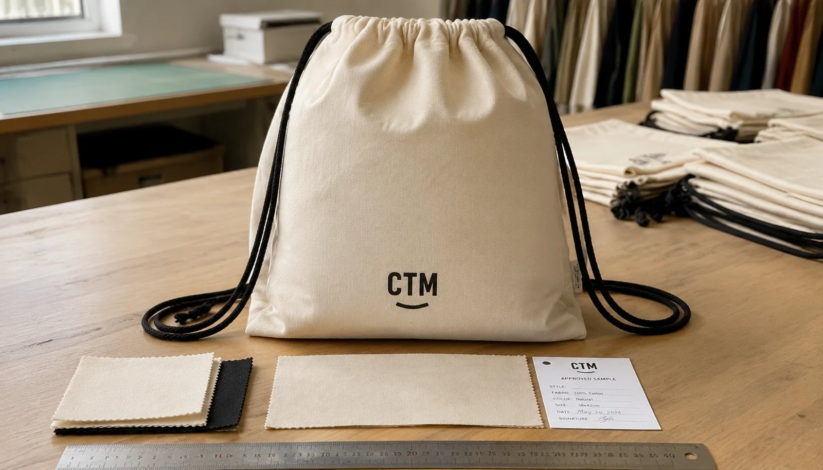
Why logo placement is the main commercial issue on this bag style
For liquor retailers, a cotton drawstring backpack is usually not bought as a fashion item first. It is a gift carrier, promotion bag, club sign-up incentive, tasting event bag, or store-branded reusable pack. That makes front logo visibility the commercial priority. If the logo sits too high, the drawcord channel gathers the fabric and bends the artwork. If it sits too low, the bottom seam eats into the print area and the bag looks unbalanced on display. Buyers often compare supplier prices on total bag cost, but the bigger difference in sell-through value is whether the branded face remains clear when the bag is filled and cinched.
This issue is more specific on drawstring backpacks than on flat totes because the front panel changes shape under load. A retailer using the bag for one wine bottle, two small spirit bottles, or a boxed gift set needs the logo to remain readable when the cords are pulled and the bag is hanging. A print layout that looks fine on a flat digital mockup can become wrinkled, cropped, or visually off-center after sewing. That is why logo placement should be treated as a construction decision, not just an artwork step.
- Main failure mode: artwork placed in the upper third where channel gathering distorts text
- Second failure mode: oversized logos reaching side seams on narrow bag widths
- Third failure mode: front print approved on empty sample but unreadable when bag is loaded
Choose bag dimensions and GSM from the actual retail use, not from a stock quote
Liquor retail programs vary more than many importers expect. A small checkout promotion bag for mini bottles does not need the same build as a holiday gift bag for a full 750 ml bottle set. For most liquor retail applications, cotton canvas around 270 to 340 GSM gives a better surface for printing and a firmer front face than light sheeting. The heavier fabric also reduces show-through from seams and cord pressure points. If the bag needs to carry heavier glass bottles, the lower corners and cord exits should be reinforced, otherwise the bag may pass visual inspection but fail in use.
Bag size should also be decided from the product pack-out. A bag that is too narrow can force the front panel to bulge, which distorts logo geometry once loaded. A bag that is too wide may look empty and low-value at retail. If buyers only request a standard size without giving the intended bottle count or insert dimensions, suppliers may quote a common stock pattern that is economical but not appropriate for the real retail use.
- Typical practical range for liquor retail promotions: 8 oz to 10 oz cotton canvas, roughly 270 to 340 GSM
- Lighter cotton can work for event giveaways, but print sharpness and bag stability usually drop
- If one or two glass bottles are expected, request reinforced lower corners and clear load-use intent in the RFQ
- State finished size tolerance because width variation directly affects logo balance on the front panel
The best logo zone is usually lower than buyers expect
Many brand teams naturally center the logo in the middle of the flat panel file. On a drawstring backpack, that often pushes the top of the artwork too close to the cord channel. The safer logo zone is usually lower front center, leaving enough space above the print so the gathered top section does not deform the graphic. In many factory layouts, positioning the artwork roughly 70 to 110 mm above the bottom seam gives a more stable visual result than vertical centering.
Horizontal centering also needs care because cotton bags are sewn, turned, and pressed by hand-guided processes. Side seam variation and panel squareness can change the apparent centerline. The better control method is to define the logo from finished seam references on the approved sample and permit a realistic placement tolerance. This gives the factory a measurable standard and gives the buyer a valid basis for inspection.
- Prefer logo placement referenced from the finished bottom seam and finished side seams
- Keep clear distance from the top drawcord channel to avoid wrinkle distortion
- Leave enough margin from side seams so artwork is not lost on narrow production variation
- State acceptable placement tolerance in the PO and inspection criteria
Match decoration method to cotton texture and order volume
For most liquor retailer programs, screen printing remains the most practical decoration choice. It handles bold logos well, gives consistent repeat results on cotton canvas, and usually offers the best unit economics once quantities move beyond small trial runs. Screen print also tends to survive store handling better than cheaper transfer methods when the bag surface is slightly textured. If the logo is one or two solid colors with no fine gradients, screen print is usually the cleanest commercial answer.
Heat transfer or digital methods can still make sense in narrow cases, especially for low MOQ pilots, artwork with fine details, or multi-color graphic campaigns. The tradeoff is surface behavior. Cotton canvas is not a smooth coated substrate, and transfers can show edge lift or texture interruption under rubbing. Digital print can look less crisp on open-weave fabric and may have wider color variation lot to lot. Buyers should not compare decoration methods only on setup cost; they should compare readability, durability, and re-order consistency.
- Screen print fits most repeat retail logo programs with simple artwork
- Transfer printing may help low-volume tests but needs abrasion review on cotton texture
- Small text and thin outlines often fail visually even if technically printable
- Request a strike-off or physical sample on the actual fabric, not artwork approval on paper alone
How MOQ logic changes when stores want branch-level branding or seasonal art
MOQ on cotton drawstring backpacks is rarely just one number. A supplier may quote an attractive MOQ based on one body fabric, one cord color, one print location, and one artwork. Liquor retailers often complicate the run by splitting quantities across branches, seasonal campaigns, membership clubs, or private labels. The moment a buyer introduces multiple prints or packing splits, setup costs and handling labor start moving. A quote that looks low at first can become expensive once screens, carton labels, or mixed assortments are added.
The most efficient way to preserve MOQ economics is to standardize the bag body and keep one front logo position across the whole run. If store names or event dates must vary, assess whether those differences justify a separate production lot or should be handled with swing tags, stickers, or insert cards. This is a classic case where buying discipline matters more than chasing the lowest initial piece price.
- One body fabric plus one logo location usually gives the cleanest MOQ efficiency
- Extra artwork versions can add screen charges, production changeover time, and packing complexity
- Branch-specific bag prints often cost more than buyers expect at moderate volumes
- Use one master style where possible and move variable information to non-printed accessories
Sample approval should simulate retail use, not just show a pretty empty bag
A pre-production sample is only useful if it tests the actual buying risk. For this product, that means measuring the logo from the finished seams, loading the bag with the intended bottle weight, pulling the cords, and reviewing how the logo reads at store distance. Too many approvals happen on an empty tabletop sample. The print may look centered flat, but once the bag is carrying weight, the front can stretch, bow, or shift visually. A useful sample approval process includes both empty and loaded photos, plus close inspection of print edges and seam alignment.
Buyers should also use the sample to evaluate retail feel. A cotton bag that is technically acceptable can still feel too soft, too thin, or too wrinkled for a premium liquor promotion. The sample stage is the right time to reject low-value visual cues such as rope cords that shed fibers, sloppy knot lengths, or front panel creases crossing the logo area. These are not minor aesthetic complaints; they influence in-store brand perception.
- Measure logo position on the finished sample, not on the artwork file
- Review the sample loaded with the actual bottle count or a realistic substitute weight
- Inspect front panel smoothness, print edge shape, and cord symmetry
- Approve cord color, knot length, and reinforcement details before bulk cutting begins
QC thresholds that matter more than generic AQL language
General AQL language is not enough for this item because the most expensive disputes are often visual rather than structural. Buyers should define a few measurable thresholds that directly affect retail acceptability. Print placement tolerance, print clarity, obvious shade variation, and front-face cleanliness deserve more attention than minor hidden thread tails. The logo is the sales face. If the front panel shows major skew, stain marks, or heavy fold lines through the printed area, the unit may be technically usable but commercially weak.
Construction still matters, especially at the lower corners and cord exits. Cotton drawstring backpacks carrying glass bottles need secure stitching where load stress concentrates. A bag may survive casual pull tests in the factory but fail after repeated customer use if stitch density is too low or reinforcement is omitted. The buyer does not need to over-engineer the spec, but should make the use case clear enough for the factory to quote the right build.
- Define placement tolerance, for example plus or minus 5 mm from approved sample reference points
- Reject severe print defects such as cracked coverage, heavy ghosting, or unreadable fine text
- Inspect the approved sales face for stains, rust marks, oil marks, and deep press lines
- Review lower corner reinforcement and cord exit stitching for skipped stitches and seam opening risk
Packing decisions affect both freight cost and store usability
Packing is often treated as an administrative note, but for promotional backpacks it affects landed cost and store labor. Flat packing in master cartons is usually the most economical option and works for most liquor retail distribution. However, if stores want cleaner presentation or the bags are sold as gift items on shelf, some buyers request individual polybags or interleaving. That can protect the print face and reduce dust transfer, but it adds labor, material, and carton volume. On low-value bags, a small packing change can noticeably move the landed cost.
Retail buyers should also think beyond factory shipment. How many units can a store unpack and display quickly? Are branch labels needed by carton? Does each carton have a barcode tied to one artwork version? These details sound routine, but they become costly when missed and corrected late. For multi-store chains, carton marking discipline is often as important as the bag spec itself.
- Flat pack is usually the default lowest-cost method
- Polybagging may improve presentation but increases labor and plastic review requirements
- Carton count per SKU should match branch allocation logic to reduce re-sorting in the warehouse
- Request carton dimensions and loading estimates to compare freight impact between suppliers
Lead time risk sits in artwork approval, fabric booking, and print scheduling
The common buyer mistake is to think sewing is the whole lead time. In reality, delay often starts before the first panel is cut. Artwork approval can drag when the brand team keeps resizing the logo after the sample is made. Fabric booking can slow if the requested GSM or natural cotton shade is not standard for that factory. Print scheduling can also bottleneck if the order includes multiple colorways or branch-specific logos. Buyers working against a seasonal liquor promotion should identify these dependencies early rather than press the factory for unrealistic ex-factory promises.
A practical RFQ should separate sample lead time from bulk lead time and ask what event starts bulk timing: artwork approval, sample signoff, or deposit receipt. That prevents timeline misunderstandings. It also helps to ask which materials are stock and which are custom. A nominally simple backpack may still require extra time if the buyer wants a specific Pantone cord color, custom side label, or unusual reinforcement patch.
- Separate sample lead time from bulk lead time in all quote comparisons
- Clarify whether bulk timing starts from deposit, artwork approval, or pre-production sample approval
- Custom fabric weight, cord color, or label trims can move the critical path
- Seasonal retail orders need more buffer if multiple artwork versions are involved
How to compare quotes without getting trapped by a low piece price
For this product, quote comparison should go beyond piece price and include print method, fabric weight, usable logo area, reinforcement, sample policy, and packing. Two factories can quote nearly the same-looking bag while offering very different commercial value. One may be pricing 200 GSM cotton sheeting with a large print area shown on paper. Another may be quoting 300 GSM canvas with a smaller but realistic printable zone and stronger lower corners. The second quote may look higher but can produce a more saleable item with fewer claims.
Buyers should normalize each quote into comparable line items. Break out body fabric, printing setup, per-color print cost, sample charges, custom labels, individual packing, and master carton details. This helps identify where a factory is hiding margin or where one quote is omitting a requirement that will reappear later as an add-on. It also makes landed-cost planning easier because packing density and carton size directly affect ocean and domestic freight.
- Compare GSM and fabric construction, not just the words cotton bag
- Normalize print setup and color charges across all suppliers
- Include packing density and carton dimensions in landed-cost review
- Treat sample cost and revision policy as part of sourcing risk, not a minor admin fee
Specification comparison for buyers
| Spec decision | Recommended option | When it fits | Buyer risk to check |
|---|---|---|---|
| Base fabric weight | 8 oz to 10 oz cotton canvas, about 270 to 340 GSM | Best for liquor retailers using the bag for one to two bottles, gift packs, or premium checkout promotions | Below about 220 GSM, front print can show drawcord pull distortion and bag shape may collapse when loaded |
| Front logo position | Lower front center, 70 to 110 mm above bottom seam | Works when the bag is carried on the back and the logo must stay visible below the cord channel wrinkle zone | If artwork sits too close to the top channel, the gathered fabric can bend text and make the logo unreadable |
| Print size | 200 x 200 mm to 260 x 280 mm depending on bag width | Suitable for store logos, bottle club promotions, and simple seasonal artwork | Oversized prints on narrow bags can run into side seams or fold out of square after stitching |
| Decoration method | Screen print for bold one to three color logos; heat transfer only for small runs or fine detail | Screen print is usually the most stable and cost-efficient for repeat retail programs | Heat transfer on textured cotton can edge-lift after rubbing; digital print may lose sharpness on open-weave fabric |
| Logo style | Solid shapes, medium line weight, limited small text | Best when bags are viewed from a few feet away in stores, events, or gift-with-purchase displays | Thin serif text, metallic gradients, and tight outlines often fail sample approval on cotton texture |
| Cord and seam layout | Reinforced lower corners with cord exits offset from print area | Useful for heavier contents and repeated reuse by shoppers | If corner reinforcement sits behind the print zone, the front panel may pucker and distort ink laydown |
| MOQ structure | Use one body color and one print location across multiple store branches to hold MOQ efficiency | Fits chains that need branch-level quantity splits but want one master production run | Multiple logo positions or branch-specific artwork can trigger extra screen costs, carton complexity, and delayed packing |
| Individual packing | Flat packed in master cartons with tissue or poly interleave only when needed | Most economical for standard retail distribution and store backroom handling | Individual polybagging may be required for clean retail presentation, but it adds labor, carton volume, and plastic compliance review |
Buyer checklist before sampling
- Set the usable logo zone from the finished bag, not from the cut panel, because the top drawcord channel and bottom seam reduce printable area.
- Match artwork detail to fabric texture: simple solid logos print more cleanly than thin lines or small legal text on cotton canvas.
- Specify fabric weight in GSM or oz and state whether the bag must hold one bottle, two bottles, or a gift set insert.
- Require a pre-production sample showing the exact logo size and position measured from side seams and bottom seam.
- Approve print method by artwork type: screen print for repeat retail programs, transfer only when detail or low MOQ justifies it.
- State print color reference using Pantone or approved visual standard and define acceptable variation under production lighting.
- Review cord color, cord thickness, and knot style because they affect both perceived quality and front panel distortion.
- Confirm whether corner reinforcement patches or eyelets will interrupt the logo area or create pressure marks behind the print.
- Define carton count, flat packing direction, and whether stores need barcode labels by inner pack or master carton.
- Request loading photos or fit photos if the bag is marketed for bottle gifting, not just empty sample photos.
Factory quote questions to send
- What is the finished bag size, usable front print area, and distance from logo artwork to the bottom seam and top channel?
- What fabric construction are you quoting: cotton sheeting, plain weave canvas, or blended canvas, and what is the tested GSM tolerance?
- Which print method are you quoting for this artwork, and what line thickness or small text limit do you recommend on this fabric?
- How many print screens, setup charges, and color stations are included, and how do costs change if one store group uses alternate artwork?
- Is the quoted MOQ based on one color, one logo position, and one packing method, or are there hidden breakpoints by SKU?
- What reinforcement is included at lower corners and cord exits, and how many kilograms of practical load is this build intended to handle?
- Will you provide a digital layout plus one physical pre-production sample with measured logo placement before bulk approval?
- What are your carton dimensions, units per carton, estimated net and gross weight, and how many cartons fit per 20GP or 40HQ example?
- What is the bulk lead time from artwork approval and deposit, and what activities sit on the critical path: fabric booking, printing, sewing, or packing?
- What AQL level or in-line inspection standard do you use for print placement, print adhesion, seam defects, stains, and mixed packing errors?
Quality-control points to confirm
- Logo placement tolerance should be defined, for example within plus or minus 5 mm from approved sample centerline and bottom reference.
- Print color should match approved standard under normal inspection light, with no obvious shade shift across one production lot.
- No print cracking, major pinholes, ghosting, or severe ink spread that changes logo edge shape at normal viewing distance.
- Top drawcord channel must be evenly sewn so gathered fabric does not skew the front logo off-center when cords are pulled.
- Finished size tolerance should be stated because narrow width variation changes logo appearance and bottle fit.
- Corner reinforcement and cord exit stitching should show no skipped stitches, frayed fabric, or seam opening after light pull testing.
- Front panel must be free from oil marks, rust stains, loose threads, and deep fold marks inside the approved sales face area.
- Mixed-carton accuracy matters for branch allocation: carton labels, assortment counts, and SKU marks should match the packing list exactly.