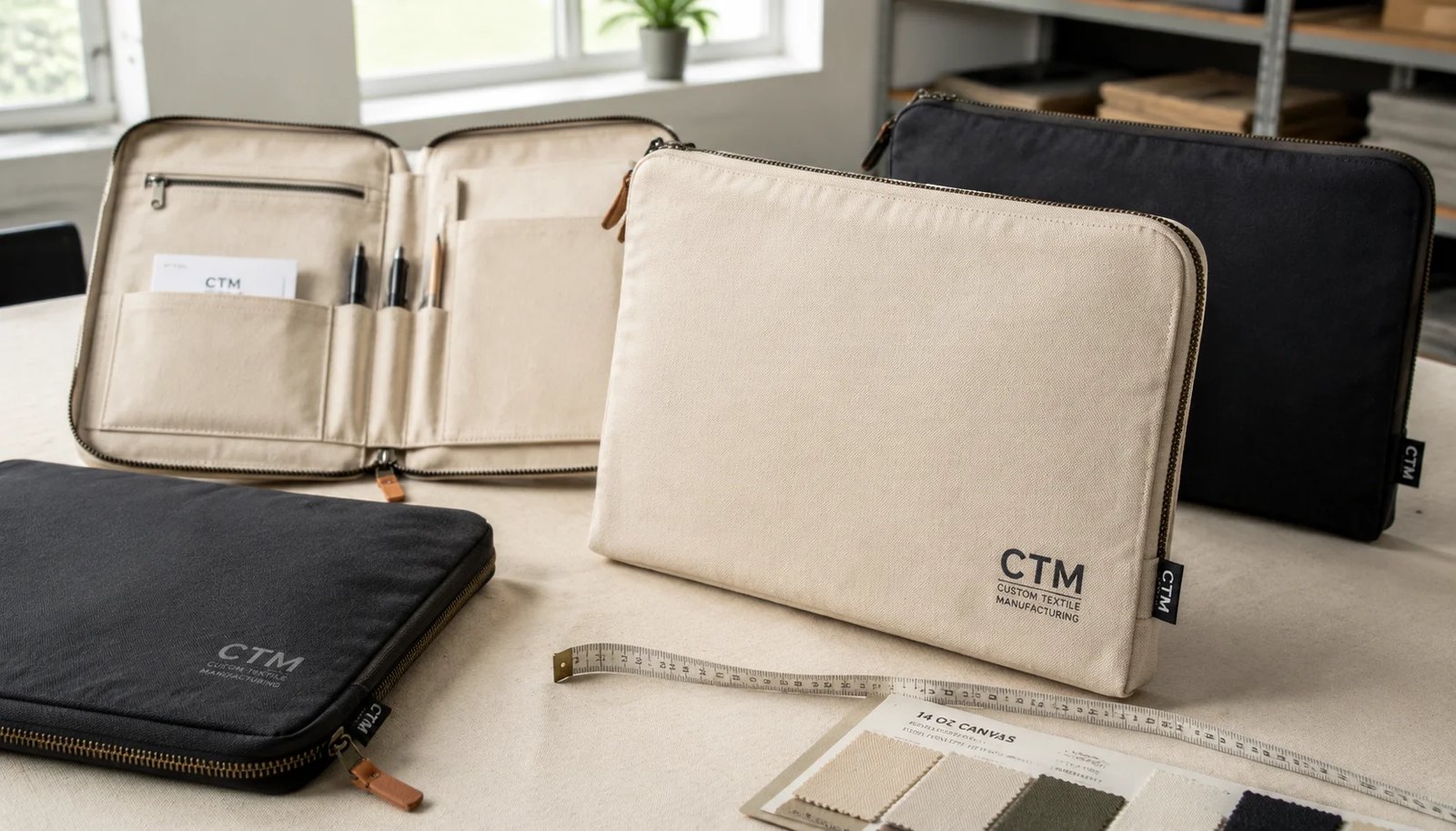
Why logo placement matters more than many buyers expect
For wellness studios, a canvas zipper portfolio is rarely just a branded extra. It usually plays a visible operational role. It may sit at reception holding intake forms, travel between consultation rooms, carry trainer onboarding documents, or be handed to premium members as part of a welcome kit. That means the front panel is not background decoration; it is one of the most visible branded surfaces in daily use.
Because of that, logo placement becomes a procurement issue, not only a design choice. On a zip-around portfolio, the visible front face is shaped by zipper tape width, seam allowance, folded edges, corner radius, interlining, and any reinforcement hidden behind the outer panel. A logo that looks centered on a flat artwork file can land a few millimeters off once the product is sewn. On a minimalist wellness brand, that small shift can stand out quickly.
Quiet branding actually raises the standard. Many wellness studios prefer natural canvas, black canvas, muted tones, and small wordmarks with generous empty space. When the layout is calm, inconsistency becomes easier to spot. A large promotional graphic may hide minor movement. A small white logo on a black or natural portfolio usually will not.
The practical fix is simple: specify placement as a measurable requirement. Define the finished reference points, approved clear space, logo width, branding method, and tolerance before bulk production starts. Once that is done, quote comparison becomes easier, sample review becomes clearer, and QC has something objective to inspect.
- Treat logo position as a controlled product spec, not a visual guess.
- Use finished-product reference points instead of cut-panel assumptions.
- Expect minimalist branding to reveal small production drift faster.
- Approve placement on a sewn sample, not on artwork alone.
Start with the construction, because branding follows structure
A common buying mistake is discussing logo position before the portfolio structure is locked. In practice, front branding quality depends heavily on what sits behind that front panel. A slim document folder behaves very differently from a padded organizer with a tablet sleeve, gusseted pocket, card slots, pen loop, or internal board. All of those features can change panel tension, introduce stitch pull, or create hidden pressure lines beneath the print zone.
For many wellness studio programs, the workable canvas range is about 10 oz to 14 oz, or roughly 280 to 400 GSM. The most balanced option is often 12 oz canvas, about 340 GSM. It usually has enough body for a cleaner print field without making the zipper path too stiff. Lighter than 10 oz can ripple more easily and may show interior construction through the outer panel. Heavier fabrics, especially around 16 oz or 450 GSM, can make corner turns bulky and can affect how smoothly the zip closure runs when the portfolio is filled.
Fill load matters just as much as fabric weight. A portfolio carrying loose paper only can work with a lighter structure. A portfolio expected to hold brochures, consultation packets, a clipboard, or a tablet needs more support and a more stable zipper path. Once the product is closed around real contents, the front panel may pull differently than it does when empty. That can make an otherwise correct logo appear tilted or compressed in use.
Buyers should confirm whether the front panel includes foam, EVA, cardboard, nonwoven reinforcement, or backing; whether the zipper is sewn directly into the body seam or into a binding strip; whether corners are square or radiused; and whether the outer panel is branded before or after reinforcement is applied. Those details sound technical, but they explain why two portfolios with the same stated size and same canvas weight may not present the logo the same way.
A good sourcing sequence is to freeze the construction first: finished size, closed thickness, intended contents, interior layout, canvas weight, zipper size, and edge treatment. Then move to branding. That order usually saves time because the factory can recommend a realistic print zone on the actual construction rather than on a rough concept.
- Typical sourcing range: 10-14 oz canvas, about 280-400 GSM.
- Most balanced spec for many programs: 12 oz, about 340 GSM.
- Interior reinforcements can change how flat the logo area stays.
- Define fill load early so the front-panel behavior is realistic.
Canvas specification details that affect print consistency
In RFQs, '12 oz canvas' is not enough detail by itself. Procurement buyers should ask for both oz and GSM, plus composition and weave. Most portfolios in this category use cotton canvas, but print holdout, handfeel, shrink behavior, and panel stability can still vary by yarn count, weave density, and finishing. If repeat orders matter, ask how GSM is controlled and whether the quoted tolerance is by average lot or by roll.
Natural canvas remains popular with wellness brands because it feels organic and understated. It also pairs well with simple black or white logos. Still, natural cotton is not a perfectly uniform base. Lot-to-lot shade variation, tiny seed flecks, or a slightly warmer or cooler tone may be commercially normal depending on the fabric grade. Those are not necessarily defects, but they do affect how the logo reads. A white logo can look cleaner on one lot and softer on another if the base shade shifts.
Dyed canvas gives more visual control when a wellness chain needs consistency across multiple locations. Black, sand, charcoal, sage, stone, and muted earth tones are common. With dyed bases, though, the print method becomes more important. Light logos on dark canvas often need a white underbase. Pigment-dyed or washed finishes may produce a softer, less crisp print edge. If the buyer needs close palette matching, the quote should state whether the supplier is using stock fabric or working to an approved color standard.
Fabric finish also changes placement reliability. A stiffer backed canvas may print flatter, which helps with small wordmarks. But it may also become less forgiving around zipper curves or corners. A washed canvas can feel more premium and relaxed, but its surface texture may reduce the clarity of fine text. Laminated or coated backings may improve body while also making any hidden reinforcement line more visible if the portfolio is compressed in packing.
The practical takeaway is straightforward: buyers should describe the fabric in enough detail that two suppliers are not making different assumptions. A usable quote line should cover composition, nominal oz and GSM, weave or construction when known, color route, and any finish or backing that affects the branding area.
- State fabric in both oz and GSM, not 'heavy canvas' alone.
- Natural canvas may have acceptable shade variation that still affects logo appearance.
- Dark dyed bases often require underbase discussion before approval.
- Backing, washing, and coating can change print edge clarity and panel flatness.
Logo zones that usually work best for wellness studio portfolios
There is no universal best logo location for every canvas zipper portfolio. In this category, two placements usually work best: lower-right front and upper-third center. Both can look premium and restrained, but each behaves differently once the portfolio is sewn and used.
Lower-right placement is often the safest choice for understated wellness branding. It keeps the center field open, supports a calm visual style, and usually feels more product-first than promo-first. It can also remain visible when papers overlap the upper area on a desk. The risk is that the lower-right area often sits closer to the corner radius and zipper turn, where distortion is more likely if the logo is pushed too close to the edge.
Upper-third center placement gives more of a presentation-folder look. It works well on clean front panels with no exterior pocket and can feel balanced on black, natural, stone, or sage bodies. But centered layouts are less forgiving. If the logo moves slightly left, right, high, or low, the human eye tends to catch it immediately. That is especially true on minimalist portfolios with one small mark and lots of negative space.
Some styles add other variables. A front pocket top stitch, decorative seam, snap tab, or stitched badge panel can change the visual center of the face. Even if the logo is mathematically centered on the overall body, it can still look wrong if another front detail interrupts the field. Buyers should review placement in relation to those lines, not the silhouette alone.
This is why measurement language matters. A spec such as 'centered' is not enough. A more reliable instruction is a measured offset from finished visible edges or from the finished zipper stitch line. That gives the supplier a reference they can actually inspect during pre-production and in bulk.
- Most common zones: lower-right front or upper-third center.
- Lower-right often suits subtle branding and daily-use portfolios.
- Upper-third center looks formal but reveals inconsistency faster.
- Check placement against pockets, stitch lines, and corner radius.
How to measure placement correctly on a finished zip-around portfolio
For this product type, placement should be measured from finished reference points, not from the cutting pattern. That one decision prevents many avoidable disputes. Once seam allowances are turned, zipper tape is inserted, and corners are formed, the visible front panel becomes smaller than the flat cut panel. If a factory prints based on the cut component only, the finished logo may drift several millimeters from where the buyer expected it.
Finished visible edges are usually the most practical reference. On some constructions, the finished zipper stitch line is even better because it is stable and easy to identify. The key is consistency. The same reference points used in the RFQ should be the ones used during sample approval and final inspection. If the buyer, merchandiser, and QC team are each measuring from different lines, disagreements are almost guaranteed.
A simple placement map is often enough. It can show finished body width and height, logo width and height, and the horizontal and vertical offsets in millimeters. For example, a lower-right placement might be specified from the finished bottom edge and finished right edge. An upper-third center placement might be specified from the top visible edge plus a centerline confirmation. The map does not need to be complicated; it just needs to be unambiguous.
Where the style includes radiused corners, buyers should also define minimum clear distance from the curve and from the zipper turn. Straight-line distances can look safe on paper but still feel crowded once the front panel wraps around the corner. This is one reason a sewn sample matters so much for final approval.
As a rule, if the supplier cannot explain exactly where they will measure from, the placement instruction is probably still too loose. Tightening the reference system early makes production smoother later.
- Measure from finished visible edges or the finished zipper stitch line.
- Use the same reference points in RFQ, sample approval, and QC.
- A simple millimeter placement map is usually enough.
- Corner radius and zipper turns need their own clear-space review.
Recommended logo size, clear space, and artwork limits
For many canvas zipper portfolios used by wellness studios, a practical front logo width falls between 80 mm and 140 mm. That size range is usually readable at reception-desk distance while still keeping the overall look calm. Smaller logos can work, especially for simple icons or monograms, but text-heavy marks can become difficult to read once they sit on textured canvas.
Clear space is just as important as logo size. A conservative starting rule is to keep the artwork at least 25 mm away from the finished zipper stitch line, folded edge, binding, rounded corner, pocket top stitch, or snap tab. Some constructions can hold less distance, but only after the same style has already proven stable in sample form. On minimalist layouts, that breathing room also helps the product look more intentional and less crowded.
Artwork detail should be treated as a production topic, not only a branding topic. Canvas texture softens edges. Very fine reverse lines can fill in. Small serif details can blur. Thin strokes that look elegant on-screen may disappear or break on woven fabric. Buyers should ask the supplier for the minimum clean line thickness, minimum reverse-gap width, and minimum readable text height they can hold on the quoted fabric and branding method.
Dark-body portfolios need extra attention when the logo is light. A white underbase may improve opacity but can also increase print thickness and make the edge of the print slightly more pronounced. In some wellness programs, that is acceptable because brand clarity matters more. In others, a softer and slightly less opaque print may fit the desired aesthetic better. The right answer depends on the brand standard, but it should be approved physically, not guessed from digital artwork.
One useful approval sheet includes: finished body dimensions, logo dimensions, offset measurements, clear-space requirement, orientation, and tolerance. That is enough detail for the buyer, factory, and QC team to work from the same standard.
- Typical front logo width: 80-140 mm.
- Use 25 mm as a practical starting clear-space rule.
- Ask for minimum printable line thickness and text-height limits.
- Review underbase effect physically on dark canvas before bulk approval.
Selecting the right branding method for canvas portfolios
Screen printing is still the most practical branding method for many canvas zipper portfolio orders. It suits solid logos, simple wordmarks, and one- or two-color studio branding. It usually offers the best balance of visual clarity, production scalability, and cost at moderate to higher quantities. Buyers should still confirm whether the quote includes screen setup, strike-off, and any underbase needed for dark fabric.
Embroidery can feel more premium, but it is not the default best option for every wellness portfolio. Dense stitches can pucker lighter or softer canvas, especially if the panel lacks suitable backing. Fine lettering is another concern. Long studio names, thin linework, and small secondary text often lose readability when stitched. If embroidery is under consideration, ask about backing type, stitch density, and whether the sample was made on the same canvas weight as bulk production.
Woven labels are a strong option for brands that want subtle, repeatable identity. A small side label or seam label can support a minimalist design language and usually carries less defect risk than a larger front print. It can also work well when the studio has multiple textile items and wants a consistent brand signature across portfolios, aprons, pouches, or totes.
Deboss patches, leather-look labels, or other patch-based solutions can suit premium member kits or spa gift programs, but they add materials, labor steps, and edge-quality checks. Heat transfer may solve some detail limitations on smaller runs, yet it needs testing for adhesion, appearance after packing pressure, and performance in bend-prone zones.
The key buying question is not simply which method looks nicest in a sample room. It is which method gives the most reliable result at the target quantity, on the chosen fabric, through shipping, storage, and daily use. The best-looking method on one sample is not always the least risky method for a full order.
- Screen print is usually the most scalable choice for simple logos.
- Embroidery requires extra review for puckering and small-text legibility.
- Woven labels support subtle branding with strong repeatability.
- Confirm setup charges, process limits, and dark-fabric requirements before comparing quotes.
MOQ, quote structure, and what changes when customization increases
MOQ strategy shapes how far a buyer can reasonably customize a canvas zipper portfolio. For many wellness studio groups, the most efficient entry point is a stock-program approach: stock canvas, standard zipper, standard puller, and one custom logo application. Volumes around 300 to 500 pieces often fit this route well, depending on the supplier. That approach usually delivers the cleanest path to launch without overcomplicating cost or approvals.
Once the brief expands to custom-dyed canvas, branded zipper pullers, woven inside labels, custom lining, specialty packaging, or hardware finish changes, the economics shift. Around 1000 pieces and above is a common level where these added features become easier to support, though exact MOQs depend on the trim package and the factory's sourcing setup. If the quantity remains low while customization remains high, setup cost and sampling time can climb quickly.
For cleaner quote comparison, buyers should ask suppliers to break pricing into at least two versions. The first version can be a stock-body program with standard materials and one branding method. The second can include the custom elements under consideration. That side-by-side structure makes tradeoffs easier to evaluate internally and prevents suppliers from pricing two very different assumptions under one line item.
Quantity breaks are also useful. Ask for pricing at 300, 500, 1000, and 3000 pieces where relevant. That helps buyers see whether a modest increase in commitment unlocks better trim control, color matching, or a more preferred branding method. It also helps with rollout planning if the order may later expand across multiple locations.
One more point matters in repeat programs: ask which charges are one-time and which repeat on every PO. Screen setup, label setup, or custom puller tooling may be front-loaded. Knowing that early gives procurement a clearer picture of the true long-term landed cost, not just the first-order unit price.
- 300-500 pcs often suits stock fabric plus custom logo.
- 1000 pcs+ usually improves feasibility for custom dye and trims.
- Request separate stock-program and custom-program quotations.
- Ask which setup charges are one-time versus reorder charges.
A practical sample approval path for placement-sensitive orders
Sampling works best when each stage answers a specific buying question. For canvas zipper portfolios, a two-stage or three-stage path is usually more effective than asking for one all-in prototype and hoping it resolves everything. The first stage should be a blank structural sample. This confirms size, opening direction, corner shape, zipper path, interior organization, and whether the intended paper set or device actually fits without distortion.
The next stage should be a branded pre-production sample using final or production-equivalent fabric, zipper color, puller, and branding method. This is where logo placement should be approved with measurements, not just a visual comment. Ask for a marked front-view photo or approval sheet showing the final offsets in millimeters from the agreed finished edges. On a placement-sensitive product, that record becomes valuable later during QC.
If the body color is dark or the artwork has fine details, a printed strike-off or test panel can save time before the portfolio is fully sewn. It lets the buyer judge opacity, edge quality, line fill, and underbase effect without waiting for complete sample assembly. For embroidery, the equivalent checkpoint is a logo sew-out on the same weight of canvas with the intended backing.
What buyers should avoid is approving a flat printed panel and skipping the sewn branded sample. That shortcut creates risk because panel turn-in, zipper insertion, and corner geometry change how the artwork finally sits. A print that looked centered on a flat panel may not look centered on the finished portfolio.
Finally, save the approval trail. Keep dated sample photos, notes on acceptable appearance, material references, and the measured placement record. That file helps prevent confusion when reorders happen months later or when a final inspection flags a placement concern.
- Stage 1: blank structural sample for fit and construction.
- Stage 2: branded pre-production sample on final materials.
- Use measured placement photos or marked sheets for approval control.
- Do not replace the sewn branded sample with flat-panel artwork approval.
QC, packing, and lead-time details that protect bulk order results
In this category, many disputes are not about random defects; they are about unclear standards. That is why QC should focus on the commercial points that matter most. Logo placement usually comes first. A common tolerance is plus or minus 3 mm from the approved location, measured from the same finished reference points used during sample approval. If the design is visually unforgiving, the buyer may want a tighter standard, but the factory should confirm what is realistic on the chosen construction.
Print quality needs plain, practical language. Screen prints should show no visible pinholes, smudges, major opacity inconsistency, broken edges, offset marks, ghosting, or obvious misregistration under normal inspection lighting. On dark bodies with light logos, opacity should be checked directly against the approved sample. Embroidery should be reviewed for puckering, loose threads, missed stitches, and readability. Labels and patches should be checked for skew, secure attachment, and clean edges.
Dimensional control matters because body distortion can make a correct logo look wrong. Closed size is often controlled within plus or minus 5 mm, though thicker or padded builds may need a separately agreed tolerance. Inspectors should also look at panel balance: twisting, bowing, seam pull, and zipper waviness can all affect how the front mark reads when the portfolio lies flat.
Zipper performance is another major checkpoint. The zipper should run smoothly end to end and around corner turns without snagging, missing teeth, tape waviness, or separation. If a specific zipper type or size is quoted, such as nylon coil #5 or #8, incoming product should match that specification. Repeated open-close checks on sampled units are more useful than a quick visual look at the zipper line.
Packing deserves the same attention as sewing and printing. Tissue interleave is often a good safeguard where printed faces may rub. Polybagging should be used only if the buyer wants it and only after the print has rested properly. Carton count should reflect actual thickness so the product is not compressed. Many programs land in the 20 to 40 pieces per carton range, but the right number depends on the build. Lead time should be managed by milestones: artwork freeze, fabric confirmation, structural sample approval, branded sample approval, printing, sewing, inspection, and shipment. That approach gives procurement better control than one broad promised date.
- Measure placement from approved finished references, typically within +/- 3 mm.
- Check print quality against the approved sample, especially on dark-body/light-logo combinations.
- Inspect body squareness and zipper performance, not dimensions alone.
- Use tissue interleave and milestone-based lead-time planning to reduce avoidable claims.
Specification comparison for buyers
| Spec decision | Recommended option | When it fits | Buyer risk to check |
|---|---|---|---|
| Base fabric weight | 12 oz canvas (about 340 GSM) for most wellness studio portfolios | Fits daily-use document portfolios, intake forms, consultation sheets, and welcome kits with enough body for cleaner logo presentation | Below 10 oz / 280 GSM may telegraph interior seams, wrinkle around print zones, and show zipper-edge distortion; above 16 oz / 450 GSM can increase corner bulk and make zip closure stiff when filled |
| Canvas construction | Plain weave cotton canvas with stated GSM tolerance and color standard | Suitable for repeat programs where front-panel appearance and print consistency matter | If weave density and GSM tolerance are not stated, different lots may print or sew differently; ask whether quoted tolerance is by average lot GSM or per roll |
| Logo placement zone | Front panel lower-right or upper-third center, measured from finished visible edges, minimum 25 mm from zipper stitch line and folded edge | Best for understated wellness branding and cleaner visual balance on zip-around portfolios | Placement measured from cut panels instead of finished edges can drift after seam turn-in; logos too near corners may skew visually once the zipper path is sewn |
| Print method | Screen print for solid logos; woven label for subtle branding; embroidery only for simple low-detail marks | Screen print fits most single-color or two-color studio branding; labels work well for minimalist programs and repeatability | Dark canvas may require white underbase; embroidery density can pucker canvas; fine text under 2.0-2.5 mm cap height may not read clearly on textured fabric |
| Logo size | 80-140 mm width for front branding; keep minimum stroke width practical for canvas texture | Readable at reception desk distance without overwhelming a calm studio aesthetic | Very fine reversed details may fill in; oversized logos make small placement drift more visible and can increase reject rate on minimalist designs |
| Interior construction | Document sleeve plus pen loop or card section only if used; add tablet pocket only after fit confirmation with actual device dimensions | Good for reception packets, consultation folders, trainer onboarding materials, and member kits | Overbuilt interiors raise sewing time, add hidden seam pressure to the front panel, and can reduce print flatness if reinforcement sits directly behind the logo zone |
| MOQ route | Stock fabric plus custom logo from 300-500 pcs; custom-dyed body and trim program from 1000 pcs+ | Useful for regional chains, rollouts, or replenishment programs with different budget levels | Low quantity plus high customization often brings setup surcharges, reduced color matching options, and longer sample approval cycles |
| Packing format | Tissue interleave for printed faces, optional individual polybag only if required, then 20-40 pcs per export carton depending on thickness | Suitable for bulk shipment, 3PL allocation, and multi-location distribution | Over-packed cartons can cause ink rub, panel compression, or zipper track deformation; polybagging too soon after printing can trap odor or residual moisture |
| Sample approval path | Approve blank structure sample first, then branded pre-production sample on final fabric with measured placement photo | Reduces resampling because fit, structure, and branding are checked in sequence | Skipping the sewn branded sample can hide placement shift caused by zipper tape width, binding turn-in, panel shrinkage after print curing, or interior reinforcement |
Buyer checklist before sampling
- Define finished size closed and open in millimeters, plus whether the product must fit A4, US letter, legal sheets, brochures, or a specific tablet model without corner crush.
- Specify canvas composition and weight in both oz and GSM, and ask the supplier to confirm quoted GSM tolerance per lot or roll.
- State whether the outer fabric is natural, reactive dyed, pigment dyed, washed, laminated, or backed with interlining, because each affects print clarity and panel stability.
- Mark the approved logo zone on a front-view drawing using measurements from finished visible edges and the finished zipper stitch line, not the cutting pattern.
- Set a minimum clear distance between the artwork and zipper seam, binding, rounded corner, pocket top stitch, or snap tab; 25 mm is a common starting point for front branding.
- List the branding method by artwork type: screen print, woven label, embroidery, deboss patch, or heat transfer, and confirm the minimum readable text height or stroke width.
- Request a blank structural sample first if the interior has pockets, organizers, foam, or tablet storage that could affect front-panel flatness.
- Request a physical pre-production sample with final fabric, zipper color, puller, artwork placement, and packing method before approving bulk production.
- Define acceptable color tolerance for dyed canvas and logo ink, especially if you must match an existing wellness studio palette across repeat orders.
- Confirm fill load: paper only, clipboard, brochure set, or tablet, because overfill changes seam stress and can make front logos appear tilted in use.
Factory quote questions to send
- What exact canvas specification are you quoting: composition, weave, nominal GSM, oz weight, and your normal GSM tolerance by lot?
- Is logo placement measured from the finished visible body edge, the zipper stitch line, or the cut panel edge? Please confirm the reference points you will use in bulk QC.
- What usable flat print area do you recommend on this construction after seam allowance, zipper tape, corner radius, and any front-panel reinforcement are considered?
- For this artwork, what print method do you recommend, and what is your minimum clean line thickness, reverse line gap, and readable text height on this canvas?
- If the body color is dark, does your quote include a white underbase, extra print pass, or strike-off for opacity approval?
- What zipper type and size are you quoting, such as nylon coil #5 or #8, and how do you control corner-turn smoothness during inline inspection?
- Does the quoted price include blank sample, pre-production sample, screen charge, embroidery digitizing, label setup, carton marks, and tissue interleave, or are these charged separately?
- What MOQ applies to stock fabric with custom print, and what MOQ applies if we require custom dye, branded zipper puller, woven inside label, or custom packaging?
- Will you provide a measured placement photo or marked approval sheet showing final logo offsets in millimeters on the sewn pre-production sample?
- How long do printed panels rest after curing before sewing and before packing, and what method do you use to prevent ink offset or face-to-face scuffing?
Quality-control points to confirm
- Logo placement on the finished front panel should be measured from the agreed finished reference points and controlled within plus or minus 3 mm unless a different tolerance is approved in writing.
- Finished size should be checked in millimeters on closed portfolios; a common tolerance is plus or minus 5 mm, but thicker padded constructions may require a separately agreed standard.
- Printed artwork should show no visible pinholes, smudging, broken edges, major color variation, ghosting, offset marks, or obvious misregistration at normal inspection distance under standard lighting.
- If white or light ink is printed on dark canvas, opacity should match the approved sample without patchiness or excessive underbase show-through at the edges.
- Embroidery, if used, should lie flat without severe puckering, thread loops, missed stitches, or unreadable small text; backing should not distort the panel face.
- Zippers should run smoothly from end to end and through corner turns without missing teeth, slider snag, tape waviness, or teeth separation after repeated open-close checks.
- Front panels should remain visually balanced with no major twisting, bowing, or stitch pull that causes the logo to appear crooked when the portfolio is laid flat.
- Interior pockets must fit the buyer's specified inserts or device dimensions, not generic A4 or letter assumptions only.
- Binding, edge paint, or turned seams should not intrude into the approved logo clear-space zone or bite into the print area near corners.
- Packed goods should be dry, correctly labeled, and protected against logo abrasion; tissue interleave or other approved separators should be present where specified.