Start with the bottle, not the logo
A printed canvas wine carrier looks simple until it is asked to carry a heavy glass bottle in front of customers. For procurement teams, print proofing should begin with the item going inside the bag, the sales channel, and the way the carrier will be displayed. A 750 ml Bordeaux bottle, a wider Burgundy bottle, a sparkling wine bottle, a cider bottle, an olive oil bottle, and a spirits bottle can all change the same bag’s fit. The differences show up in internal clearance, front-panel tension, opening width, handle drop, and how flat the base sits on a table.
The most common proofing error is approving a clean flat mockup and assuming it will look the same when filled. It rarely does. Once the bottle goes in, the gusset opens, the base drops, the fabric wraps around a cylinder, and the handles pull the upper panel upward. A logo that looked centered on a PDF may sit too low, tilt slightly, or creep toward a seam when the carrier is standing at a craft-fair booth.
That visual shift matters. Shoppers usually see the product at close range, often already filled or displayed upright beside wine, preserves, flowers, or gift items. A giveaway carrier can tolerate a more basic presentation. A paid holiday-market carrier or tasting-room retail item needs a cleaner print, stronger structure, and more controlled packing. A two-bottle gift set adds another layer: the divider must actually separate glass, not just appear in the sample photo.
Write the intended use into the RFQ. Is the product a low-cost event handout, a retail item, a gift-with-purchase, a seasonal bundle, or wholesale packaging for multiple venues? Each answer affects fabric weight, construction, QC level, labeling, and carton packing. Also approve the sample in the same condition the end customer will see it: filled, standing, and viewed under realistic light. Indoor booth lighting, outdoor daylight, and warm tasting-room bulbs can all change how natural canvas and ink colors appear.
- List every target bottle type and dimension in the RFQ, especially maximum body diameter and overall height.
- State whether the bag must stand upright, hang from a rack, sit inside a gift basket, or ship folded in event kits.
- Measure the visible front panel after inserting the bottle, not only the empty carrier laid flat.
- For two-bottle bags, confirm whether the divider must separate bottle bodies only or extend high enough to keep shoulders apart.
- If the carrier is retail merchandise, include hangtag, barcode, price label, warning label, and display needs before sampling.
- Photograph the approved sample filled, front-facing, side-facing, top-facing, and packed so QC can compare presentation as well as measurements.
Specify canvas in purchasing language: GSM, composition, finish, and tolerance
The word canvas is not a specification. One factory may quote 8 oz cotton canvas; another may quote 12 oz cotton-poly canvas; a third may use a washed finish that feels softer and prints differently. All three can call the product a canvas wine carrier. If buyers want comparable quotes and repeatable production, the RFQ should state composition, fabric weight, color, finish, and acceptable tolerance.
For many craft-fair and winery retail programs, 10 oz to 12 oz cotton canvas, roughly 280 to 340 GSM, gives a useful balance of body, printability, and cost. It usually feels giftable without becoming unnecessarily bulky. Lighter canvas can work for promotional handouts, especially when the carrier does not need to stand upright for long display periods. Below about 260 GSM, many constructions become softer and may show the bottle corners or curves more clearly.
Heavier canvas has its place, but it is not automatically better. A 12 oz to 16 oz material can feel substantial, yet it may increase carton volume, sewing difficulty, needle breakage risk, and crease pressure on printed areas. Thick folded seams near the base or handles can also affect logo placement and packing marks. If the carrier will be folded through the printed panel, test that fold before approving the final material.
Natural unbleached cotton canvas is popular because it looks rustic and pairs well with wineries, farm shops, and maker markets. It is not a bright white print substrate. Cotton flecks, slubs, and warm undertones are normal unless the buyer specifies a more controlled finish. Dyed canvas offers stronger visual branding, but dark colors need lab dip or bulk swatch approval and extra print-opacity checks, especially for white, cream, pastel, or metallic ink.
Texture also changes the print. Coarser canvas may make small text look broken, close up reverse gaps, or reduce QR-code readability. Tighter weave usually prints cleaner but may alter handfeel and price. If the artwork includes URLs, thin script, small icons, legal copy, or scannable codes, do not rely on a mockup. Proof the artwork on the actual fabric.
- Use a written spec such as: 100% cotton canvas, natural, 320 GSM ±5%, no coating, unwashed unless approved.
- Ask whether ounces are a finished fabric weight or a trade description; confirm GSM where possible for easier supplier comparison.
- For natural canvas, approve shade against a physical swatch and accept cotton flecks only within the approved sample standard.
- For dyed canvas, approve a lab dip or bulk roll swatch and request crocking review when dark shades may touch light goods.
- For premium heavy canvas, test folding, stitching, and packing before approval because crease marks can hurt print presentation.
- If exact brand color matters, approve a printed strike-off or pre-production sample rather than relying on Pantone numbers alone.
Engineer the carrier around loaded fit and table presentation
Wine carriers are judged empty during sampling, filled during use, and often displayed somewhere between the two. That is why the structure should be locked before the artwork placement is finalized. A flat sleeve is economical but may not stand well. A boxed base improves table presentation but changes the visible print position after loading. A side gusset adds clearance, but it can pull artwork toward the side breaks.
Single-bottle carriers are usually simpler to quote, sew, inspect, and pack. They are a good fit for tasting-room sales, winery event merchandise, craft-fair packaging, and one-bottle gift purchases. Even so, the buyer should confirm the widest and tallest bottle the carrier must accept. A bag sized around a standard Bordeaux bottle may feel tight around Burgundy or champagne bottles, and that tension can distort both the front panel and the logo.
Two-bottle carriers need a more careful review. The divider is not decoration; it is part of the safety and user-experience design. The divider height, fabric strength, bottom attachment, and side attachment determine whether two glass bottles stay separated during normal carrying. If the divider ends too low, bottle shoulders can knock together. If the base seam is weak, the extra load concentrates at the very point the shopper trusts most.
Handles deserve the same attention. Self-fabric handles create a consistent canvas look, but they need enough width, reinforcement, and stitch security. Cotton webbing handles may feel softer or stronger in the hand, yet they change the appearance and cost. Reinforcement may include bartacks, box stitching, X-stitching, backstitching, or multiple stitch rows depending on the design. The purchase order should describe the actual method instead of saying only “strong handle.”
Base stability should be checked filled, not guessed from a flat sample. If the carrier leans severely, twists, or collapses around the bottle, it may still function as a bag but fail as a craft-fair display product. For retail tables and tasting counters, upright presentation is part of the product quality.
- Check internal clearance with the largest bottle, including diameter, shoulder profile, and total height.
- Measure handle drop so a customer can grip the carrier without the bottle neck pressing into the hand.
- Keep logo placement away from bottom folds, gusset breaks, and handle stress areas unless distortion is approved.
- For two-bottle styles, inspect divider height, divider fabric, bottom seam, side seam, and loaded separation.
- Ask for sample photos from the front, side, top opening, base, handle attachment, inside seams, and divider area.
- Reject structures that lean severely when filled if upright display is required for fair tables, shelves, or tasting counters.
Match the print method to the artwork, fabric color, and reorder plan
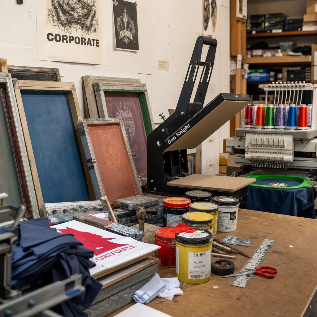
Screen printing remains a practical choice for many custom canvas wine carriers. It suits bold winery logos, one- to three-color event marks, seasonal slogans, and repeat programs where cost control matters. Once ink type, color, placement, and curing are approved, inspection can be fairly clear. Water-based inks may give a softer hand. Higher-opacity systems or plastisol-type inks may be needed when coverage is more important than softness. The quote should state which system is being used.
Dark fabric is where weak proofing shows quickly. A white logo on black, navy, burgundy, or forest green canvas may need an underbase, extra pass, or high-opacity ink. If the low quote includes only one pass of white, the final logo may look gray, thin, or uneven. Buyers should ask whether underbase screens and additional passes are included, then judge opacity on the actual selected canvas.
Full-color artwork changes the decision. Heat transfer, DTF, DTG, and other digital methods can be useful for illustrated bottle art, artist collaborations, gradients, and short seasonal runs with many colors. They also bring different inspection risks: visible film edges, gloss mismatch, cracking at folds, adhesion weakness, banding, and color shifts on natural fabric. A printed sample should be folded, rubbed gently, and packed in the same way as the bulk order.
The production sequence also matters. Printing on cut panels can give a flatter print surface and better access to the front panel, but placement depends on accurate sewing after printing. Printing on finished bags confirms final placement, yet it restricts the printable area around seams, gussets, and handle attachments. A sample made one way does not fully approve bulk production made another way. Make the sample match the planned production sequence.
- Use screen print for bold logos, simple artwork, repeat orders, and clear cost control.
- For small text or QR codes, request a print test on actual canvas and confirm readability after curing and folding.
- For dark fabric, specify whether underbase, two-pass white, or high-opacity ink is included.
- For transfers, check edge visibility, flexibility, crease behavior, and whether the film changes the canvas handfeel.
- For digital print, approve color on natural canvas because the fabric base can warm and mute some tones.
- Clarify whether printing occurs before sewing or after sewing, and require the production sample to match that method.
Turn the artwork proof into instructions an inspector can measure
A useful proof is more than a nice mockup. It is a production control document. It should include vector artwork, final print size, print side, carrier orientation, Pantone or ink references, placement measurements, safe zones, and acceptance tolerances. For wine carriers, measurements might reference the top edge, side seam, center line, bottom seam, or gusset break. The proof should say which reference controls the placement.
Many disputes start because different teams approve different things. The brand team sees a catalog-style image. The factory follows a cut-panel drawing. The event team expects the filled carrier to match a lifestyle photo. Procurement can reduce that confusion by building one proof pack: the dimensioned drawing, vector file, approved physical sample, and photos of the carrier filled and standing. Everyone then judges against the same standard.
Color proofing needs plain, realistic language. Pantone numbers help, but cotton canvas is not coated paper. The fabric’s base color, weave texture, ink absorption, and curing process can all change the visible shade. For most orders, the safest control is approval against a signed physical sample, with Pantone used as the target. If the buyer needs tighter measured color control, that requirement should be raised before quoting because it may affect sampling time, ink selection, and inspection cost.
Placement tolerance should not be left for final inspection. For simple front-panel screen prints, ±3 mm to ±5 mm is often a workable range, though the right tolerance depends on artwork size, construction, sewing variation, and print method. Artwork with borders, circles, straight baselines, centered typography, or QR codes also needs a slant check. A print can be technically within distance tolerance and still look crooked to a customer.
- Provide AI, EPS, or editable PDF files with fonts outlined and linked images embedded or supplied.
- State print size in millimeters or inches, not only “same as mockup.”
- Mark distance from top edge to logo top and center line to logo center, or another agreed reference point.
- Define safe distance from seams, gussets, bottom folds, and handle attachments.
- State front, back, both sides, or special placement; two-sided printing affects cost and inspection.
- Use the approved physical sample as the final color standard unless strict measured color control is contracted.
- For multiple carrier sizes, create separate drawings rather than automatically scaling one layout.
Compare quotes by the total program, not just the unit price
MOQ for printed canvas wine carriers is shaped by more than sewing volume. Fabric availability, cutting efficiency, print setup, number of artworks, fabric color, construction complexity, packing labor, and shipment splits can all change the minimum. A natural canvas single-bottle carrier with one-color screen print will usually be simpler than a dyed two-bottle carrier with four artwork versions, hangtags, and carton assortments.
Ask which minimum applies. Is it per total order, per bag size, per fabric color, per artwork, per print color, or per destination? The answer matters for craft-fair programs because buyers often want multiple local designs or seasonal messages in modest quantities. A supplier may accept 2,000 total units but still require a minimum per design or charge extra setup for each artwork.
Low unit prices can hide important charges. Screen setup, underbase, color changes, sample fees, transfer film, hangtags, barcode labels, individual polybags, carton relabeling, and inspection support may sit outside the base price. Procurement should compare the total landed or program cost per sellable unit, including setup and packing. This gives a more accurate picture than unit price alone.
A quote matrix is usually worth requesting. Show the quantity for each design, unit price, setup cost per artwork, ink-color charges, fabric-color charges, packing charges, and lead-time impact. If the buyer wants 2,000 carriers split across ten designs, the economics may be very different from 2,000 units of one design. Better to see that before artwork approval than after screens are prepared.
Reorder plans also affect the best decision. A recurring seasonal carrier may justify tighter sample records, retained screens, controlled fabric references, and a more durable construction. A one-time fair promotion with a fixed event date may be safer with stock natural canvas and a simple one-color print.
- Ask whether MOQ is per artwork, per print color, per bag size, per fabric color, or per total PO.
- Separate unit price from setup charges, sample cost, packaging cost, labeling cost, and freight-related packing changes.
- Request quantity breaks for each design version rather than one blended number.
- Confirm whether underbase or extra ink passes are included for light print on dark canvas.
- For retail programs, include hangtag, barcode, individual packing, and inner assortment labor in the quote.
- For reorders, ask how long screens, samples, and production records will be retained.
Approve a physical pre-production sample before the order becomes hard to fix
A digital proof can approve the design direction. It cannot approve fabric body, stitching, handle comfort, print opacity, curing, texture, fold marks, or how the logo sits once a bottle is inside. For branded craft-fair inventory, a physical pre-production sample is the most useful approval point. Whenever possible, it should use the final fabric, final print method, final ink, final thread, final handle reinforcement, final divider, and final packing fold.
Separate design approval from production acceptance. The brand owner may decide whether the logo looks right. Procurement should record measurable details: fabric GSM, finished dimensions, handle drop, print size, print placement, ink reference, stitch reinforcement, divider height, and packing method. A signed or photographed approved sample then becomes the standard for bulk QC.
Blank samples and print strike-offs both help, but neither tells the whole story. A blank sample checks bottle fit and sewing, not print. A strike-off on loose canvas checks ink, not placement on the finished carrier. If the schedule allows only one sample, make it as close to mass production as possible. If the design includes dark canvas, metallic ink, white ink, small text, QR codes, large solid areas, full-color transfer, or a two-bottle structure, sample review should be more detailed.
Use the sample the way event staff and shoppers will use it. Insert filled bottles, lift the carrier, place it on a table, fold and unfold it, and view it under likely lighting. If the carrier will be sold, inspect it like retail merchandise: front print, stitch neatness, loose threads, odor, creases, handle comfort, and perceived value. Any requested changes should be written on revised drawings or marked photos, not left in email shorthand.
- Measure the sample against the quoted dimensions and record any approved deviations.
- Confirm fabric weight by supplier record or GSM check if weight is critical.
- Review the logo with the bottle inserted and the carrier standing upright.
- Rub the cured print gently with a white cloth to check obvious pigment transfer or smudging.
- Fold the sample as packed and check for cracking, blocking, ghosting, or pressure marks.
- Inspect inside seams, base corners, handle attachments, and divider—not only the printed front.
- Keep one approved sample with the buyer and require the factory to keep one matching sample.
Set QC rules for print, sewing, and loaded use before bulk starts
Canvas has texture, so a perfectly smooth print edge may not be realistic. Small ink breaks caused by the weave can be acceptable if they match the approved sample. True defects should be named clearly: wrong artwork, wrong print side, incorrect color direction, missing letters, major smudges, unreadable text, weak opacity outside the approved standard, crooked placement, or print crossing into an unapproved seam or fold area.
Print inspection should include measurement and visual judgment. A logo may meet a linear tolerance but still appear slanted if the bag body is uneven or the artwork has a straight baseline close to a seam. Multi-color screen prints need registration checks. Transfers need edge, adhesion, and flexibility checks. Digital prints need banding, color consistency, and fold-performance checks. Inspect both at close range and from a normal customer viewing distance.
Sewing QC matters because the carrier holds glass. Strong canvas cannot make up for open seams, skipped stitches at stress points, weak handle attachments, or a loose divider. Load-bearing areas should follow the approved reinforcement method. Inspect thread tension, stitch density, backstitching, bartacks or box stitches, seam allowance, loose threads, and raw edge control.
Add a loaded check. Use the intended filled bottle or equivalent weight, lift the carrier by the handle, hold it, and watch what happens. Does the handle distort severely? Do stitches pop? Does the base pull out of shape? For two-bottle carriers, load two bottles and move the bag gently to confirm the divider reduces glass-to-glass contact during normal carrying. For larger orders or retail distribution, define an AQL sampling plan with critical, major, and minor defect categories before production.
- Typical print placement tolerance may be ±3 mm to ±5 mm, but state the exact rule in the PO.
- Reject wrong artwork, reversed print side, unreadable brand text, major smears, and unapproved color mismatch.
- Check QR codes by scanning after print, curing, folding, and normal handling if QR codes are included.
- Inspect handles under loaded conditions, not only visually on empty bags.
- Reject open seams, skipped stitches at stress points, thread popping, weak divider seams, and severe base distortion.
- If using AQL, define inspection level and acceptable quality limits before production.
- Compare bulk goods against the approved sample for shade, stitch color, print size, placement, handle drop, and packing presentation.
Plan packing so carriers arrive clean, sorted, and event-ready
Packing is easy to overlook because it happens after the product seems finished. It can still ruin the presentation. Canvas wine carriers are often folded flat and bundled, but tight compression can create crease lines through the logo. If ink is not fully cured, printed surfaces may block, transfer, or develop dull patches under pressure. The packing proof should show fold direction, print exposure, inner bundle count, and carton arrangement.
Craft-fair programs often ship to several tasting rooms, pop-up shops, distributors, or event teams. Carton marks and inner labels are practical operating details, not admin clutter. A carton may be efficient for export but inconvenient if it is too heavy, contains mixed designs without separation, or lacks clear artwork codes. Event teams need to open the right carton and find the right design quickly.
Match packing to the print method. A small one-color screen print may tolerate standard flat folding after full curing. A large solid print, metallic ink, transfer, or full-color print may need print-to-print avoidance, tissue, interleaving, or lower carton compression. Individual polybags can protect against dust and moisture, but they add cost, labor, and packaging waste. For retail resale, hangtags, barcode stickers, price labels, and shelf-ready bundles may be required.
Request carton quantity, gross weight, net weight, carton dimensions, and estimated CBM before final PO approval. Heavy canvas and two-bottle dividers increase volume and weight. If cartons ship directly to craft-fair venues, small shops, or tasting rooms, practical manual handling and clear labels may matter more than maximum carton density.
- Specify fold direction and whether the printed panel may be folded across the logo.
- Use inner bundles to separate artwork versions, sizes, fabric colors, destinations, or retail assortments.
- For delicate prints, consider tissue, interleaving, print-to-print avoidance, or lower compression.
- Carton marks should include item code, artwork code, color, quantity, gross weight, net weight, carton number, and destination if split.
- Ask for first packed-carton photos before shipment approval.
- Keep carton weights practical for manual handling at event venues and small retail stockrooms.
- Confirm whether hangtags, barcodes, price labels, warning labels, or individual bags are attached before final inspection.
Protect the schedule from proofing delays and late event inventory
Lead time is not just sewing time. A realistic schedule includes artwork cleanup, proof review, sample making, print curing, sample transit, buyer approval, bulk fabric preparation, cutting, printing, curing, sewing, trimming, inspection, packing, carton marking, and freight handover. Craft fairs and seasonal markets have fixed dates, so a slow proofing decision can turn usable merchandise into late inventory.
Work backward from the required in-hand date. Include time for one sample rejection or artwork adjustment, especially with new artwork, dyed canvas, full-color printing, QR codes, or a supplier you have not used before. Also reserve time for final inspection, packed-carton review, destination split instructions, and carton relabeling if goods ship to more than one location.
Artwork readiness can make or break the timeline. Vector files with outlined fonts and Pantone references move quickly. Low-resolution JPEGs, screenshots, or logos pulled from slide decks often need redraw work before screens or transfers can be prepared. If several internal stakeholders must approve the design, set a decision deadline before the PO is placed.
Production sequence changes timing too. Printing before sewing may require complete artwork approval before cutting. Printing after sewing may allow blank bags to be prepared earlier, but it limits print area and can require slower placement work. Dyed fabric, custom labels, woven tags, hangtags, barcode stickers, and special packing can add time before or after sewing. Ask the supplier for milestone dates, and make clear which dates depend on buyer approval.
- Set target dates for artwork release, digital proof, physical sample, sample approval, bulk start, inspection, packing, and shipment.
- Build in buffer for one artwork revision or sample correction when the design is new or technically risky.
- Confirm curing time before packing so ink or transfer areas do not block or mark adjacent fabric.
- Ask whether bulk production starts only after signed sample approval.
- Reserve time for final inspection and rework if defects are found.
- If stock ships to multiple destinations, send split instructions and carton mark requirements before packing starts.
- For seasonal craft fairs, prioritize proven fabric and simple print if the in-hand date is tight.
Specification comparison for buyers
| Spec decision | Recommended B2B specification | When it fits | Buyer risk to check |
|---|---|---|---|
| Fabric weight for craft-fair retail use | 10 oz to 12 oz cotton canvas, approximately 280-340 GSM, with agreed roll tolerance such as ±5% or supplier’s stated mill tolerance | Reusable printed wine carriers that need enough body to stand on tables, feel giftable, and survive event handling | Below about 260 GSM may collapse or show bottle corners; above about 380 GSM can raise cost, carton CBM, needle breakage risk, and crease-related print defects |
| Fabric composition and finish | 100% cotton canvas or cotton-rich canvas stated in writing; natural, bleached, dyed, washed, or treated finish identified before sampling | Needed for comparable quotes and repeat orders where handfeel, shade, and print performance must be controlled | The word canvas is not enough; suppliers may quote different blends, weights, or finishes that change price, print absorption, shrinkage, and color appearance |
| Fabric color control | Natural unbleached canvas approved by swatch or sample; dyed canvas approved by lab dip or bulk fabric swatch before cutting | Natural canvas suits rustic winery and maker-market programs; dyed fabric supports stronger brand-color packaging | Natural canvas has cotton flecks and shade variation; dark dyed fabric needs crocking review and white-ink opacity testing |
| Single-bottle structure | Internal fit tested with target bottle; common 750 ml wine carrier should be checked for bottle diameter, bottle height, opening, base depth, and handle drop | Tasting-room sales, winery giveaways, single-bottle gift packaging, craft-fair merchandise | A bag that fits a Bordeaux bottle may be tight for Burgundy or champagne; logo placement can shift once the round bottle expands the panel |
| Two-bottle structure | Sewn center divider with confirmed height, base attachment, side attachment, and loaded separation test using two filled bottles | Premium holiday bundles, winery gift sets, retailer gift packs, distributor promotions | Divider that is too low or weak allows glass-to-glass contact; handle and base seams carry roughly double the load of a single-bottle carrier |
| Base and gusset construction | Boxed base or side gusset dimensioned in the tech pack; finished base checked flat and filled, with dimension tolerance such as ±5 mm or agreed percentage | Important when carriers must stand upright on craft-fair tables, shelves, tasting counters, or in gift baskets | A flat empty sample can look correct but twist, lean, or pull the print off-center after the gusset opens around the bottle |
| Print method for simple logos | Screen print using approved ink type, mesh/line suitability, underbase if needed, and curing method; one to three solid colors usually most cost-controlled | Bold winery marks, event logos, maker brands, one-color seasonal artwork, repeat replenishment orders | Fine reverse type, thin strokes, small gaps, and tight multi-color registration can fill in on textured canvas; dark fabric may require underbase or extra pass |
| Print method for full-color artwork | Heat transfer, DTF, DTG, or digital print only after a strike-off or pre-production sample on actual canvas and actual fold method | Illustrated bottle art, artist collaborations, low-volume seasonal designs, multi-color craft-fair editions | Transfers may show film edge, gloss mismatch, or cracking; digital color can shift on natural canvas and should be checked after rub, fold, and packed compression |
| Artwork proofing rules | Vector artwork plus dimensioned placement drawing: print size, Pantone/ink references, side printed, bag orientation, center line, safe zone, and tolerance | Essential when several bag sizes, several artworks, or several destinations share one program | A logo centered on a flat panel may appear low, slanted, or too close to a seam when the carrier is loaded and standing upright |
Buyer checklist before sampling
- Define the bottle size range before quoting: Bordeaux 750 ml, Burgundy 750 ml, champagne/sparkling, slim Riesling, cider, olive oil, spirits, or a mixed assortment.
- Measure the largest target bottle: overall height, maximum body diameter, shoulder width, and label area that should not be scuffed by the carrier opening.
- State the sales channel: giveaway, paid merchandise, winery tasting-room sale, gift-with-purchase, holiday bundle, wholesale resale, or event kit. QC level and packaging should match the channel.
- Specify fabric by composition, weight, and tolerance: for example, 100% cotton canvas, natural, 320 GSM ±5%, no coating unless approved.
- Confirm fabric finish and color control: natural swatch approval, dyed lab dip, bulk roll swatch, or tolerance to approved physical sample.
- Define construction: single bottle, two bottle, boxed base, side gusset, center divider, self-fabric handles, cotton webbing handles, hang loop, label patch, hangtag, barcode, or retail sticker.
- Provide target finished dimensions with tolerance: height, width, gusset/base depth, opening width, handle width, handle drop, divider height, and print panel size.
- Send vector artwork, preferably AI, EPS, or PDF with outlined fonts, plus Pantone references, exact print size, artwork orientation, and side to be printed.
- Confirm whether print color is a strict brand match, a close commercial match, or approved by physical sample; do not rely only on a screen-viewed PDF.
- Require a physical printed sample for dark canvas, dyed canvas, metallic ink, white ink, full-color transfer, QR codes, small text, large solid ink areas, new suppliers, or retail resale orders.
Factory quote questions to send
- What exact fabric is included in the quote: composition, yarn/finish if known, canvas weight in GSM or ounces, and normal production tolerance by roll?
- Is the fabric stock natural canvas, bleached canvas, dyed canvas, cotton-poly canvas, organic cotton, recycled-content canvas, or another blend?
- Can you provide stock swatches, lab dips, or a printed strike-off before sample making, and what shade variation should we accept for bulk production?
- What are the quoted finished dimensions and tolerances for height, width, gusset/base depth, opening, handle drop, handle width, and divider height?
- Which print method is quoted: screen print, heat transfer, DTF, DTG, digital, embroidery, or label patch? Is the print applied to cut panels or finished bags?
- For screen printing, how many colors, screens, ink passes, underbase layers, and setup charges are included? Are color changes charged separately?
- What is the maximum printable area and recommended safe area on the selected carrier, including distance from seams, gussets, bottom fold, and handle attachment points?
- How do you handle Pantone matching on natural or dyed canvas, and what tolerance should be used for inspection: approved sample, Pantone visual match, Delta E, or commercial tolerance?
- Does the sample fee include final bulk fabric, final print method, final thread color, actual handle reinforcement, divider if any, and one artwork adjustment round?
- What is the MOQ per total order, per artwork, per print color, per bag size, per fabric color, and per shipment destination?
Quality-control points to confirm
- Fabric weight should match the approved specification within the agreed tolerance, commonly checked by GSM cutting test, roll record, or supplier lab record. Record whether the tolerance is per roll or per shipment lot.
- Bulk fabric shade should be compared against the approved swatch or signed sample under consistent lighting such as D65 daylight or another agreed light source. Natural cotton flecks and slubs should be accepted only within the approved sample standard.
- Finished carrier dimensions should be measured flat and filled: height, width, base/gusset depth, opening width, handle drop, handle width, divider height, and print panel location. Typical soft-goods tolerances are often ±5 mm or ±2%, but the PO should state the actual rule.
- Bottle fit should be checked with the largest approved bottle. The bottle should insert and remove without tearing seams, excessive label abrasion, or severe distortion of the printed panel.
- Print placement should stay within the approved tolerance, commonly ±3 mm to ±5 mm for simple front-panel screen prints. Artwork with borders, circles, or straight baselines needs slant review in addition to linear measurement.
- Ink opacity should match the approved sample on the selected canvas color. Reject obvious show-through, heavy bleeding, missing brand text, rough edges outside the sample standard, or dull white ink when a stronger underbase was approved.
- Small text, QR codes, URLs, thin logo strokes, and reverse details should remain readable after curing, normal handling, folding, and gentle rub testing. QR codes should be scanned from a practical customer distance if used.
- Multi-color screen prints should be checked for registration. Reject obvious color shadows, gaps, misalignment of brand marks, or color order errors.
- Heat transfer, DTF, DTG, or digital print areas should be checked for edge lift, film marks, gloss mismatch, cracking after folding, adhesion weakness, banding, and color shift against the approved sample.
- Handle attachment should pass the agreed loaded check with filled bottles or equivalent weight. Inspect for seam opening, thread popping, skipped stitches, fabric tearing, or severe distortion at handle stress points.