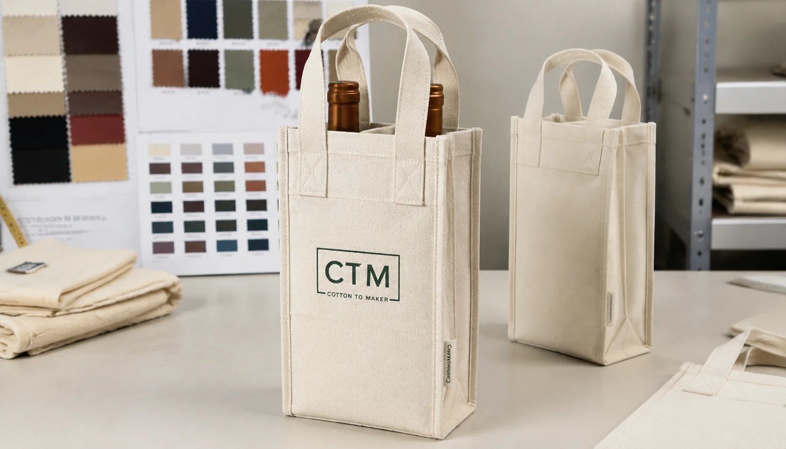
1. Start with the finished bag, not the logo file
For procurement buyers, logo placement on a canvas wine carrier is not a graphic-design decision first. It is a product-construction decision. The visible front panel changes once the bag is sewn, hemmed, folded, and loaded with bottles, so artwork approved too early often fails in sampling or bulk production.
Natural grocers in particular tend to prefer reusable, natural-looking packaging with straightforward branding. That can make the bag look simple, but the specification is not simple. Side seams reduce usable width, handle stitch boxes create no-print zones, dividers can pull the center of the front panel, and heavier bottles can curve the fabric enough to distort a logo that looked fine on a flat PDF.
A better process is to lock the bag geometry before approving final artwork size. Ask for a finished measurement drawing, a sewn sample, and a marked safe print area. Once those are in place, logo placement becomes measurable and repeatable instead of subjective.
This approach also improves quote comparison. If one supplier is quoting on a flat panel assumption and another is quoting on the finished sewn area, prices and tolerances will not be comparable. Procurement teams save time by aligning that foundation before discussing bulk cost.
- Approve construction first, then placement.
- Treat the finished front panel as the real print surface.
- Require a safe print area drawing before artwork sign-off.
- Do not compare suppliers unless they are quoting on the same finished geometry.
2. Define the carrier format around real bottle use
A one-bottle bag, a two-bottle divider bag, and a mixed-bottle promotional carrier do not behave the same when loaded. The best logo placement depends on what the bag must carry in store, not on a generic wine-bag template.
One-bottle formats usually have a narrower visible face. That often favors compact centered logos, vertical badges, or shorter horizontal marks. If the logo is too wide, it can wrap visually toward the seams when the bottle expands the front panel. In a two-bottle format, the front panel is wider, but the divider often introduces a center pull that can make a large single logo look subtly distorted unless the construction is well balanced.
Natural grocers may also use these carriers beyond a standard 750 ml bottle. Sparkling bottles, olive oil bottles, or taller imported shapes can change how the panel sits. If the buying team approves placement using only the easiest sample bottle, the production result may disappoint once the full assortment reaches stores.
The simplest control is to define the maximum bottle diameter and height at RFQ stage and ask the factory to test against that range. If merchandising includes neck tags, tissue, or a gift insert, include those too because they change the way the bag opens and how the logo reads from shelf distance.
- Specify the largest bottle diameter and tallest bottle height.
- Test one-bottle and two-bottle formats separately.
- Compare empty and loaded appearance before approval.
- Include inserts, tissue, or neck tags if they are part of the retail program.
3. Set logo placement from measurable reference points
The most reliable placement specification uses finished sewn reference points. Buyers should avoid wording such as 'center logo nicely on front' or 'place approximately 5 cm below top.' Those instructions leave too much room for interpretation on a production floor.
Instead, define the placement in measurable terms. Example: logo centered on finished front panel; top of artwork 45 mm below top hem; minimum clearance 20 mm from each side seam; minimum clearance 15 mm from handle stitch box; overall logo width 110 mm. The exact numbers will vary by bag size, but the principle remains the same: every inspector should be able to take the same measurement and reach the same result.
It also helps to separate three dimensions that are often confused: total panel size, safe print area, and approved artwork size. A finished panel might be 180 mm wide, but the safe print area may be only 120 to 130 mm once seam clearance and loaded distortion are considered. The logo itself should sit comfortably inside that area rather than filling it edge to edge.
For natural grocers carrying more than one branded element, decide hierarchy early. If the front panel needs a retailer logo, sustainability message, and certification icon, one of those may belong on a side label, back panel, or hangtag. Fine symbols and legal marks should stay in the most stable area rather than near folds or seams.
- Measure from top hem and sewn side edges.
- Write exact clearances into the artwork spec.
- Separate total panel size from safe print area.
- Keep fine marks away from curved or stressed zones.
4. Choose placement options by merchandising goal
There is no single correct logo position for every canvas wine carrier. The right option depends on how the bag will be displayed, how subtle the branding should feel, and whether the product is a year-round reusable bag or a seasonal gift item.
A centered front logo is still the default for most natural grocer programs because it is easy to recognize, simple to repeat, and straightforward to inspect. It works especially well when the front panel remains visible on shelf or on a gift stack. Buyers who want a cleaner aesthetic may choose a smaller logo lower on the panel, but they should confirm that the logo does not disappear once the bottle is inserted.
Two pocket-aligned logos can be a better choice on some two-bottle bags. This is not only an aesthetic decision; it can also reduce the visual effect of a center divider pulling the fabric. Side seam labels, meanwhile, are useful when the brand wants quiet identification rather than a bold promotional look. They are best treated as secondary branding unless the merchandising plan guarantees the side seam will be visible.
Back-panel branding is useful for co-branded programs or when the front is reserved for a gift tag, seasonal message, or cleaner visual presentation. The risk is obvious: if the back faces away from shoppers, the branding loses value. This is why buyers should ask retail teams how the bags will actually sit in store or in promotional displays.
- Centered front logo is easiest to standardize and inspect.
- Two-pocket logos can improve balance on divider bags.
- Side seam labels suit subtle house-brand positioning.
- Back-panel branding only works if display orientation supports it.
5. Match fabric weight and decoration method to the program
Fabric weight, weave, and print method directly affect placement accuracy and logo appearance. A nominal 10 oz or 12 oz label is useful, but it is not enough. Two fabrics with the same stated weight can behave differently because of weave density, finishing, and yarn character.
For many reusable wine carriers, 10 oz canvas offers a good balance of body, printability, and freight efficiency. A 12 oz option may feel more premium and support heavier bottles more confidently, but it also increases seam bulk, carton volume, and sometimes the difficulty of holding a tight print placement tolerance on narrow formats. Heavier fabric is not automatically the better procurement decision.
Decoration method should be chosen with the intended use cycle in mind. Screen print is usually the most practical option for natural grocers because it handles simple logos well at volume and is comparatively easy to control for repeat orders. Heat transfer can work for short runs or complex multicolor art, but buyers should assess whether a transfer film surface suits a reusable cotton accessory. Embroidery adds value for premium sets but should be avoided for dense text or marks that need precise readability.
Because natural cotton fabric can shift the perceived ink color, strike-offs should be requested on the actual production canvas, especially for muted greens, low-contrast neutrals, or sustainability-led palettes where subtle color differences matter to the brand.
- Do not evaluate fabric by oz alone; confirm GSM and hand feel.
- Use screen print for most simple repeat programs.
- Require strike-offs on actual natural canvas.
- Balance premium feel against seam bulk, CBM, and placement control.
6. Clarify compliance and documentation by market
Compliance requests often become vague in accessory sourcing, especially for simple textile items. Procurement teams can avoid confusion by separating mandatory legal requirements, retailer onboarding requirements, and internal risk-management requirements.
For example, an EU program may require documentation aligned with the buyer's REACH management process, while a US retailer shipping into California may ask for Proposition 65-related information under its own policy. That does not mean every order needs the same paperwork. The factory should be told exactly which market the goods are for and what your retailer or importer expects.
Common document requests for canvas wine carriers include fiber composition declaration, restricted substances statement, country-of-origin information, packaging material declaration, and supplier profile or audit information if onboarding requires it. If there are claims around recycled content or other sustainability attributes, those should be specified separately rather than assumed from a generic canvas description.
Natural grocers should also flag practical compliance-adjacent issues such as odor, mold risk during sea transit, and retailer restrictions on excessive plastic packing. These may not be framed as formal legal compliance, but they can still block receipt or create customer complaints if ignored.
- State destination market and retailer policy in the RFQ.
- Ask only for the documents your channel actually requires.
- Separate legal requirements from onboarding paperwork.
- Include odor, mold-prevention, and packaging-policy expectations.
7. Build quote comparisons that expose real landed cost
A good canvas wine carrier quote is not just a unit price. Procurement needs to see which assumptions are built into that number. Otherwise, a cheaper quote may simply reflect lighter fabric, a smaller logo, lower-grade packing, or fewer QC controls.
Ask suppliers to separate body cost, print setup, running print cost, woven label cost, sample fee, custom packaging cost, and carton details. If the carrier uses a divider, confirm whether that reinforcement is already included. If the quote assumes a stock body with a standard safe print area, make sure that is obvious. A fully custom body and a stock-body print order should never be compared as if they were the same sourcing path.
Landed cost depends heavily on packing efficiency. A thicker fabric or bulkier handle reinforcement may improve hand feel but increase CBM enough to erase any ex-factory price advantage. This matters for grocery buyers because high-volume replenishment programs often move through centralized distribution, where carton dimensions and pallet efficiency directly affect receiving and storage costs.
It is also wise to question unusually low MOQs. Sometimes they are genuine, but often they imply a stock fabric, limited color control, grouped production timing, or less flexibility on exact placement. Procurement should ask what operational conditions make the MOQ possible before treating it as a like-for-like commercial benefit.
- Request itemized pricing, not one blended figure.
- Confirm whether the quote is for stock body or custom body.
- Compare carton size, pack count, weight, and CBM early.
- Interrogate low MOQ offers for hidden constraints.
8. Approve samples the same way the customer will use the bag
Sample approval is where many placement issues can be prevented at low cost. The key is to evaluate the sewn, loaded, and packed bag, not just the flat visual of the logo. If the sample uses substitute fabric or a mock print, treat it as a development sample rather than a final approval sample.
For placement, measure the bag first and then look at it as a shopper would. Record the distance from the top hem to the top of the logo, the logo width and height, and the left and right clearances from sewn edges. Then insert the intended bottle, stand the bag upright, and inspect it from normal viewing distance. That is often where problems appear: the logo rides too high under handle tension, curves too much over the bottle shoulder, or drifts visually toward one seam once the bag is carrying weight.
Photographs are useful, but only if they are tied to numbers. A retained approval sheet should include fabric details, print method, artwork code, measured placement points, approved color references, and notes on acceptable natural-canvas variation. Keep one retained sample with the buyer or QA team and one at the factory as the production master.
If the order matters commercially, ask to see the bag in its approved fold and packing method as well. A print that looks perfect standing upright can still become a claim issue if the fold line cuts directly through the logo and leaves a lasting crease after transit.
- Approve sewn and loaded samples, not artwork alone.
- Measure placement and record it on the sample sheet.
- Retain one approved sample on both buyer and factory sides.
- Review the packed fold method before bulk approval.
9. Use explicit QC tolerances and pass-fail rules
A useful QC plan for custom canvas wine carriers does more than say 'check print and sewing.' It tells the supplier what to measure, how much deviation is acceptable, and which defects count as critical, major, or minor. That is especially important for logo placement, where visual judgment alone can become inconsistent across inspectors.
For example, a buyer may define a major defect as any front logo whose vertical placement deviates by more than plus or minus 5 mm from the approved sample, whose horizontal centering deviates by more than plus or minus 4 mm, or whose skew exceeds 3 degrees relative to the top hem. The exact values should match the artwork size and the program's brand sensitivity, but the logic should be concrete. If the logo includes small text, the QC plan might also set a minimum readability threshold and treat broken letters or filled counters as major defects.
Print quality should include practical durability checks. At minimum, use dry-rub and light damp-rub evaluation on cured print areas and inspect for smearing, tackiness, or visible transfer to adjacent units. Structural quality should include representative load testing and checks on handle reinforcement, divider seams, and bottom seam integrity. Packing should be inspected for offset, moisture exposure, incorrect carton marks, and fold method consistency.
This level of detail protects both sides. Procurement gets a clear pass-fail basis, and the factory knows what standard it is expected to build toward. That is far better than arguing over whether a logo 'looks a little off' after goods are already packed.
- Write numeric placement tolerances into the quality agreement.
- Classify unreadable print and out-of-spec placement as major defects.
- Use rub, load, and packed-carton checks as standard QC actions.
- Tie all inspections back to the approved sample and drawing.
10. Final buyer checklist before PO release
Before a purchase order is issued, natural grocers should make sure the specification pack is complete enough to survive handoff from sourcing to sampling, production, QA, and logistics. Most preventable problems happen because one of those groups is working from an incomplete version of the product brief.
At minimum, the PO file should include the finished measurement drawing, artwork file, safe print area, approved logo placement measurements, fabric specification, decoration method, color references, sample approval photos, inspection method, defect definitions, and packing instructions. Compliance and onboarding documents should be listed as deliverables, not assumed. If there is a retailer-specific carton label format or non-plastic packing requirement, it should also be stated there.
Buyers should also confirm who has authority to approve changes if sampling reveals a construction issue. A factory may propose shifting the logo a few millimeters, reducing the print width, or changing fold method to protect the artwork. Those are not small shop-floor decisions; they affect repeatability and should be approved through a named contact.
If this information is assembled before bulk production starts, logo placement on canvas wine carriers becomes a manageable sourcing task rather than a recurring quality complaint.
- Attach all technical files and approval references to the PO.
- List required documents and packing rules as deliverables.
- Name the approval contact for any construction or placement change.
- Do not release bulk until sample, QC, and packing standards are aligned.
Specification comparison for buyers
| Decision area | Option | Best fit | Advantages | Limits and buyer checks |
|---|---|---|---|---|
| Logo location | Front logo centered below top hem | Most private-label natural grocer programs | Clean shelf-facing branding, easiest to standardize across repeat orders | Set measurable clearance from top hem, side seams, handle stitch boxes, and bottom fold; verify appearance on a loaded sample |
| Logo location | Two pocket-aligned front logos | Two-bottle carriers where the center divider creates visible panel pull | Can look more balanced when bottle pockets tension unevenly | Requires pocket geometry to be controlled; misalignment between left and right logos is highly visible |
| Logo location | Back-panel branding or secondary message | Programs using front panel for gifting, tags, or cleaner merchandising | Useful for co-branding, seasonal messaging, or retailer copy | Back panel may not face the shopper; confirm in-store orientation before approving |
| Logo location | Side seam woven label only | Understated house-brand or sustainability-led programs | Low visual noise, premium look, no large print area needed | Label visibility depends on fold, seam turn, and shelf orientation; approve on sewn and packed samples |
| Decoration method | Screen print | Most medium- to high-volume cotton canvas orders with 1-3 spot colors | Cost-efficient, repeatable, good readability on canvas, familiar QC controls | Need strike-off on actual fabric; check color shift on natural canvas, curing quality, rub resistance, and small-text edge definition |
| Decoration method | Heat transfer | Short runs or artwork requiring gradients, photos, or many colors | Can reproduce complex art without multiple screens | Check film hand feel, cracking, edge lift, blocking risk in cartons, and whether the finish suits a reusable grocery accessory |
| Decoration method | Embroidery | Premium gift sets or simple logos with limited stitch detail | Durable, tactile, elevated appearance | Can pucker narrow panels, add seam-area bulk, and reduce clarity for small text or certification marks |
| Fabric weight | 10 oz canvas | Common one-bottle and two-bottle reusable formats | Good balance of structure, printability, and freight efficiency | Need actual GSM, weave density, and load test; nominal oz alone does not predict performance |
| Fabric weight | 12 oz canvas | Programs wanting more body, a firmer hand, or heavier bottle support | Stronger shelf presence and more structured feel | Adds cost, seam bulk, and CBM; verify the factory can still hold print placement tolerance and clean fold lines |
Buyer checklist before sampling
- Lock the carrier format first: one-bottle, two-bottle, divider style, intended bottle diameters, and tallest bottle height the bag must accommodate.
- Request a finished-dimensions drawing with all points of measure: front-panel width, body height, gusset depth, top hem, bottom fold, handle width, handle drop, stitch-box size, and divider position.
- Define the safe print area from finished sewn reference points rather than from a flat cut panel or generic mockup.
- Specify logo size together with placement tolerances, not as artwork width alone.
- State fabric clearly: cotton content, recycled content if any, nominal weight in oz and GSM, weave type if known, color standard, and acceptable shade variation on natural canvas.
- Confirm whether printing is done before sewing or after sewing and ask how registration is controlled for that workflow.
- Require vector artwork, Pantone references, minimum text size, minimum line weight, and clear-space rules for every branded mark.
- Request a strike-off on actual production canvas whenever color accuracy, low-contrast ink, fine lines, or certification icons matter.
- List compliance documents by market or retailer policy: for example fiber composition, restricted substances statement, REACH-related documentation for EU programs, Proposition 65-related documentation when California or retailer policy requires it, country-of-origin labeling format, and packaging declarations if onboarding requires them.
- Write the inspection plan into the PO: AQL method, defect definitions, logo-placement tolerances, print-rub requirements, measurement tolerances, load test expectations, and packing approval standard.
Factory quote questions to send
- Please provide a finished measurement drawing with tolerance for each point of measure, including front width, body height, gusset, handle length, stitch-box size, and divider width after sewing.
- What is the usable safe print area on the finished front panel for this exact construction? Please mark it on a dieline or measurement drawing.
- For our target bottle sizes, what logo width and height do you recommend and what clearances will remain from top hem, side seams, handle stitch boxes, and bottom fold?
- Is the quoted canvas stock or made to order? State fiber composition, nominal weight in oz and GSM, weave type if available, and typical shade variation on natural canvas.
- Which decoration method do you recommend for this artwork and quantity, and why? Please include setup charges, color limits, curing method, and expected dry-rub and damp-rub performance.
- Will printing be done before sewing or after sewing? What placement tolerance in millimeters can you hold on this construction in bulk production?
- Can you provide required onboarding documents such as fiber declaration, restricted substances statement, packaging declaration, country-of-origin information, and any audit profile documents if requested by the retailer?
- What controls do you use for odor, curing, airing time, and prevention of blocking or offset when printed goods are packed for export?
- What MOQ applies separately to stock-body print orders, custom fabric orders, woven labels, embroidery, retail-ready packing, and any custom carton labeling?
- Please quote unit packing method, units per carton, carton size, gross weight, net weight, and CBM, and confirm whether folding or banding will cross the printed area.
Quality-control points to confirm
- Agree the inspection framework before production. Many buyers use ANSI/ASQ Z1.4 or an equivalent AQL plan; the exact acceptance level should follow your internal policy, but critical, major, and minor defect definitions must be written specifically for this item.
- Set inspection timing at minimum for an in-line production check and a final random inspection on substantially packed goods. In-line review catches artwork or sewing drift early; final inspection confirms finished dimensions, print performance, and packing condition.
- Measure logo placement from finished sewn reference points only. For example, record top-of-logo to top hem, left edge of logo to left sewn side edge, and right edge of logo to right sewn side edge on the finished bag, not on the cut panel.
- Use explicit placement tolerances. A practical example for a centered front print might be: vertical offset within plus or minus 5 mm from approved sample, horizontal center deviation within plus or minus 4 mm, and logo skew no more than 3 degrees from the hem line. Your own standard may be tighter or looser, but it should be stated.
- Define pass or fail for skew and offset. If the logo appears centered visually but measures outside tolerance, it fails. If it measures within tolerance but one side visibly rolls due to construction, compare against the approved loaded sample before release.
- Check print size as well as print position. Example threshold: overall logo width and height within plus or minus 2 mm for simple spot prints, with no missing elements, broken letters, or unreadable fine text.
- Perform dry-rub and light damp-rub checks on cured print areas. A practical pass standard is no obvious smearing, no tackiness, and no visible transfer that would make adjacent units saleable only as seconds. If your retailer uses a formal crocking standard, reference that standard in the quality agreement.
- Inspect edge quality and fill consistency. Small text should remain legible, solid areas should not show pinholes or severe patchiness, and fine lines should not close up beyond the approved strike-off.
- Check structural performance under representative load. Test with the intended bottle size or equivalent weight and inspect handle attachment, stitch-box reinforcement, divider seam integrity, bottom seam stress, and panel distortion after lifting and short-duration hanging.
- Review sewing and construction against the approved sample. Common major defects include skipped stitches, loose thread tension, open seams, uneven bartacks, mis-centered divider seams, and handle stitch boxes placed too close to the panel edge.