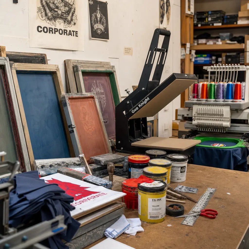
1. Treat the proof as a production control, not a design preview
A printed canvas wine carrier looks simple until it is sitting in a museum shop with a bottle inside it. Then it has to do several jobs at once. It must hold the bottle securely, protect the label, stand or stack neatly enough for retail, and carry the museum’s visual language without looking like a disposable giveaway. The front panel may show a permanent collection mark, a temporary exhibition graphic, donor program branding, a sponsor credit, or a private-label retail design. If the print is muddy, badly placed, or hard to read, the item immediately feels less valuable, even when the sewing itself is acceptable.
Canvas adds another layer of uncertainty. Unlike paper, coated board, or smooth synthetic film, cotton canvas has yarn texture, slubs, seed flecks, thickness variation, and different absorbency from lot to lot. A fine serif, pale gray line, small sponsor name, or reversed copyright notice can look perfect in the PDF and still soften, fill in, or disappear when printed on natural canvas. For museum buyers, a canvas wine carrier print proof guide is really a control document: it turns subjective comments into measurements the factory can repeat.
The proof should confirm more than layout. It should lock down fabric condition, construction, artwork scale, placement, ink opacity, curing, divider behavior, bottle fit, handle reinforcement, and packing pressure. A signed physical sample plus a written specification gives the buyer, factory, and inspector the same reference point. Without that reference, final inspection becomes a debate. One person says the logo is centered. Another sees drift. Nobody can point to the agreed measurement.
- Use a physical proof for new artwork, licensed images, legal credit lines, dark fabrics, light inks, multiple colors, or a new supplier.
- Approve on the intended canvas, not on paper, polyester, or a digital mockup alone.
- Record measurable proof details: artwork width, artwork height, distance from top edge, distance from side seam, handle drop, and bag size.
- Keep one approved sample with the factory and one with the buyer, importer, or inspection company.
- Use the approved proof as the inspection reference for color, print hand feel, placement, sewing, bottle fit, and packing.
2. Define the bottle before you define the bag
Many problems begin with one vague phrase: “wine bag.” A supplier may picture a standard 750 ml Bordeaux bottle. The museum shop may later use a Burgundy bottle, champagne bottle, cider bottle, olive oil bottle, or tall flute bottle. Those bottles are not interchangeable. They vary in diameter, shoulder shape, height, balance, and filled weight. A pattern that works beautifully for one bottle can feel tight, unstable, or distorted with another.
For single-bottle carriers, the key measurements are usable internal width, gusset depth, total height, and handle drop. For two-bottle carriers, the divider deserves just as much attention as the outer shell. It needs enough height and strength to keep bottles separated, but it cannot be so bulky that it steals compartment width or rubs against labels. If the wine label is part of the gift presentation, test for abrasion. A carrier that scuffs the bottle label during insertion will disappoint retail staff and gift buyers.
Use the intended filled bottle whenever possible. A measured dummy is acceptable if it matches diameter, height, shoulder, and weight. Empty bottles help check shape, but they do not confirm handle stress or balance under load. If the carrier will be used at member previews, donor dinners, or retail gift-wrapping stations, the sample should also answer a practical question: can staff insert the bottle quickly without forcing it?
- Provide bottle diameter, bottle height, shoulder type, and filled weight in the RFQ.
- Send the actual bottle or a technical drawing for champagne, Burgundy, tall flute, olive oil, or non-standard bottles.
- Specify whether the bag is for one bottle, two equal bottles, or mixed products such as bottle plus booklet or bottle plus food item.
- Check insertion and removal with the bottle label facing the printed panel to identify rubbing or abrasion risk.
- For two-bottle carriers, confirm usable compartment width after divider sewing, not only the outer bag width.
3. Specify construction in finished dimensions, not product names
A canvas wine carrier may be a flat sleeve, a gusseted single-bottle tote, or a two-bottle carrier with a stitched divider. Each format has a different risk profile. A flat sleeve is compact and economical, but it may not stand well on a shelf. A gusseted tote improves insertion and presentation. A two-bottle carrier works well for gift sets and donor packs, but only if divider alignment, seam strength, and balance are controlled.
Procurement specifications should use finished dimensions in millimeters. List width, height, gusset depth, handle drop, divider height, usable compartment width, seam allowance if critical, and finished tolerance. Typical sewn cotton tolerances may be around ±5 mm for width and height and ±8 mm for handle drop, but do not assume. Ask the factory what it can hold for the selected construction. A narrow wine carrier with a tight bottle fit may need tighter control than a larger grocery-style tote.
Construction also changes how the artwork reads. A print that looks centered on a flat cut panel can shift visually after gussets are sewn. Handle box stitching reduces the safe print zone near the top. Divider seams can pull a panel inward. For that reason, a fabric strike-off is not enough to approve final placement. The artwork needs to be judged on the finished construction.
- State finished width, height, gusset, handle drop, divider height, and usable compartment width.
- Ask for a pattern drawing or marked sample showing seam positions, handle attachment, and divider stitch line.
- Use lockstitch seams with secure reinforcement at handles; specify bartack or box-stitch reinforcement if needed.
- Keep artwork at least 15-20 mm from seams, hems, bottom folds, gussets, and handle reinforcement unless the sample proves a smaller margin is safe.
- Confirm whether the product must stand upright empty, ship flat, or be shaped for shelf display.
4. Control canvas weight, finish, and shrinkage before color approval
Canvas weight affects both function and print quality. Lighter canvas can reduce cost and freight weight, but it may collapse around the bottle, wrinkle through the print zone, and feel less retail-ready. Heavier canvas gives structure, yet it can increase sewing bulk, needle marks, carton weight, and handle stiffness. For many museum shop wine carriers, 10 oz to 12 oz cotton canvas, approximately 320-380 GSM, is a practical middle range. Confirm whether the ounce weight means ounces per square yard, because fabric weight terms are not always used consistently across markets.
The fabric finish needs to be named. Natural unbleached cotton has warmth, flecks, and slubs that often suit heritage, craft, and collection-led merchandising. The tradeoff is that pale inks can look duller and white or light gray may lose crispness. Bleached canvas gives a cleaner base for bright graphics, but it may show dust, scuffs, and carton marks more easily. Dyed canvas can support strong brand color, but light ink needs opacity testing and may require an underbase or a transfer solution.
Shrinkage matters too. Washed or pre-shrunk canvas may reduce later size movement, but it can change hand feel and soften printed edges. Greige or untreated fabric may move more if exposed to moisture or finishing. Ask for the expected shrinkage range, and clarify whether the proof is made before or after any washing or finishing process. A proof on one fabric condition should not silently become bulk production on another.
- Specify canvas in oz and GSM, for example 10 oz/approximately 320 GSM or 12 oz/approximately 380 GSM, subject to supplier confirmation.
- Define the finish: natural, bleached, dyed, washed, pre-shrunk, softened, laminated, lined, or untreated.
- Approve color on the actual fabric condition because natural canvas shade changes perceived ink color.
- For dyed canvas, test light ink opacity and decide whether an underbase, thicker ink deposit, or heat transfer is required.
- For reorders, compare bulk fabric against retained swatch and signed sample, not only against a fabric name.
5. Choose the print method from the artwork, not from habit
Screen printing is often the right answer for museum wine carriers, especially when the artwork uses solid color, line art, typography, exhibition titles, collection marks, or one to four print colors. It can be repeatable and cost-effective when the design suits the process. But each artwork and color may require its own setup. Four designs on the same blank carrier can still mean four proofing routes, four screen sets, and four sorting requirements.
Water-based and pigment inks can give cotton canvas a softer hand, which usually feels more appropriate for museum retail than a thick plastic surface. The tradeoff is opacity. Soft inks may not cover dark fabric strongly, and the weave of the canvas can create a slightly broken edge. More opaque systems may improve coverage, but they can feel heavier. The proof should show the real compromise between edge clarity, opacity, and touch.
Heat transfer can be useful for detailed multicolor graphics, gradients, or image-based artwork that would be inefficient to screen print. It is not automatically superior. Check edge adhesion, cracking resistance, film outline, hand feel, and how the transfer sits on textured canvas. Embroidery can look premium for simple marks, but it is not suitable for long credit lines or fine exhibition copy. A woven side label is useful for recurring shop identity when front graphics change by exhibition.
- Use screen print for bold wordmarks, line art, limited colors, and repeatable museum shop programs.
- Use water-based or pigment ink when a soft cotton hand feel is important and the fabric color supports the ink.
- Use an underbase or alternative method when printing pale ink on dark or saturated canvas.
- Use heat transfer only after checking film feel, edge lift, cracking, washing expectation if relevant, and visibility of the transfer border.
- Use woven labels for recurring private-label identity, not as a substitute for required front-panel artwork.
6. Prepare artwork files that can be made, inspected, and reordered
A good production proof begins with a production-ready file. Provide vector artwork whenever possible, with fonts outlined, final dimensions in millimeters, Pantone targets, and placement measured from fixed points. A note such as “front print centered, artwork width 95 mm, top of artwork 70 mm below finished top edge” is much stronger than “logo on front.” If the bag has a gusset, divider, side label, or distinct front panel, the artwork sheet should show orientation clearly.
Museum shop graphics often include details that do not behave well on canvas: fine serif text, artist credits, sponsor names, bilingual copy, copyright notices, thin borders, and reversed-out type. Review these details at actual printed size before screens or transfers are made. If a legal line must remain readable, say so. If a line is decorative rather than required, simplifying it may produce a cleaner, more premium carrier.
Pantone references are helpful, but they are targets, not guarantees. A Pantone fan is usually viewed on coated or uncoated paper. Canvas has a different base tone and absorbs ink differently. The proof should record both the Pantone target and the accepted fabric result. For strict brand programs, agree whether the standard is visual match to the signed proof, a tolerance under controlled lighting, or another documented method.
- Submit AI, EPS, SVG, or production PDF files; avoid screenshots, low-resolution JPGs, and web graphics.
- Outline fonts and include a reference PDF so missing fonts or layout shifts can be detected.
- State final artwork width, height, Pantone targets, legal text requirements, and minimum readable text size if critical.
- Mark front, back, top direction, handle direction, no-print zones, and measurement reference points.
- Ask the factory to warn about fine lines, small reversed text, gradients, low-contrast colors, and photographic detail before proofing.
7. Build a sample approval route that prevents bulk disputes
For a new museum program, the safest route is a pre-production sample made with the actual or approved bulk-equivalent canvas, actual print method, final construction, final handles, final divider, final label or hangtag, and intended packing. A fabric strike-off can help evaluate ink and color. A digital mockup can help with layout. Neither one approves the finished carrier. They cannot show seam interaction, curing, bottle fit, print texture, or carton pressure marks.
Sample approval should create a written standard, not a vague memory. Sign or formally approve the sample and record what is accepted: natural flecks accepted, Pantone target approved as printed on natural 12 oz canvas, artwork top distance approved at 70 mm, legal text readable, or slight ink texture acceptable. Cotton canvas will not look like a smooth printed card, so the accepted level of texture needs to be clear.
Approve multiple artworks separately. One approved blank carrier does not approve all prints. One approved print does not approve every construction. If the assortment includes a permanent collection design, a temporary exhibition design, and a holiday design, each design should have its own proof record, SKU or artwork name, and final photo. Bulk production should begin only after the buyer defines whether photo approval is enough or a physical sample is mandatory.
- Approve one physical sample per artwork, fabric color, print method, and construction unless the buyer formally accepts grouped approval.
- Photograph the approved sample with a ruler showing print width, print height, top distance, side distance, and handle drop.
- Retain two standards: one at the factory and one with the buyer, importer, or inspection company.
- Test the sample with the intended bottle, including insertion, lifting, balance, and removal.
- Record all accepted variations in writing, including natural canvas flecks, minor shade movement, and print hand feel.
8. Quote MOQ, price, and assortment splits by the real cost drivers
MOQ for printed canvas wine carriers is rarely a single clean number. It may include fabric purchasing MOQ, dyeing MOQ, sewing line minimum, print setup minimum, screen charges, heat-transfer minimums, packing material minimums, and carton allocation requirements. Museum shops often need modest quantities across several designs, which makes this especially important. A supplier may combine blank carrier production but still charge separate artwork setup, screen making, color mixing, proofing, sorting, and carton labeling for each design.
A useful RFQ states quantity by style, fabric color, artwork, print color count, packing format, and shipment destination. “2,000 wine carriers, four designs” leaves too much room for assumptions. A clearer version is: 500 pieces per design, same natural 12 oz canvas, same gusseted single-bottle construction, one-color front screen print, same hangtag, same master carton, one destination. If one design uses two print colors and another needs a transfer, the quote should show the difference.
Think about inventory risk before chasing the lowest unit cost. Ordering extra pieces of an exhibition-specific design may reduce unit price and still create obsolete stock after the show closes. A smarter plan may be to standardize the blank carrier, accept separate print setup charges, and keep design quantities closer to expected sell-through. For reorders, ask whether the supplier stores screens and for how long. Do not assume they are retained indefinitely.
- Request pricing by artwork and colorway, not only by total order quantity.
- Separate blank bag cost from print setup, screen charge, sample charge, label cost, packing cost, and inspection-ready sorting cost.
- Ask whether screens, print films, patterns, and approved samples are stored for reorders and whether storage has a time limit.
- Use one fabric, one construction, and one print method across an assortment when cost control is more important than design variation.
- Avoid combining unlike designs in one carton unless carton labels and packing lists clearly show the design mix.
9. Set QC tolerances and defect classifications before production starts
Quality control should translate the approved proof into measurable checks. If the approved artwork sits 70 mm below the top edge, inspection should measure from that same edge. If the only instruction is “centered,” the inspector has to judge by eye, and judgment varies. Practical tolerances for canvas wine carriers often include ±3-5 mm for print placement, ±5 mm for finished width and height, and ±8 mm for handle drop, depending on artwork size and construction complexity. The final values should appear on the purchase order or inspection checklist.
QC must cover appearance and function. A wine carrier is handled under load, so inspect handles, handle reinforcement, side seams, bottom seams, and divider seams. Two-bottle carriers need extra attention because the divider creates pressure and friction between bottles. A bottle fit test should use the intended bottle or a measured substitute. The inspector should check whether the bottle inserts smoothly, whether the bag balances when lifted, and whether seams show stress after handling.
Defect classification keeps decisions objective. A wrong artwork, missing divider, or broken handle is not comparable to a small natural slub in cotton canvas. Licensed museum artwork can raise the severity of print problems: unreadable required credit lines, missing copyright notices, or incorrect marks may be major or critical depending on the agreement. Define these categories before final inspection, not after the goods are already packed.
- Critical defects: wrong artwork, wrong SKU, unsafe seam failure, broken handle, missing divider, severe ink transfer, mold, contamination, or unusable bottle fit.
- Major defects: print shift beyond tolerance, obvious color mismatch from proof, unreadable required text, open seam, loose handle reinforcement, visible stain on front panel, or wrong barcode.
- Minor defects: small natural slub, minor shade variation within standard, tiny trimmed thread end, or slight print texture already accepted in proof.
- Measure and record print location, finished width, finished height, gusset, handle drop, divider height, and compartment width.
- Perform bottle insertion, lift, balance, and removal checks during inspection.
- Check print cure with a dry rub and stacking review before approving packing.
10. Plan packing, carton marks, and lead time around the retail launch
A strong print can still be damaged by weak packing. Printed canvas should be fully cured before stacking. If print faces touch under pressure, ink can offset, collect lint, or develop pressure marks. Flat packing saves carton volume, but too much compression can create fold lines and seam impressions. Pre-shaped dividers may improve shelf presentation, but they increase carton size. Decide early whether the goods are arriving as backroom stock, shelf-ready merchandise, online fulfillment inventory, or event gift packaging.
Packing also intersects with museum sustainability policies. Individual polybags protect against dust and moisture, but some museum shops prefer reduced plastic. Alternatives include paper bands, tissue interleaving, master carton liners, or plastic-free inner packs. If individual polybags are removed, the shipment still needs a moisture and abrasion plan for export transit. A master poly liner may protect the carton contents without wrapping every unit.
Lead time should be broken into real steps: artwork review, legal approval, Pantone confirmation, sample making, sample curing, sample shipping, buyer approval, material preparation, printing, curing, sewing, trimming, final inspection, packing, and export handover. Museum dates are often fixed by exhibition openings, donor dinners, member previews, and holiday selling periods. Late artwork changes can restart proofing. Reorders also deserve checks because fabric shade, ink behavior, and screen condition can change.
- Use interleaving paper when printed faces touch, ink coverage is heavy, or large solid print areas are present.
- Confirm inner quantity, master carton quantity, carton dimensions, gross weight, net weight, carton strength, and carton marks before shipment.
- Mark cartons by PO, SKU, design name, colorway, quantity, destination, and carton number.
- For store allocations, require carton-level packing lists showing exact quantity by design and destination.
- Set final dates for artwork freeze, physical proof approval, bulk release, inspection booking, packing completion, and shipment handover.
- For reorders, compare against a retained sample and reconfirm fabric lot, screen availability, ink formula, and packing method.
Specification comparison for buyers
| Spec decision | Recommended option | When it fits | Buyer risk to check |
|---|---|---|---|
| Bottle fit basis | Approve against the actual bottle or a measured dummy: diameter, height, shoulder, and filled weight | Museum shops selling 750 ml wine, champagne, cider, olive oil, or mixed gift bottles | A standard Bordeaux bottle is not the same as Burgundy or champagne; wrong compartment width causes tight insertion, label abrasion, or unstable carry |
| Canvas weight | 10 oz to 12 oz cotton canvas, approximately 320-380 GSM; confirm whether oz is per square yard | Retail wine carriers needing structure, natural texture, and reliable print holdout | Too light collapses and wrinkles at the print face; too heavy increases sewing bulk, needle marks, carton weight, and handle stiffness |
| Fabric condition | Natural, bleached, dyed, washed, or pre-shrunk canvas stated in the RFQ and proofed on matching fabric | Color-sensitive museum artwork, licensed marks, and reorder programs | Natural flecks, bleaching level, dye shade, and shrinkage can change print color and finished size if bulk fabric differs from the proof |
| Carrier format | Gusseted single-bottle tote or two-bottle carrier with stitched divider; flat sleeve only for compact economy use | Gift retail, member events, donor sets, exhibition merchandise, or winery collaborations | Divider height, seam bulk, and compartment width must be measured; bottles should not rub hard against print panels or each other |
| Print method | Screen print for solid 1-4 color artwork; heat transfer for fine multicolor detail; woven label for recurring brand mark | Museum wordmarks, exhibition graphics, line art, limited-color collection marks, or detailed image-based artwork | Screen print is not ideal for photographic detail; low-grade transfers can feel plastic, crack, lift at edges, or bridge over canvas texture |
| Ink and color approval | Water-based or pigment ink with Pantone target, approved physical fabric proof, and agreed tolerance | Natural canvas retail look where hand feel and artwork clarity matter | Pantone on paper is only a target; cotton absorbency, base shade, and ink opacity change the visible result |
| Artwork placement | Vector artwork with final millimeter size, no-print zones, and placement measured from fixed seams or top edge | Reorders, licensed artwork, multiple museum shops, and legal credit lines | “Centered” is not enough; sewing variation, gussets, and handle reinforcement can make artwork drift visually |
| Sample approval route | Pre-production sample using actual fabric, ink, construction, handle, divider, label, and intended packing | New supplier, new construction, dark fabric, light ink, licensed artwork, or first production run | Digital mockups cannot confirm hand feel, ink curing, seam interference, bottle fit, carton pressure marks, or divider function |
| MOQ and setup logic | Quote by style, fabric color, artwork, print color count, packing format, and shipment split | Assortments with exhibition designs, seasonal graphics, bilingual labels, or store allocation | Total quantity may meet sewing MOQ while each artwork still carries separate screen, setup, proof, sorting, and label costs |
Buyer checklist before sampling
- Identify the exact bottle use before sampling: 750 ml Bordeaux, Burgundy, champagne/sparkling, tall flute, cider, olive oil, empty display bottle, or mixed use.
- Record bottle diameter, bottle height, shoulder profile, maximum filled weight, and whether the bottle has a fragile paper label that must avoid abrasion.
- Specify finished carrier dimensions in millimeters: width, height, gusset depth, handle drop, divider height, usable compartment width, and tolerance for each dimension.
- State fabric weight in both oz and GSM where possible, plus fabric condition: natural, bleached, dyed, washed, pre-shrunk, laminated, lined, or untreated.
- Require the print proof on the same fabric condition and comparable bulk lot; do not approve color only from paper, PDF, or polyester strike-off.
- Send vector artwork with outlined fonts, final print size, Pantone targets, placement dimensions, no-print zones, and required legal or licensing text.
- Confirm print method by artwork: screen print, water-based ink, pigment ink, discharge where applicable, heat transfer, embroidery, woven label, hangtag, or combined branding.
- Set minimum clear margins from seams, top hem, handle box stitching, bottom fold, gusset edge, and divider seam; 15-20 mm is a practical starting point unless the sample proves otherwise.
- Request one pre-production sample for each fabric color, artwork, print method, and carrier construction before bulk cutting, printing, or full sewing release.
- Define acceptance tolerances for finished size, print placement, color variation, registration, ink coverage, stitch density, seam strength, stains, shrinkage, and bottle fit.
Factory quote questions to send
- What bottle type and maximum bottle diameter is your quoted carrier designed to fit, and can you provide usable compartment width after sewing?
- What finished dimensions are quoted for width, height, gusset, handle drop, divider height, and compartment width, and what millimeter tolerance can you hold in bulk?
- What canvas weight is included in the quote in oz and GSM, and is oz measured as ounces per square yard?
- Is the quoted fabric natural, bleached, dyed, washed, pre-shrunk, greige, or otherwise finished, and what shrinkage range should we expect?
- Will the proof and bulk order use the same canvas lot, or how will you control acceptable shade, fleck, texture, and absorbency variation between lots?
- Which construction is included: flat sleeve, gusseted single-bottle tote, or two-bottle carrier with divider, and what reinforcement is used at handles and stress points?
- What stitch type, stitch density, thread type, seam allowance, bartack or box-stitch reinforcement, and divider attachment method are included?
- Which print method is quoted, how many print colors are included, what Pantone system will be referenced, and is an underbase required for light ink on dark canvas?
- What setup cost applies per artwork, per screen, per color, per heat-transfer film, per strike-off, and per revised proof?
- What is the MOQ by carrier style, fabric color, artwork, print color count, packing format, and shipment destination?
Quality-control points to confirm
- Fabric weight should match the approved range, for example 10 oz to 12 oz or approximately 320-380 GSM, verified by supplier record or fabric weight check before cutting where practical.
- Fabric condition must match the signed sample: natural seed flecks, slubs, bleaching level, dye shade, wash effect, stiffness, and hand feel should remain within approved visual tolerance.
- Finished dimensions should be measured after sewing and normal relaxation, with typical tolerances such as ±5 mm for width/height, ±5 mm for gusset, and ±8 mm for handle drop unless a tighter standard is agreed.
- Usable compartment width should be checked with the target bottle or a measured gauge; the bottle should insert without excessive force and without scraping the printed panel or label.
- Print placement should be measured from fixed reference points such as top edge, side seam, or bottom fold; a common tolerance is ±3 mm for small logos and ±5 mm for larger front graphics, depending on construction.
- Registration for multi-color screen print should be checked at the finest artwork details; tolerance should be agreed before production, especially around outlines, borders, and reversed text.
- Color should be judged against the signed physical proof under consistent lighting on actual canvas, not against a screen display or coated-paper Pantone fan alone.
- Ink coverage must be even across textured canvas, with no unacceptable pinholes, smearing, ghosting, bleeding, lint contamination, blocked mesh marks, screen edge marks, or patchy underbase.
- Legal text, artist credits, copyright lines, sponsor names, and collection marks must remain readable if they are required by the artwork owner or licensing agreement.
- Ink curing should be verified before packing; a dry white cloth rub and stacked-pressure check can reveal unacceptable transfer, tackiness, or offset marks.