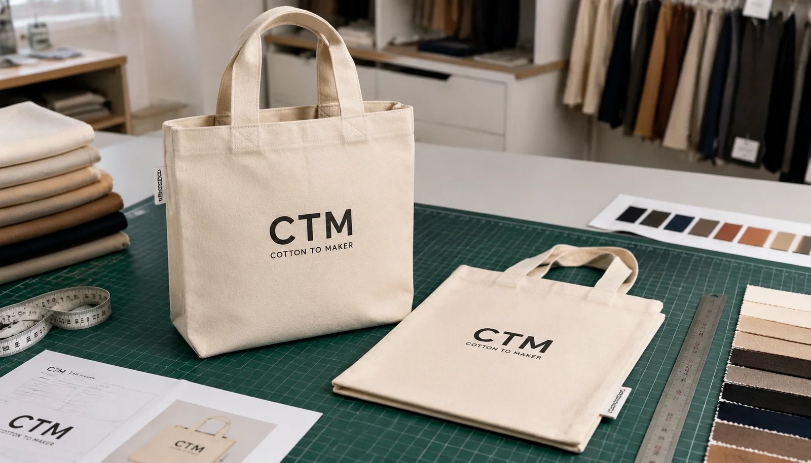
Why logo placement becomes a buying problem in museum retail
Museum shops usually need more from a tote bag than a giveaway buyer does. The bag has to display the institution name clearly on shelf, work across different exhibitions, and still carry books, catalogues, or souvenirs without the artwork looking distorted. That is why logo placement is not only a design issue. It affects how you specify the bag, what print method the factory can use, how the sample should be approved, and how disputes are handled when bulk goods arrive.
In museum retail, the tote is often a visible brand carrier, a routine replenishment item, and a margin product at the same time. That combination raises the stakes. A tote that is slightly off-center may still be usable, but it can look unplanned on a retail peg or in a point-of-sale display. When buyers standardize placement early, they reduce repeat explanations to multiple stakeholders and make reorder cycles easier to control.
The main production mistake is treating the logo position as a visual note instead of a measurable manufacturing instruction. 'Centered on front' sounds clear inside a design team, but it is loose language on a sewing line. On a finished tote, the artwork position changes with seam allowance, top hem depth, body panel skew, handle stitching, and gusset fold. Museum buyers who convert artwork intent into finished-bag measurements get cleaner quotes and fewer arguments during inspection.
This is especially important for institutions that run evergreen brand stock alongside exhibition-specific merchandise. A placement that works for a standard museum wordmark may not work for a long exhibition title or a mark with a wide emblem. If the tote is meant to stay in range for multiple seasons, the placement standard should be broad enough to survive repeated use, but specific enough for a factory to reproduce exactly. That balance is the core of a usable museum shop tote spec.
- A retail-facing tote needs shelf presentation, not only print readability on a flat fabric panel.
- Museum branding often stays in stock for long periods, so placement errors are more expensive than on short event merchandise.
- Bulk production approval should be based on finished bag measurements, not only artwork file placement.
- Museum buyers usually need the tote to survive gift-shop handling, not just first-day unpacking.
Start with the finished bag geometry before placing the logo
Logo placement only makes sense after the finished body size is locked. For most museum shop canvas totes, common finished sizes fall around 35-38 cm wide by 38-42 cm high, with or without an 8-10 cm bottom gusset. If the bag will carry books, a gusseted construction usually improves retail value, but it also changes the usable front print zone because part of the panel wraps around the fold line. A front logo that looks balanced on a flat layout can appear too narrow or too low after sewing.
Canvas weight matters here because lighter fabric moves more during cutting, printing, and sewing. For museum retail, 280-340 GSM canvas is usually the practical range. Around 280 GSM keeps the bag foldable and cost-efficient. Around 340 GSM gives a more substantial hand feel for premium museum stores, especially where the bag doubles as a souvenir purchase. Once weight, size, and gusset are fixed, the print zone can be defined from the finished top hem and seam positions.
Do not let suppliers quote from fabric cut size only. A cut panel may be larger than the final body by several millimetres because of seams, turning, and hem allowance. If the quote does not state finished dimensions, it is hard to compare one factory’s positioning claim with another’s. For procurement, the useful question is not 'Can you print here?' but 'Can you hold this placement on the sewn tote, carton after carton?'
If the museum has more than one tote format, separate them clearly in the brief. A flat tote for lightweight retail is not interchangeable with a gusseted bookstore tote. The same logo width might work on one and crowd the seam lines on the other. Build the spec from the bag structure first, then place the mark around that structure.
- Flat tote: simplest for centered artwork and lowest placement risk.
- Bottom gusset tote: better carrying capacity, but the fold line must stay outside the visible logo area.
- 10 oz to 12 oz canvas is usually the stable range for museum shop retail bags.
- Finished dimensions should always be separated from cut panel dimensions in the RFQ.
- Ask for sewing drawings or a simple factory technical sketch when the bag shape is not standard.
Define logo position with production measurements, not visual language
The most usable RFQ wording gives the factory a measurable reference system. For example: front artwork centered on panel, top of logo 80 mm below finished top hem, left and right artwork edges equidistant from finished side seams, artwork width 180 mm. That gives three control points a printer and QC inspector can both use. The phrase 'logo in the upper-middle area' gives none. Museum shops that reorder the same tote season after season benefit from this discipline because later quotes can copy the same placement standard.
It also helps to separate optical centering from mathematical centering. Some logos with tall symbols, long names, or uneven shapes look low or high even when mathematically centered. If the museum has a preferred visual balance, note that the approved pre-production sample is the placement master. Otherwise, factories may center from the artwork bounding box and still be technically correct while the buyer dislikes the result.
For wordmarks that include both an icon and text, define how the group should be treated. A logo with a symbol above text may need the whole block to be centered rather than the icon alone. If the museum has a strict style guide, include it. If not, attach a marked-up proof showing the approved safe area. That prevents the supplier from making its own aesthetic decision on what is essentially a production instruction.
Avoid specifying placement with percentages only. 'Print 30% down from top edge' seems tidy, but percentages can be hard to translate across multiple bag sizes and hem styles. Millimetres from finished reference points are better for RFQs because they stay readable across procurement, pre-production, and inspection paperwork.
- State top clearance from finished hem: usually 70-90 mm works for standard retail totes.
- Keep at least 50 mm clearance from finished side seams for most front logos.
- State artwork width in millimeters, not only as a percentage of bag width.
- Use the pre-production sample as the visual master for repeat orders.
- Keep one drawing or annotated image as the single source of truth for placement.
Match print method to museum logo style and run size
Most museum shop logos fit screen printing best because the artwork is often a clean wordmark, emblem, or single-color graphic. Screen print holds up well on 10 oz to 12 oz canvas, gives solid coverage, and becomes cost-efficient once quantity moves into practical bulk ranges. If the bag uses one body color and one print color, factories can usually optimize setup and reduce unit cost. The print area should still stay away from heavy seam zones and thick cross-stitch points where ink laydown becomes uneven.
Heat transfer or digital methods can make sense for smaller trial runs, multicolor exhibition graphics, or highly detailed artwork, but buyers should compare not only appearance on day one. They also need to compare hand feel, edge visibility, rub performance, and how the print looks on textured canvas. On dark dyed canvas, white or light ink may need an underbase, which changes both cost and texture. For museum retail, where customers often inspect products at close distance, that visual finish matters.
Embroidery is sometimes suggested for premium retail, but it is usually better for small labels, chest-size badges, or woven detail patches than for a large front-panel tote logo. On thick canvas, large embroidery can make the fabric stiff and can pull the panel slightly. If embroidery is proposed, the buyer should ask for stitch density, backing method, and a sample view from both the face and reverse side.
A practical RFQ should also ask what print screen count, cure method, or transfer film is being proposed. These details are not just technical noise. They tell the buyer whether the factory is quoting for a durable retail item or simply offering the cheapest way to put ink on fabric. That distinction matters when the tote will be resold in a museum shop rather than handed out once and discarded.
- Screen print: best for solid museum logos and volume efficiency.
- Digital or transfer: useful for detailed art or smaller runs, but sample review must include texture and durability.
- Dark canvas with light print usually needs extra process steps that affect quote and lead time.
- Embroidery is better for small labels or badge details than large front logos on standard totes.
- Ask for curing or fixation method when ink durability is important.
How logo placement changes price even when the bag body stays the same
Buyers often expect a logo placement decision to be free if the tote size and fabric stay unchanged. In practice, placement can affect setup, wastage, and line speed. A centered front print in a standard zone is the simplest route. A low print close to the gusset fold, a back print added for legal text, or a design that must align precisely with pocket seams or side labels can slow both printing and sewing review. That is why two quotes for the same tote body can differ even before fabric changes.
Museum shop orders also tend to split across different stores, exhibitions, or institution departments. Quantity fragmentation matters. A supplier may quote a good unit price at 3,000 pieces for one logo in one color, then a materially higher one when the same total is split into three body colors or three artwork versions. The MOQ is not only about sewing. It is also about print setup efficiency, fabric booking, and carton consolidation.
Logo size affects cost through process, not just through visible area. A larger print may need a bigger screen, more ink, more drying time, or tighter inspection because coverage problems become easier to see. If the logo uses fine detail, the factory may also need a better mesh count or a slower print pass. For procurement, that means print size should be quoted alongside artwork complexity rather than treated as a cosmetic afterthought.
The useful negotiating question is not 'Can you do this?' but 'What in this artwork changes the manufacturing cost?' That pushes the supplier to explain whether price is driven by color count, placement precision, print method, or extra packing. Once those factors are visible, the buyer can compare alternatives that keep the visual result but reduce handling difficulty.
- Main cost drivers linked to placement: print side count, color count, print size, body color, and alignment difficulty.
- One front print is the lowest-friction retail specification.
- Multiple SKUs reduce print efficiency even when the total order quantity looks healthy.
- Request price breaks by quantity and by artwork variation, not only one blended quote.
- Ask whether a placement change would require a new screen, new jig, or new sewing setup.
What a museum buyer should approve in samples
A print strike-off is useful for color and artwork sharpness, but it does not prove the final tote will present correctly. For logo placement, the more important approval stage is the sewn pre-production sample using the actual canvas, actual handle position, and actual print size. This sample shows whether the logo sits too close to the handle stitch area, whether the front panel pulls slightly off-square, and whether the visual balance still works once the tote is folded, hung, or filled.
Sample comments should be written in acceptance language, not general taste language. 'Logo looks slightly high' is weak feedback. 'Lower artwork by 12 mm from approved sample A and maintain 80 mm distance from finished top hem' is production-ready feedback. If museum retail teams, design teams, and import teams all review the sample, one master annotated image should be issued so the factory is not trying to reconcile conflicting markups.
The sample should also be checked in the same orientation the buyer will receive in carton. A tote can look acceptable flat on a table but shift visually when hung by the handles or folded for packing. That is why one photo from the front, one from a hanging position, and one with a ruler or scale reference are useful. They convert subjective comments into measurable approval notes.
For reorders, keep the sample archive. Store the approved physical sample or at least a scanned record with date, supplier name, artwork revision, and measured placement. Museum procurement often spans multiple seasons, and the most common quality drift is not dramatic failure but small changes that slowly accumulate. A clean sample archive stops that drift before it becomes a dispute.
- Approve one flat shot and one hanging shot of the sample for visual balance.
- Mark dimensions from finished edges directly on the approved sample photo.
- Use the same sample to approve canvas color, handle drop, and print position together.
- Do not release bulk on artwork file approval alone when placement precision matters.
- Keep an approved sample archive for reorder reference.
QC thresholds that prevent subjective placement disputes
Logo placement disputes usually happen because the buyer expects visual consistency while the supplier inspects against loose language. The fix is to write measurable thresholds into the order file. For example, front logo centerline deviation within plus or minus 5 mm from panel center, top-of-artwork distance within plus or minus 5 mm from approved sample, no visible tilt beyond agreed tolerance when the bag hangs naturally. Tolerance should reflect the bag type. A premium museum store may want tighter presentation than a mass promo order, but tolerance must still be realistic for sewn textile goods.
QC should also separate critical, major, and minor defects. A logo printed over a handle stitch area when that zone was defined as clear is a rejectable issue. A 2 mm variation in bag height may not be, if it does not change shelf presentation or use. When these priorities are written clearly, suppliers can control the line better and third-party inspectors can report against the same standard the buyer actually cares about.
Quality control should extend beyond print location. On canvas totes, the bag can pass artwork measurement and still fail retail expectations because the handle length differs, the panel is skewed, or the body shade varies from carton to carton. A museum buyer should ask for inspection of weave consistency, slub level, stain rate, stitch quality, and even packing fold consistency where it affects the branded face.
Do not rely on a generic AQL line alone if placement is the main concern. A tote can fall inside a broad defect sampling plan and still arrive with logo drift that is visually obvious to a retail customer. Add a placement-specific check to the inspection instruction and tie it back to the approved sample. That keeps the inspection focused on what matters for the shop floor.
- Placement tolerance should be written in millimeters from finished reference points.
- Tilt, ghosting, weak ink coverage, and seam intrusion should be listed as specific print defects.
- Use approved sample plus written tolerances together; one without the other leaves room for interpretation.
- Sample cartons from different packing stacks should be measured because folding pressure can hide skew on top layers.
- Add a placement-specific inspection step rather than relying on generic AQL alone.
Packing details matter because museum shops receive for retail, not only for storage
For many museum shops, receiving teams open cartons and move stock straight into back-room shelving or retail prep. If bags are folded inconsistently, logos may appear wrinkled, hidden, or facing different directions, which slows counting and visual inspection. A simple packing note can solve this: all bags folded to identical size, front logo facing outward, handles tucked inward, fixed carton quantity, and no mixed SKUs in one carton unless specifically approved. This is basic factory discipline, but it affects retail handling more than many buyers expect.
Individual polybags are not always necessary for canvas totes and can even conflict with sustainability goals or local retail standards. However, if the museum requires barcode labels, event stickers, or retail hangtags, those operations must be described before production. Adding them after bulk packing often creates repacking cost and extra lead time. Packing instructions belong in the RFQ because they change labor content and sometimes carton dimensions.
Carton strength and carton count are also procurement issues. A tote that is heavier than expected may still be acceptable per piece but create over-weight cartons that are harder to receive or ship. Ask the factory to state carton net and gross weights and to confirm whether the goods will ship in single SKU cartons or mixed cartons. For museum retail replenishment, single SKU cartons are often easier to receive and faster to count.
Where shelf presentation matters, ask for a folding standard. Some buyers want the printed face out and the handles folded behind the artwork. Others want the bag folded to a fixed rectangle so it can stand neatly in a display crate. The point is not to over-prescribe the fold. It is to make sure the bag arrives in the same visual state the receiving team expects.
- Specify fold size or folding orientation if shelf-ready receiving matters.
- State whether polybags are prohibited, optional, or mandatory.
- Define carton quantity, gross weight limit, and SKU separation rule.
- Include barcode, swing tag, or retail labeling requirements in the original quote request.
- Ask for carton drop protection or edge reinforcement if the route is long or the bags are packed densely.
Lead-time risks usually come from approvals, not sewing
On straightforward canvas tote programs, the sewing itself is rarely the schedule bottleneck. Delays usually come from artwork revision loops, late logo placement decisions, and re-approval after the first sample shows that the design team positioned the art too close to the top hem or seam. Museum shops are especially exposed when several internal reviewers need to sign off. If the approvals are staggered, the factory may hold fabric or screens while waiting, which compresses the bulk schedule later.
A more reliable workflow is to lock the body spec first, then lock the print area, then approve one sewn sample with measured placement. After that, the factory can move into print preparation and production planning with fewer resets. For dyed canvas, add time for shade review if the body color has to match institutional branding. For seasonal exhibition stock, leave margin for one revision round instead of planning as if the first sample will always pass.
Procurement teams should also ask for a stage-by-stage lead time, not a single total number. A useful breakdown is fabric booking, sample making, sample approval, bulk production, inspection, and packing. That format shows where the supplier thinks the risk sits. If the factory can only give a vague total, the buyer cannot tell whether the promise is realistic or simply optimistic.
For museum shops with event-driven deadlines, build in a cutoff date for artwork finalization. A tote order can be technically simple but still miss the selling window if internal sign-off arrives late. The right lead-time question is not only 'How long will production take?' It is 'What decision do you need from us by what date to hold this schedule?' That is the question that protects launch timing.
- Separate artwork approval from placement approval so the team knows what is still open.
- Allow time for one sewn sample revision if the logo is new or the bag body changed.
- Dark dyed canvas and special print colors usually add more schedule risk than natural canvas with black print.
- Bulk lead time should be broken into sample, approval, production, and packing stages in the supplier quote.
- Ask the supplier what deadline will trigger schedule slip if approvals are late.
How to compare quotes when suppliers seem to price the same bag differently
When two factories quote the same canvas tote bag, the differences usually hide in assumptions. One may be pricing 280 GSM natural canvas while another assumed 340 GSM. One may include only a print strike-off while another includes a sewn pre-production sample. One may quote front print only, while another includes back print or woven side label attachment. Without a normalized comparison sheet, procurement teams can select the lower quote and discover later that the approved museum presentation requires add-ons that erase the savings.
The practical way to compare is to force the same quote structure from each supplier: finished dimensions, GSM, print method, number of print colors, logo size, placement method, sample type, packing standard, carton quantity, MOQ by SKU, and lead time by stage. If a supplier cannot state printable area, placement tolerance, or sample method clearly, that is not only a quotation gap. It is a production risk signal.
A good quote should also identify what is excluded. Are hanger tags, barcode stickers, repacking, carton marks, and freight included or not? For museum buyers, those details matter because they often become part of store-ready delivery. If the factory is pricing only ex-works tote sewing and printing, the buyer should know that before comparing to a more inclusive quote from another supplier.
Do not overvalue the lowest unit price if it is tied to a weak sample process or vague placement controls. Museum shop totes live close to the customer and are handled as visible brand items. A slightly higher quote that clearly defines production controls, packing, and approval stages often costs less in the end than a cheap quote that leads to rework, delays, or unusable stock.
- Normalize the quote by line item: body, print, sample, labels, packing, and shipment term.
- Compare MOQ logic per SKU, not only total order volume.
- Flag any quote that does not define GSM tolerance or placement tolerance.
- Treat vague printable area language as a warning sign before order placement.
- Ask each supplier to confirm inclusions and exclusions in writing.
Specification comparison for buyers
| Spec decision | Recommended option | When it fits | Buyer risk to check |
|---|---|---|---|
| Front logo position | Center the artwork on one panel with 70-90 mm clearance below top hem and at least 50 mm from both side seams | Best for museum gift shops selling branded totes with a clean retail presentation and low placement dispute risk | If art sits too close to seams or top hem, production may shift visually even when within tolerance |
| Back panel printing | Leave blank unless the museum requires sponsor copy, exhibition dates, or legal text | Fits evergreen institution branding and avoids outdated event inventory | Back print increases setup cost, approval time, and dead stock risk if dates or campaigns change |
| Canvas weight | 10 oz to 12 oz canvas, about 280-340 GSM | Suitable for retail tote bags expected to carry books, catalogs, and souvenirs without looking too thin | Below this range, panel distortion can affect print registration; above it, the bag may fold poorly for standard packing |
| Print method | Screen print for solid logo art; heat transfer only for short runs or complex multicolor graphics | Screen print works for museum logos, wordmarks, and simple exhibition graphics at bulk volume | Heat transfer may crack or show edge film; digital options can vary on dark canvas and need strike-off approval |
| Logo size | Keep primary logo width around 140-220 mm for standard tote widths | Large enough for shelf visibility without crowding seams, gusset folds, or handle attachment zones | Oversized art may look centered on artwork file but print off-balance once the bag is sewn and filled |
| Bag construction | Flat tote for simple centered logos; bottom gusset tote when the store wants higher usable volume | Flat bags suit low-cost museum promo and gift shop basics; gusseted bags suit bookstore-heavy sales | Gusset folds can visually interrupt artwork if the printable panel width is not defined from finished bag dimensions |
| MOQ route | One base body color and one print color for the first production run | Good for museum shops testing new branding or replacing an existing tote with lower inventory risk | Multiple body colors split quantity and can push unit price up if each SKU falls below efficient print MOQ |
| Sample approval method | Approve sewn pre-production sample with actual print position measured from finished top hem and side seams | Necessary when placement precision matters more than artwork itself | Flat print strike-offs alone do not reveal handle interference, panel skew, or seam-related visual shift |
| Packing format | Individual bag folded to the same orientation in export carton, no individual polybag unless required by compliance or retail handling | Works for most museum retail replenishment where visual inspection and easy recount matter | Inconsistent folding changes how the logo presents at receiving and can trigger unnecessary QC claims |
Buyer checklist before sampling
- State finished bag size as width x height x gusset based on sewn dimensions, not fabric cut size.
- Define canvas weight in GSM or oz and confirm whether the quoted fabric is natural cotton canvas, recycled cotton blend, or dyed canvas.
- Specify the exact logo placement using measured distances from top hem, side seams, and bag centerline.
- List printable area limits and note any no-print zones caused by handle stitching, gusset folds, or seams.
- Name the print method required for the artwork: screen print, heat transfer, DTG, or embroidery for label details only.
- Attach artwork in vector format and identify print colors by Pantone reference when color control matters.
- Require a pre-production sample with actual sewn body, actual print size, and actual handle position before bulk approval.
- Set tolerance for logo placement deviation, bag size, and fabric weight so inspection standards are aligned before production.
- Confirm carton pack quantity, folding direction, barcode or swing tag requirement, and whether inner polybags are allowed or prohibited.
- Request quote lines that separate sample cost, print setup cost, unit price, packing add-ons, and shipment terms.
Factory quote questions to send
- What is the finished printable panel width and height after sewing, excluding seam allowance and hem area?
- What logo placement tolerance can you hold in bulk production, measured from top hem and side seams?
- Is the quoted canvas weight tested before or after washing, and what is the normal GSM tolerance?
- Which print method are you quoting for this logo, and why is it the best fit for this artwork and order volume?
- What MOQ applies to this body fabric, this print color count, and this size, and where do price breaks start?
- Will you provide a printed strike-off first, a sewn pre-production sample, or both?
- How do you control panel skew during cutting and sewing so the logo does not look tilted on the finished bag?
- What is the lead time split between fabric booking, sample approval, bulk printing, sewing, and final packing?
- How are bags folded and packed in carton, and can you keep all logos facing the same direction for receiving inspection?
- What defects in print placement, ink coverage, and seam appearance are treated as rejectable during final inspection?
Quality-control points to confirm
- Measure logo position from finished top hem to top of artwork and from each side seam to artwork edge on sampled cartons.
- Verify print color against approved Pantone reference or signed strike-off under consistent lighting.
- Check for print skew, ghosting, pinholes, weak ink coverage, and edge fuzz on textured canvas.
- Confirm finished bag dimensions, gusset depth, and handle drop against approved tolerances.
- Inspect whether handle stitch lines intrude into the visible print zone on any units.
- Check canvas for slubs, stains, weaving defects, and shade variation that make the logo look inconsistent.
- Verify fold and packing orientation so the same panel faces outward in every carton where required.
- Run rub and adhesion checks appropriate to the print method, especially on dark dyed canvas or heavily textured fabric.