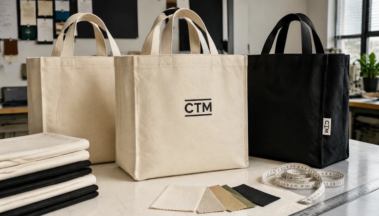
Why logo placement is a sourcing specification, not just a design choice
For procurement teams buying canvas grocery totes for natural grocers, logo placement sits at the intersection of branding, construction, print process, and inspection. It is not enough to approve a nice-looking mockup. The exact print location changes how suppliers quote the job, which print method they recommend, whether the artwork crosses seam dead zones, and how the goods are measured at final inspection. If the instruction is vague, every downstream department fills in the gaps differently.
That risk is especially visible in natural grocer programs. Many brands in this segment prefer restrained design: unbleached canvas, dark green or black ink, simple wordmarks, and generous negative space. Minimalism looks premium when executed well, but it also exposes production drift. A 6 mm placement shift may be barely noticeable on a busy promotional bag and very obvious on a natural canvas tote with one centered logo.
Buyers should therefore treat logo placement as part of the bag specification. The same tote body can perform very differently depending on how close the print sits to the top hem, how wide the artwork runs toward the seams, or whether the front logo is referenced from the cut panel instead of the finished bag. Those details affect approval speed, reject risk, and consistency across repeat orders.
A useful logo placement guide answers four practical questions. First, what exact area on the finished bag is truly printable? Second, what fabric and print method will preserve edge definition on that area? Third, what tolerances are realistic in bulk? Fourth, what QC checkpoints prove the approved sample was actually reproduced? If those four points are clear, buyers can compare quotes more fairly and reduce avoidable disputes.
- Placement affects quotation, artwork setup, sewing references, and final QC.
- Minimal natural-grocer branding makes small alignment errors more visible.
- The finished sewn bag, not the flat digital mockup, should control the print spec.
- Clear millimeter-based instructions reduce supplier interpretation risk.
Start with finished-bag geometry before approving any logo size
Many tote programs go wrong because buyers begin with the artwork file rather than the bag geometry. A nominal front panel size does not equal usable branding space. Once the top hem is folded, the handles are attached, and the side seams are sewn, the visible front field becomes smaller than the original cut rectangle.
Take a common grocery tote example: finished body about 380 mm wide by 400 mm high with a 120 mm gusset and 25-30 mm cotton webbing handles. On paper, the panel looks large. In production, however, the top hem may take 25-35 mm, the handle stitch boxes may extend another 35-55 mm below that hem, and buyers still need left-right margin from the side seams so the logo does not look crowded. The practical front print zone may end up closer to roughly 280-300 mm wide by 220-260 mm high depending on construction.
That is why the factory should supply or confirm a dimensional drawing showing finished bag width, finished body height, gusset width, top hem depth, handle spacing, handle stitch box depth, and the print-safe area. Without these references, a request such as centered logo on front is not measurable. One supplier may center from the cut panel; another may center from the finished visible panel below the handles. Both can claim compliance while producing visibly different bags.
For procurement, the key rule is simple: logo placement should always be referenced to the finished sewn bag. The tech drawing should show a centerline, a top-hem reference edge, side seam limits, and the bottom visual zone where folds and gusset transition begin to distort large art. If the order includes gusset print or a side label, those locations should also be shown on the same drawing so all branding decisions are coordinated.
- Usable print space is smaller than nominal panel size after hemming and handle attachment.
- Ask for a finished-bag drawing with centerline, seam limits, and handle stitch depth.
- Do not let suppliers reference logo position from cut panels unless that is explicitly intended.
- A shared geometry drawing improves quote consistency across vendors.
Build a print-safe area that works in real retail use
The print-safe area is the buyer’s control box for artwork placement. It should be defined in millimeters and tied to the finished bag, not guessed visually. For many standard canvas grocery totes, a safe starting point is to place the top of the logo about 55-70 mm below the finished top hem and keep the art at least 35-45 mm clear of each side seam. The lower edge should also stay out of the fold-dominant bottom zone so the design does not visually bend when the bag is filled.
These are not universal dimensions, but they are practical starting guides for the category. The exact numbers should be adjusted by bag width, logo shape, handle stitch depth, and gusset width. A compact emblem can often sit comfortably within a smaller centered box. A long wordmark may need reduction in width or a revised handle spacing concept. A tall seal or badge may look better if it is slightly lowered to balance the visual field beneath the handles.
Natural grocer branding usually benefits from restraint. Buyers often get better results from moderate logo scale with disciplined margins than from trying to maximize printable area. The front panel should still look calm when the tote is empty, folded, and in hand. If the logo is too close to the top, the hand and handles dominate it. If it is too close to the sides, the front view loses balance once the gusset opens.
Also think about how the bag is actually seen in-store. At checkout, the upper third can be blocked by a cashier’s grip. On peg displays, the top area is interrupted by the hang angle of the handles. On folded shelf stacks, only part of the front may be visible. That means a mathematically centered print is not always the best visual center for retail use. The safest approach is to review the print-safe area on a sewn sample in hanging, flat, folded, and lightly filled conditions.
- Define the print-safe box in millimeters on the finished bag.
- Use practical clearances from top hem, side seams, and bottom fold zones.
- Moderate logo scale often performs better than maximum coverage on minimalist natural canvas.
- Review the safe area in real display and carry positions, not only flat on a table.
Choose canvas weight, weave, and base shade with print clarity in mind
Fabric choice directly affects how well the logo reproduces. In B2B buying, GSM should be treated as one decision point, not the only one. For grocery totes, 10 oz to 12 oz canvas, roughly 280-340 GSM, is a common working band because it balances durability, structure, and printability. Many natural grocer programs land around 300-320 GSM for everyday reusable use, but the right target depends on tote size and load expectation.
Weave matters as much as weight. Two 300 GSM fabrics can produce different print results if one is a tighter plain weave and the other has a more irregular slub or recycled-blend surface. A tighter, more even surface usually gives sharper logo edges and fewer visible pinholes in solid dark prints. A rougher surface may support the natural look but can blur thin lines, break up small text, or create uneven ink holdout.
Base shade matters too, especially for unbleached canvas. Natural cotton body tone can vary by lot from lighter cream to warmer beige. That variation may still fall within a normal raw-cotton range, but it changes how dark green, brown, charcoal, or black inks appear to the eye. Buyers should not wait until a bulk order arrives to notice this. The better practice is to approve an acceptable body shade range on the PPS, retain a swatch, and compare future lots under neutral lighting.
If the artwork includes line-art leaves, small serif text, or a thin-outline emblem, ask for a strike-off on the actual quoted fabric. A paper proof or a strike-off on smoother substitute cotton is not enough. Actual-fabric testing shows whether the chosen weave can hold the line weight and whether the logo needs simplification before screens are finalized.
For procurement teams comparing suppliers, the takeaway is straightforward: ask each factory to quote fabric by cotton composition, GSM, weave description, and surface character. That makes it easier to distinguish between two offers that look similar on price but are not similar in print outcome.
- 280-340 GSM is a common range for grocery totes; many programs target around 300-320 GSM.
- Compare weave and surface regularity, not GSM alone.
- Approve natural-canvas shade range because base tone changes perceived ink depth.
- Use actual-fabric strike-offs for fine lines, small type, or dark minimalist logos.
Select the branding method that matches the artwork and the bag
Screen printing is still the most common method for canvas grocery totes, and for good reason. It handles bold, simple retail logos efficiently, scales well for medium and large runs, and fits the visual expectations of reusable grocery bags. For natural grocers, this often means one to three solid colors on the front panel with clean edges and durable coverage.
But buyers should sharpen the discussion beyond the phrase screen print. On canvas, water-based and plastisol systems behave differently. Water-based ink often gives a softer hand feel and a less coated appearance, which suits a natural aesthetic. However, on rougher unbleached canvas it may show more texture through the print and may need careful strike-off review for opacity. Plastisol generally delivers stronger opacity and more consistent solids, but it can feel heavier. The best option depends on the artwork, the fabric surface, and the brand’s tactile preference.
Transfer-based methods such as heat transfer or DTF can reproduce finer detail than basic screen printing, but they introduce a different surface character. On a canvas grocery tote, that can be useful for complex art or tiny detail, yet less desirable if the brand wants an organic, low-film look. Buyers should compare not only appearance on a fresh sample but also how the decorated area behaves when folded, creased, or repeatedly carried.
Embroidery and woven labels have their place, but usually as secondary branding. Embroidery can look premium for small marks, though it can pucker lighter canvas or become too heavy for larger front graphics. Woven side labels are practical when the front needs to stay quiet or when the project requires a subtle brand touch with lower setup complexity than a second print location.
The procurement decision should connect artwork detail, fabric surface, volume, and expected hand feel. Ask the supplier what minimum line thickness and text size they recommend on the quoted fabric and print method. A sourcing-accurate answer is more valuable than a generic claim that any design can be done.
- Screen print is usually the base method for 1-3 color grocery tote branding.
- Water-based and plastisol prints should be compared for opacity, hand feel, and fabric interaction.
- Transfer methods can help with detail but may alter the natural canvas look.
- Embroidery and woven labels are usually better as secondary branding than as large front graphics.
Common logo placement failures and how procurement can prevent them
The first repeat failure is placing the logo too high. Brand teams often want strong visibility near the top opening, but the upper zone is already occupied by handles, stitch reinforcement, and the shopper’s hand. On real use, a high print can feel trapped under the handle bridge or partially hidden during carry. The fix is not subjective feedback such as move it a bit lower. The fix is a measured top offset from the finished hem, reviewed on a sewn sample with final handle construction.
The second common failure is over-width artwork. A wide wordmark may look balanced on a flat mockup but starts to lose front readability when the side gussets open. The outer letters curve into the fold area and the eye reads the logo as compressed. This is one reason many buyers get better sell-through presentation from a slightly smaller centered logo with stronger side margins.
The third failure is approving only a print strike-off on loose fabric or a cut panel. That verifies color and edge quality, but not final visual placement. Sewing can shift panel perception, especially if body dimensions run toward one side of tolerance or if handle stitch boxes are not perfectly symmetrical. A sewn PPS with actual handles attached is therefore essential for final placement approval.
The fourth failure is ignoring natural-canvas variation. On unbleached fabric, body shade and surface irregularity can alter how the same dark logo appears from lot to lot. If the team has not approved a realistic shade range, they may reject production that is technically normal raw-cotton variation. Better front-end documentation reduces those disputes.
The fifth failure is scattered internal approval. Merchandising may approve one image, marketing another, and QC a third. Procurement should consolidate all comments into one controlled sample package with one approved drawing, one approved sample, and one tolerance note. That single source of truth matters more than any individual aesthetic comment.
- High logo placement often conflicts with handles and shopper grip.
- Over-width logos can fail once gussets open under use.
- A loose-panel strike-off cannot replace a sewn PPS for placement approval.
- Natural-canvas variation must be anticipated in the approval process.
- One controlled approval package prevents internal contradiction.
Write measurable tolerances into RFQ, tech pack, and PO
A strong RFQ for canvas grocery totes for natural grocers should let multiple factories quote the same item with minimal interpretation. To do that, the buyer needs to convert design intent into measurable specifications. The tech pack should show body dimensions, gusset width, top hem construction, handle width, handle spacing, stitch box depth, print size, and print location. The PO should then lock the final approved values and tolerances.
A practical front-logo spec might read: finished bag body 380 mm W x 400 mm H with 120 mm gusset; top hem 30 mm folded; handle webbing 30 mm wide; handle stitch box depth 45 mm; front logo 180 mm wide x 95 mm high; centered to finished body centerline; top of artwork 62 mm below finished top hem; minimum clearance 40 mm from each side seam; placement tolerance ±5 mm horizontal and vertical; no obvious visible skew relative to top hem. This language is much stronger than centered front print.
Where possible, separate tolerances by category. Placement tolerance controls where the artwork sits. Finished-size tolerance controls body width, height, and gusset. Print-size tolerance controls the width and height of the actual decorated image. This helps root-cause analysis if goods are challenged. For example, a logo may be correctly centered but appear low because the finished body height was short. If all issues are bundled together, the discussion becomes subjective.
Buyers should also define the measurement references precisely. If the top hem is rolled, identify whether measurement starts at the upper finished edge or the lower seam line of the hem. If side seams are inside-turn seams, note whether the visible body edge or internal seam line is used for clearance measurement. These details sound small, but they matter when different suppliers prepare samples or when a third-party inspector checks bulk goods.
Finally, attach the approved annotated photo or technical drawing to the PO file. In practice, disputes are resolved faster when everyone can point to the same marked references rather than to separate email comments.
- Use millimeter-based specs for body size, print size, and print position.
- Separate placement tolerance, print-size tolerance, and finished-bag tolerance.
- Define exactly which finished edges are used as measurement references.
- Attach annotated approved drawings or sample photos to the PO record.
Understand MOQ, setup cost, and quote structure before adding branding complexity
Logo decisions influence cost structure more than many buyers expect. The tote body is only part of the quote. Each extra print location, each fabric color, and each artwork version can create new setup, handling, inspection, and assortment complexity. A simple first order of one natural-canvas body with one centered front logo is relatively easy to quote and control. The same order split across natural and black bodies, two logo sizes, a back message, and a gusset icon is no longer a simple print program.
For cleaner supplier comparison, ask for a base quote first. That base should cover one finished body size, one canvas spec, one front logo size, one print method, and one standard packing plan. Then ask for optional adders: heavier GSM, black-dyed canvas, back print, gusset print, woven side label, individual polybag, or mixed-carton assortments. This lets procurement see where cost is really coming from instead of accepting one blended price with unclear assumptions.
MOQ should also be unpacked by variable. Some factories treat MOQ as total units only. Others apply effective minimums by fabric color, by print screen setup, by artwork version, or by SKU. If a chain wants region-specific text or event-specific dates under the same logo, that may create a fresh setup requirement even when the bag body is unchanged. Buyers should ask this explicitly before internal stakeholders promise customization.
Lead time follows the same logic. Extra artwork versions can add screen preparation time. Extra print locations add handling steps. Dyed black canvas may require different fabric booking than natural canvas. A heavier body may reduce pieces per carton and affect booking assumptions. Quote logic is stronger when the buyer asks suppliers to identify what exactly drives lead time and unit-cost changes.
For new programs, the lowest-risk path is often standardization first: one body, one front logo, controlled PPS, and repeatable packing. Once sell-through and replenishment patterns are known, secondary branding can be added with better cost visibility.
- Request a clean base quote first, then ask for itemized adders.
- Clarify MOQ by total units, color, artwork version, and print position.
- Customization can create hidden setup minimums even on the same bag body.
- Simpler first orders usually improve cost clarity and operational control.
Use a sampling process that predicts bulk production, not just sample-room appearance
A useful sampling process should answer different sourcing questions in stages. Stage one is the digital placement sheet. This confirms dimensions, print-safe area, and reference points before screens or physical samples are made. Stage two is the strike-off on the actual quoted fabric. This checks color, opacity, line definition, and how the fabric texture interacts with the art. Stage three is the sewn pre-production sample using final fabric, final construction, and final logo location. Each stage eliminates a different class of risk.
Procurement buyers should be careful not to merge these stages into one vague sample approval. A beautiful fabric strike-off does not prove final placement, and a well-sewn blank sample does not prove print quality. The PPS should therefore show the whole combination: correct fabric, correct body dimensions, correct handles, and correct logo in the approved position.
For natural grocer programs, review the PPS in four conditions: laid flat, hanging by the handles, lightly filled so the gusset opens, and folded as store staff might display it. This reveals problems that the sample table hides. A logo may look balanced flat but sit too low when hanging, or appear centered empty but distort once the gusset opens.
Comment control is just as important as the physical sample. Procurement should gather feedback from brand, merchandising, and quality, then issue one consolidated approval note to the supplier. The retained approved sample, along with the annotated drawing, should be stored for reorder comparison. This is especially useful on replenishment programs where fabric lots and operators may change over time.
A sampling process that mirrors production reality usually saves time overall. It can feel slower upfront, but it reduces rework, chargebacks, and arguments after bulk goods are already in cartons.
- Use a three-step path: digital layout, actual-fabric strike-off, and sewn PPS.
- Approve fabric, print quality, and placement separately before final sign-off.
- Review PPS flat, hanging, lightly filled, and folded for store display.
- Retain one approved sample and one marked drawing for reorders.
Control QC, packing, and transit so the approved logo reaches stores intact
Final performance is not secured by design and sampling alone. Inline control and packing discipline determine whether the approved logo survives production and delivery. During printing, operators and inspectors should check placement from fixed sewn references, not by visual estimation. Early-run checks can catch fixture drift, while mid-run checks help confirm consistency across the order.
Print QC on canvas should include coverage, edge definition, and cure condition. On natural fabric, lint, slubs, and weave gaps can create pinholes or broken edges in dark solids. Buyers should require a practical rub-resistance check after curing, especially for black and deep-green logos on unbleached canvas. The goal is not laboratory overstatement in the PO, but a clear expectation that the print will not offset, feel tacky, or rub excessively under normal handling.
Handle and seam checks also matter because they affect logo perception. If one stitch box sits lower than the other, the print can look off-center even when measured correctly. Finished body width and gusset width should be verified because size drift changes the visual relationship between the art and the bag.
Packing is another frequent blind spot. Printed totes should cool fully before face-to-face stacking and carton compression. Bundle counts should be controlled so dense print areas are not over-pressed. If dark fresh prints are prone to transfer, ask whether interleaving or alternate stacking direction is used. Cartons should be labeled clearly by SKU and quantity to reduce unnecessary warehouse opening and rehandling.
For imported B2B orders, final inspection should include random stuffed-bag checks from packed cartons. This confirms that the logo still reads correctly in realistic use and that transit compression has not created unacceptable creasing or offset. A tote is both a carrying item and a branded retail surface; QC should reflect both functions.
- Check placement, print size, and skew during inline and final inspection.
- Use practical cure and rub checks on dark prints over natural canvas.
- Verify handle symmetry and finished bag dimensions because they affect visual centering.
- Control cooling, stacking, and carton compression to prevent offset and pressure marks.
- Include stuffed-bag checks from cartons, not just flat sample review.
Specification comparison for buyers
| Spec decision | Recommended option | Typical numeric guide | When it fits | Buyer risk to check |
|---|---|---|---|---|
| Front logo placement zone | Center logo on finished front body, referenced from sewn centerline and finished top hem | Top of logo about 55-70 mm below top hem; keep at least 35-45 mm clear from each side seam; keep at least 20-25 mm above bottom fold visual zone | Best for standard grocery totes where front readability matters most at checkout, store display, and repeat use | Artwork can drift into seam dead zones if measured from cut panels instead of finished bags |
| Front print size | Use a moderate-width logo rather than maximum panel coverage | Common front logo width about 140-220 mm on mid-size grocery totes; adjust by bag width and logo shape | Good for natural grocer branding that relies on clean negative space and readable wordmarks | Oversized art looks cramped under handles and appears off-center once the gusset opens |
| Gusset print | Use only small secondary marks on wider gussets | Prefer gusset width at least 100-120 mm; keep gusset art narrow and simple | Works when side visibility is important on hanging displays or premium store programs | Fold lines and bag collapse can break visual centering and reduce readability |
| Canvas weight for grocery use | Use mid-heavy plain-weave canvas for balance of structure and printability | 10 oz to 12 oz per square yard, about 280-340 GSM; many buyers target 300-320 GSM for everyday grocery totes | Best for reusable retail totes that need better body than promo bags without excessive freight bulk | GSM alone does not guarantee print quality; loose weave and slub texture can blur edges |
| Handle construction vs logo area | Use 25-30 mm cotton webbing handles with stitch box ending above the safe print zone | Common stitch box depth about 35-55 mm depending load target and reinforcement pattern | Standard for grocery loads and repeated carry cycles | Low stitch boxes can crowd or overlap the top visual field of the logo area |
| Print method for main logo | Screen print is usually the base quote method | Most efficient for 1-3 solid colors; ask for water-based and plastisol options if hand feel or opacity matters | Best for chain programs, repeat POs, and store merchandising with stable artwork | Fine lines, tiny text, and exact shade matching may need art simplification or strike-off approval |
| Placement tolerance | Write a millimeter tolerance into RFQ and PO | Many buyers use ±5 mm for placement on standard totes; tighter tolerance may raise reject risk and cost | Useful when brand teams need consistent shelf presentation across replenishment orders | No stated tolerance creates subjective disputes during final inspection |
| Shade approval for natural canvas | Approve an acceptable fabric shade window on PPS | Use retained sample plus note that natural cotton body tone may vary by lot under neutral lighting | Important when dark green, black, and muted inks must look consistent on unbleached canvas | Base shade shift can change perceived logo density even when print process is unchanged |
| Packing format | Flat packed in controlled bundle counts with cured prints fully cooled before carton loading | Bundle counts often 25 or 50; avoid over-compression of dense print areas; label cartons by SKU and count | Best for DC receiving, cross-docking, and cleaner final-mile store allocation | Premature packing can cause offset, blocking, gloss marks, and pressure creasing |
Buyer checklist before sampling
- Define finished bag width, height, gusset width, and handle drop in millimeters before discussing logo scale; buyers should not approve artwork size from a mockup alone.
- State whether all logo measurements are taken from the finished sewn bag, not from cut panels, and show the reference points on the drawing.
- Mark the front print-safe area with exact dimensions: distance from top hem, minimum clearance from side seams, and visual no-go area below handle stitch boxes.
- Request the handle webbing width and stitch box depth because these directly affect usable branding space at the top of the bag.
- Specify the base fabric by GSM or oz, weave type, and whether the canvas is bleached, unbleached, recycled blend, organic cotton, or slub-textured.
- For natural canvas, approve a body shade range on the pre-production sample and retain a fabric swatch for repeat-order comparison.
- State the print method preference early and note artwork limits such as minimum line thickness, minimum text height, or whether halftones are acceptable.
- Write a placement tolerance in millimeters on the PO, such as ±5 mm from approved centerline and top offset, and define how skew will be judged.
- Review a sewn sample with actual handles attached and the bag lightly filled to working volume; do not rely on a flat strike-off alone.
- Check whether the logo must remain visible when the tote is folded for checkout display, banded for retail sale, or packed into e-commerce cartons.
Factory quote questions to send
- What is the usable front print area on the finished bag after deducting top hem, handle stitch box depth, side seam dead zone, and bottom fold visual zone? Please provide dimensions in millimeters.
- Are you quoting on finished bag size or cut-panel size, and what finished-size tolerance do you hold for body width, body height, and gusset width?
- What fabric are you quoting exactly: cotton percentage, GSM or oz, weave type, yarn character, and whether the surface is plain, slub, brushed, recycled blend, or organic?
- For a mid-size grocery tote in this spec, what fabric weight do you recommend and why: 280 GSM, 300 GSM, 320 GSM, or 340 GSM? How will each option affect print sharpness, body structure, and carton quantity?
- What print method are you quoting for this artwork, how many print colors are included, what is the estimated screen count, and what setup or strike-off charges apply?
- What minimum line thickness and minimum text size do you recommend on this canvas so the logo reproduces cleanly in bulk, not just on a sample swatch?
- What placement tolerance do you control in production for front-panel screen print, and how is it measured during inline and final inspection?
- Can you provide one digital placement sheet plus one sewn pre-production sample with actual handles attached, using the exact logo position on the finished bag?
- What MOQ applies by total order, by fabric color, by logo version, and by extra print position such as gusset or back panel?
- What are your standard sample lead time, strike-off lead time, and bulk lead time from final artwork approval, and what process steps usually create delay?
Quality-control points to confirm
- Measure logo placement from fixed sewn references: finished top hem edge, finished side seams, and finished body centerline. Do not judge by eye only.
- Verify print width and height against approved artwork dimensions. Record actual measurements and compare with the PO tolerance.
- Check horizontal and vertical placement tolerance, for example ±5 mm from approved location, and note any visible skew or rotation relative to the top hem.
- Inspect handle stitch box depth and left-right symmetry because asymmetrical handle attachment can make a correctly printed logo look visually off-center.
- Review seam interference: outer letters, leaves, lines, or icon edges should not disappear into the side folds when the bag is flat or lightly filled.
- Check canvas surface quality in the print area for slubs, lint, seed specks, weave gaps, oil marks, or shade variation that affect logo clarity.
- Perform rub resistance checks on dark prints over natural canvas after curing; note crocking, surface tack, under-cure, or inconsistent gloss.
- Stuff random samples to realistic grocery volume and re-check logo appearance, especially on wider gusset bags where panel geometry changes under load.
- Open cartons during final inspection to check for print offset, blocking, pressure creases, sticking, or face-to-face transfer from premature packing.
- Confirm finished bag dimensions and gusset width because body size drift changes perceived logo position even when print was applied correctly.