Why print proofing is the main procurement risk on coffee roaster tote orders
Canvas grocery totes look simple until the first proof lands on real fabric. A buyer sees a clean vector logo. The factory sees cotton yarn, slubs, absorbency, seam bulk, ink deposit, curing time, and handling variation. Most B2B disputes on coffee roaster totes start in that gap between the screen mockup and the finished bag.
Coffee roasters use these totes in many channels: café retail shelves, subscription add-ons, wholesale partner gifts, farmers market booths, launch events, loyalty programs, and online merchandise drops. In each case, the tote is more than a carrier. Customers photograph it, carry it, fold it into a car or pantry, and associate it with the roaster's quality. If the logo is leaning, the brown ink looks too red, or the small origin text is muddy, the defect is visible every time the bag is used.
Canvas is not a neutral print surface. Natural cotton can warm a color. A coarse weave can soften line edges. White or cream ink may need enough opacity to stand out against unbleached fabric. A logo that appears centered while the bag is flat may look low once the tote is filled with several coffee bags and held by the handles. None of these issues is unusual in textile production, but they need to be decided before bulk printing starts.
A strong canvas grocery totes for coffee roasters print proofing checklist turns subjective brand feedback into factory instructions. It connects the finished bag size, canvas base, artwork version, print method, ink target, placement reference, tolerances, sample approval, packing, and inspection method. The aim is not to eliminate every natural variation in cotton. The aim is to define which variation is commercially acceptable and which variation makes the tote unsuitable for retail or brand use.
- Common preventable failures: logo too low, brown ink too red on natural canvas, small text filling in, print leaning, print too close to the gusset, ink offset after packing, or the wrong artwork version being printed.
- Risk often begins before cutting: incomplete artwork, missing Pantone references, unspecified base fabric, unclear MOQ splits, and approval based only on a digital mockup.
- A paper proof can confirm layout direction, but it cannot confirm ink opacity, fabric shade influence, print hand feel, curing, seam interference, or packed-carton behavior.
- For coffee merchandise, inspect the tote flat, hanging, filled, folded, and packed. Each view reveals different problems.
Freeze the tote construction before approving print scale
Print approval should not happen while the tote specification is still moving. If width, height, gusset depth, handle drop, or top hem construction changes after artwork approval, the same logo can suddenly look too small, too low, or too close to a seam. This is common when a buyer first approves art on a generic flat tote template and later chooses a deeper grocery gusset or longer shoulder handles.
For coffee roaster grocery totes, many useful retail formats fall around 35-40 cm wide, 35-42 cm high, with a 10-15 cm bottom gusset. Those ranges are practical starting points, not mandatory standards. A tote intended to hold two or three 340 g or 12 oz coffee bags plus a dripper box needs different volume from a lightweight café souvenir. Scale the artwork against the final front panel, the filled shape, and the way the customer will carry it.
Fabric weight also affects both print handling and perceived value. A 10 oz to 12 oz canvas, roughly 280-340 GSM, is a common B2B range for reusable grocery-style cotton totes because it balances structure, printability, carton weight, and cost. Lighter canvas can work for budget giveaways, but it may wrinkle more during printing and feel less retail-grade. Heavier canvas can feel more premium, yet it may require stronger sewing control, increase freight cost, and make cartons bulkier.
Measurement language deserves care. Finished dimensions should mean measurements after sewing, not cut-panel dimensions. For a gusseted tote, confirm whether width is measured flat from side seam to side seam, whether gusset depth is listed separately, and how height is measured from the finished top edge to the bottom seam. A 10 mm misunderstanding is enough to make a carefully placed front logo look wrong across an entire bulk order.
- Useful RFQ spec line: 100% cotton canvas, 300 GSM ±5%, natural base, finished size 38 W x 40 H x 12 D cm, folded top hem, cotton webbing handles 60 cm long x 2.5 cm wide, front screen print.
- Practical sewing tolerances to discuss: body width/height ±1 cm, gusset depth ±0.5-1 cm, handle drop ±0.5 cm, top hem width ±3 mm.
- State whether the logo must clear the bottom gusset fold, side seams, top hem, or handle stitch zone by a minimum distance such as 30-50 mm.
- Confirm handle drop early. Shoulder-length handles change the visual balance of top-centered artwork.
- If sample fabric differs from bulk fabric, require it to be labeled as substitute material and do not approve final color or hand feel from that sample alone.
Specify canvas by composition, base shade, and tolerance
The phrase "heavy natural canvas" is not a specification. One factory may quote a sturdy cotton canvas; another may quote a lighter cotton-rich blend. Both may believe they answered the inquiry. Procurement teams should specify composition, weave or finish if relevant, target weight, weight tolerance, and base shade. If fiber content matters for brand positioning, labeling, import records, or sustainability communication, it should appear on the quote, sample tag, and purchase order.
GSM creates a clearer standard than words like thick, premium, or reusable. If the target is 300 GSM ±5%, incoming fabric should generally fall between 285 and 315 GSM under that agreed tolerance. If the buyer writes only 300 GSM, disputes can follow because textile weight naturally varies. If the quote uses ounces, ask the supplier to state the approximate GSM equivalent they are applying, since ounce descriptions are not always used consistently across markets and fabric constructions.
Base shade is especially important for coffee brands. Natural canvas is warm and often contains visible cotton flecks. Bleached canvas is lighter and can improve contrast for brown, black, or green logos. Optical white can make colors look cleaner but may not fit a natural café merchandise story. Black or dyed canvas can look premium, but it adds questions about dye shade, rub behavior, and light ink opacity. Approve the base fabric before approving the printed proof whenever brand color accuracy matters.
Processing can also move the result. Most canvas tote bags are not pre-washed like garments. Heat curing, pressing, steaming, and normal storage may affect dimensions slightly. If the tote is expected to be machine washable, discuss fabric shrinkage and print durability separately and require sampling for that requirement. For ordinary retail grocery totes, define finished dimensions at shipment and durability under normal use rather than assuming garment-wash performance.
- Avoid: "thick cotton tote, natural color." Better: "100% cotton canvas, 300 GSM ±5%, natural unbleached base, approved swatch required, retail-facing panels free of heavy stains or severe slubs."
- Ask whether the quoted canvas is stock fabric or custom woven/dyed fabric. Custom fabric may change MOQ, shade approval, and lead time.
- For natural canvas, agree whether cotton flecks and mild slubs are acceptable outside the print area and what level becomes a defect.
- If sustainability or fiber content claims will be used publicly, request documentation appropriate to the claim instead of relying on verbal descriptions.
- For dyed canvas, ask about colorfastness to rubbing and whether the dye may affect light-colored ink opacity.
Prepare artwork so prepress does not have to guess
Artwork handoff is one of the easiest places to prevent sample rounds. A café logo copied from a website, a screenshot, or a low-resolution JPG may look acceptable in email and still be unsuitable for production. For screen printing, the factory needs artwork that separates cleanly by color. Send AI, EPS, SVG, or a production-ready PDF. Convert fonts to outlines or supply the required font files. If the design includes small origin text, café addresses, tasting notes, URLs, or a registered mark, ask the printer to confirm legibility on the selected canvas before screens are made.
Placement instructions should be written as measurements, not left to the mockup. A clear line might read: front logo 220 mm wide, centered horizontally, top of artwork 95 mm below finished top edge. If the tote prints on both sides, give separate instructions for each side. If the order includes a woven label, hangtag, inner label, barcode sticker, or carton label, those pieces need their own artwork revision and placement notes.
Canvas is less forgiving than coated paper. Thin lines can break over yarn texture. Knockout text can fill in when ink spreads slightly. Halftones may look uneven if the print setup is not suited to the fabric. Distressed vintage logos can work well for coffee brands, but the production team needs to know which missing areas are intentional distressing and which gaps would be defects.
Version control sounds administrative, but it protects the order. Coffee roasters often update location names, seasonal graphics, event dates, roast names, and partner logos. The approved artwork file should include a date or revision number, and that same reference should appear on the PO, sample tag, production sheet, and inspection checklist. If artwork changes after sample approval, treat it as a new approval step with possible cost and lead-time impact.
- Send vector AI, EPS, SVG, or production-ready PDF. Avoid PNG, JPG, Canva exports, or web files as final art unless the printer confirms they are adequate.
- Convert fonts to outlines and include all linked artwork; missing fonts can change spacing, counters, or logo proportions.
- List Pantone spot colors for screen print and state whether close commercial matching is acceptable or whether an ink strike-off is required.
- Write print size in millimeters and placement from the finished top edge, side seams, center line, and gusset fold where relevant.
- Ask the printer to confirm minimum line thickness, minimum knockout gap, and minimum readable text height on the exact canvas weight and print method quoted.
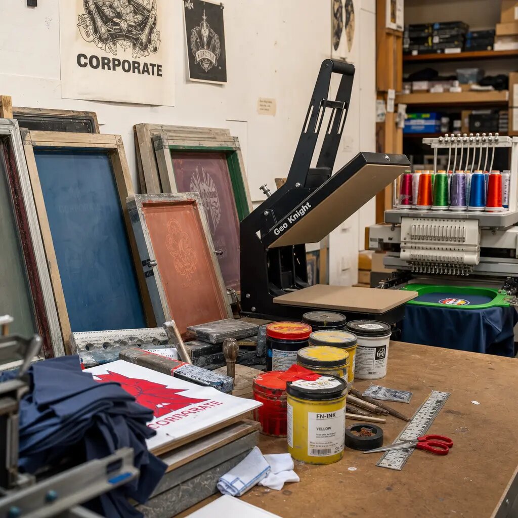
Choose the print method by artwork, quantity, and reorder plan
For many coffee roaster grocery totes, screen printing is the practical baseline. It suits bold logos, solid typography, simple icons, and one-to-four-color designs. It can provide strong ink laydown on canvas and clear setup economics for medium and larger runs. If the roaster plans to reorder a core retail tote throughout the year, screen print also makes it easier to control screen count, ink formula, and approved-sample matching.
Digital printing plays a different role. It is useful for detailed seasonal illustrations, gradients, multicolor launch graphics, or short pilot programs where screen setup would be inefficient. It can help a roaster test demand before committing to a larger repeat SKU. The tradeoffs may include higher unit cost, different hand feel, and greater dependence on machine settings, fabric preparation, and operator control. Approve digital print on a physical sample, not a monitor image.
Heat transfer may appear in quotes for complex artwork or low quantities. It can reproduce detail, but it also changes the surface feel and may look more film-like than direct print. Some brands accept that result. Others want the ink to feel more integrated with natural canvas. Transfers should be checked for edge lift, cracking on folds, pressure marks, and packed-carton behavior before bulk approval.
The best print method is the one matched to the actual artwork, order quantity, budget, brand feel, and reorder plan. A useful supplier quote should explain why the method is recommended. If the supplier cannot comment on line weights, color count, opacity, curing, or sample proofing, the quote may be based on a generic tote rather than on the print risk of your design.
- Screen print fits: one-color espresso brown logos, black café marks, bold typography, repeat retail SKUs, and jobs where Pantone spot color control matters.
- Digital print fits: gradients, full-color illustrations, limited seasonal campaigns, launch tests, and small design runs with many colors.
- Transfer print may fit detailed low-volume artwork, but require a physical hand-feel, fold, rub, and packed-pressure check before approval.
- For dark prints or large ink coverage, confirm curing/rest time and packed-goods offset control before cartons are sealed.
- For repeat orders, ask whether screens, ink formulas, and approved samples are retained and how long the supplier keeps them.
Control color proofing on natural, bleached, optical white, and dyed canvas
Coffee brand palettes often depend on subtle tones: espresso brown, cream, tan, copper, rust, forest green, sage, charcoal, black, and off-white. These colors can shift on different canvas bases. Natural cotton warms the print and may lower contrast. Bleached fabric gives a cleaner background while still showing texture. Optical white makes colors look brighter but may not support a natural brand story. Dyed canvas can create premium merchandise, but it needs separate shade approval and stronger attention to ink opacity.
Pantone references are useful, but they are not production standards by themselves. Pantone books communicate ink targets on standardized materials. Tote printing happens on absorbent woven fabric. A brown that looks right on coated paper may appear too red on natural canvas. White ink may need a heavier deposit or extra pass to reach acceptable opacity. Cream ink on natural canvas may be technically accurate but commercially unreadable. The physical printed sample is the real approval standard.
Repeat orders add another variable: the fabric lot. Natural canvas ordered in March and reordered in September may not have the same warmth, fleck level, or whiteness. Procurement should state whether reorders must match the original signed sample, a current-lot swatch, or an agreed commercial range. If several café-location designs need to look consistent, ask whether they can be cut from the same fabric lot and printed in the same production window.
Lighting matters too. Review samples in consistent daylight or a controlled inspection area. Warm café lighting can be a secondary check, especially if the tote will be sold in-store, but it should not be the only approval environment. Phone photos are not reliable color standards because exposure and white balance change the result. When practical, keep signed physical samples with the buyer, supplier, and inspector.
- Approve base fabric shade first, then approve the printed logo color on that base.
- Use Pantone references for communication, but make the approved physical printed tote or strike-off the production standard.
- For white or cream ink, check opacity and contrast at normal viewing distance, not only close-up under bright light.
- If multiple artwork versions use the same ink, ask whether they can be printed from one controlled ink mix where practical.
- For dyed canvas, request a dye swatch and confirm rub risk before approving light-colored prints.
Make MOQ, setup charges, and artwork splits transparent
A low unit price can hide different assumptions. One supplier may quote 300 GSM cotton canvas, reinforced handles, Pantone-matched screen print, a printed pre-production sample, fixed-count cartons, and carton labels. Another may quote lighter fabric, generic ink, simpler handle attachment, no physical sample, and loose packing. Both quotes may say "custom canvas tote," but the risk and delivered product are not the same.
MOQ should be broken down by SKU logic. Coffee roasters often split orders across a core brand tote, café locations, holiday graphics, subscription programs, wholesale partner designs, and events. A 3,000-piece total order is not the same as 3,000 pieces of one design. Six designs at 500 pieces each may require separate screens, separate approvals, separate carton labels, and more production handling. Ask for MOQ by bag size, fabric color, artwork version, print color count, and print side.
Fixed and variable costs should be visible. Fixed costs may include screen charges, prepress adjustment, Pantone matching, sample charges, courier fees, label setup, and carton label setup. Variable costs include fabric, sewing, printing, trimming, packing, carton materials, and inland logistics. This matters for reorders. If screens are stored and artwork is unchanged, some setup may be reduced, but storage duration and remake charges should be confirmed in writing.
Mixed artwork also affects color consistency. If six café-location designs share the same natural canvas base, printing them from the same fabric lot reduces shade variation. If they are produced weeks apart from different fabric receipts, the base color can shift. Procurement should ask how the supplier will manage shared fabric lots and whether split deliveries or staggered approvals create color or schedule risk.
- Request quote lines for fabric composition/GSM, finished size, handle spec, print method, number of colors, screens per side, sample cost, packing method, carton quantity, and trade term.
- Define MOQ per design-color-size combination, not only total order quantity.
- Clarify screen storage: whether screens are kept, for how long, under what artwork name, and whether reorders incur remake charges.
- Ask whether mixed designs can share one fabric lot and one ink mix where practical.
- Compare quotes only when incoterm, packing, artwork count, sample approval route, and QC standard are the same.
Approve a pre-production sample that represents bulk production
A useful pre-production sample is not just a nice-looking tote. It should represent the intended bulk product as closely as practical: same or approved-equivalent canvas, same base shade, same finished dimensions, same gusset, same handle construction, same artwork size, same print position, same print method, and same finishing. If a sample is made on substitute fabric or a different tote size, treat it as a rough layout sample, not as final approval for color, hand feel, or construction.
Inspect the sample in real-use positions. Check it flat for placement, registration, edge sharpness, and panel shape. Hang it by the handles to see whether the artwork still appears balanced. Fill it with realistic café retail contents, such as several coffee bags and a small accessory box, to judge handle comfort, panel distortion, and print appearance under load. Fold and stack it to check whether the print marks, cracks, or transfers under normal handling pressure.
Sample comments should be measurable. Instead of writing "logo position approved," record "front logo approved at 220 mm wide, centered, top of artwork 95 mm below finished top edge." If revisions are needed, write them as instructions the factory can execute: move artwork up 15 mm, reduce logo width to 210 mm, increase white ink opacity, thicken small text, or change ink from one Pantone reference to another. Vague comments create vague accountability.
If the order includes hangtags, barcode labels, sewn labels, care labels, individual polybags, inner bundles, or carton marks, include them in the approval flow or at least in a packing mockup. A tote can be correct while the carton label, SKU split, or café-location allocation is wrong. For multi-location coffee businesses, packing accuracy can be just as important as print quality.
- Approve sample measurements: finished width, height, gusset, handle drop, logo width, logo height, top-edge distance, side reference, and gusset clearance.
- Check inside the unlined tote for unacceptable ink strike-through, especially with heavy dark prints.
- Retain signed physical standards: one for buyer records, one for factory production floor, and one for final inspection when possible.
- Use photos only for minor layout confirmation; require a physical resample for color, opacity, construction, or major placement changes.
- Tag the approved sample with PO number, artwork revision, fabric specification, print method, date, and buyer approval name.
Set QC tolerances and defect classes before inspection
Quality control works best when tolerances are agreed before bulk production. Without written tolerances, the supplier may treat visible print drift, soft edges, or uneven handle stitching as normal. The buyer may see the same issues as retail defects. For canvas grocery totes used by coffee roasters, the QC checklist should cover both appearance and function: fabric shade, GSM, finished dimensions, print color, print placement, registration, legibility, seams, handles, stains, odor, packing, and carton marks.
Defect classes help reduce argument at inspection. Critical defects are safety or unusable-product risks, such as sharp contamination, mold, or severe damage. Major defects are issues that make the tote unsuitable for retail or brand use: wrong artwork, wrong print color outside the approved range, unreadable brand text, major off-center print, open seams, missing handle reinforcement, wrong fabric base, severe stains, or ink offset on the front panel. Minor defects may include small trimmed thread ends, mild natural slubs, or slight shade variation within the approved standard.
Practical tolerance examples belong on the PO or inspection checklist. Common starting points are finished body dimensions ±1 cm, handle drop ±0.5 cm, print placement ±5 mm from approved references, and print registration controlled so visible misalignment does not distort the logo. These are not universal rules. Premium retail merchandise may need tighter visual standards, while giveaway totes may allow wider commercial tolerances. What matters is that buyer, supplier, and inspector use the same written standard.
Inspection should include loose goods and packed goods. Loose tote inspection catches sewing, print, and fabric defects. Packed-carton inspection catches count errors, SKU mix issues, crease lines, dampness, odor, compression marks, and ink transfer after stacking. For dark prints on natural canvas, the packed-goods check is especially important because offset and pressure marks are easier to see.
- Attach the approved sample, fabric swatch, artwork revision, and tolerance list to the inspection standard.
- Classify wrong artwork, unreadable logo, severe color mismatch, open seams, missing handle reinforcement, heavy stains, and print offset as major defects.
- Treat normal canvas flecks as acceptable only when they do not sit in critical logo areas or create obvious retail-facing blemishes.
- Use a ruler for placement checks; do not rely only on visual judgment for centered logos.
- Open random packed cartons after final packing to verify count, labels, crease damage, and offset risk.
Prevent packing damage after the print passes
Packing can ruin an otherwise approved tote. Canvas grocery totes are often flat packed in bundles and export cartons. If prints are packed too soon after curing, stacked under heavy pressure, or compressed in overfilled cartons, ink can offset onto adjacent bags, crease through the logo, or leave pressure marks. The risk rises with large dark prints, heavy ink deposits, humid storage, and tight cartons.
Packing should be included in the RFQ and PO, not decided at the end. Define pieces per inner bundle, pieces per export carton, whether individual polybags are required or avoided, maximum carton gross weight if your warehouse has manual handling limits, and the exact carton labels required. Some roasters avoid individual polybags for brand reasons. Others need individual protection for e-commerce or retail inventory. The packing method should match the sales channel.
Fixed-count bundles make receiving easier. A distributor shipping to multiple cafés may need cartons labeled by SKU, artwork version, café location, PO number, quantity, and carton number. Loose mixed cartons may save a small amount of effort at origin but create counting labor and shortage disputes at destination. If mixed cartons are unavoidable, the mix should be documented on both the carton label and packing list.
Before shipment, the supplier or inspector should open random sealed cartons and review the totes in the condition they will travel. Compression problems often appear only after final packing. If the factory checks goods before packing and never opens a sealed carton, it may miss marks created by the final stack. For roasters working toward a café launch, market event, or seasonal merchandise drop, catching packing damage before shipment is far cheaper than finding it after arrival.
- Typical B2B packing structure: flat packed totes, fixed-count inner bundles, optional bundle bag or individual polybag, export carton with shipping marks on two sides.
- Specify carton labels: SKU, artwork version, color, quantity, carton number, PO number, and destination café or warehouse if required.
- Set maximum carton gross weight where manual handling matters; confirm carton dimensions if palletization or warehouse racking requires limits.
- For dark prints, require adequate curing/rest time and a random packed-unit offset check before shipment release.
- Do not change packing after production without confirming carton quantity, freight volume, label requirements, and lead-time impact.
Specification comparison for buyers
| Spec decision | Recommended option | When it fits | Buyer risk to check |
|---|---|---|---|
| Fabric weight | 10 oz to 12 oz cotton canvas, approximately 280-340 GSM, with written tolerance such as ±5% or an agreed GSM range | Retail grocery-style totes for coffee bags, brewing accessories, café merchandise, and reusable customer bags | Below about 250 GSM may wrinkle more during printing, feel promotional, show more panel distortion, and reduce perceived retail value; above about 380 GSM can raise sewing, packing, and freight cost |
| Fabric composition | 100% cotton canvas, or a stated cotton-rich blend with exact composition on quote, sample tag, and PO | Coffee roasters positioning the tote as natural, reusable, or premium café merchandise | If composition is vague, supplier may substitute fabric with different shrinkage, hand feel, whiteness, absorbency, or print adhesion behavior |
| Fabric base shade | Natural, bleached, optical white, black, or dyed canvas approved by physical swatch before printed proof | Important for brand palettes using espresso brown, cream, copper, muted green, charcoal, tan, or off-white ink | Natural cotton varies by lot; the same Pantone ink can appear warmer, duller, or lower contrast on different base cloths |
| Finished size | Finished body width, height, and gusset stated after sewing, with tolerance such as ±1 cm unless tighter control is agreed | Needed for artwork scale, carton planning, shelf presentation, and café allocation | Approving artwork before final bag size can make the logo look too low, too small, too close to seams, or visually unbalanced when carried |
| Handle construction | Cotton webbing handles 2.5-3.8 cm wide, with handle length/drop, stitch pattern, and reinforcement area specified | Reusable grocery totes carrying several coffee bags, small retail boxes, or café merchandise | Unspecified handles may be too narrow, too short for shoulder carry, weak at the top hem, or inconsistent across production |
| Print method | Pantone-matched screen print for 1-4 solid colors; digital print for gradients, detailed illustrations, or short runs | Screen print is usually practical for bold coffee logos and repeat retail SKUs; digital print suits seasonal art or test quantities | Fine lines, small knockouts, halftones, and low-contrast colors need printer confirmation before screens or digital profiles are approved |
| Print placement | Written reference points and tolerance, commonly centered within ±5 mm from approved top/side references for retail-grade work | Useful when totes are sold at retail, shipped to multiple cafés, or displayed front-facing | Without tolerance, visible leaning, rotation, or side-to-side drift may be treated as normal production variation |
| Artwork file | Vector AI, EPS, SVG, or production-ready PDF with outlined fonts, Pantone colors, final print size, and placement notes | Reduces interpretation errors between buyer, merchandiser, prepress, printer, and inspector | Low-resolution JPG/PNG files, RGB colors, unconverted fonts, and unclear scaling cause avoidable sample revisions |
| Sample approval | Physical printed pre-production sample on bulk-like fabric and final construction before bulk printing | Best checkpoint for color, opacity, registration, line detail, print hand feel, placement, and fabric absorption | PDF or paper proofs cannot show canvas texture, base shade influence, ink strike-through, curing, seam interference, or packed-goods offset |
Buyer checklist before sampling
- State finished bag body width, height, gusset depth, top hem style, handle length, handle drop, handle width, and whether dimensions are measured after sewing, not on cut panels.
- Specify canvas by composition and target weight, for example 100% cotton canvas, 300 GSM ±5%, instead of using only words such as thick, heavy, premium, or reusable.
- Define the fabric base as natural, bleached, optical white, black, or dyed, and approve a physical swatch before printed sample approval when brand color accuracy matters.
- Ask the supplier to confirm fabric shrinkage risk if washing, steaming, pressing, or heat curing is part of production; do not assume unwashed canvas will remain dimensionally exact.
- Attach vector artwork, final print size in millimeters, print side, print location, and required clearance from seams, top hem, gusset folds, and handle stitching.
- Convert fonts to outlines, list Pantone spot colors, identify any gradients, halftones, knockouts, small text, thin lines, distressed textures, or low-contrast design areas.
- Ask the factory to confirm the suitable print method for the actual artwork and to state minimum recommended line thickness, knockout gap, and readable text height on the selected canvas.
- Approve a physical printed pre-production sample on production-like fabric and final construction before bulk printing; do not release bulk printing based only on a PDF mockup.
- Write acceptance tolerances for print position, finished size, handle drop, color variation, registration, ink coverage, pinholes, edge sharpness, and small-text legibility.
- Define handle reinforcement, stitch pattern, stitch color, stitch density expectation, and practical load expectation for grocery and coffee retail use.
Factory quote questions to send
- What exact fabric composition, weave, yarn finish, and GSM are included in your price, and what GSM tolerance do you use during incoming fabric inspection?
- Is the quoted fabric natural, bleached, optical white, black, or dyed canvas, and can you send a swatch from the intended bulk lot or closest available production fabric?
- What finished size tolerance do you normally control for this tote construction, including body width, height, gusset depth, handle length, and handle drop?
- Which print method are you quoting for our artwork, and what minimum line thickness, knockout gap, and small-text height do you recommend on this canvas?
- For screen print, how many screen setups are included per color and per side, what are the screen charges, and are screens stored for reorders?
- For digital print or transfer print, what hand feel, color matching limits, wash/rub behavior, and setup costs should we expect compared with screen print?
- Will you provide a printed pre-production sample using the same or production-equivalent fabric, final size, final handle construction, final print size, and final placement?
- What is the sample lead time after final artwork confirmation, and when does bulk lead time officially start: deposit, fabric approval, or signed sample approval?
- What print placement tolerance do you control in production, and what reference points do you use: finished top edge, side seams, center line, gusset edge, or handle attachment points?
- What curing, drying, rub check, tape check, stacking-rest time, or packed-goods offset check do you use for printed canvas totes?
Quality-control points to confirm
- Fabric GSM must fall within the agreed tolerance or range, with no visible mixing of thinner panels, different weave density, or noticeably different base shade within the same production lot.
- Fabric base shade should match the approved swatch within agreed commercial tolerance, with no heavy stains, oil marks, mildew odor, uneven dyeing, unexpected yellowing, or severe slubs in retail-facing print areas.
- Finished size, gusset depth, top hem width, handle length, and handle drop should match the approved specification within written sewing tolerance, commonly ±1 cm for body dimensions and ±0.5 cm for handle drop unless otherwise agreed.
- Print color should match the approved physical printed sample under agreed lighting, with acceptable variation defined as textile production variation rather than monitor-based matching.
- Print placement must remain within the written tolerance, commonly ±5 mm for centered retail artwork, with no obvious leaning, rotation, side drift, or inconsistent vertical position across inspected units.
- Print registration between colors must be controlled so misregistration does not blur the logo, close small counters, change letter shapes, or create visible color halos on retail-facing artwork.
- Ink coverage should be even, with no unapproved pinholes, ghosting, mesh marks, dry edges, double images, scratches, heavy ridges, smudges, or strike-through that affects the inside appearance.
- Fine text, line art, QR codes if used, and logo counters must remain legible after curing; small openings should not fill in and thin strokes should not break in a way that changes the brand mark.
- Seams must be secure, with no skipped stitches, loose thread chains, open corners, broken top hem, exposed raw edges beyond the approved finish, or stitch tension that puckers the front print panel.
- Handle reinforcement must match the approved stitch pattern and dimensions, especially where the handle crosses the top hem or carries load.