1. Why print method is the real procurement decision
For canvas conference bags for trade shows, decoration is not a cosmetic afterthought. It drives cost, MOQ, artwork limits, sample timing, packing method, and rework risk. A bag can look fine in a mockup and still fail in production because the print sits too close to a seam, the underbase makes the logo heavy, or the transfer film cracks after the bag is folded and boxed. Procurement teams get better results when decoration is treated as part of the product specification, not as a last-minute branding choice.
The commercial reason is simple: the bag is judged fast, often at a registration desk or on a show floor, so the logo has to read clearly at arm’s length and survive handling. If the artwork is too detailed for the chosen process, the factory may quietly simplify it, push the quote higher, or add hidden production risk. The first RFQ question should therefore be: which method can be produced consistently on this exact canvas, at this exact quantity, with this event date?
That framing also helps compare suppliers fairly. One vendor may quote a cheap unit price for a screen print, but only because the artwork is reduced, the canvas is lighter, or the packing is loose. Another may quote a higher price while actually including a better fabric, a more stable print, and a lower defect risk. Buyers should compare method fit, not only the headline number.
2. Start with the bag body, then choose the decoration
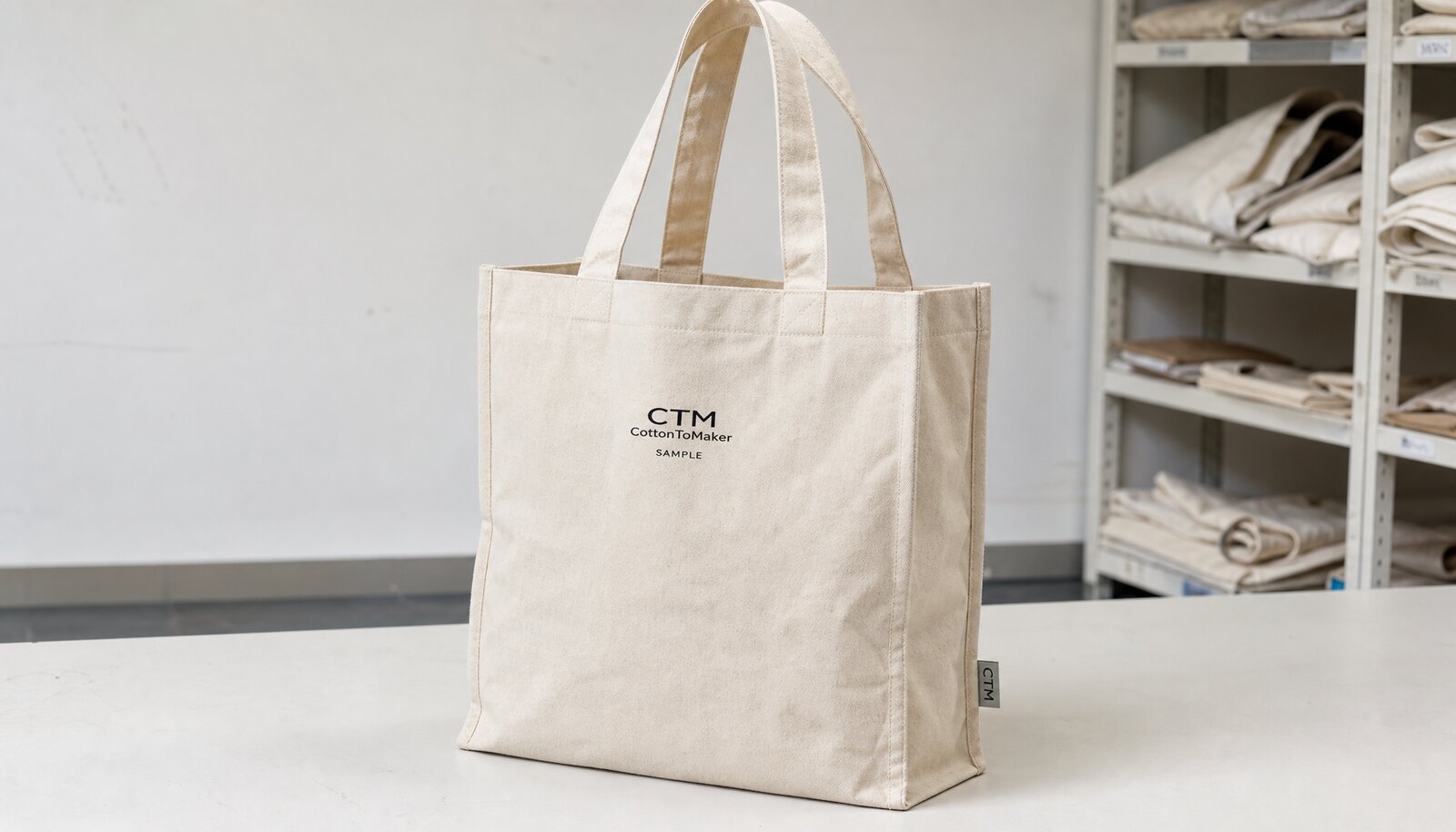
The bag body decides how forgiving the decoration will be. For light handouts, 8 oz canvas can work, but 10 oz canvas is usually the safer middle ground for a conference tote that needs some structure. If the bag will carry catalogs, a notebook, or a tablet sleeve, 12 oz canvas gives the panel more body and helps the print sit flatter. Thin or floppy canvas can make a technically good print look inconsistent because the fabric shifts during decoration and during use.
The weave and finish matter as much as weight. A tightly woven panel usually supports sharper line work and cleaner edges, while a rougher weave can make small text or thin lines look broken. If the canvas is brushed, washed, or lightly coated, that changes ink absorption and transfer adhesion. Ask the supplier to state the exact fabric construction, not just the weight, and ask whether the sample used the same lot as the bulk order. A print method should be selected for the actual fabric surface, not for a generic tote in the catalog.
Construction also affects print area. Reinforced handles, gussets, and seam allowances can shrink the usable front panel more than buyers expect. If the logo has to sit close to a seam or cross a bar-tack, the risk rises quickly. For procurement, the safest sequence is: confirm the bag body, confirm the flat print area, then choose the print method. That avoids approving artwork that only works on paper.
3. Screen print, DTF, transfer, and embroidery: what each method does well
Screen print remains the standard choice for many conference bags because it balances price and clarity well when the artwork is simple. One-color and two-color logos can print cleanly on canvas, and unit cost usually improves as volume rises. The method is strongest when the design uses bold spot colors, solid shapes, and relatively large text. The main tradeoff is setup: each color needs separate screens, and multi-color registration must be controlled carefully. On dark canvas, an underbase may be needed, which adds ink build and another point where quality can drift if the process is rushed.
DTF and heat transfer are more flexible when the artwork is detailed or the order is small. They can carry gradients, fine lines, full-color logos, and event-specific graphics without the same screen setup burden. Their weakness is not only feel; it is how they behave on folded canvas, rough weave, and repeated handling. A transfer that looks sharp on the sample can age differently once the bag is packed tightly, carried, and reused. Buyers should ask how the supplier tests rub resistance and fold behavior on the actual canvas, not on a smooth test cloth.
Embroidery adds texture and perceived value, but it should be used carefully on canvas conference bags. It works best for a small logo, a pocket mark, or a premium accent area. Large stitched artwork can pucker the panel, distort small text, or interfere with seams. For executive kits or premium gifts, embroidery can be a good fit. For large trade-show graphics, it is usually the wrong tool.
4. The print-method comparison by fabric texture, rub resistance, and seam behavior
The same artwork can behave very differently depending on the canvas surface. On a tighter weave with a smoother finish, screen print can hold fine type well and DTF can sit more evenly on the panel. On a more open or textured weave, bold spot colors tend to perform better than thin lines regardless of process, because the fabric texture interrupts the edge. If the bag is lightly brushed or slubbed, a detailed transfer may look less precise than the proof suggests. That is why a supplier should quote against the actual fabric image or sample swatch, not against a generic tote description.
Rub resistance is where procurement teams often get caught. Screen print, when cured properly, usually handles handling and repeated folding well on canvas, especially for simple spot colors. Transfer and DTF can also perform acceptably, but they are more sensitive to film edge lift, pressure settings, and the way the bag sits in carton. A fresh transfer that is packed too tightly can show scuffing before it ever reaches the event. Buyers should ask how the factory checks cure or bond strength and whether they have a fold-and-rub check before carton sealing.
Seam behavior is another difference that deserves more than a passing mention. Screen print tolerates a flat panel best; once a design crosses a seam, the ink can visually break where the fabric changes direction. Embroidery is even more sensitive to seam placement because the stitch path can distort around thickness changes. DTF and heat transfer can bridge a small irregularity better than embroidery, but if the design crosses a hard fold, the film may crack sooner. For any method, keep the primary logo on the flattest part of the front panel unless the artwork was built for a seam-crossing layout from the start.
5. Match artwork complexity to quantity and event frequency
Quantity should steer the decoration method just as much as logo style. For a small regional event or a one-off conference drop, the economics of screen setup are less attractive, so DTF or transfer printing may be a better fit. When the run grows and the artwork stays stable, screen print usually becomes the more commercial choice for simple logos because the setup cost spreads over more units. That is why buyers should ask for quote options at two quantities: the current order and the next reorder quantity. It shows how quickly the economics change.
Artwork complexity matters in a different way. A logo with a gradient, fine legal text, or a small multicolor emblem may need more print area than the brand team first expected. If the artwork has thin strokes or tiny type, ask the supplier to show the minimum legible size in millimeters for each method. This is not a design preference question; it is a production control question. A logo that looks elegant in a PDF can become weak, fuzzy, or unreadable on textured canvas.
If the same design will be reused across multiple events, ask the supplier which method will be most repeatable over time. A quote that works once may not be the best choice if the artwork changes every quarter, because remake and setup charges can exceed the savings from a lower first-order unit price. For procurement, the better comparison is not “which method is cheapest?” but “which method stays stable across expected event cycles?”
6. Build a true apples-to-apples quote matrix
A usable quote is line-itemed, not bundled. It should show the bag body, print setup, unit print cost, sample charge, packing method, inland freight, and any extra cost for artwork changes or reorders. Without those lines, buyers cannot compare suppliers on the same basis. A low unit price can hide a heavier reliance on setup fees, expensive packing, or a different fabric spec. Procurement should ask each supplier to quote the same template so differences are visible quickly.
A practical quote matrix should also force method comparison. Ask each supplier to quote the same artwork in at least two processes where realistic: for example, screen print versus DTF for a simple two-color logo, or transfer versus embroidery for a premium small mark. Then compare the total landed cost at the target quantity and the lead time from sample approval. That makes it easier to see where each method fits commercially, instead of choosing based on habit.
It also helps to ask which steps are in-house and which are outsourced. If sewing happens in one place and printing in another, the schedule and quality-control points change. Outsourcing is not automatically bad, but it should be visible. Buyers should know who owns curing, who inspects first-off pieces, and who is responsible if the print method or packing causes defects.
7. Use the sample to test production reality, not the artwork file
The pre-production sample should confirm the real bag, the real decoration, and the real packing method. That means the exact canvas weight, the final handle length, the final stitch pattern, and the selected print process. A rendering can hide seam shift, panel distortion, or a logo that lands too close to the folded edge. Buyers should sign off the sample as a production reference, not as a prettier version of the art file.
When reviewing the sample, check it under consistent light and compare it with the approved artwork dimensions and any Pantone reference. If the bag is dark, confirm that the logo still reads clearly at normal viewing distance. If the design contains fine text, make sure the smallest line is legible without strain. For dark bags with light logos, ask the supplier to explain how they achieved opacity and what layer structure they used.
A good sample review also includes handling. Fold the bag the way it will be packed, then inspect the print after the fold. This reveals whether a transfer edge will crack, whether ink will mark itself, or whether embroidery will press into a seam. If the sample passes flat-table inspection but fails fold inspection, do not treat that as a minor issue. Conference bags are handled folded, boxed, and carried; the sample has to survive that reality.
8. Define QC thresholds the factory can actually execute
QC language should be direct and actionable. Tell the factory what is unacceptable: a crooked logo, visible ink bleed, film edge lift, poor color match, or print that remains tacky after cooling. The goal is not a long policy document. It is a short set of acceptance rules tied to the way the bag will be used. If the bags will be handed out at a show, front-panel appearance and carton condition matter most. If they will be reused, wash/rub resistance and handle strength become more important.
Use measurable thresholds where possible. Placement should be checked against a fixed edge and the approved sample. Color should be checked against a named reference, whether that is a Pantone target, physical swatch, or approved master sample. For transfer and DTF, ask the factory how they verify bond strength and rub resistance before packing. For screen print, ask how they confirm cure time and whether any cartons are held back until the ink has cooled fully.
A small first-off inspection is useful on larger orders. Reviewing 10 to 20 pieces at the start can reveal placement drift, color shift, or packing mistakes before the full batch is finished. If the supplier cannot stop the line for a defect, that is worth knowing early. Buyers should also define a defect hierarchy: critical issues that trigger rejection, major issues that trigger rework, and minor issues that can be accepted within agreed limits. That keeps the conversation commercial instead of subjective.
9. Packing, carton handling, and rework responsibility
Packing can undo a good print job if it is not matched to the decoration method. Freshly printed canvas should be cooled and cured before it is folded tightly or stacked under pressure. If the print sits on the fold line, the carton plan needs to protect that area. For trade show deliveries, a flat fold or a protected fold is usually safer than a compact pack that presses the logo into a hard crease. A few cartons packed more efficiently are not worth a shipment of scuffed bags.
If the order is split across event sites, distributors, or warehouse drops, the packing plan needs destination-level clarity. Carton marks should match the purchase order, and the factory should confirm whether bags are packed by event, colorway, size, or SKU. That prevents sorting mistakes on arrival. It also makes rework easier to assign if the wrong variant is packed. The shipping label, carton mark, and inner pack should all tell the same story.
Procurement teams should also clarify rework responsibility before production begins. If the print method causes a defect, who pays for reprint, repacking, or replacement freight? If the issue is caused by a file change after approval, the answer is different. But if the supplier packed too soon, used the wrong cure parameters, or ignored the approved placement sheet, the supplier should own the rework path. Putting that expectation into the order terms early avoids later debate.
10. A practical default spec for most conference bag programs
For many trade show programs, a 10 oz canvas bag with a clean front panel, reinforced handles, and a one-color or two-color screen print is the best starting point. It gives a good balance of structure, print clarity, and cost control. Move to DTF or transfer only when the artwork is too detailed, the volume is too low for screen setup, or the design changes from show to show. Use embroidery only when the logo is small and the brand wants a premium tactile finish.
The RFQ should stay short but specific. It should name the bag weight, usable print area, artwork size, decoration method, quantity by colorway, sample expectation, packing requirement, and event date. Attach a flat artwork file, a placement diagram, and an approval sheet that shows what the sample must match. That forces the factory to quote the same job you actually want, not a looser version that looks cheaper on paper.
The cleanest procurement habit is to ask every supplier the same three things: can you produce this method on this canvas, can you show a sample on the same material, and can you commit to the lead time from sample approval. Those questions cut through a lot of vague selling language. If the answers are consistent, the quote is easier to compare. If the answers are vague, the risk is already visible before any order is placed.
Specification comparison for buyers
| Print method | Best fit on canvas | Quality strengths | Risk points to check | Commercial note |
|---|---|---|---|---|
| Screen print | Simple logos, spot colors, repeat orders, 10 oz and heavier canvas | Strong color block, efficient on textured fabric, best unit economics at scale | Registration drift on multi-color art, underbase build on dark canvas, ink rub if curing is rushed | Usually the default option when the artwork is simple and quantity is stable |
| DTF | Small runs, photo-style art, gradients, variable event graphics | Handles detail that spot print cannot, faster artwork changes, no screen cost | Film feel, edge lifting on fold lines, abrasion on rough weave, inconsistent press control | Useful for short-run or changing-event programs, but ask for wash/rub evidence and sample approval |
| Heat transfer | Low to mid volume, multi-color logos, event-specific designs | Flexible on artwork, good when setup must stay light | Transfer edge cracking, scuffing in packing, pressure and dwell sensitivity | Often economical for small programs, but must be tested on the actual canvas texture and fold pattern |
| Embroidery | Small premium marks, executive gifts, branded pockets or top panels | Premium texture, good perceived value, strong for small logos | Puckering on light canvas, seam interference, slow stitch setup, not ideal for large graphics | Best as a small accent, not as the primary decoration on a large front panel |
| Material | 8-12 oz cotton canvas, 120-220 gsm cotton, recycled cotton, or blended fabric selected by use case and target price | Before price comparison | Different cloth weights, backing, or certification claims make quotes hard to compare | |
| Construction | bag size, gusset, handle drop, seam allowance, stitch density, reinforcement patch, and loading expectation | Before sampling | Weak stress points create returns and failed inspections | |
| Decoration | screen print, heat transfer, embroidery, woven label, or hangtag matched to fabric texture and brand durability needs | Before artwork approval | The wrong method can crack, bleed, pucker, or fail on the chosen fabric | |
| MOQ | Base MOQ plus change drivers | During quote review | Custom colors, trims, and packing can change minimums |
Buyer checklist before sampling
- Lock the bag spec before choosing print method: fabric weight, weave, gusset depth, handle length, stitch count, and usable print area.
- State logo size in millimeters, Pantone targets, artwork file type, and whether the mark crosses seams, darts, or bar-tacks.
- Ask for separate pricing for bag body, print setup, unit print cost, sample, packing, inland freight, and any reprint or remake charge.
- Request a pre-production sample using the same canvas, the same print process, and the same panel construction as bulk production.
- Ask the supplier to identify which steps are in-house and which are outsourced: cutting, sewing, printing, curing, inspection, and packing.
- Confirm packing orientation, carton count, and whether fresh print areas will be protected from blocking or scuffing.
- Set written acceptance criteria for color, placement, registration, cure, and seam clearance before production starts.
- Tell the factory the end use: conference handout, brochure carrier, tablet carry, reusable tote, or premium gift bag.
- Require lead time from sample approval, not from order placement.
- Ask for a first-off photo or in-line approval point on larger orders so defects are caught before the full run is finished.
Factory quote questions to send
- Which decoration method are you quoting, and what changes in price if we switch from one color to two colors or move to a different process?
- What canvas weight and weave are included in the quote, and is that the same fabric used for the sample?
- What is the setup charge for this method, and is it a one-time charge or repeated on reorders or artwork changes?
- What MOQ applies by decoration method, and can you quote a lower quantity using a different process if needed?
- Will the logo be decorated before or after assembly, and how does that affect placement tolerance and seam clearance?
- What curing or pressing parameters do you use for the print, and how do you verify that ink or film is fully bonded before packing?
- What is the sample charge, and will it be credited back after order confirmation or treated as a non-recurring cost?
- How do you test print quality during production: registration, color, wash/rub resistance, or visual inspection only?
- How are bags packed for shipment, and what prevents fresh print from blocking, scuffing, or transferring in carton?
- What is your rejection threshold for off-center logos, color variation, broken stitches, and damaged cartons before shipment?
Quality-control points to confirm
- Logo placement should match the approved placement drawing and stay within the agreed tolerance on the sewn bag, not just on the flat artwork file.
- For multi-color artwork, registration should be checked on the actual canvas texture against the approved sample, especially where fine type or outlines are involved.
- Color should be judged against the approved sample or Pantone target under consistent light, and the supplier should state what variation is acceptable.
- Ink, film, or embroidered thread should not cross seams, bar-tacks, folds, or handles unless that layout was explicitly approved.
- Printed areas should be fully cured or bonded, with no tackiness, transfer to adjacent bags, powdering, cracking, or edge lift after light flexing.
- A simple flex test should not cause line breaks, haloing, or edge lifting on the decoration area.
- On transfer and DTF jobs, rub resistance should be checked on the fold area and on the outer surface where bags stack in cartons.
- Handles and stitches should remain secure after a basic load check if the bag is intended to carry brochures, catalogs, or a tablet.
- Fabric weight and bag dimensions should match the approved spec so the decoration does not distort on a thinner-than-expected panel.
- For first-off inspection, review an initial sample lot before the run continues and record any placement drift, color shift, or packing error.