Why cosmetic brands buy canvas conference bags differently than generic promo buyers
A canvas conference bag for a cosmetic brand usually does more than carry brochures. It may be used for a launch kit, a press mailing, a retailer meeting, a trade-show handout, or a VIP gift. That changes the buying logic. The bag has to look deliberate on arrival, protect the contents in transit, and still feel branded after folding, shipping, and warehouse handling.
For procurement teams, the right starting point is not decoration. It is use case. A bag intended for a press kit may justify a more refined finish, while a handout for a large event may need faster throughput and tighter cost control. The print method should follow that decision. If the artwork or process drives the spec too early, the result is often a bag that looks acceptable in a mockup but underperforms in production.
Cosmetic buyers also need to think about perception. The same natural canvas can read as premium or cheap depending on logo placement, ink coverage, and edge sharpness. That is why this comparison is less about finding the cheapest print method and more about matching the method to the role the bag plays in the campaign.
- Trade-show handouts usually prioritize speed and predictable unit cost.
- Press kits and VIP gifts usually justify a more refined finish and better packaging.
- Retail-facing bags need consistency across color, placement, and carton labeling.
Lock the base spec before you compare decoration methods
The canvas itself changes the result. For most canvas conference bags, 10 oz to 12 oz is the practical buying range because it balances structure, print behavior, and freight efficiency. Lighter fabric can work for brochures or low-weight inserts, but it tends to show stretch, seam ripple, and a lower perceived value. Heavier canvas looks more substantial, but it can raise sewing time and freight cost without improving the branding outcome if the artwork is simple.
Finish matters as much as weight. Natural unbleached canvas, bleached canvas, and washed canvas do not accept decoration the same way. A brand mark with thin type may look sharp on a smoother finish and soft on a rougher one. If the bag is meant to hold cosmetic samples or boxed product, the buyer should also specify gusset depth, handle drop, and seam reinforcement. Those details affect both usability and print placement.
If the supplier cannot quote the bag body separately from the decoration, the comparison is not ready. The product, the process, and the packing format need to be visible as separate cost items. Otherwise a low unit price may simply hide a weaker fabric, a smaller print area, or simplified packing.
- Use 10 oz to 12 oz canvas as the default comparison band, then move up or down based on load and presentation needs.
- Approve the actual fabric finish, not just a generic canvas description.
- Keep the bag structure fixed before testing print methods so the quote is comparable.
Use the comparison table as a sourcing filter, not a final award
The table below is meant to narrow the field before you ask for samples. It compares the main decoration routes in terms a buyer can actually use: what drives cost, how much setup they need, how they behave on canvas, and where the reprint risk sits. That is more useful than a generic list of decoration options because the right answer depends on the artwork, the quantity, and how much handling the bag will see after delivery.
For a cosmetic brand, the real question is rarely, "Which method is best?" It is usually, "Which method gives the right result at this volume, on this fabric, with this artwork, without creating avoidable rework?" Screen print remains a strong default for clean logos. Transfer methods are better when the art is detailed or the order is small. Embroidery and label-based branding are better when the bag is supposed to feel more tactile or premium.
The comparison only becomes useful if all suppliers are quoting the same assumptions. That means the same logo size, the same decoration area, the same canvas weight, the same packing format, and the same trade term. If any of those change, the price comparison stops being apples-to-apples.
- Compare suppliers on the same artwork dimensions and the same bag spec.
- Ask for a decorated swatch and a full pre-production sample.
- Record the assumption set behind every price before you rank the quotes.
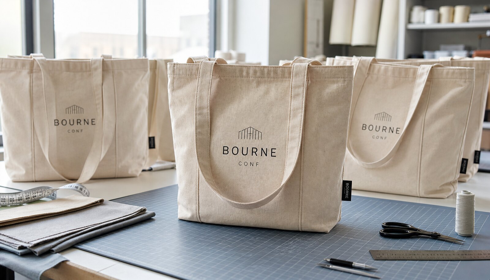
Screen print: best for simple logos and repeat programs
Screen print is usually the best commercial choice when the artwork is simple and the order is large enough to absorb setup. It produces clean solids, strong brand marks, and stable repeat output. For a cosmetic brand, that makes it a good fit for a minimal logo, an event name, or a short tagline placed on one side of the bag. It is also the method most buyers can compare easily across suppliers because the cost structure is straightforward once the screen count is known.
The limitation is detail. Canvas has texture, and texture affects ink deposition. Fine strokes can fill in, small serif type can soften, and very tight registration can drift if the supplier does not control the line well. The issue is not that screen print is outdated. The issue is that it rewards simple artwork and disciplined setup. A good screen-printed tote can look more premium than a bad transfer because the edges are cleaner and the ink sits naturally on the fabric.
Screen print is also the method most likely to benefit from repeat orders. Once the screens, ink mix, and placement are locked, the run can be reproduced with relatively low unit cost. That said, reprint risk rises when the supplier changes the screen shop, substitutes ink, or reuses a setup without confirming the approved sample. Buyers should treat the physical sample as the master, not the PDF.
- Choose screen print for bold logos, short text, and repeat replenishment orders.
- Avoid it for gradients, hairline detail, or artwork that depends on photographic precision.
- Ask the supplier to confirm how they control registration and ink thickness on coarse canvas.
Transfer methods: best when the artwork is detailed or the MOQ is lower
Transfer methods, including DTF and heat transfer, solve a different buying problem. They are useful when the artwork has gradients, multiple colors, tiny text, or a more photographic feel that would be expensive or messy to screen print. They can also help when the quantity is too small to justify a full screen setup. For beauty launches, that flexibility is valuable because artwork often changes late and buyers may need a faster route to a sampleable bag.
The tradeoff is surface behavior. Transfer art can look precise but still fail if the press settings, curing, or fold performance are not controlled. The most common buyer mistakes are judging the bag only when it is flat, then discovering edge lift or cracking after the bag is folded or shipped. A transfer that passes visual review on a bench is not automatically safe for packing or repeated handling.
For procurement, the practical questions are about the process, not just the logo. Ask what film or transfer system is being used, whether the shop has a fixed press profile for the canvas weight, and how they test the bag after curing. The supplier should be able to explain how they prevent edge lift, gloss mismatch, or heat marks. If they cannot, the method may be more fragile than the quote suggests.
- Use transfer when the art is detailed, multi-color, or time-sensitive.
- Require fold and rub testing on the actual canvas before bulk approval.
- Do not assume a visually clean sample will survive packing without edge issues.
Embroidery and label-based branding work better for premium presentation
Embroidery is usually chosen for a reason other than cost. It signals a more tactile, premium feel, which can suit VIP kits, retailer meetings, or compact identity marks where the logo is intentionally understated. The downside is that embroidery introduces density. On light or soft canvas, too much stitch coverage can cause puckering, pull distortion, or a stiff hand feel that clashes with a cosmetic brand's aesthetic.
That is why embroidery should be reserved for compact marks, not large logos or fine legal text. The buyer should ask how many stitches the logo requires, what underlay is planned, and whether the thread color matches the approved brand standard or just a close visual match. Thread dye lots and stitch density can shift the result more than many procurement teams expect.
A woven label or patch often solves a different problem. It can give the bag a more retail-ready finish without risking the base fabric as much as direct embroidery. A small woven label stitched into a seam or handle area can work well when the brand wants restrained identity and a cleaner front panel. It is especially useful when the cosmetic line uses a minimal aesthetic and the tote should complement the packaging, not dominate it.
- Use embroidery for compact marks and premium positioning, not for large or detailed logos.
- Use woven labels or patches when you want less risk to the base fabric and a cleaner face panel.
- Ask for stitch count, label construction, and attachment method before approving the sample.
Sourcing model changes risk more than many buyers expect
The same bag can behave very differently depending on who controls the process. A factory with in-house sewing and decoration usually gives the cleanest path from sample to bulk because the same team controls fabric, print, assembly, and packing. That reduces handoff risk. It also makes it easier to keep the approved sample aligned with production, especially when the order needs a specific ink, backing, thread, or fold format.
A trading company or consolidated supplier can still work, especially if the buyer is combining several promo items into one shipment. The issue is visibility. If the decoration is subcontracted, the quote may hide who actually owns the process, where the work is being done, and how much schedule risk sits outside the supplier's direct control. If the supplier cannot tell you who prints or embroiders the bags, the quote is less useful than it looks.
The safest commercial habit is to ask for the factory role, the decoration role, and the packing role separately. If the supplier is a broker, that is fine, but the buyer should know it. If the supplier says the process is in-house, ask them to confirm which machines or lines are used and whether the sample and bulk are made on the same setup. Specificity is what turns a quote into something you can trust.
- In-house factories usually give better control over color, placement, and repeatability.
- Outsourced decoration is acceptable only when the subcontractor and handoff points are disclosed.
- The strongest quote is the one that shows who owns each step, not just the final bag price.
How to compare quotes without getting misled by unit price
A useful quote should be detailed enough that another supplier could reproduce the order without guessing. At minimum, it needs the finished size, gusset depth, handle length, canvas weight, bag color, print area, logo size, packing format, and carton count. If those details are missing, two quotes that look similar may actually describe very different products. That is how procurement ends up comparing a plain bag to a packed, labeled, branded program and thinking they are equivalent.
The hidden cost drivers are usually setup and packing. Screen print has screens and registration. Embroidery has digitizing and machine time. Transfer has preparation and press labor. Label-based branding has sourcing and attachment. Packing can be just as important as decoration: individual polybags, insert cards, barcode labels, and master carton requirements all affect the final landed cost. A quote that omits them is not a clean bid. It is an incomplete one.
A good buyer also checks the pricing logic. Ask where the price steps are at 500, 1,000, 3,000, and 5,000 pcs. A supplier that can explain the breakpoints clearly is usually giving a more reliable commercial answer than one that only offers a single headline price. The goal is not to force the lowest number. It is to understand the conditions under which the price is actually true.
- Compare prices using the same trade term, such as EXW, FOB, or DDP, so freight is not hidden in one bid and excluded from another.
- Ask for line items for bag body, decoration setup, decoration per unit, and packing.
- Check whether the quote includes proofing, labels, inserts, or special carton marks before you compare totals.
Sample approval should test the decoration, not just the tote shape
A sample only has value if it represents the real production path. A flat mockup or a sample made from different fabric tells you very little about the bulk order. For cosmetic-brand canvas bags, the pre-production sample should use the final fabric, final decoration method, final handle construction, and final packing format. If any of those change later, the sample is no longer the right reference.
A practical approval path has three stages. First, approve the artwork layout and logo size. Second, approve a decorated swatch or strike-off on the actual canvas. Third, approve a full pre-production sample that includes sewing, decoration, folding, and carton packing. That last step matters because a bag that looks correct on a table can still fail in a packed carton or arrive with the wrong fold profile for a launch box or fulfillment insert.
The sample should also answer a simple procurement question: can this order be repeated? A bag that only works when one senior operator is present, or one ink batch is used, is not a stable program. The supplier should be able to explain what is fixed, what can vary, and what they use to control those variables before bulk starts.
- Approve artwork, decoration, and packing as a single production system, not as separate visuals.
- Test the sample after folding so cracks, lift, or distortion are visible before bulk starts.
- Keep the signed physical sample because it becomes the standard for reorders.
QC thresholds should be specific enough to stop rework early
Quality control works only when the acceptance rules are concrete. Saying a tote should look good leaves too much room for interpretation. Better control points are measurable: the fabric weight must stay within the approved tolerance, the logo must sit within the defined placement window, and the color must match the approved master or the agreed tolerance range. For a cosmetic brand, small deviations are often visible even when the bag is technically usable.
The same logic applies to physical testing. Print adhesion should be checked after curing and folding, not just on a flat panel. Transfer graphics should be checked at the edges and across creases for lift or cracking. Embroidery should be checked for puckering, thread tails, and uneven density. Handle seams and bar-tacks should be tested against the intended load, especially if the bag will carry product samples rather than brochures.
Packing needs the same discipline. Carton counts, SKU labels, and destination marks should match the shipment plan exactly, and each style or colorway should be isolated in the packing map. Warehouse problems are often caused by packing mistakes rather than by the bag itself. Buyers who treat packing as part of QC usually have fewer disputes at receipt.
- Use the physical approved sample as the master for color, placement, and hand feel.
- Check adhesion and cracking after folding, not only before packing.
- Verify carton labels, SKU mapping, and counts before dispatch.
Specification comparison for buyers
| Option | Indicative cost structure | Turnaround assumption | Print quality on canvas | Setup burden / MOQ pressure |
|---|---|---|---|---|
| Screen print | Lowest unit cost for simple 1-3 color logos once setup is spread across a mid-size run; setup charges matter on smaller orders. Indicative only: assumes one logo location, standard canvas, and in-house printing. | Often 7-15 working days after final artwork and sample approval, but the actual schedule depends on screen count, drying space, and whether packing is also done in-house. | Strong for solid fills, brand marks, and clean typography when the ink system matches the weave. | Moderate upfront setup: screens, registration, and color matching add pressure on short runs. |
| DTF / heat transfer | Higher per unit on small runs, but lower upfront setup than screen print. Indicative only: assumes standard transfer film, one-sided decoration, and no special finish. | Often 5-12 working days after proof approval, though pressing, curing, and packing can extend the schedule. | Very good for multi-color art, small text, and detailed marks; finish can feel more film-like than direct print. | Low to moderate; easier to launch at 300-1,000 pcs when artwork is not screen-friendly. |
| Embroidery | Usually the highest logo-area cost because stitch count, thread changes, and machine time drive pricing. | Often 10-20 working days because digitizing and machine setup are required before bulk production starts. | Premium tactile finish with strong perceived value for compact marks and small brand identifiers. | High upfront digitizing burden; less efficient for short runs or multiple logo versions. |
| Woven label / patch | Moderate cost, especially when the label is sewn into a seam, handle, or side panel rather than covering a large area. | Often 7-18 working days depending on label sourcing, attachment method, and whether the label supplier is separate. | Clean, retail-friendly branding with low risk to the base fabric and good consistency on natural canvas. | Moderate; label sourcing and attachment add a step, but the bag body is easier to keep stable. |
| Combination print + label | Highest total cost, but often strongest presentation for cosmetic launch bags, VIP kits, and retail-facing packaging. | Longer lead time because two processes must be approved and scheduled without collision. | Strongest branding hierarchy: one method carries the main logo, the other adds identity or compliance details. | Highest coordination burden because sewing, decoration, and packing all need to stay aligned. |
| Material | 8-12 oz cotton canvas, 120-220 gsm cotton, recycled cotton, or blended fabric selected by use case and target price | Before price comparison | Different cloth weights, backing, or certification claims make quotes hard to compare | |
| Construction | bag size, gusset, handle drop, seam allowance, stitch density, reinforcement patch, and loading expectation | Before sampling | Weak stress points create returns and failed inspections | |
| Decoration | screen print, heat transfer, embroidery, woven label, or hangtag matched to fabric texture and brand durability needs | Before artwork approval | The wrong method can crack, bleed, pucker, or fail on the chosen fabric |
Buyer checklist before sampling
- Lock the finished bag size, gusset depth, handle drop, closure style, and intended load before comparing decoration methods.
- Specify the canvas weight, weave style, finish, and acceptable shade variation by lot so suppliers are quoting the same base material.
- Send vector artwork and define the exact print area, logo size, color targets, and any small-text exclusions in the brief.
- Require a decorated strike-off or swatch on the actual canvas, then a full pre-production sample on the final bag construction before bulk approval.
- Ask who actually performs the decoration: the factory, an in-house print room, or a subcontracted partner.
- Confirm packing format in writing, including bulk fold, individual polybag, insert card, barcode label, and master carton count.
- Set a remedy for placement drift, color mismatch, broken stitching, or label errors before the order starts.
- Tie every quote and sample to a single spec version so later revisions do not quietly change the comparison.
- If the bag will hold beauty samples, add a load target and seam-strength expectation rather than relying on generic tote standards.
Factory quote questions to send
- What is the exact finished canvas weight, weave, and finish, and how do you verify it on incoming fabric?
- Is decoration done in-house? If not, who performs the print or embroidery work and where is it done?
- What assumptions sit behind your unit price: quantity, number of colors, logo size, packing format, and trade term?
- Please break out bag body, decoration setup, per-unit decoration, packing, and any special handling charges.
- What are the setup fees for screens, digitizing, transfer preparation, or label sourcing, and which are refundable or not?
- Will the sample use the same cloth, ink, thread, press settings, backing, and sewing line as bulk production?
- Which print method do you recommend for this artwork, and what quality tradeoff are you accepting by choosing it?
- What checks do you run at start-up, mid-run, and before packing for placement, color, adhesion, and seam quality?
- If the artwork is revised after sample approval, what rework charges and schedule impact should we expect?
- Can you quote the same spec with bulk fold, individual polybag, and retail insert as separate line items so we can compare landed cost properly?
Quality-control points to confirm
- Fabric weight should match the PO spec by lot, with no unapproved shade banding or obvious roll-to-roll mismatch in the same shipment.
- Logo placement should be measured from a fixed reference edge or seam, with a defined tolerance for the run; premium programs usually need a tighter window than promo-only orders.
- Color should be checked against the approved physical master under daylight and indoor white light, not just against a screen file.
- Printed panels should pass a dry-rub check after curing and folding, with no flaking, smearing, or visible transfer that would be obvious to a customer.
- Transfer graphics should be inspected at the edges and across creases for lift, cracking, gloss mismatch, or press-line marks.
- Embroidery should be checked for puckering, loose tails, uneven density, and thread breaks, especially on lighter canvas weights.
- Handle seams, gussets, and bar-tacks should be checked against the intended load rather than a generic tote standard if the bag carries product samples.
- Carton count, SKU labels, master carton marks, and destination labels should match the shipment plan exactly before dispatch.
- Outer cartons should be reviewed for compression, wet damage, and corner crush, particularly on export lanes or warehouse-dock receipts.
- If the order includes multiple SKUs or colorways, each variant should be isolated in the packing plan so no mixed-carton error slips through.